My original artwork step by step- my first custom divider for Steemit
Hi guys!
How are you today?
This time I'm writing about one cool way of upgrading your posts- a customized text divider :)
I wrote another post on a customized footer (Original artwork step by step- my first custom footer for Steemit), and I will definitely continue with more custom blog art, like a header, a GIF footer and other forms of visual communication of this sort.
I think that adorning your posts with custom art is a great way to make your blog stand out, to make them more pleasant to the eye and comfortable to read. In my experience, it results in greater visual recognisability and leaves a really nice impression on the reader.
This whole idea is thanks to two prominent fellow Steemians- @inquringtimes, who prompted me to do my own divider and @spiritualmax, who has this cool dragon divider in his posts, which really caught my eye and stayed in my memory. I thought that it would be nice to have a divider of my own. But this is only one of maaany good ideas inspired by those two excellent authors. I most definitely recommend you to follow them, guys! Their posts are inspiring, extremely useful and entertaining, I'm a regular reader ! :)
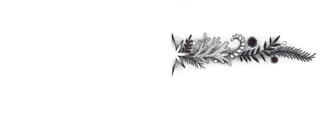
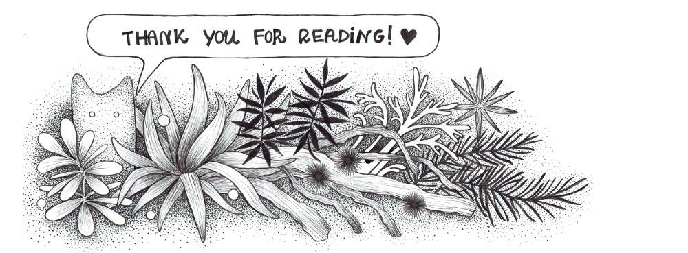
Ok, so here's how my divider looks like:
Pen and ink on paper, 21x29,7 cm
Well, it's turned out absurdly lascious, but it's my first take on a text divider haha so I'm very ok with the final result :)
THE PROGRESS OF ARTWORK
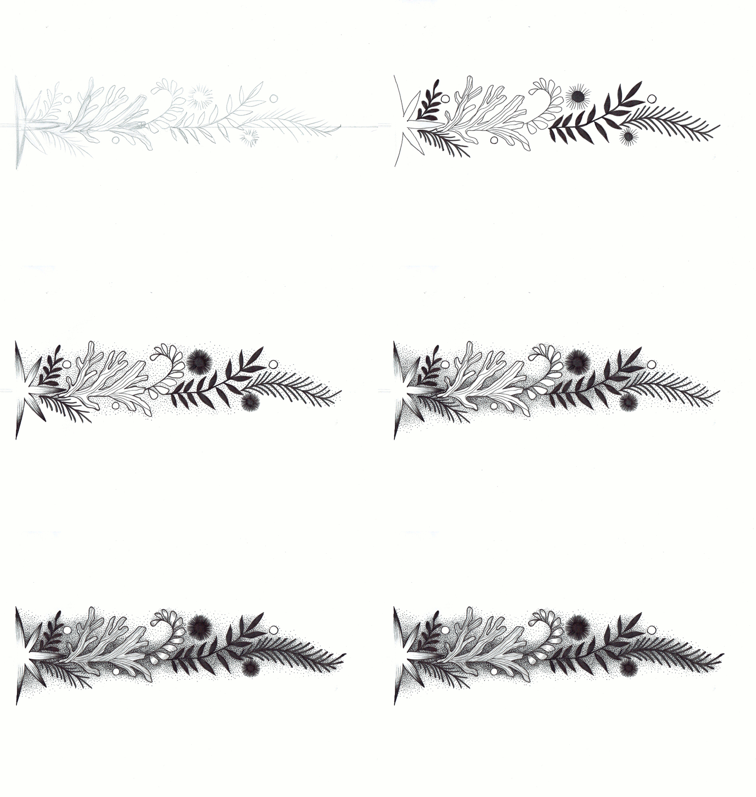
I scanned the stages of my artwork to show you the progression of my work.
As the divider should be quite long and symmetrical I decided to draw the half of it and then using GIMP copy it, reflect and put the two parts together to form a nice little divider.
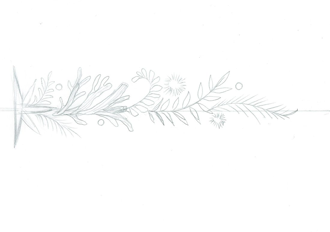
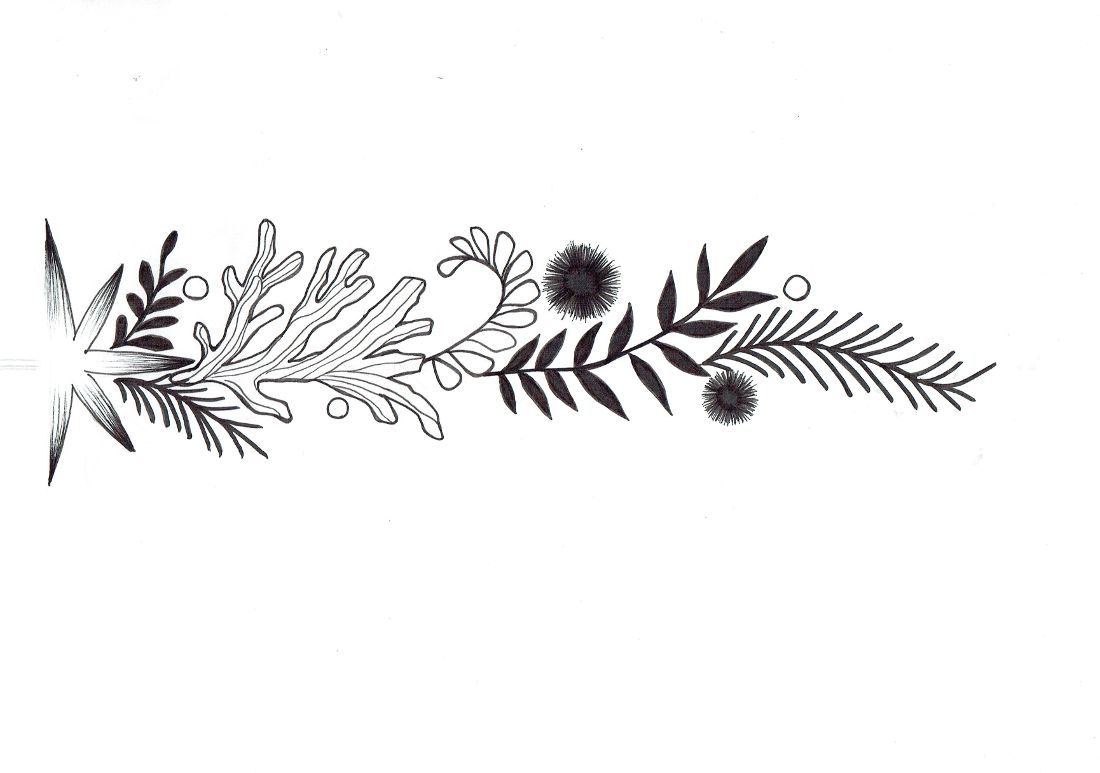
I started with a sketch, as I always do.
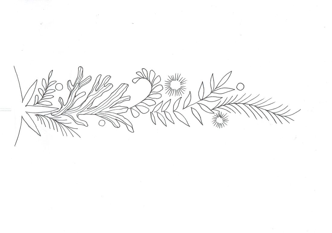
I redrew the lines with pen and got rid of the pencil marks.
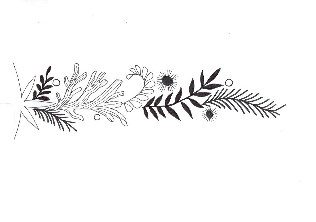
Filled out the black parts.
Started with texture and outlines.
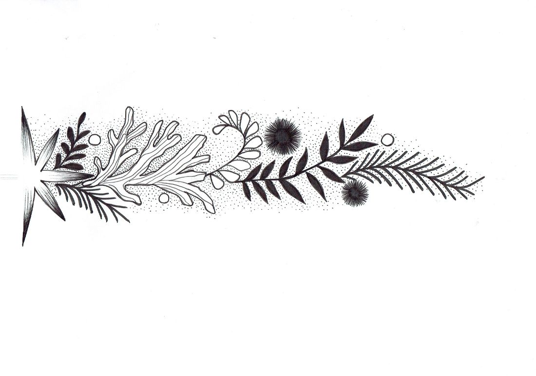
Here's the initial shading:
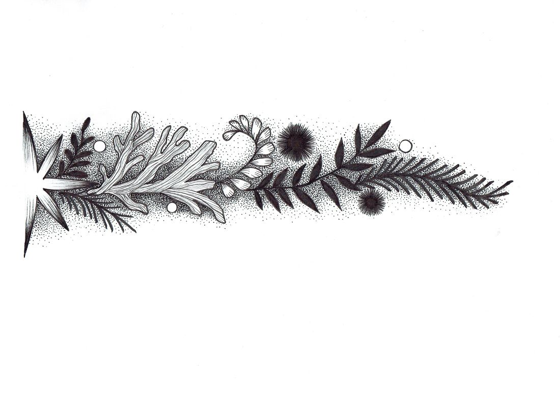
And the finished half of the divider :)
Here's the half of the divider before I created it's symmetrical copy.
And here's the divider after joining both parts together. I actually had to do some minor changes in the drawing using GIMP, because the star needed some cleaning and trimming. It has some funny proportions to certain degree, but I like it.
And traditionally, below's a GIF with the progress of artwork:
How do you like my effort, guys?
Do you have your own custom art for your blog? Or are you maybe planning on doing one yourself? I would love to see it!
I also wanted to tell you that I'm floating on a see of hardwork and no time, and lately I couldn't post on Steemit as intensely as I wished.
I really got very serious about the advice given me frequently back when I was a young minnow, that posts should be long, top-notch and high quality, and it's taking it's toll ;) When I don't have enough time to create a huge monster of a post, the most usual case is that I'll stop posting at all :) and I'm not very happy when it happens.
So I think I'm gonna try something new in this area, cause I'd like to post more consistently. Besides, I'm a big fan of short posts of my favourite authors here myself, so it is possible that other Steemians will like my shorter posts, too. Hopefully :) And with this post I tried to write it real quick, as th Napoleon Dynamite would say (but it wasn't as swift as I hoped it will be, so I need to practice more).
I hope that you enjoy this idea of a custom blog art series, and as always...

It's so ''you'', so recognizable way of drawing. Very nice job @shinyforest :)
Thank you @jungwatercolor! I'm relieved to hear this from you, as I've recently read several guides with tips about what works in Steemit and many of them emphasized the need of having your own niche and recognizable artistic style. Your beautiful artwork is also very unique and recognizable, so we both have this factor working for us ;P
Love,
Klaudia
Thank you Klaudia, I would recognize your work from moon :) And you have one more fan, my boyfriend was so in love with your drawings when I showed him. Just keep up the good work @shinyforest.
You are always draw beautiful artwork! Very good and detailed tutorial.
Thanks @marinaart, it's always so nice to read your encouraging comments, I'm looking forward to see some of your posts soon :) I'm having trouble with posting regularly because I have so much work, do you have it similar?
Love,
Klaudia
Yes, I can't post regularly latly, way to mush life responsibilities( remodeling bedroom and bathroom . I am preparing everything on week days for a weekend break through), plus my YouTube channel need to have one video a week to keep it alive. It is sad that I can't post on Steemit now, but family needs and money earning will go first:) I am hoping for Easter days off to come back here for a little bit. :) Hugs and see you later in the mail box :)))!
Well Done!
I would have made them in transparent .png because in Steemit night mode you can see the white in the background.
Other than that they look perfect!
Thanks so much! You know, when you visit my blog it's like a Sensei came by and said 'hello' :)Thanks for this tip, I forgot about the white background in jpg when uploading the post on my computer and only then I saw the divider in night mode on my phone, so I need to do as you suggest.
Love,
Klaudia
You are one month older than me, so don't talk like that... I simply got lucky :)
Cheers
I'm thankful I caught this before 7 days so I could add my upvote. And I've found a new artist to follow, yay!
I like the clean style of your lines and the thoughtful details you've incorporated, like the soft gradient effect from the stippling.
Beautiful, great job! Love the whole artwork and style!
Thank you @megy.fine.arts, I'm glad you like my art and have commented it here, because you're an instant follow for me and otherwise I could've not find your blog! Your art is very intriguing to me.
See you around ;)
Very pretty divider! Fancy✧
I want to make my own divider too! Seems a lot of fun and it would make my posts a lot more 'personal' n_n
Thank you @kothy, I appreciate your kind support :) I would love to see a divider designed by you! I wonder what you would put in it. Have you thought about anything in particular yet? :)
Beautiful job as usual Klaudia. I agree with @spiritualmax on the png file format.
Your post got me thinking if I need these dividers myself, hmm, I guess I'll have to think about it. I'm still stuck on creating my logo/avatar. Yikes.
I think you made the right call by mixing it up a bit between short and long form posts. I think rules can be flexible and that you have a lot of talent to steem your way to the moon, your images already show high quality and dedication.
I feel in my case the long posts don't do as well, so I guess it varies with each account and topic.
Thank you for sharing all your knowledge @shyinyforest. I've learned so much from you. You rock girl!
Thank you @creativista! Ah, I think I should start some series of post, as it would make easier being consistent with this new kind of shorter posts. Otherwise my work overwhelmes me and I end up yet again not posting at all ;P wish me luck dear ;) I appreciate all your support very much and all those good feelings are mutual! What would you like to put in your avatar? I'm very intrigued if you have thought about anything specific already :)
Love,
Klaudia
Yes, do a series dear Klaudia, that's a great idea, maybe one in which you publish a little part of a bigger illustration...or something that takes 1-2 hours of your day that can be strung together as a tutorial. Don't strive for perfection because that will only hold you back.
I wish you all the luck in the world, you are my number one supporter and one of the best talents I found earlier when I joined steemit. I'm glad we are holding each other strong together ;)
I wanted to do a drops cap C for my avatar, but I gave up on that idea. I'm still brainstorming on that one...he
Let's see more of your awesome work! :) Love, Ana
Aww, cool! You'll have to make me one if you get any free time ;)
With pleasure, Caleb! :)
Amazing, @shinyforest! Simply amazing! Very detailed and inspirational! I was having trouble when writing my posts without any additional visual forms/details and this is a great and aesthetic way to solve this. I hope you don't mind if I follow your example. ^.^
Oh, please be inspired, I'd be so happy if my post turned out to be an inspirational help for others! And I'm very intrigued how will your divider look like! Can't wait to see it! Have you thought what would you like to put in your divider?
Thank you for your encouraging support @katalinaooma!
Love,
Klaudia
I already made up a small one with details from my initials (just flipped them horizontally and the result was a bit surprising - It looked like a butterfly), you can check it on my previous post: https://steemit.com/steemartists/@katalinaooma/amaryllis ^.^
Don't underestimate yourself, dear! You can be a great inspiration for everyone. ;)
Whoa, this divider is very elegant, I love it! Totally pro, Katalina, I'm amazed.
I love your post - long and short. But I understand your dilemma. I very often write to much, which leads to a day working on the text and the photos and and... or I am simply to slow. So I normally post max two times a week more often only one time. It is so hard for me to write something short and substantial.
Now your divider: so beautiful!!!! I want to steal it 😍😍 (or better I transform myself in a kind of skill-vampire and steal your drawing skills....muahahahaha)
No really, I love it and it is easy to recognise without beeing to much. Perfect.