Font Adventures.
Arial
Probably the most recognizable of the loyalties free fonts in the world, you see this almost everywhere from the top tech brands of the likes of Microsoft, Apple to our own home platform Steemit. It is widely used and it is the most common typeface around the world, it serves well for readability and sharpness.
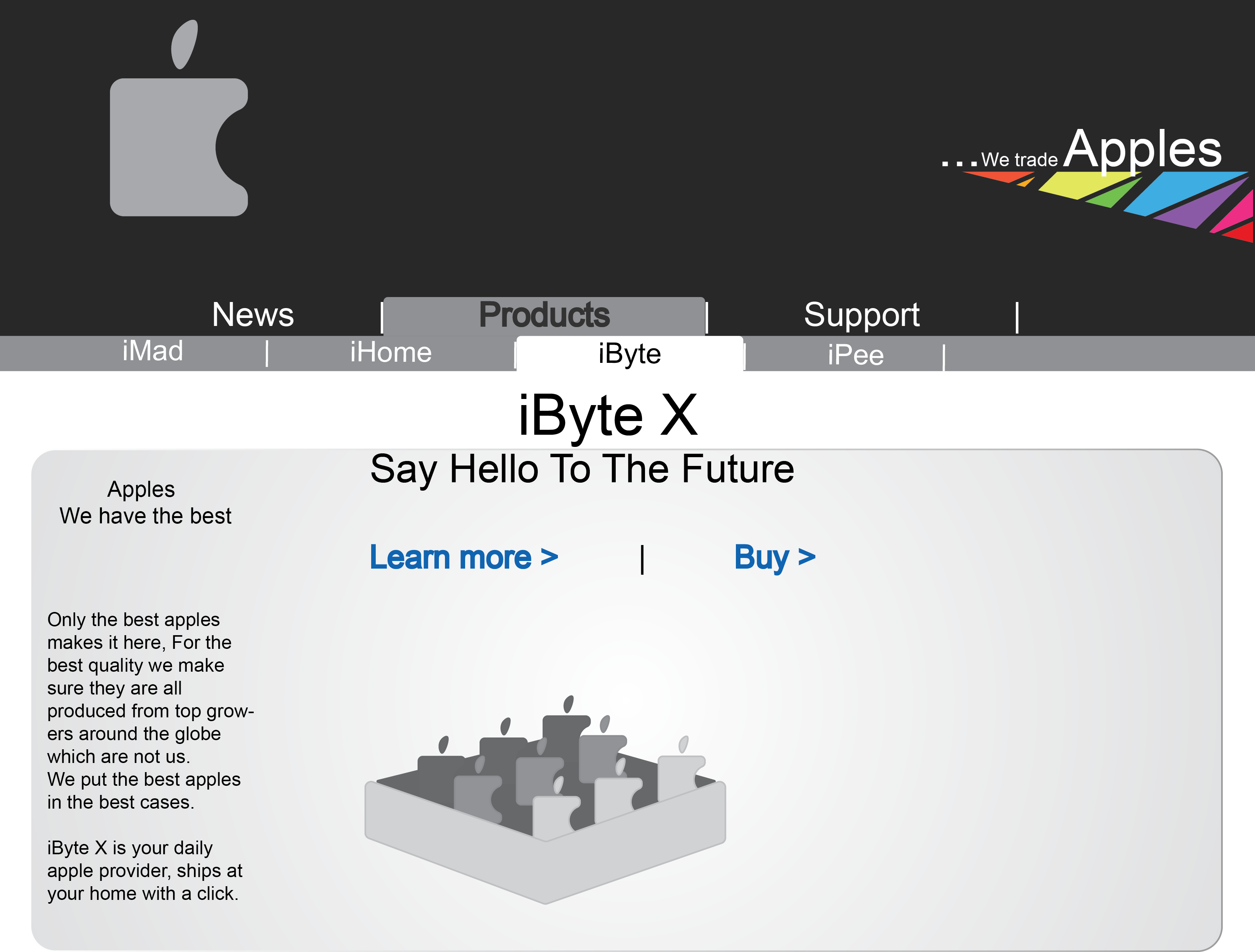
Today I will use this font to create an illustration that will display the professional look that Arial is used to achieve for those that embrace it. So I will go and try to make a mobile page for a huge firm, Apples.
This is a series I am making about fonts, my goal is to create educational content that combines humor and knowledge through original concept design.
If you enjoy my blog consider to leave me an upvote at your way out,
Thanks for stopping by.
disclaimer: All names and brands are made up and are made for educational and displaying purposes, the design though it is original and made by me. It has nothing to do with Apple the world first class Samsung customer that composites smartphones with parts manufactured of top brands.
The Arial typeface was designed in 1982 by a 10-person team, led by Robin Nicholas and Patricia Saunders, for Monotype Typography. It was created to be metrically identical to the popular typeface Helvetica, with all character widths identical, so that a document designed in Helvetica could be displayed and printed correctly without having to pay for a Helvetica license✺
Previous in Font Adventures:
Check'em out if you missed them here.
Helvetica


thats pretty cool to know...thanks for sharing.
resteem and upvote
You are welcome also thank you for the support.
wonderful this art...i appreciate this blog.best of luck dear friend....resteemit
Thank you a lot dear.
most welcome..
The blog is wonderful....please can someone put me on