"Mermaid" Original Artwork in progress : Part-5
Hello there, boys and girls!
How are ya doing today?
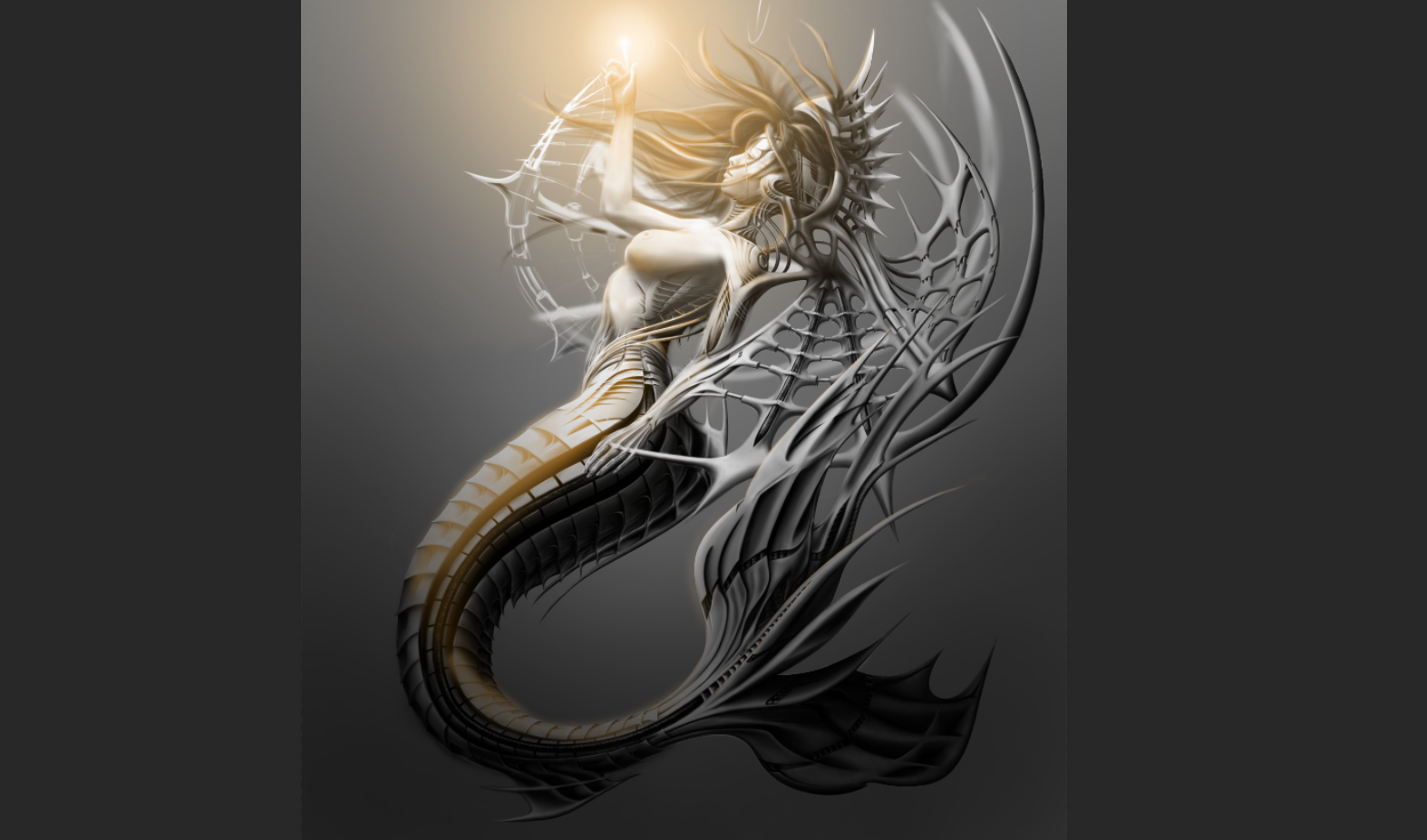
I would like to show you a bit of progress on this painting.
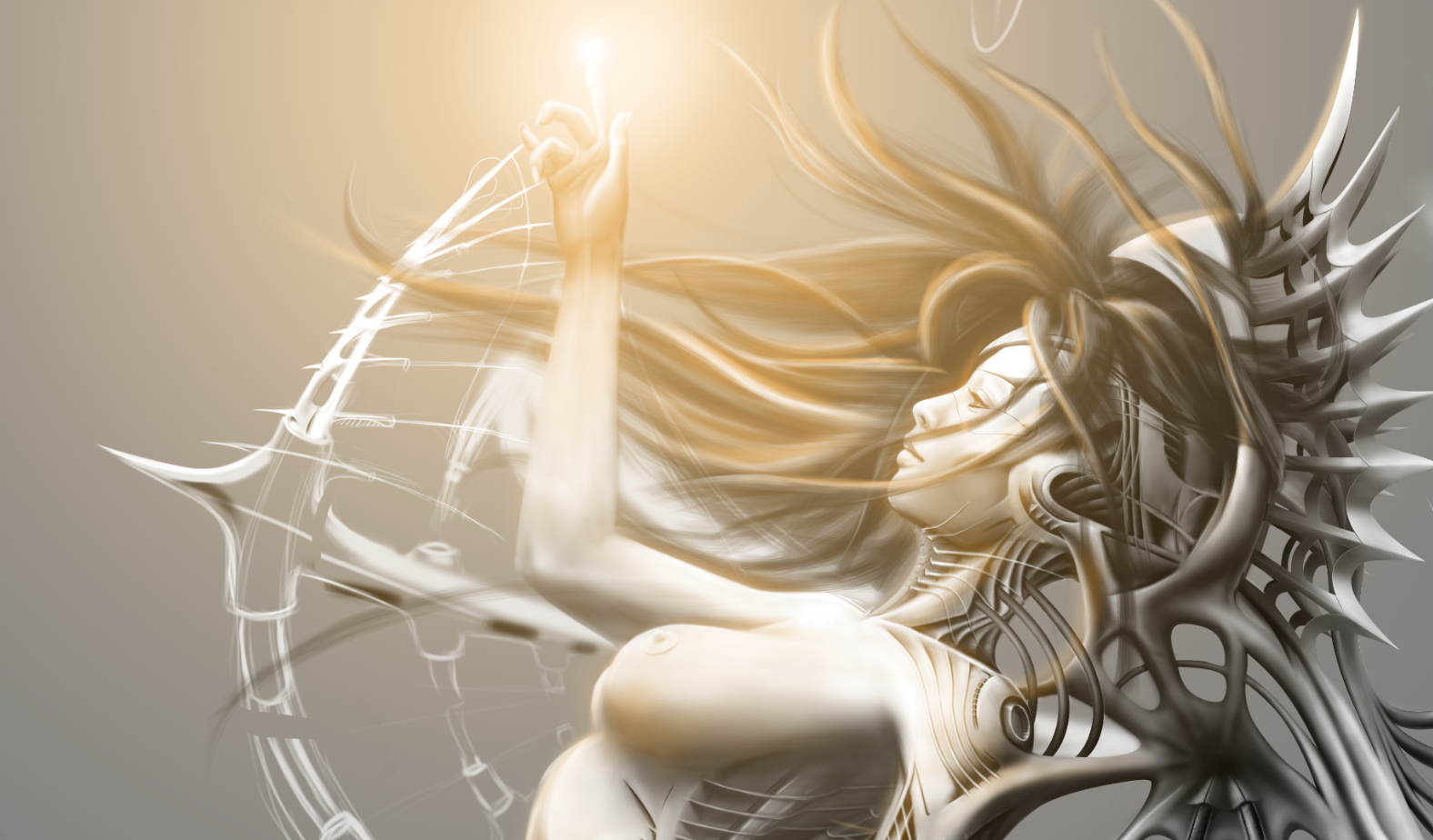
A couple of days ago I was working on it, as usual. And I was tweaking the wing that's closer to the viewer, making it look like that the segments can actually move around in a mechanical manner... If that makes sense :D
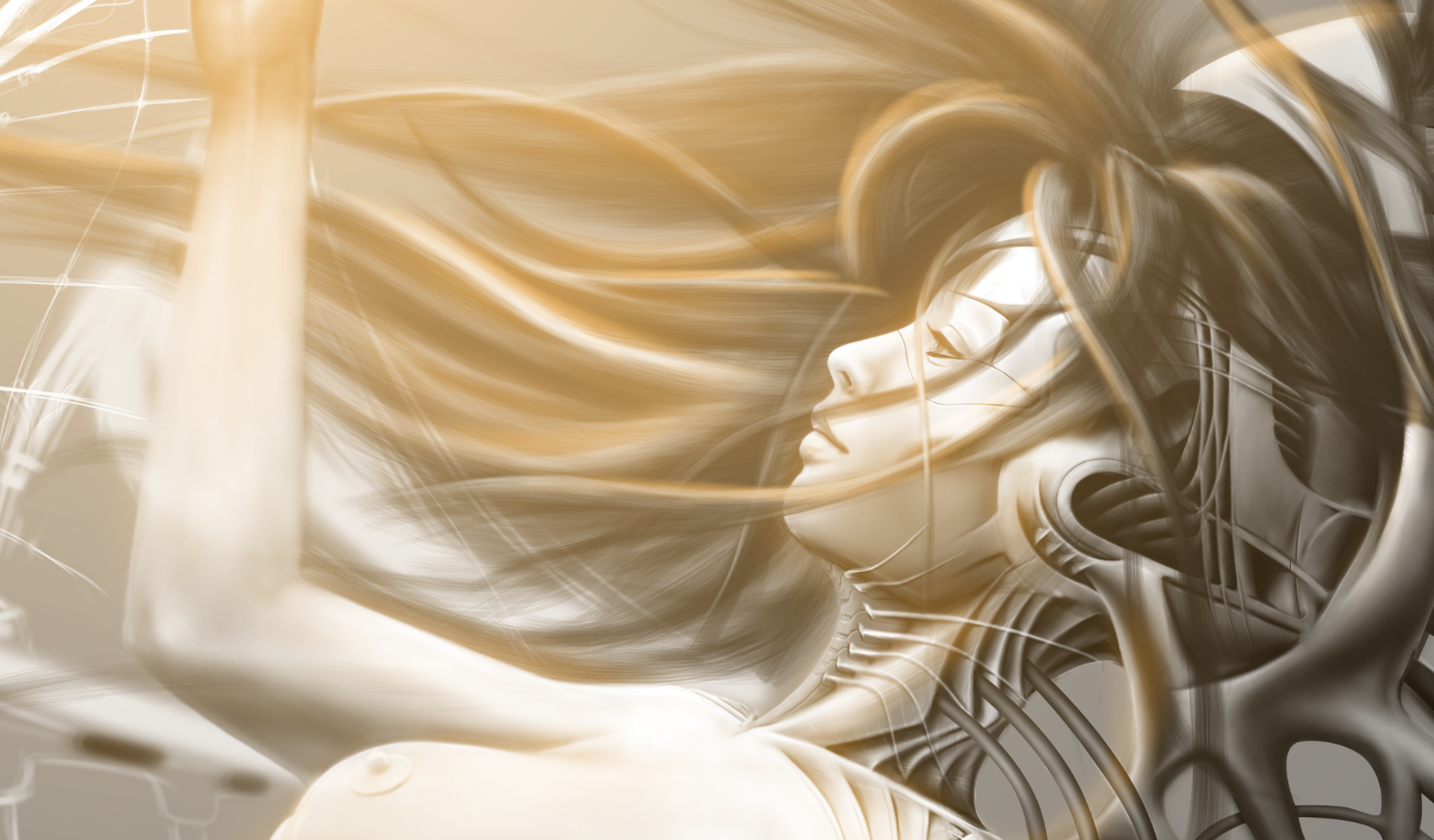
Then I started staring at the face for a while, flipped the canvas a couple of times. I started seeing how disproportionate and unnatural it looked like, I tried to fix it I spent around 15 minutes erasing, overpainting, repeating, but something was off, so I just went online, looked for a face that can do the trick as a reference, Then it started to come together. A fellow artist suggested not so long ago to make the lines of the face a bit softer. I didn't listen to him then, but when I reworked the face I understood what he actually meant by that.
A dude joined my stream on twitch two days ago and we exchanged for a bit, then he suggested that I should make the face brighter because it's turned straight towards the light.
I had a lot of darker values, especially around the eyes and the chin. I didn't take his advice into consideration at first, but later just applied really soft layer on top of it, and it started to pop out very much... Liked it a lot, so I just connected it to the back of the head.
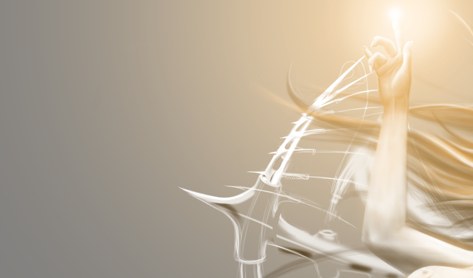
After that when the face looked decent enough, I wanted to switch up a bit, to work on something else, so the next thing in order was the wing that's connected to the organic hand. Most of the time I was trying to use the same design as the other one, tried to warp it, change the perspective, but it didn't quite work, It didn't fit. It looked out of place, especially because I wanted to make it look like that the light turns the mechanical being into a living one, someone mentioned Pinokio. For some reason, aichmophobia came to my mind, in other words, the fear of needles. So instead of pistons jammed in the forearm, I started drawing lines, It looked really fine, something like a harp... I've got really hyped up about it because it happened randomly... Mermaids and harps are not so far from one another, It was quite fitting in fact. The design language is similar, to the rest of the piece, yet somewhat different.
Maybe I should make it a bit larger, but I want to keep the finesse to it, maybe I'll add more needles/ strings to it, Later today I'll continue working on it.
Thank you all for supporting me, and my work!
Tools used: Wacom Intuos Pen small & Photoshop cc2018
Facebook; Artstation; Deviantart; Behance;Patreon; Instagram; Dlive; Twitter and Twitch
CLICK HERE
This post was shared in the Curation Collective Discord community for curators, and upvoted and resteemed by the @c-squared community account.
If you are a community leader and/or contest organizer, please join the Discord and let us know you if you would like to promote the posting of your community or contest.
@c-squared runs a community witness. Please consider using one of your witness votes on us here
Ooh it's looking good!
and looks like it's shaping up much better than mine XD
Thank you, dude!
What do you mean? Can I check your work out?
I meant your current wip is looking a lot better than my current wip (I'm also doing a mer, was supposed to be designing a cecaelia but ended up with one of my avatars being an exasperated octopus/eel/sea dragon/thing).
just keep working on it till you're happy with it :)))
looking really good man!