Bitshares — New website update (Part 8)
Hello Everyone!
Here is part 8 for the new Bitshares website. Thanks for your valued suggestions. Those of you who are good copywriting skills, please keep sending your thoughts and suggestions. We need help in this area.

Here are the latest changes and improvements:
- We have redone the menu system, it now covers the whole screen when you click on the hamburger icon.
- We have added a tab in the menu to show live BTS price, market cap, and 24hr volume.
- We have improved the look and wording of the home page header.
Here's what we will be working on in the next few days:
- we will continue to improve the boxes on the home page (wording, look, and feel.)
- We will keep improving the wording of the rest of the page according to your good suggestions. Please keep sending your thoughts.
- We are also working on a language drop down button.
Again, thanks for your support and your constructive criticism. Don't forget to follow me so that you can be notified when new changes are submitted.
Cheers!

It would be greatly appreciated. :-)
I think you might be getting overlooked due to the Bittrex fiasco... Website is looking fantastic and you are doing great work!
My suggestion is that this:
"First public blockchain with built-in stack of financial services for development of trading and banking DAPPS"
Should perhaps read as:
"The first blockchain with a built-in stack of financial services for development of trading and banking decentralized applications"
But as I read it the time is ripe to mention the DEX in some way...
"The world's largest decentralized exchange (DEX) with a built-in stack of financial services for development of decentralized trading and banking applications."
YMMV :D
agreed
very well said @johsmith sir
Thank you!
Banking....I remember there being some discussion about using the term 'bank'. If I remember right it is a regulatory problem in some countries. Canada is the one that comes to mind. Why not just say financial services? Bitshares is not a bank.
DAPPS is the buzzword. Non crypto savvy people see ETH and see DAPPS and this will help them link in their mind our DAPPS and ETH DAPPS so they have some idea of what is going on.
Website is looking very nice. Thanks for all your hard work mate. :)
always upvoting your comments brother :)
For my money I like it. Simple and elegant.
I like the summaries on one page - hopefully clickable with more info.
The email link doesn't work.
Well done 🙃
OK -I don't like it. It is too heavy in crypto speak and does not share the value to someone who does not understand this. I joined the excahnge last week and as someone new to crypto this doesn't mean much to me. We need to relate it to other things. For example: power Show a man with a small backyard generator and then an industrial power plant. Or show a man with a small pickup truck ("This is bitcoin") and then show a mac truck underneath. "This is Bitshares" (small print --- worlds largest blockchain tested up to xxx transactions a second. For Fee, Bit share trading is almost free. A trade costs .01213 BTS that is like Less than 1 US penny for 8 trades. (note figure out math; but these costs are so low pick a slightly higher number that has a ring to it.)(for fine print put a date) (compare this to 5 competing exchanges. (bittrex, poloiex ect) with their fees (which are about 0.25%). A color chart here would show how cheap we are. To explain the the decentralized exhanges.... You know what BitCoin did when in brought block chain technology to to Banks (show banks visa mastercard in the background in black and white old fashioned out of date way with Bitcoin symbol in front. We are bringing block chain technology to exchanges. No central point, you hold your own wallet, trades in the block chain. (show a graphic of I want to buy.... I want to sell... Trader A sells BTC to Trader B in blocks in a Chain with a hash ) In the background show the names of Decentralized exchanges our competitors with a obsolete stamped over the top) , The current site is Sharp, and well designed; but it only communicates in cryptospeak. Using Pictures and Visualizations we can sell the features and benefits and tell them what this does for them. A decentralized exchange the government cann't shut down that trades with tiny fees. It is a story we need to tell. And we need to tell so people who don't understand cypto get. Your grandmother has to understand! Anyway, I am sorry to be so negative, but I don't think you are effectively selling the features this revolutionary platform has!
I kind of agree - and yet I don't because I like it how it is.
Maybe include a 'for dummies' section
Yeah, it is a major change up. But marketing needs to be directed at the unreached customer not the reached customer. If people can't understand it; they can't join. One way to navigate between the to methods is with background picture or examples; there you are able to suggest things. That said I know it is a major changeup. Just want to stir some thoughts on how it could be better.
Yep. These are good suggestions 👍
we have a big marketing effort going on with the HERO with the aim to get regular people using bitshares to store and spend money without even knowing they are using the bitshares exchange.
I think this is a job for providers like Openledger. Remember, bitshares is a tool not a product, and anyone can build an interface for the exchange. Providers like Openledger need to market their front ends while the bitshares website attracts the techie sort of folk who is interested in developing stuff for the platform
maybe another thing to include in the blocks of stuff (a less known feature of BitShares) PREDICTION MARKETS! something like this
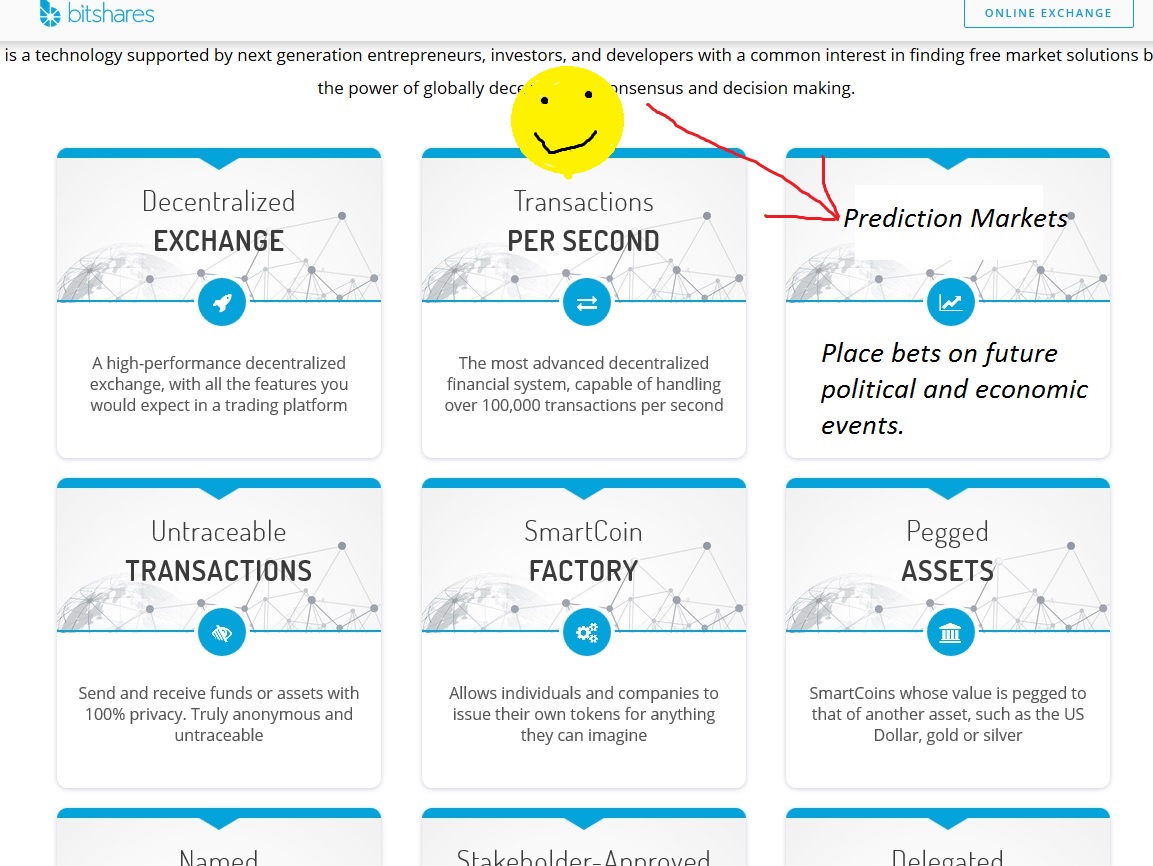
Awesome!
Thanks, instead of replacing a block like I did in the image you can probably add another row (3). Another block could be "Referral Program- Earn BTS by becoming a lifetime member and gaining referrals through your affiliate link".... another maybe "Recurring & Scheduled Payments - allow others to withdraw funds from your account. define a daily/weekly or monthly limit"
Please people I need some comments. Some constructive criticism! 😎
I directly get into it. I just want to help and share what i feel and what i think to create the best possible product!
**The first impression is okay but maybe its better to use a picture(take a look at ripple.com) or another animation (example: https://nem.io/) instead of a moving geometric forms which you can find on every 5th website in Cryptospace.
**The topics like technology, documentation or forum could be present as a tabbar on the top like here: https://nem.io/ or https://www.ibm.com/us-en/. Like these websites i really would like to see Bitshares website more unique and decent like a business website to make it interesting at first sight (maybe with some professional pictures.
**On the website itself: The logo is too small, it can be a bit larger to be more present. If i scroll down to "Infographic" which is too small writen, i cant click on it. A direct forward to the Infographic page would make the sentence - "Click on the image below to experience a visual walkthrough of the Bitshares platform"- needless..
When i click into Infographic page i notice that the word here is also to small. The galaxy background is not the right theme for Bitshares. I think the actual background with the Hexagons on Bitshares.org looks much better.
As i said before the Logo is also bit too small, it can be more present. The text or picture below is too large, it look like i zoomed in 4x. The footer textsize could be larger too, also the twitter,github, telegram buttons which are almost not there.
Thats what I noticed on tour. I wish i would have some coding skills to help you out but ya. Thank you for your effort, i appreciate your work very much!
I love the type and backspace effect. I think it would work better slightly quicker though.
Might be interesting to A/B test changing the "Download" button to "Wallet". Download is more accurate but many people show up thinking they need the wallet (not realizing it's a full DEX).
Good point. Thanks!
I don't like this section. There's too much text. I think as a first time user I'd be deterred wouldn't even bother reading.
Highlighting each section may be a better alternative like ripple does:
Or nem:
The only problem is that you've got 9 subsections to expand on. So maybe focus on the main selling points and then add a final section where you group together the remaining.
You are right. We will have to work on this section as first priority. It’s one of the most important sections of the whole site. Thanks!
BTS offers too many features! dur! xD (this is a comment on our audience, not you fine sir)
Nice cards on those website but can I add a UX suggestion? It was not immediately obvious that you could scroll the backside? So maybe like blur the last 2-3 lines?
I like the new look for Bitshares (I looked at your demo site www.is1.co/). Excellent work! Now, if we fix up the look of the online exchange that'll be a tremendous improvement!