How We Designed a Classroom Layout in 1 Minutes
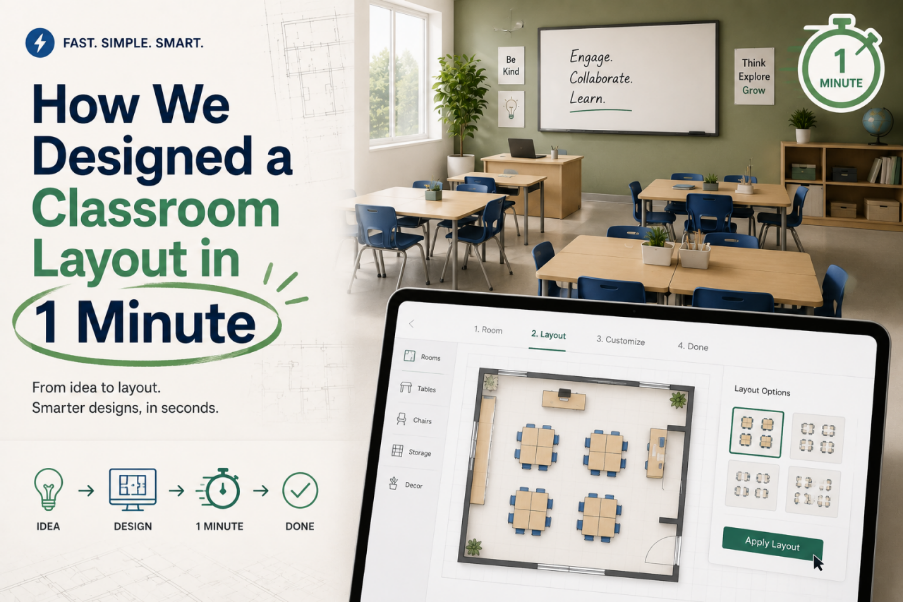
design classroom layout in 1 min
Most classroom layouts are not designed—they are inherited.
You walk into a room, see rows of desks, and assume that’s the “correct” structure simply because it already exists. Changing it usually involves long discussions, manual rearrangement, and a lot of uncertainty about whether the new setup is actually better.
We wanted to challenge that assumption.
So we tested something deliberately simple: could we design a usable classroom layout in under one minute using Floor Plan Maker?
Not a polished architectural plan. Just a functional, realistic classroom setup that could actually support teaching.
The result was faster—and more revealing—than expected.
The Problem With “Slow Design Thinking”
Traditional classroom planning tends to follow a predictable sequence:
- Discuss requirements
- Sketch rough ideas
- Manually adjust layout
- Debate alternatives
- Repeat
The issue is not that people lack ideas. The issue is that iteration is too slow to test those ideas properly.
By the time a second or third layout is considered, the conversation often resets or becomes subjective again.
We wanted to remove that delay entirely.
The 1-Minute Constraint Changes Everything
To make this test meaningful, we imposed a strict rule:
The classroom layout must be generated, adjusted, and finalized within 1 minute.
We used Floor Plan Maker as the core tool because it allows fast generation and immediate structural editing without rebuilding everything from scratch.
Instead of thinking in terms of “perfect design,” we focused on:
- speed of decision-making
- clarity of structure
- immediate usability
Step 1: Start With a Default Structure (10–15 Seconds)
The first action inside Floor Plan Maker was simple: generate a baseline classroom layout.The initial version gave us a standard structure:
- rows of desks
- teacher area at the front
- central walking aisle
But instead of refining it slowly, we immediately moved on to questioning its assumptions.
Step 2: Identify One Priority (15–30 Seconds)
At this stage, the key decision was not “how should it look,” but:
What is the primary function of this classroom?
We chose one priority for this test:
- balanced interaction between teacher and students
Instead of optimizing for density or symmetry, we started optimizing for visibility and movement.
Step 3: Structural Adjustment (30–45 Seconds)
With the priority defined, we made three fast changes:
- shifted front rows slightly into a curved alignment
- opened side pathways for easier movement
- reduced strict row uniformity
The goal was not precision—it was behavioral clarity.
What changed immediately was how the space “felt”:
- less rigid
- more open
- easier to visually scan from the teacher’s perspective
Step 4: Final Validation (45–60 Seconds)
The last step was not editing—it was checking logic.We asked three questions:
- Can the teacher see all students clearly?
- Can students move without obstruction?
- Does the layout support both instruction and interaction?
But within Floor Plan Maker, the layout had already reached a functional state within the time constraint.
There was no need for perfection—only usability.
What We Learned From Doing It This Fast
The most interesting result was not the final layout itself, but how quickly decisions stabilized.
When time was limited:
- fewer debates occurred
- assumptions were tested faster
- unnecessary options were eliminated early
Instead of exploring endless variations, we naturally converged toward a workable structure.
The Hidden Value of Speed in Floor Planning
Traditionally, speed is seen as a trade-off against quality.
But in this experiment, speed improved decision quality.
Because with Floor Plan Maker, faster iteration meant:
- less attachment to early ideas
- quicker rejection of weak layouts
- more focus on structural behavior rather than detail
We started trying to validate whether it worked at all.
Why This Works Better Than Traditional Planning
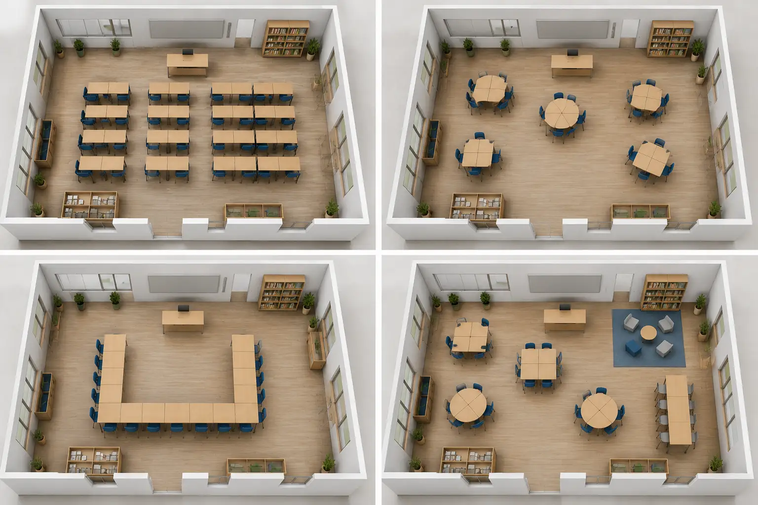
traditional plan tool vs ai floor plan maker
In manual design workflows, time creates friction:
- more time → more opinions → more complexity
- less time → clearer decisions → faster convergence
It becomes:
generate → adjust → validate → move on
That shift makes early-stage design significantly more practical.
Final Thought
Designing a classroom layout in one minute sounds unrealistic until you remove the expectation of perfection.
What we found is simple:
You don’t need more time to make better layouts.
You need faster feedback loops.
And tools like Floor Plan Maker don’t just speed up design—they change what you focus on while designing.
Instead of spending time building a layout, you spend time understanding whether it actually works.