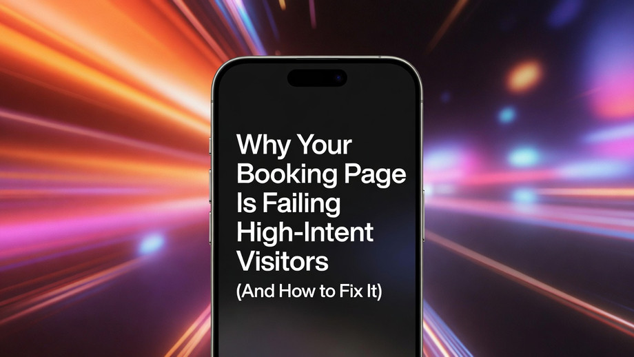
Why Your Booking Page Is Failing High-Intent Visitors (And How to Fix It)
If you're running a service business, consultancy, or any appointment-driven funnel, here's an uncomfortable truth: most conversion losses don't happen because of bad traffic — they happen on the page itself.
By the time someone clicks to book, they're already close to a "yes." Your booking page just needs to not get in the way. Yet most pages do exactly that.
The Three Questions Every Visitor Asks
Before committing to a booking, every visitor silently runs through three questions:
Is this relevant to me? — They need that answer in seconds, not paragraphs.
Can I trust this? — Is the outcome credible? Is the process professional?
Is this worth the effort? — If booking feels complicated, they postpone or leave.
High-performing booking pages are structured around these three questions — in that exact order. Most underperforming pages ignore this sequence entirely.
The Most Damaging Mistakes (And Their Fixes)
❌ A generic hero section "Book a session" tells visitors nothing. Rewrite your headline around a specific outcome your audience actually wants.
❌ Trust signals placed too late If credibility only appears after the form, hesitation wins. Move concise proof — a testimonial, a credential, a relevant result — above the booking controls.
❌ Forms that ask for too much Every unnecessary field is a reason to quit. Capture the minimum needed to confirm the booking. Collect extras after commitment is established.
❌ Unclear post-booking experience Visitors who don't know what happens after they submit are far more likely to cancel or no-show. A single short block — confirmation timing, what to prepare, reminder schedule — can meaningfully improve show-up rates.
What the Best Booking Pages Have in Common
Research into top-performing landing pages shows conversion rates can exceed 10% when three things align: specific value messaging, clear calls to action, and minimal friction. That's not a design secret — it's a structural discipline.
The pages that consistently convert well tend to share the same architecture:
Outcome-focused headline (not format-focused)
Session scope visible before deep scrolling
Trust layer placed near the first action point
Simplified calendar and form interface
Objection handling close to booking controls
Clear post-booking expectations
None of this requires a full redesign. Often, one rewritten headline, one repositioned testimonial, and two removed form fields are enough to see a measurable shift.
One Practical Starting Point
Before you touch layout or colors, do this audit:
Open your booking page on your phone. Can you see the CTA without scrolling? Can you tap the calendar with one thumb? Do you know what happens after you hit submit?
If any answer is no — that's where your conversions are going.
For a complete breakdown including a 9-block page architecture, copywriting framework, mobile checklist, and a full 30-day optimization plan, this guide covers everything in depth:
👉 Booking Landing Page Examples in 2026 — Unicorn Platform
Whether you're building from scratch or optimizing an existing page, the principle stays the same: reduce friction at the exact moment intent is highest, and conversions follow.