Brutal TearDowns - My Downstairs Is Wet! We Analyse the Rebrand for a 40 Year Old Foundation Repair Business
Hey Steemians!
As promised, I'm going to re-focus the posts I make on Steemit to be strictly about business, marketing and entrepreneurship, with the goal of bringing more solid business content to the platform.
To get started, I thought I'd share a content piece I wrote for one of my side projects, BrutalTeardowns.com, where I give people brutally honest feedback on their website and social media strategy, along with some actionable advice to help them build and grow their businesses.
Each week, I send out new teardowns to my subscribers, so that they can learn from the advice I give to others, and this week we're looking at WetBasements.com, a site that's been built as part of a rebrand for a foundation company that's been in business for over 40 years.
The Request
Greetings: Long time lurker, thanks for taking the time to read my post!
I'm in the process of relaunching my brand (family run business specializing in underpinning, concrete waterproofing, structural restoration) here in Canada.
I just launched my new website (with new branding, fresh logo, custom timelapse videos of my projects combined with thorough/thoughtful content writeups on our specialties) etc.
Take a peek, let me know how it comes across! Any advice or comments would be helpful!
(Naturally, the best version of the new website is the desktop version)
Thanks in advance!
Gavin MacRae - GJ MacRae Foundation Repair
Toronto, Canada http://www.wetbasements.com/
First Impressions
My parents live outside of Ottawa and I totally get the "wet basements" thing.
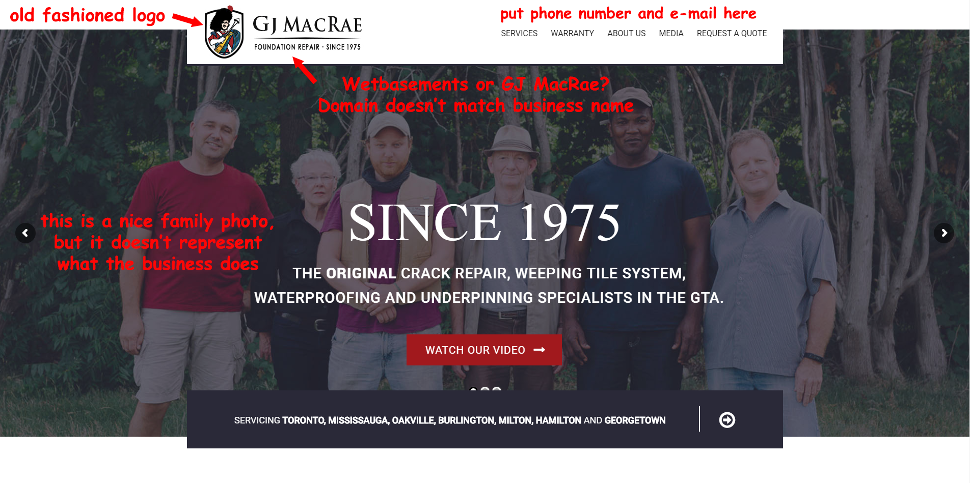
Company name doesn't match URL
Family photo doesn't really sell me
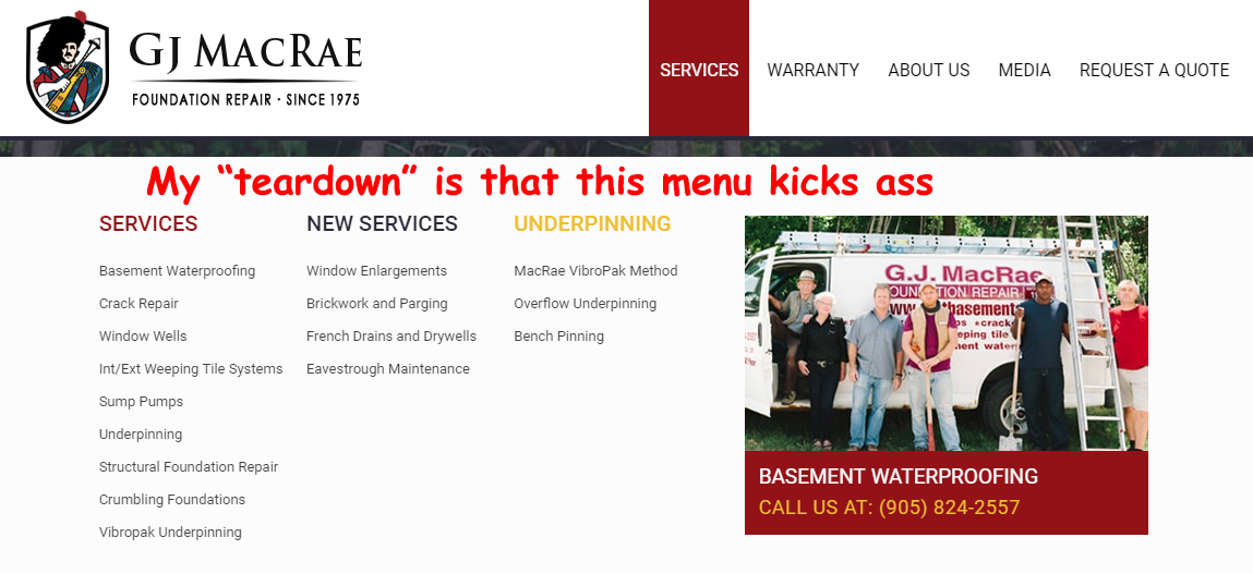
Animation on the menu is a bit over the top
Logo is a bit old fashioned. Consider reducing the detail/colours, making it more stylised and modern. I'd personally throw $50 at fiverr gigs just for ideas and inspirations, then find a more expensive designer to implement a concept you decide on.
Overall site speed is a bit slow. Consider adding a WP Caching plugin and throwing it through Cloudflare's free plan for CDN/caching. Also look at GTMetrix and Pingdom for speed ideas.
Should have your phone number and e-mail at the top of every page
Bit overwhelmed with the whole brand history - how long you've been in business. I mean, it's great, be proud of it, but I feel the website focus should be more on the work you do.
Landing Page
Hero
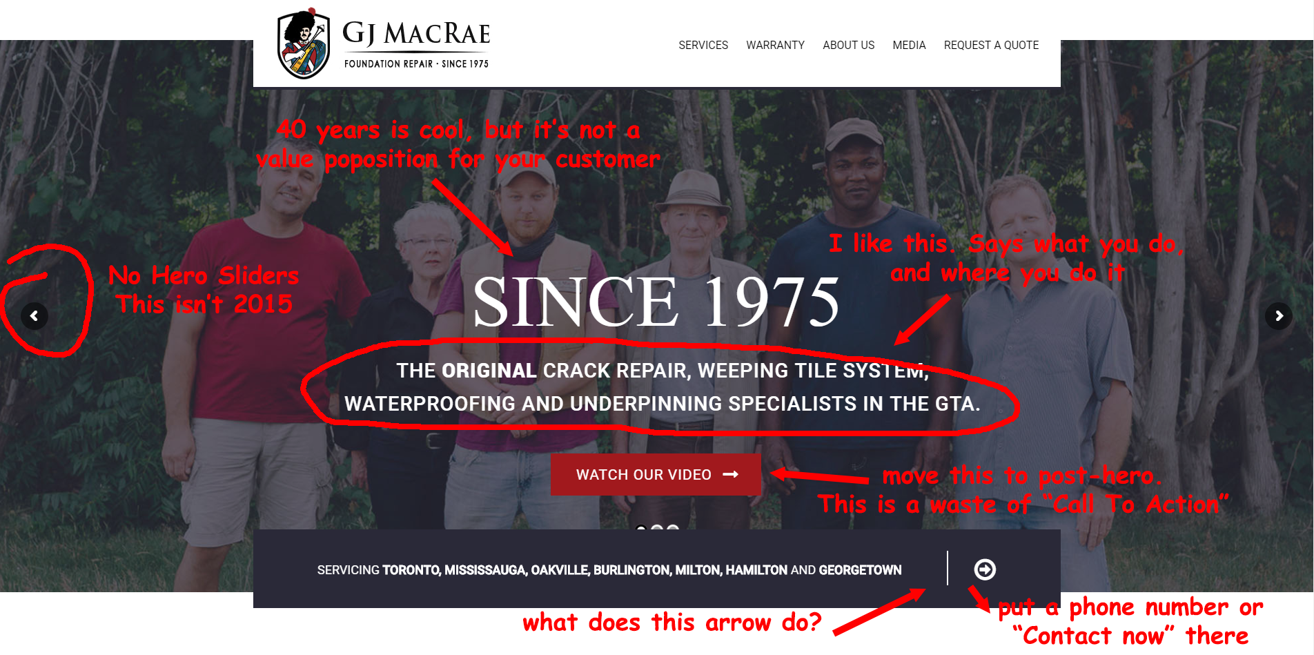
- "Since 1975" isn't really a benefit to the customer so probably doesn't deserve space in your main header. Your main header should really be about the core value proposition you offer to your customer (presumably something about wet basements)
The sub-header is pretty decent. Breaks how you add value to your customer, and notes your service area (GTA won't make much sense to people outside the Greater Toronto Area, but I don't think that's a big issue)
The family photo doesn't really sell me. You look like a nice family, and that's a great family photo, but you don't look like bad-ass foundation repairers. I'd rather see a photo of the 4 young lads in full construction gear, striking a bad-ass pose. Or better yet, working on a foundation
Watch our Video -> Save that for a post-hero section. The hero is really about having a call to action for "Get a free quote", or something to that effect
I didn't even notice until now that there is a slider/carousel there. Ditch it... If they're self-animated, they're annoying; if they're not, they're unnoticable.
Love that service area tagline at the bottom, but the arrow doesn't tell me what I'm clicking for. I would probably just put your 1800 number on the end there.
Sub-Hero section
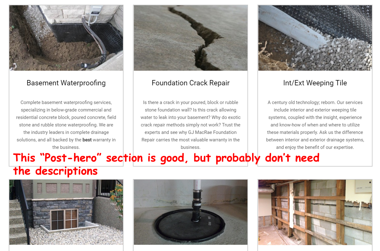
- This is great! You go straight into the services you provide - it's highly visual, with clear labels of what you do.
I'm not sure you need the paragraph of text after each service. I think they're self-explanatory, and if people want to know more they can click through.
Kudos on making the entire box clickable for the services... might be worth having a "read more" button (or equivalent) in place of the paragraph of text, to underscore people can click to see more
Alternatively, consider the "... read more" approach, if you decide to keep the text
Rest of Landing Page
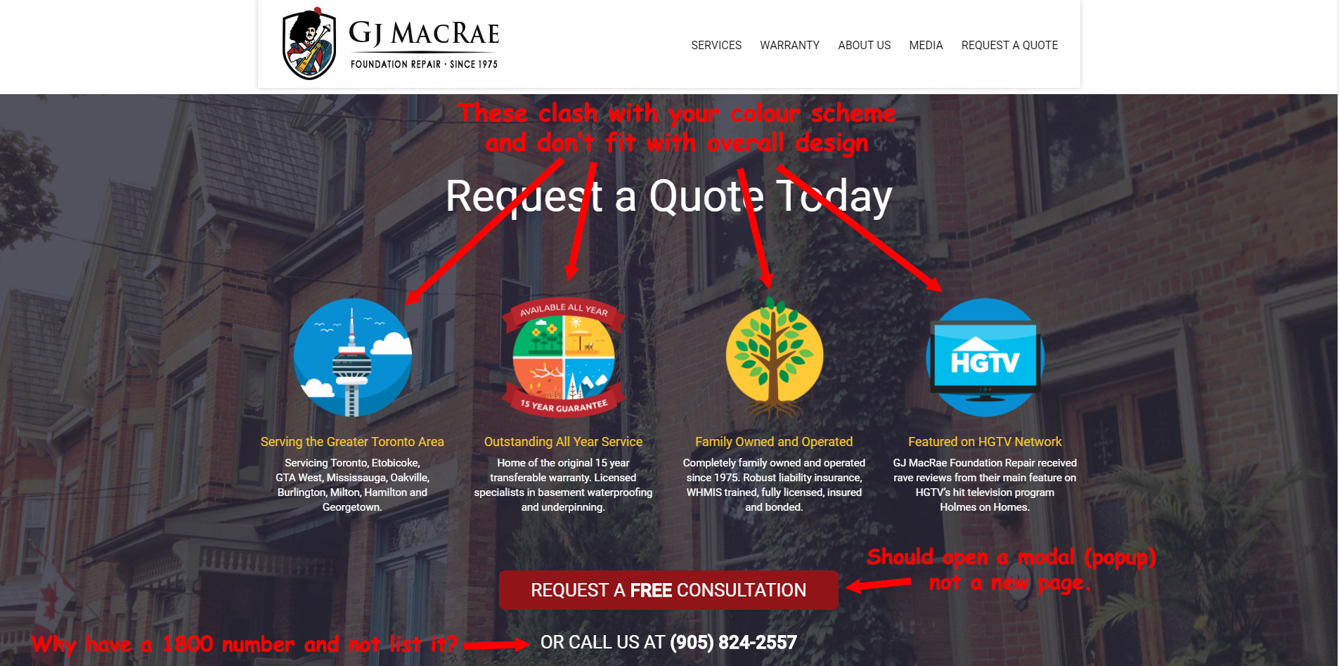
Request a Quote Today:
- I don't think the pictures you've used here really fit with the rest of your design. Way too colourful. I'd consider aligning them to 1-2 colours in your colour palette (red green black gold)
Why not have the toll free number in this section?
Consider having the "request a free quote" button just load a modal/popup with the quote request form... that way they don't have to leave the current page (or wait for anything to load)
Sad Broken Link
- I'm not sure what the next section is meant to be, but I get a sad broken link icon.
- This would be a good place to put your video (I'd do it half screen with something on the right about the history/longevity of your company, and the great job you do)
Footer:
That is a bad-ass footer. Has everything you need, and more
Only thing I'd suggest is maybe making it a different shade (black with white writing?), or having some other divider so it's very clear
Rest of Site
Menu
You could probably safely move "warranty" to the bottom of the page, unless this is specifically a pain point for customers in your industry (eg, people are sick of paying for someone like you to waterproof their basement and then it doesn't work)
Likewise with the blog link, I think this could be moved to the bottom because your blog will be used as a way to bring people to your site (either through SEO or through social media links/ads).. once they're on your site, you want them focused on buying your services
For "Media", consider renaming this "Tutorials" (see youtube comments below)
That said, don't be afraid to add these as sections on your landing page
Services Pages
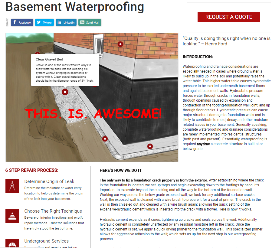
- These are amazingly well done. I don't think I've ever seen a local trade company with a site like this
I'd swap the quote and the "Introduction:" header for just a short paragraph that sums up the service. From an SEO perspective, this paragraph is the opportunity to hit your keywords.
Not much else to say here
About Us
Love the family and business history here. I feel like this is where it belongs, rather than dominating the landing page.
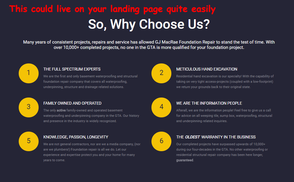
That "Why Choose us?" bit is great, could easily live on the landing page
Blog
The fact that you're using it, and creating good content is fantastic
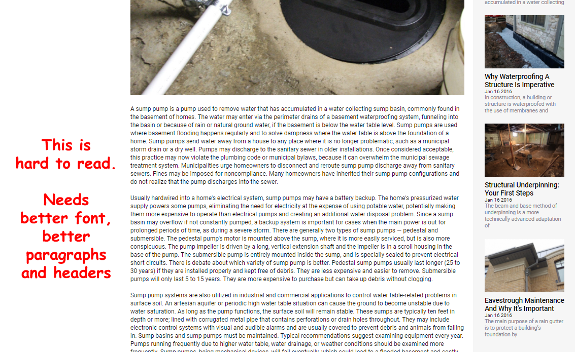
Consider adding better paragraphing to your posts, using h2 and h3 tags throughout your post. Eg this one just looks like a wall of text
Consider writing more "Toronto-centric" posts.. things relevant to people living in the GTA, but also framing the posts in context of the GTA. "How Torontonians benefit from water-proofing their basement" kinda thing.
Use longer text in the page URL. Eg "why-waterproof-4" should be "why-to-waterproofing-your-structure-is-imperative".
Contact Page
Ditch the captcha on the contact page. You're already listing Noreen's e-mail address, so you're going to get spam regardless.
Simplify the "Request a Quote" form. Basically you want name/e-mail/phone number, and then you can get in contact with them to setup a time.
You could consider changing noreen@wetbasements.com to hello@ or sales@ or something, but I think noreen@ works, because I know I'm getting a real person.
Social Media
- It's rare to see companies with 3 social media links actually using all 3 social media platforms. Kudos.
Doing a good job here, too!
Push some more customers to leave reviews, if you can. You've got over 40 years of customers and 4 reviews :D
Probably less "HEY CALL US TO FIX YOUR BASEMENT" posts... a few more blog tips, show photos of finished basements, or basements that customers have built after you have fixed them. Eg, "Check out the awesome home bar Jimmy McDougal put into his Mississauga home after we fixed his leaky basement"
Before and after photos would be cool. Photos of you doing the work, etc.
Promote more of your blog content here, since you seem to be uploading this to your site quite regularly (kudos)
Make sure you've got a facebook pixel setup and have it installed on the site.. you can then target Facebook ads at people who've visited your site. Likewise for Google tracking pixel.
Posts here are good, same thing about less "call to action" posts.
When I click "Tweets and Replies" here, I don't see you talking to anybody else on Twitter. Spend 30 minutes a day tweeting to anyone who uses hashtags relevant to your area (eg, anyone posting from Toronto or on the #toronto hashtag).. do it while you're eating lunch, between sets at the gym, while sitting on the couch watching TV at the end of a long day, etc.
Youtube
You're doing a good job here, the one thing I'd suggest is to look at doing some longer videos. Videos like this one about hanging a whiteboard are a good example, but don't be afraid to do super longer ones.
Because of your local focus, consider spending the effort on youtube how-tos that specifically address issues people in Ontario go through.
I think his name is John... he's great at presenting. Really good with the camera.
The Feedback
After replying to Gavin's request for a teardown, we never heard back from him, but within a few days, we began to see some of our recommended changes begin to be implemented on the site. For us at Brutal Teardowns, that's more important than receiving a thank you - so many people thank us for our reviews, tell us how much they agree with everything we said, and then a few months later haven't made any of the changes. So kudos to you Mr MacRae!
Final Thoughts
There's some really impressive effort that's gone into building this site. I think most of my recommendations are just that I'd do things differently to how the GJ MacRae team did them, not that they did them the wrong way... and given that they've started to implement some of the changes, we're glad that they took some value away from our teardown report.
If you'd like to see more teardowns like this, follow me on Steemit, or join the mailing list at BrutalTeardowns.com
Also, whether you can spare an upvote or not, drop a comment below and tell me what you think of my critique!



Very original business for sure! Much needed. Would be cool to see the stats before a tear down (visitors CTR, time on site, money earned, etc) and then after a tear down with changes made. That would sell me big time!
Yeah there are a couple I've done reviews for that would probably know that, and be able to share that.
Part of the issue is they all love the teardown and agree with everything you say, then don't actually implement the advice. One of the ones I did, they still have a broken link to their Facebook on their landing page!
Maybe we need to do the entire process for one of my sites :D
Yeah but if I fuck up your monetisation in any way you'll hire an assassin to come after me.
On the flipside, assassin hunting me down could make for a good DTube mini-series.
hahaha
Really like what you have done here with this post and the way that you structured it. As a brick-n-mortar service business myself I was really intrigued by the depth you went to. Hope you do more of these. Very Nice !!!
Cheers Mike!
I've got a few more on the BrutalTeardowns site and have a bunch more I'm yet to publish :D
I will absolutely check them out.
Respect for bringing in more business context to the platform!
Also a nice analysis of the site, with some tips that I can take with me ;)
Cheers, glad you enjoyed it!
Will check out Brutalteardowns 👍 Any plans to start using it's Instagram account?
Good catch. I regularly tell people "use it or take it off the page"
But yes, there is a plan :D
Talk about not eating your own dog food 😋
Too busy steeming haha
wow i appreciate the fact that you take your time to give opinions on other peoples websites. This is like a selfless service. i am sure people reading this post now will find it very useful.
Yeah, I guess I've always been big on "giving value", which I think a lot of people miss the point of these days.
Taking an article you wrote for your blog and copy/pasting it to reddit, isn't giving value, it's promoting yourself. Hiding a free ebook behind an e-mail capture is not giving value, it's selling something for an e-mail address.
Granted, this is a copy/paste from something I wrote the other day, but the original post was just a comment to someone else's post asking for help... and it's likely I'll be doing the same here on Steemit if I see someone posting a request for feedback.
And it's not completely selfless, either... I know that when I posted that a bunch of people on Reddit saw it, and checked out the site. If even one of those becomes a customer, or tells their friends about the site, it's easily worth my time
I wish you dropped this message earlier. I submitted this post for curation and it was rejected. I guess it was because it was copy and paste. Thats bad for me
Possibly, most of my content posted here will be original, but for the Brutal Teardowns I post here, it's a three step process:
You won't know what this has costed me. Please next time indicate
Sorry! Thought this bit at the top made it clear:
SUPERB POST. KEEP IT UP!
Thanks @aybee! How’s your entrepreneuring going this week?
FINE. STILL WORKING ON MY LATEST POST. BUT MY INTRODUCTORY POST IS COMING UP NEXT. MY CIRCLE NEEDS TO KNOW MY BACKGROUND. HAVE A NICE DAY.
Wow! Im looking over my own website and thinking about your words of advice. Hope ypu keep posting stories like this. Fantastic perspective on business websites.
Cheers! It's funny how often I saw people posting on reddit, asking for "brutally honest feedback". There are definitely some things that we can't see for ourselves, when we're looking at our baby.
Even the BrutalTeardowns.com site has had feedback from a bunch of different people (everyone wants to give their two cents when you run a site called that!), which has helped a great deal in refining it
Pat Flynn of Smart Passive Income has a great story about the evolution of his website and how many iterations it took, as well as the feedback he received (and the financial impact the changes made).
Glad to hear you've made a business out of these critiques!
You got a 0.53% upvote from @postpromoter courtesy of @rossdcurrie! Want to promote your posts too? Check out the Steem Bot Tracker website for more info. If you would like to support development of @postpromoter and the bot tracker please vote for @yabapmatt for witness!