New stickers
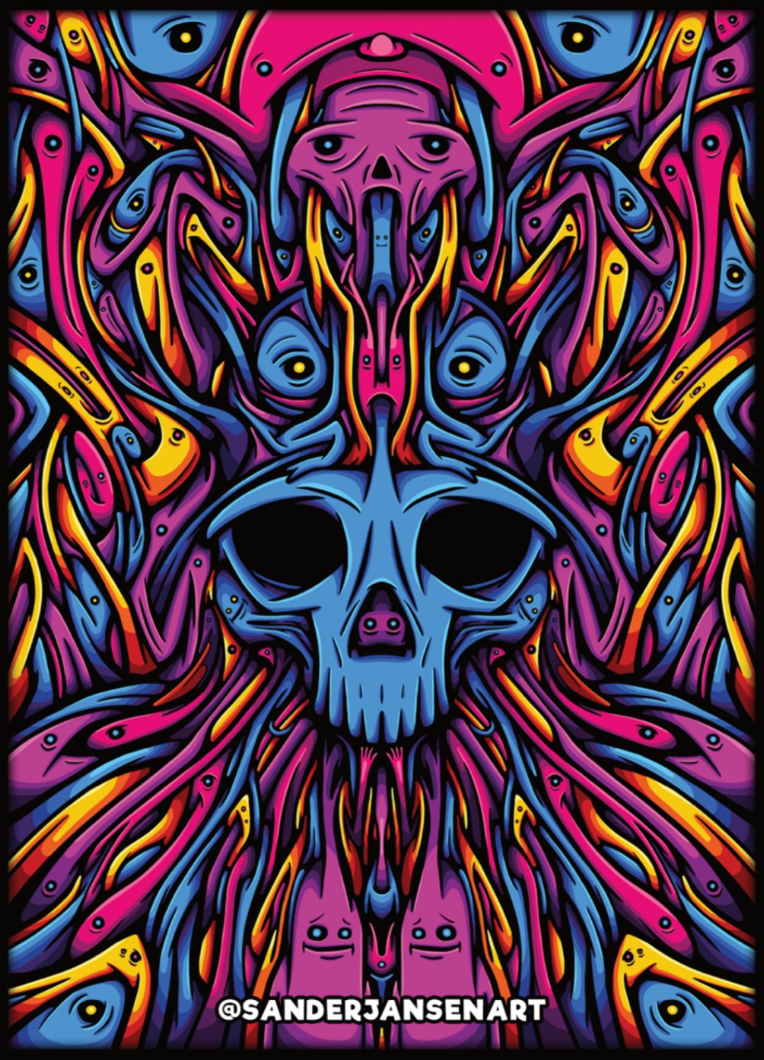
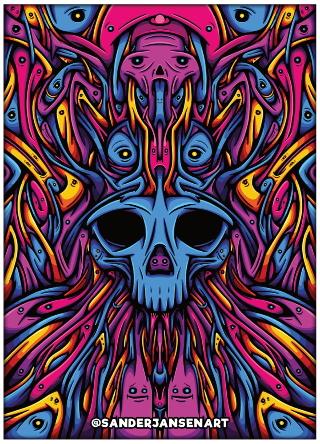
I'm working on new stickers. Well I had them ready but forgot that I have to work with a cutting margin so I decided to add a border so the image stays uncut and the @sanderjansenart could stay in place. To give it an extra dimension I added a small inner shadow. It will be small a6 stickers.
Before I start making them I was wondering what you think? Which one do you like most?
Black border
White border
Thanks for your opinion :D
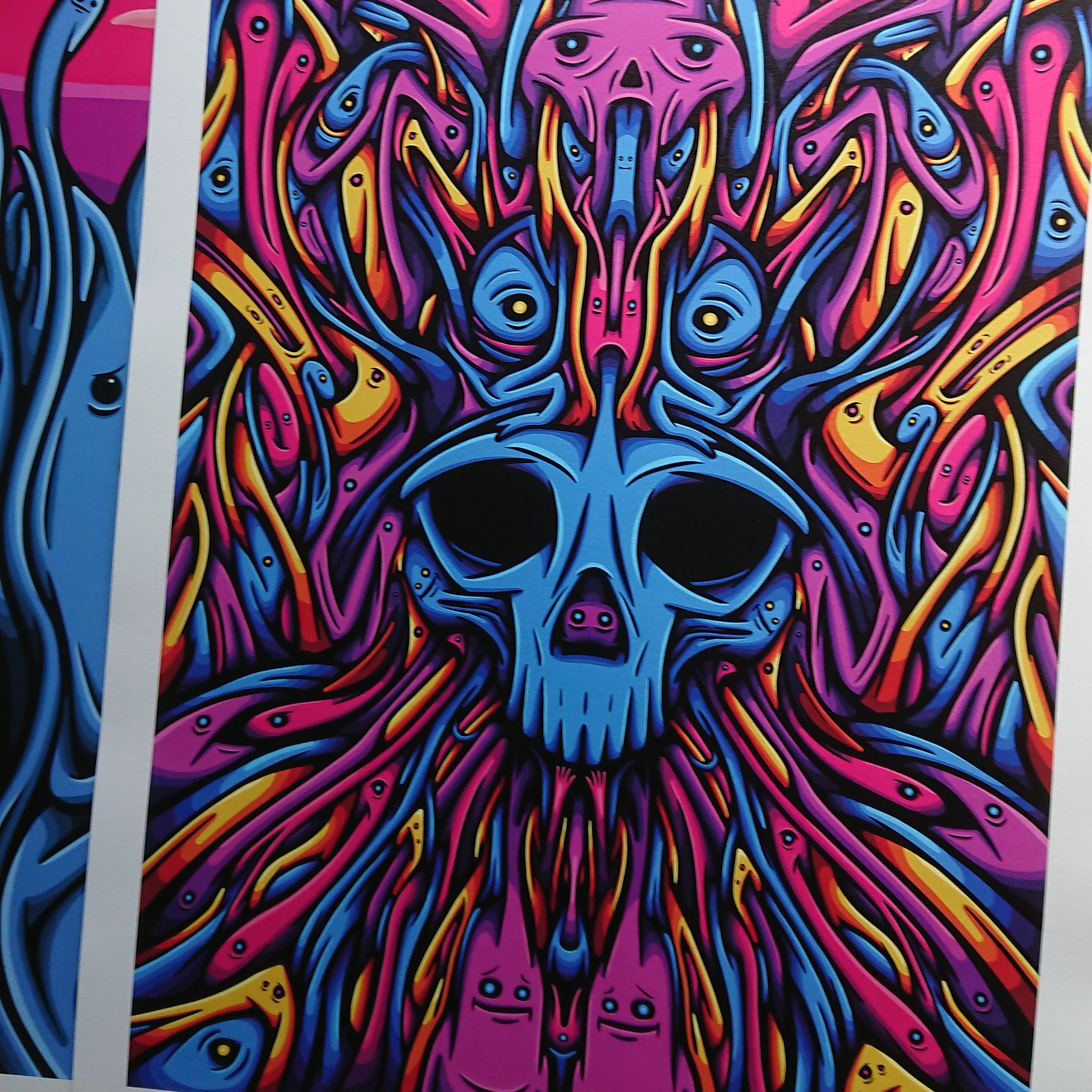
Oh and I forgot to mention the art print will come soon


Hello!
This post has been manually curated, resteemed
and gifted with some virtually delicious cake
from the @helpiecake curation team!
Much love to you from all of us at @helpie!
Keep up the great work!
Manually curated by @georgeboya.
@helpie is a Community Witness.
This post was shared in the Curation Collective Discord community for curators, and upvoted and resteemed by the @c-squared community account after manual review.
@c-squared runs a community witness. Please consider using one of your witness votes on us here