Bitcoin Technical Analysis - Major Indicators
It's important to do a TA based macro-review of the Bitcoin charts periodically
You need a holistic view of the market in order to prevent yourself from being surprised by major market movements, as well as to enable yourself to make realistic future predictions.
I'm here to help with that.
This is a short post about the major things that you should be look out for when studying BTC TA.
Bitcoin Technical Analysis - Major Indicators
I'll take you through this line by line. First: an overview:
Made by @bitbrain with TradingView
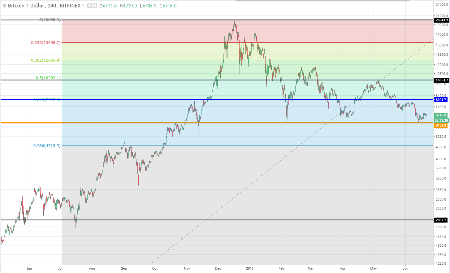
That chart shows a one year long period of BTC prices. I have placed the major TA lines that we need on the chart using a combination of baseline identification and Fibonacci levels as a guide.
Made by @bitbrain with TradingView
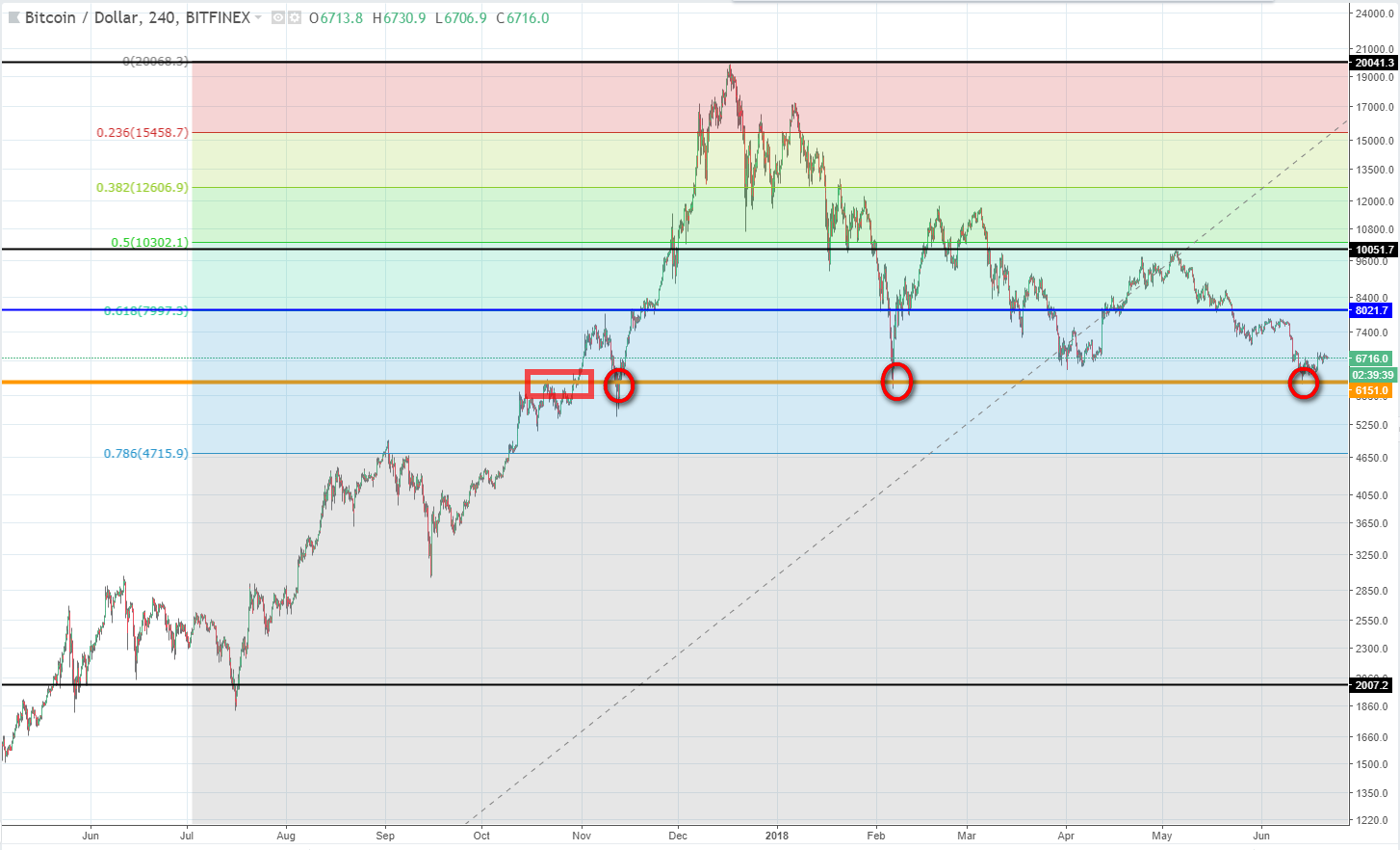
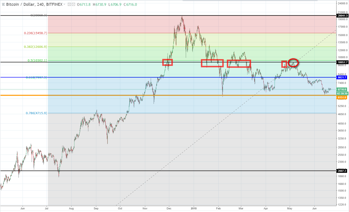
This is the most important line. It lies just above $6000 and represents the base from which to measure all recent price movements. It is also clearly the base of the major tapering triangle pattern that BTC has been forming since reaching its ATH in December 2017. If you look further back you can see (in the red rectangle) that this baseline started to be established by the price consolidation period in late October 2017. Since then it has formed the base, i.e. the major support level, for all subsequent price dips (as indicated in the circles). It is a strong price level below which BTC should not drop and from which subsequent price movements can be measured.
Made by @bitbrain with TradingView
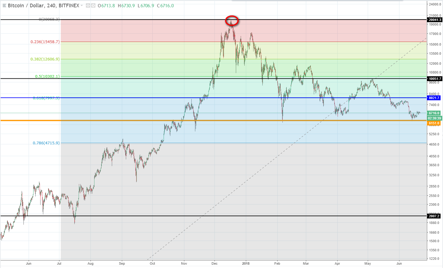
The ATH (All Time High) line is the upper reference point for our Fibonacci level calculations. It's a price resistance level and lies at $20 000. In future climbs it should provide resistance again. It is also the top point of the tapering triangle pattern that BTC is currently forming.
Made by @bitbrain with TradingView
The MTL (Main Transition Line) is the line around which most price transisitons occur. It is the dominant mid-range support and resistance level between the Baseline and the ATH line. Most price movement changes occur around this line. BTC MTL is at $10 000.
Made by @bitbrain with TradingView
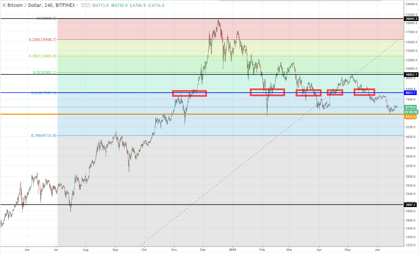
The Mean Price Level (sometimes referred to as the "Average Price Level") is the average price, within the current market movement (in this case - the tapering BTC price triangle). It's not necessarily the midpoint (in this case it is below the midpoint at $8000), but rather the level where the price most often settles within the prevailing pattern. As can be seen in the chart above, BTC has settled at this level for significant periods of time on various occasions. The important thing about the Mean Price Level is that the BTC price is more likely to settle at this level than at any other level.
Made by @bitbrain with TradingView
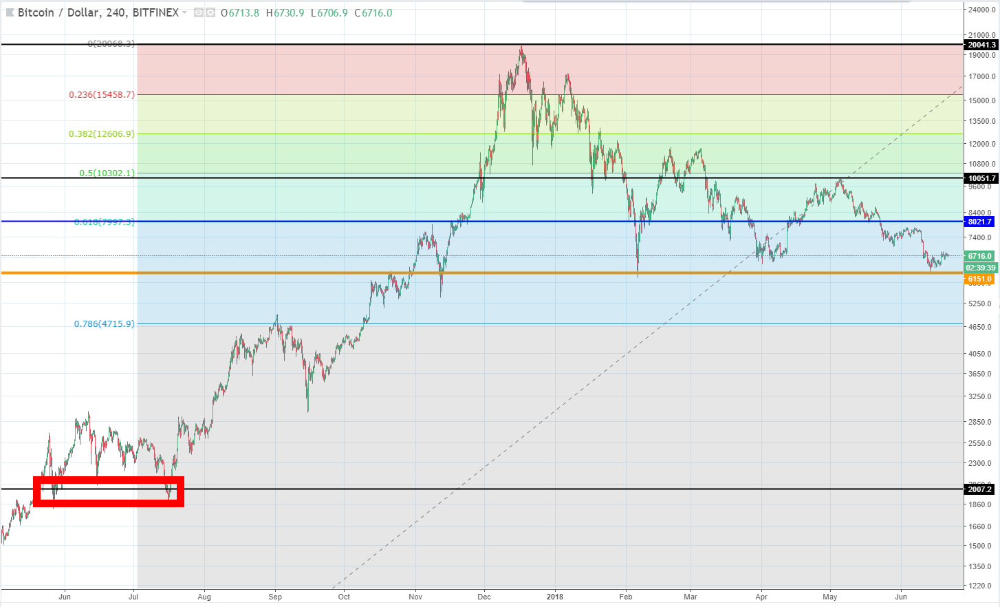
To be perfectly honest, I don't know if this line has a name or what that name might be. The line is important though. It's the level of the double-bottom that preceded the major BTC climb. At $2000, it's not important to us now, BTC should not drop that low again, but back when it formed, it indicated a level above which BTC must almost certainly rise and remain above. BTC certainly did rise and remain above that line.
Summary
That is an overview of the major BTC chart lines. Keep them in mind when doing your TA and when looking at the TA of other crypto experts. They won't be especially useful in the short-term, but they will certainly give you an indication of whether you are on the right track in the long-term.

I'm now going to count slowly backwards from "3". When I get to "0", I'm going to clap my hands and you'll wake up:
3
2
1
👏
It's fake. All of it.
Every bit of TA in this post so far is absolutely fake.
Remember back in the introduction when I said "This is a short post about the major things that you should be look out for when studying BTC TA"? Well that part wasn't a lie. This IS a post about the major things that you should look out for when studying BTC TA. Those major things are bad "experts" and their fake TA!"
The entire purpose of this post is to show you how easy it is to do bad TA that looks good and genuine on the surface. It's also going to serve as the introduction to tomorrow's post on crypto "experts" (at least that's what I plan to write about tomorrow.) Sometimes bad TA is intentional, but more often it is just the result of TA being done by someone who is either inexperienced, overconfident, reading the market wrong, inept, or some combination of those factors.
Don't believe me?
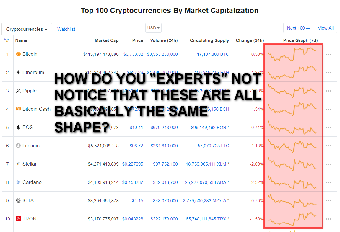
Without jumping the gun on tomorrow's post, let me show you what I'm talking about. How many posts have you seen recently that speak of the "breakout" of a coin? "STEEM breaking out!!!", "EOS is breaking out!" etc, you must have seen them because I see them all the time. Some are real, breakouts DO happen, but most of the time they are rubbish. There can't possibly be so many individual breakouts! Almost all the cryptos are strongly linked in price, particularly to BTC. (Read my recent post about how altcoins act as "BTC Superchargers." ) Yet this doesn't stop hundreds of people predicting breakouts left , right and centre. So one will be talking about a STEEM breakout at the same time as another is talking about a Ripple breakout, while a third is frantically drawing charts of the Ethereum breakout. Don't these "experts" know it's all linked? Either none of them are really breaking out, or they all are together. I mean really:
Modified by @bitbrain from https://coinmarketcap.com
See how many "breakout" posts you can find from just this month alone. See how many have actually broken out. See if their charts look any different to any other major altcoin chart. I think I already know those answers.
Let me explain my fake TA
Firstly: I didn't do it to try to trick people and to make them feel stupid. I did design it to catch people out. If you spotted that it was fake, then well done!, but if you didn't then don't feel bad, I made it look at least as real as that of any of the not-so-good "experts" who post similar things.
Let me prove it is fake: Remember all those lines I had? $20 000 ATH, $6000 Baseline, $10 000 MTL, $8000 Mean Price Level and the $2000 double-bottom? Here is where I took them from:
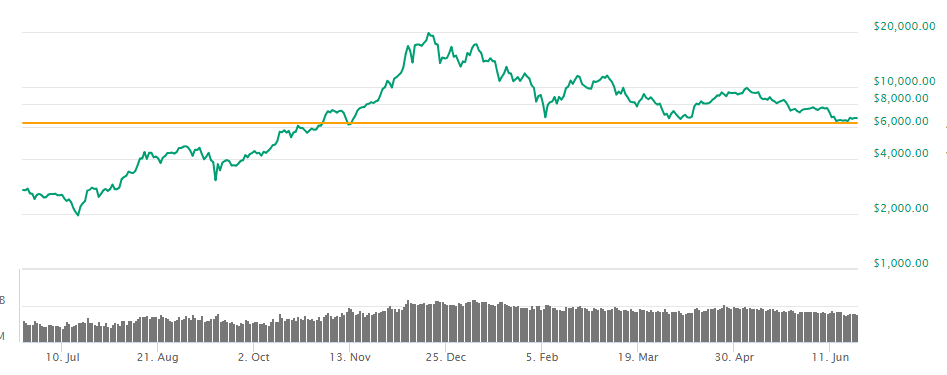
That's right. I stole the normal grid-lines directly off the coinmarketcap logarithmic BTC chart. And as for the all important baseline? Look at the CMC chart, it's the BTC price line that says that 1 BTC = 1 BTC! It happened to line up with a position of just greater than $6000 on the one-year chart. That's where I took all my lines from, every last one.
After that is was merely a matter of lining up a Fibonacci scale to roughly fit the data, highlight a few lines and data points on those lines, and then I justified their existence with rubbish that I made up as I went along.
Anyone ever heard of a "Main Transition Line" before? I made it up. I even gave it a fancy abbreviation: MTL (No relation to the crypto coin "Metal" 😉). How about a Mean Price Level? I made that one up too, then I made it look extra legitimate by stating that it was also sometimes called an "Average Price Level". I spoke a lot of nonsense, not caring about the content, but making sure that it sounded believable. I used generous sized lines to hide my innaccuracies, and even more generous sized blocks and circles to hide other inconvenient data. Have a look at the fat border of that block in the "Line 5" diagram! It's hiding a few hundred dollars worth of inaccuracy!
And that is exactly what a lot of crypto bloggers do daily, at least that's what I see. If you're reading the mass produced posts of people such as heajin, then that is what you're getting. Quantity, not quality. "Work" that is churned out rapidly to look good, but with very questionable content.
Look, I'm not saying that they get it all wrong. If you look at my own post today, much of it does make sense! Some of it is right. But the point is that I put no real effort into it. I matched up a few lines, threw out a few statements and called it TA. It isn't TA, it's a farce.
Conclusion
In my time studying crypto and trading a few stocks, I have developed a pretty decent set of TA skills. I know how to use and read the charts, their indicators, drawing tools etc. I know most of the major patterns and what they mean. I know things like what it means what a MACD crosses over, a candle forms a hammer or when it breaks through a Bollinger band. But you'll hardly ever see me publish such things in my posts. I don't like short-term TA. I don't believe that TA is very accurate or reliable. I like long-term trendlines and only a handful of other reliable patterns and tools. Most of the time I advise people to zoom the chart out and to see what they can see with their own two eyes and without all the fancy indicators and lines. I firmly believe that a good trader can see everything they need to see on a raw chart without any need for tools. The only time I really put lines on a chart is to explain what I'm seeing to someone else.
Main message of the day:
BE CAREFUL of who you follow. Be careful of blindly trusting TA - something which is open to interpretation at the best of times. Don't fall for the over-confident analyst who thinks that they are better than what they really are. Don't fall for the guy mass producing TA to get you to click on his post and earn him a little STEEM. Don't fall for the person who thinks that TA is the be-all and end-all of trading. These people are dangerous and following them is not wise.
I hope this post has opened your eyes a little. My apologies for misleading you initially, it was for a good purpose, so my conscience is clear! 😃
Always be careful with anything related to crypto trading - it's a jungle out there. I can't say this enough: Do Your Own Research!
Yours in crypto,
Bit Brain
Published on

by Bit Brain

Upvoted ($0.12) and resteemed by @investorsclub
Join the Investors Club if you are interested in investing.
Thanks for this :)
My pleasure!
To listen to the audio version of this article click on the play image.

Brought to you by @tts. If you find it useful please consider upvoting this reply.