Cryptoassets and Risk & Return metrics: Pythia's reports explained
Managing risks and returns is core to accumulating wealth. To help shed light on the risk and return characteristics, I created Pythia, a Twitter bot which generates a quick quantitative snapshot on demand. I received a number of questions regarding the metrics reported by the bot, which I aim to answer in this quick write down.
Managing risks and returns
This report contains traditional risk and return metrics that are widely used in finance to help inform investment decisions. The primary purpose of this report is to shed light on and increase the understanding of the risk/return characteristics of crypto assets. Like technical indicators, these metrics are backward looking, i.e. they are based on historic price movements. Therefore, using these indicators to guide investment or trading decisions relies on the extrapolation of historic price performance. As the popular adage goes, "past performance is not indicative of future results." However, improving your understanding of risk is instrumental to improving your ability to increase your wealth, both through trading and through investing more long term. Failing to manage your downside risk will erode the gains you make on profitable trades.
The majority of crypto traders on Twitter, or perhaps traders in general, seem to rely on technical analysis. Charts are based on historic price and volumes, which are used as the inputs for a large variety of indicators. According to Investopedia, "[i]ndicators represent a statistical approach to technical analysis as opposed to a subjective approach. By looking at money flow, trends, volatility, and momentum, they provide a secondary measure to actual price movements and help traders confirm the quality of chart patterns or form their own buy or sell signals." Although the risk-return metrics provided in this report are arguably less actionable than technical indicators, they do provide valuable insight into the (relative) performance of an asset.
An example: A Bitcoin report
Some basic information is provided in the top right hand corner: The current date is printed, as well as the currency pair that is used to generate the metrics in the report. At the bottom you can find the sample period, currently set to 365 days. The daily prices are retrieved from CryptoCompare's API. Quick shout out to CoinzTrader, whose reports this setup is based upon.
Charts
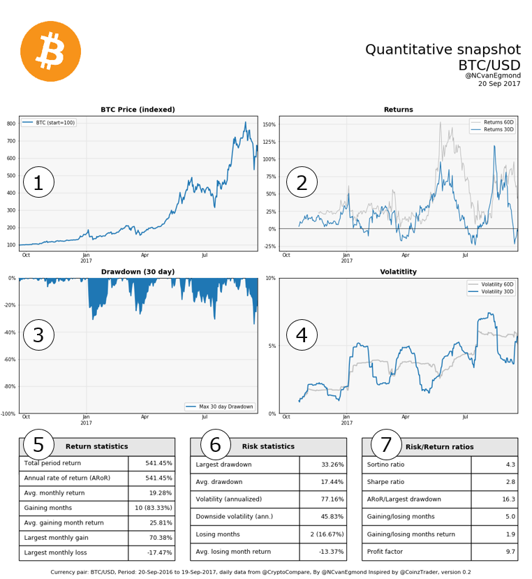
1. Indexed price
The top left graph shows the price development over the past year. Simple and straightforward. I chose to index the price to allow for easy comparison with other assets.
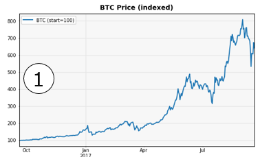
2. Returns
The top right graph shows the 30- and 60-day return for the asset. It clearly illustrates that Bitcoin is characterized by rapid expansions and contractions. Also pretty straightforward.
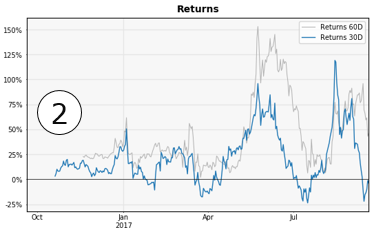
3. Drawdown
This graph shows the maximum 30 day drawdown that a buy and hold investors will have experienced in the past year. A drawdown is the decrease in value relative to the (recent) maximum. For example, if Bitcoin makes a new all time high at $ 4000 and the price declines over the next week to $3000, the drawdown is equal to 3000 - 4000 = $ 1000, or 25%. This measure can be interpreted as the downside risk on an investment.
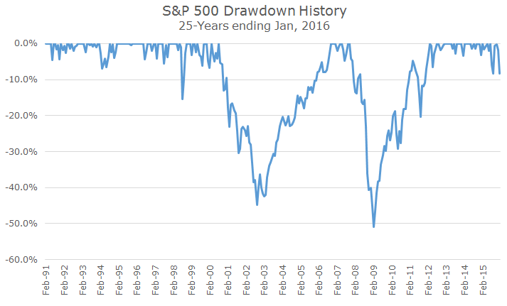
In my opinion, drawdown risk is one of the most important risks for an investor to manage, because returns are asymmetrical. If your position results in a loss of 30%, you will need a gain of 42% to break even. Crypto markets are extremely volatile, and a drawdown of more than 30% is not uncommon. In the last year, a Bitcoin holder has experienced a drawdown of more than 30% four times throughout the year before the price made a new high. To give a bit of context, the S&P500 experienced drawdown of this magnitude twice in the past 30 years: First it experienced a 45% drawdown when the dot-com bubble burst. Less than a decade later, it experienced a 50% drawdown during sub-prime mortgage crisis (chart borrowed from Acropolis Investment Management).
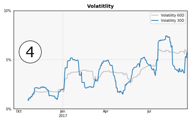
4. Volatility
This point is further illustrated by the chart showing the rolling 30- and 60-day volatility of returns.
5. Return statistics
The metrics in this table summarize the returns of the asset.
The total period return is percentage change in price over the entire period. The Annual Rate of Return (ARoR) is the geometric annual return, following the formula prescribed by the SEC (see Wikipedia) to enable comparison across funds/portfolios. The total period return and ARoR are equal as long as the sample period is equal to 1 year. The Average monthly return is the arithmetic mean of the monthly returns. Gaining months indicate the number of months with a positive return, and the average gaining month return_ gives the average return in those months. The last two metrics give the largest monthly gain and the largest monthly loss in the past year respectively.
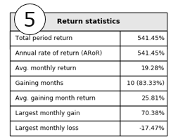
From this table, we can conclude that Bitcoin has experienced a tremendous increase in value. Although decreases were few, they were also swift and huge. "The market takes the stairs up and the elevator down."
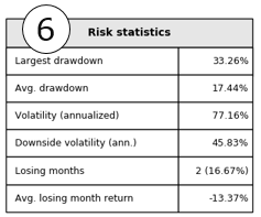
6. Risk statistics
This next table focuses on risk metrics. The largest drawdown shows the largest drawdown in the past year. The average drawdown shows that on the average day in the past year, an investor was down 17.4% from the recent top.
Both volatility and downside volatility are annualized by multiplying the standard deviation by the square root of the number of trading days, 365. For context, the rolling 12 month volatility of the S&P500 bounces between 5-25% (PDF), and for precious metals like gold it's between 10-45% (Business Insider).
7. Risk/Return ratios
The final table ties all the other metrics together by reporting ratios that incorporate both risk and return factors.
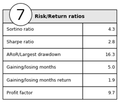
The Sortino ratio divides the mean return by the volatility of the negative returns (more specifically, by the second order lower partial moment using a 0% threshold value). It can be interpreted as the reward for exposure to negative volatility. Similarly, the Sharpe ratio can be interpreted as the rewards you get for the volatility risk you are exposed to. The volatility used to calculate the Sharpe ratio includes both positive and negative returns. Both ratios are annualized by multiplying the initial ratio by the square root of the number of trading days (365). The ratio of ARoR / Largest drawdown can be interpreted similarly. Gaining/Losing months speaks for itself. Gaining/Losing month returns reports the ratio of the average return in gaining months over the average return in losing months. For all ratios reported in this table, 'the higher, the better'. A higher ratio indicates a higher reward for a certain unit of risk.
Closing remarks
In conclusion, the metrics in this report give a broad overview of the risk-return characteristics of a crypto asset. In my opinion, understanding the trade-off between risk and return is key to a successful trading or investing strategy. Although these metrics arguably provide less actionable signals for traders, they do provide valuable insights for traders and investors alike.
Let me know if you would like to see changes to the current report, further explanation on any of the metrics, or have suggestions for different reports you would like to see. Same goes for any mistakes you spot in my explanation of the various metrics or their interpretation. Consider this a working document. You can contact me via @throwawayreport on Twitter.
(Absent a draft function on steemit: I'll add calculations used where needed later)