Today's Data Viz Collection #dataisbeautiful (12.12.2017)
Here are today's best data visualisations scraped from social media.
Be sure to check in to #dataisbeautiful regularly and tag your viz' with it as well!
What happens when you pull the plug on the Marianas Trench

A fantastic example of how you can use maps and animations to show data extrapolation.
Author: https://www.reddit.com/user/Vinnytsia
Roy Moore vs. "Half your age plus seven"

Now with this data analysis we finally understand just HOW bad of a person Roy Moore truly is ;)
Author: https://www.reddit.com/user/HillaryApologist
Terrorism Data (a lesson in data journalism)
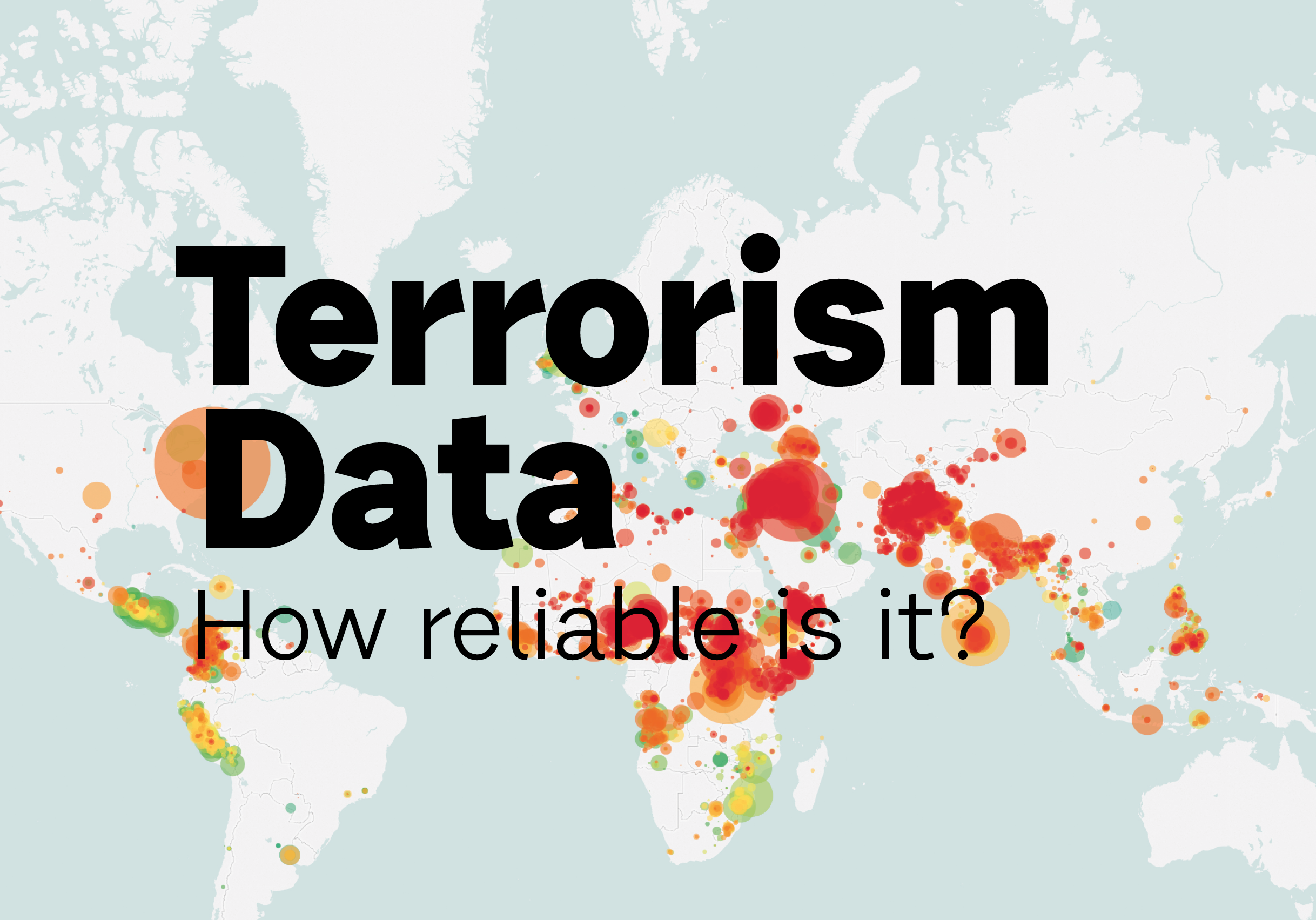
An example of the very important lesson to always look at the origin of the data you're working with!
Author: @Remuslord
Lifespans of the Presidents of the United States (Chronological Order)
Author: https://www.reddit.com/user/BRENNEJM
Who knew that American presidents were usually quite close to their death?
The Most Valuable Companies of All-Time

The comparison with the East India Company is truly mind-blowing!
Author: Jeff Desjardins for VisualCapitalist.com
Climate Correlations
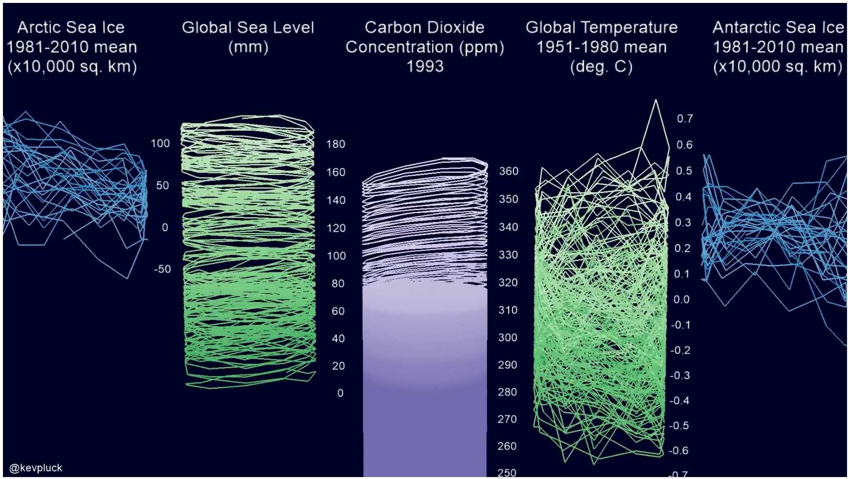
Some seriously scary data involved here and beautifully presented in a compact way alongside each other.
Author: https://www.reddit.com/user/kevpluck
The Roy Moore chart is fully cringeworthy. That election is today, isn't it? Wonder how it's going. Thank goodness I'm up in Canada on the west coast... and a 30yr old male.
Haha very similar fate here. 31/m/Europe :D
This is the kind of curation effort I wanna see.
Visual learning really helps me.
I <3 #infographics
Kudos!
edit:
Would like to see a short description/sentence about each entry and not just the title and link.
Good point! I'll include a little description!
Splendid. Thank you!
Nice post