📱 My app design - IOTA community wallet exploration
Yo :)
I started a small collaboration with people in IOTA community on design of the new IOTA wallet. These are the first steps.
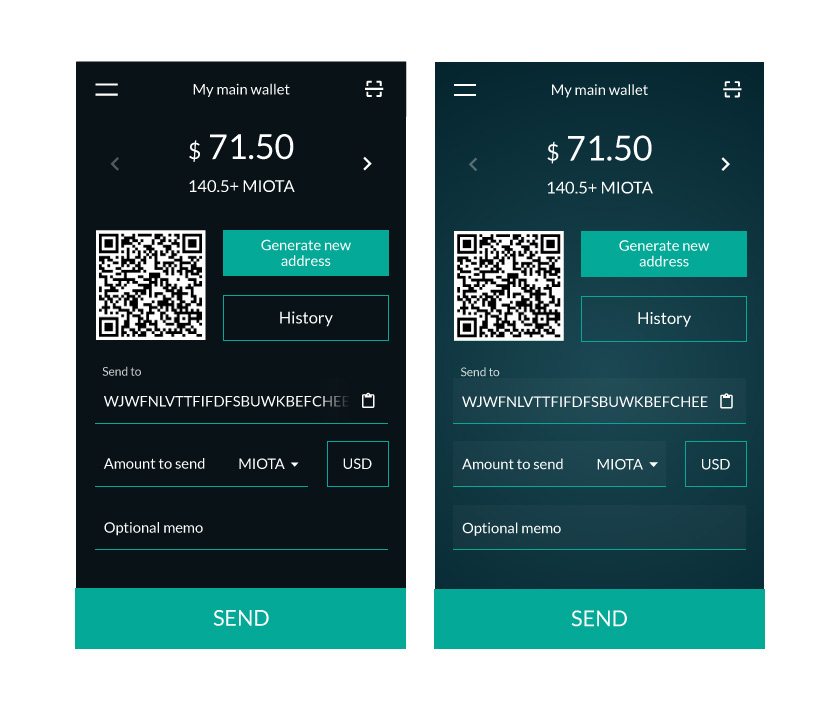
Which one is better? Left or right?

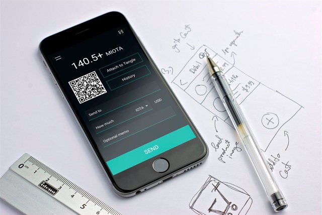
Dark version

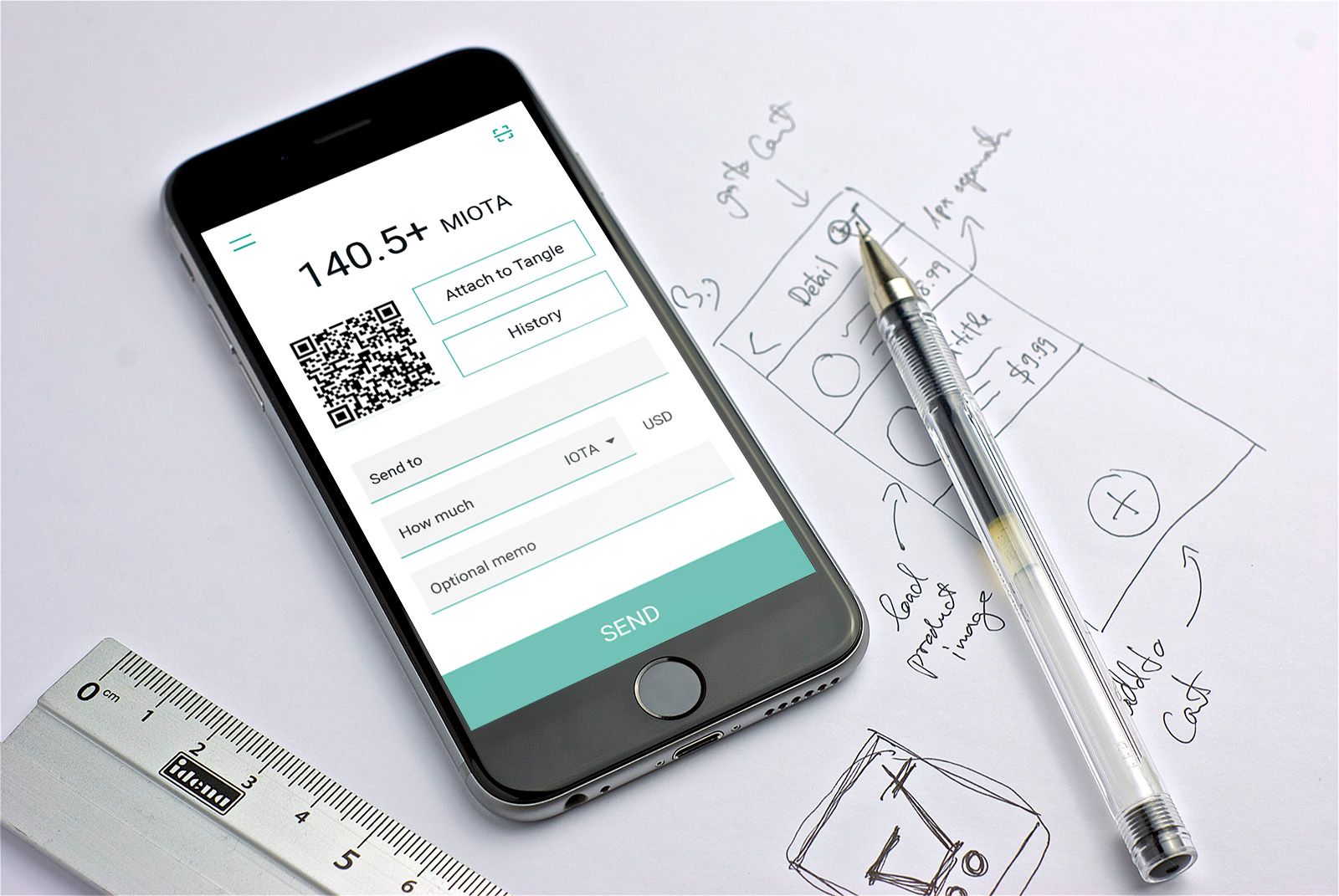
Light version
We will probably go with just the dark version.

IOTA is the future :)

Andrej Cibík @andrejcibik
Web design | Web development | Logo design
the dark version looks better
And from the top designs? Left or right?
left
left
The design on the left is more user-friendly I'd say.
I think Color On Right Image Looks good.
hey.. I would go with the right version.. it is not neither the black or white.. it is like dark emerald.. looks nice and original.
Thx for the vote :)
I wasnt sure, but now I think left is better :)
how about, BOTH? Just like in poloniex.com. You can choose night or day mode. :) I like dark actually. But thinking that you cannot please everybody with dark how about make or give them option? or options?
Thats what we are going to do! :) But we still have to think about the first - default style as most people will use only default.
I think the dark version too. I am not sure if that is because that seems to be the way UI design is going at the moment. Thinking about Adobe CC in particular but it spreads across many other creative UIs. I would have made the type at the top, the number, a thicker font. That might be personal taste though.