#RedesignTheWorld Challenge: A Redesign of a local Deli in the Philippines
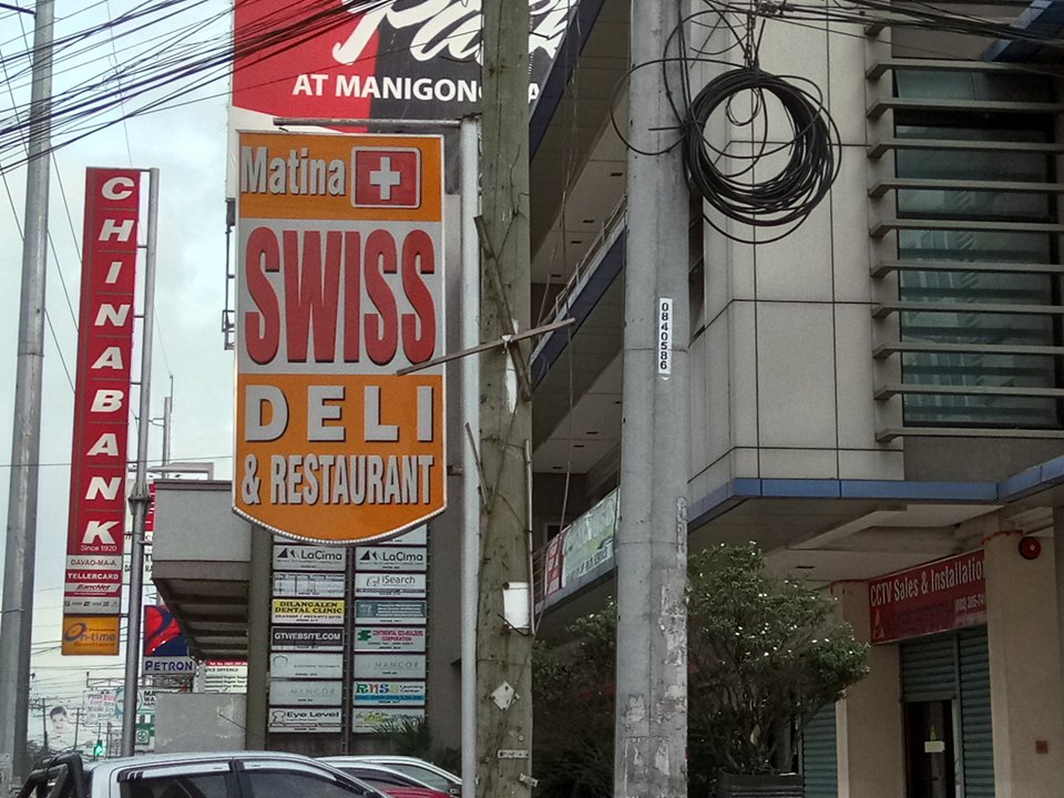
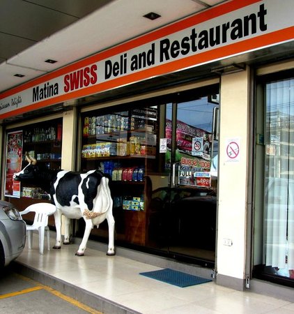
So there's this restaurant in our place called "Swiss Deli and Restaurant". I've been passing by that place for so long and I never knew that it was a restaurant because of the appearance. It looked like a pharmacy if you don't really pay attention to it.
What doesn't work?
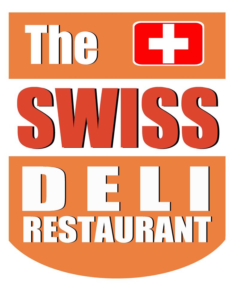
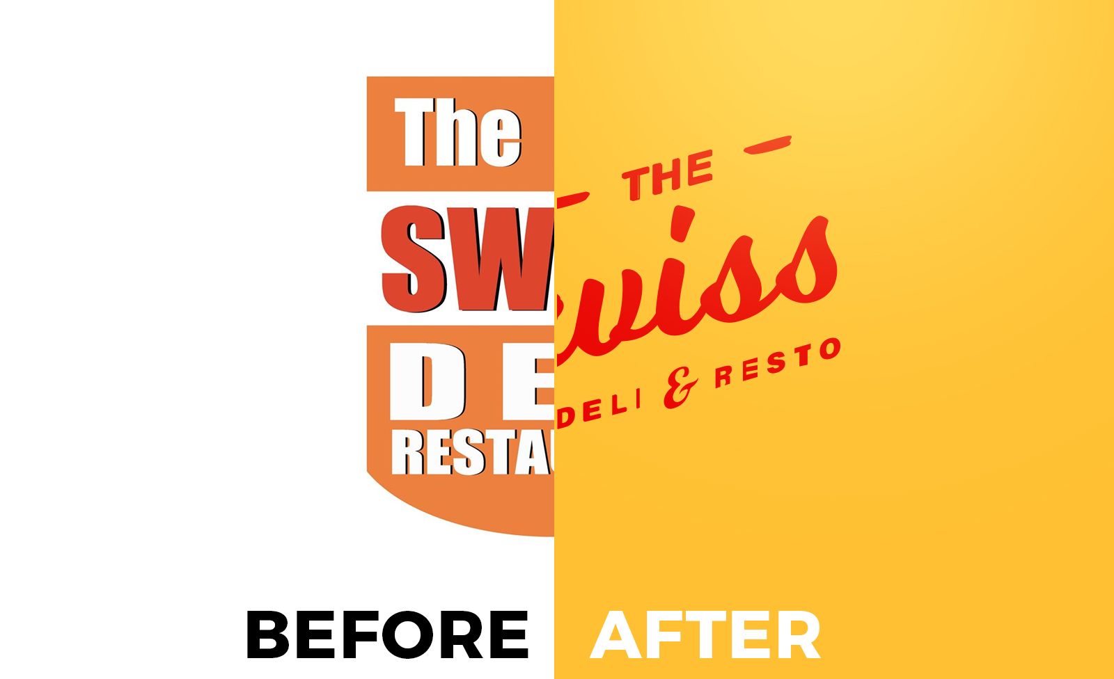
What I think doesn't work the most is the font being used. It's too bulky and too plain for it to be used in a food company. The swiss flag makes it look like a medical establishment or pharmacy. But what I like in this design is the use of Red and Orange colors. These colors are usually used for food and beverages industry so they got that one.
Design Process
I started of with some sketches. I sketched some samples that incorporates the Swiss flag. I used cursive/Script style font because it gives the logo it's homemade, personalized feel. Though I tried some solid fonts but I didn't liked it that much.
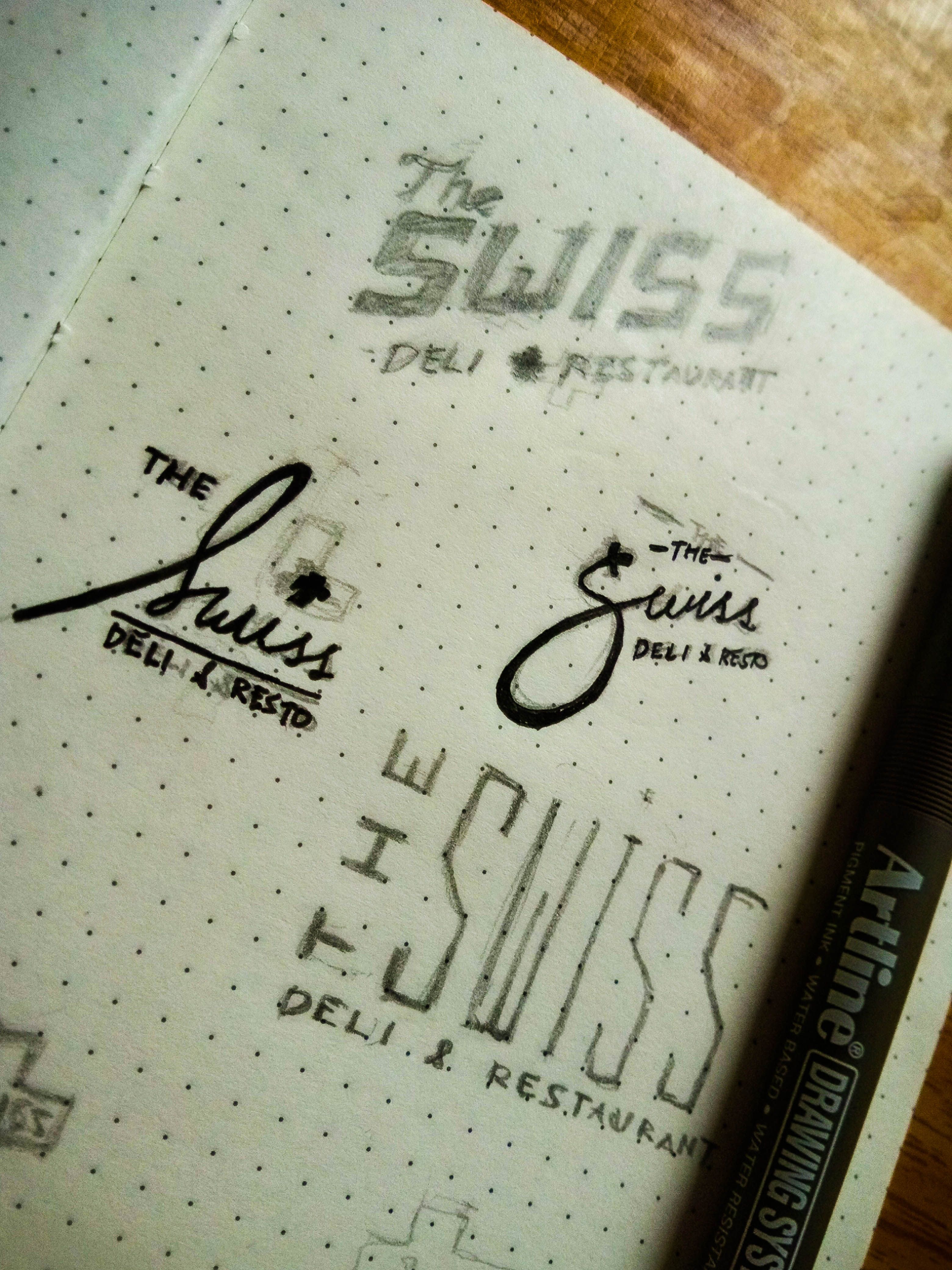
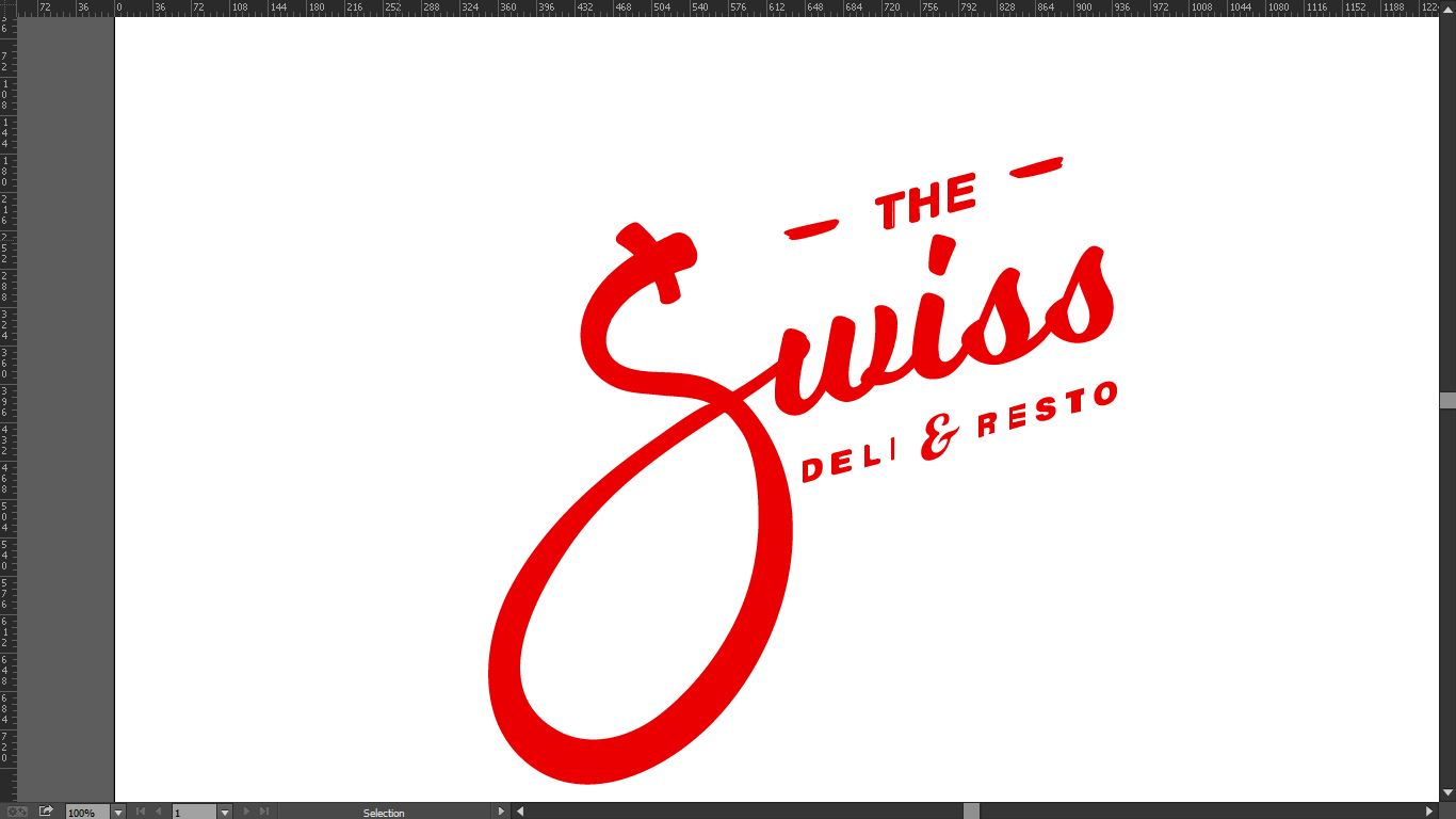
Next is I opened Adobe Illustrator and started making the digital version of the sketch. I'm not a good calligraphy artist though so i used the font Milkshake because it is close to the one I sketched. The only letter I did traced is the S.
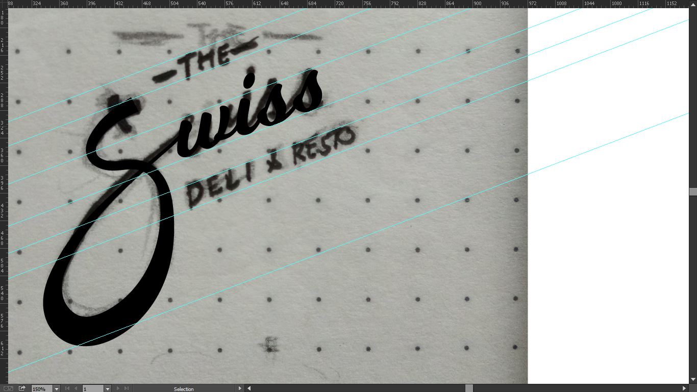
After that, I finished it with some little details, The swiss flag is at the tip of the letter S. I ended up using the same color but more vibrant since it's one of the things that they did spot on.
Done! I did 3 versions with different colors and 1 version in use.
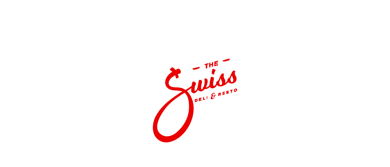
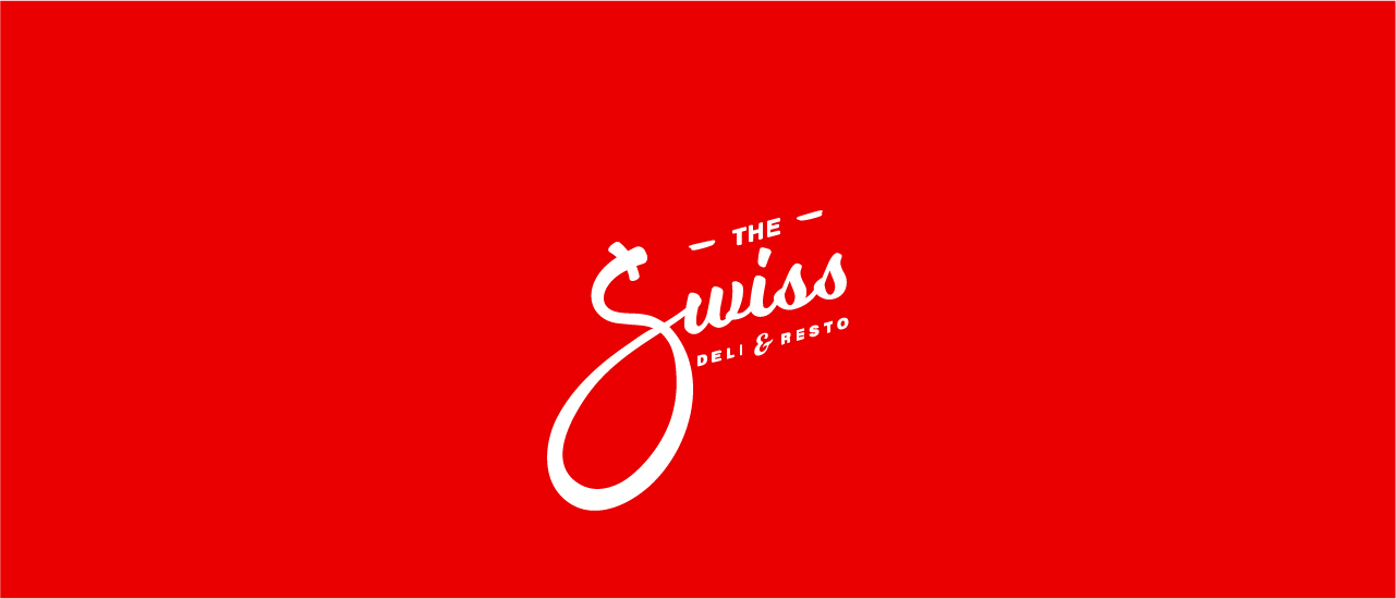

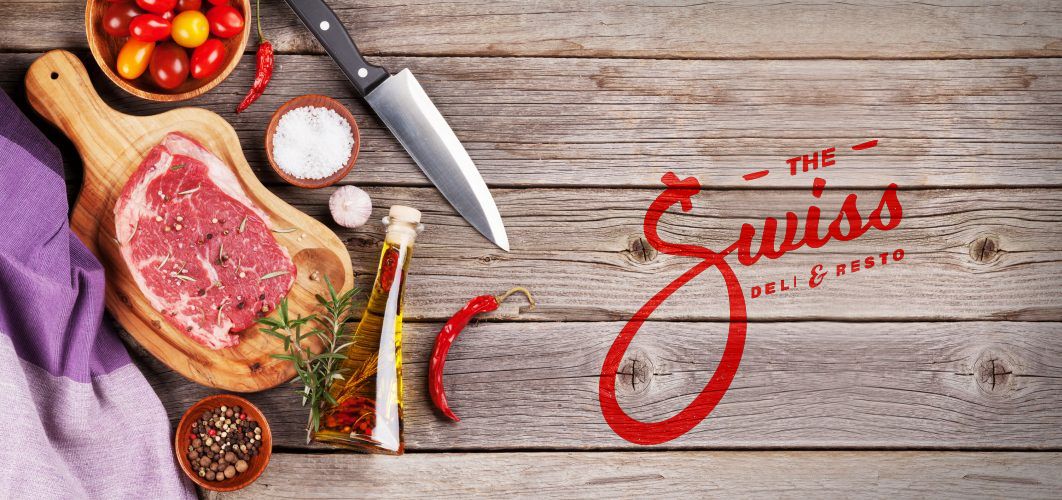
I think this version would work because when you look at it in a glance, you'll know that this is in the food industry, just use it in the right placing, branding packaging and It'll work like a charm, I think.
Thank you for reading this blog! If you want to do your own #redesigntheworld challenge, you can visit this post for the mechanics: https://steemit.com/art/@embity/redesigntheworld-challenge-make-the-world-a-better-looking-place
PS:
I just noticed that the logo was effed up due to the compression of the vector size. Meh. :D
bai pwede nako ni i endorse sa tag-iya haha. kaila nako ang tag-iya haha. nice work!
Sure? Tarungon sa nako kay naguba ang logo atay haha very niiice
10 out of 10 very nicest! haha
Galing po. I wish the owner would see your design. Or maybe you could just come up to him and show him your design. Who knows what could happen next. ^^,
Or I could just tag their business facebook page haha :) Thanks yadah!
@Originalworks
Wow what a great post! Keep posting good content!
Thanks my friend! Likewise!
wow! that's an awesome redo. really liked the way you analyzed what was 'wrong' with the previous logo and how you 'tastefully' recreated the new one! keep it up man :)
#SteemitBloggers
Thanks man!
Nice combination of the Swedish logo with the S.
Nice creation! Wow! just Wow! :)
Your Post Has Been Featured on @Resteemable!
Feature any Steemit post using resteemit.com!
How It Works:
1. Take Any Steemit URL
2. Erase
https://3. Type
reGet Featured Instantly – Featured Posts are voted every 2.4hrs
Join the Curation Team Here