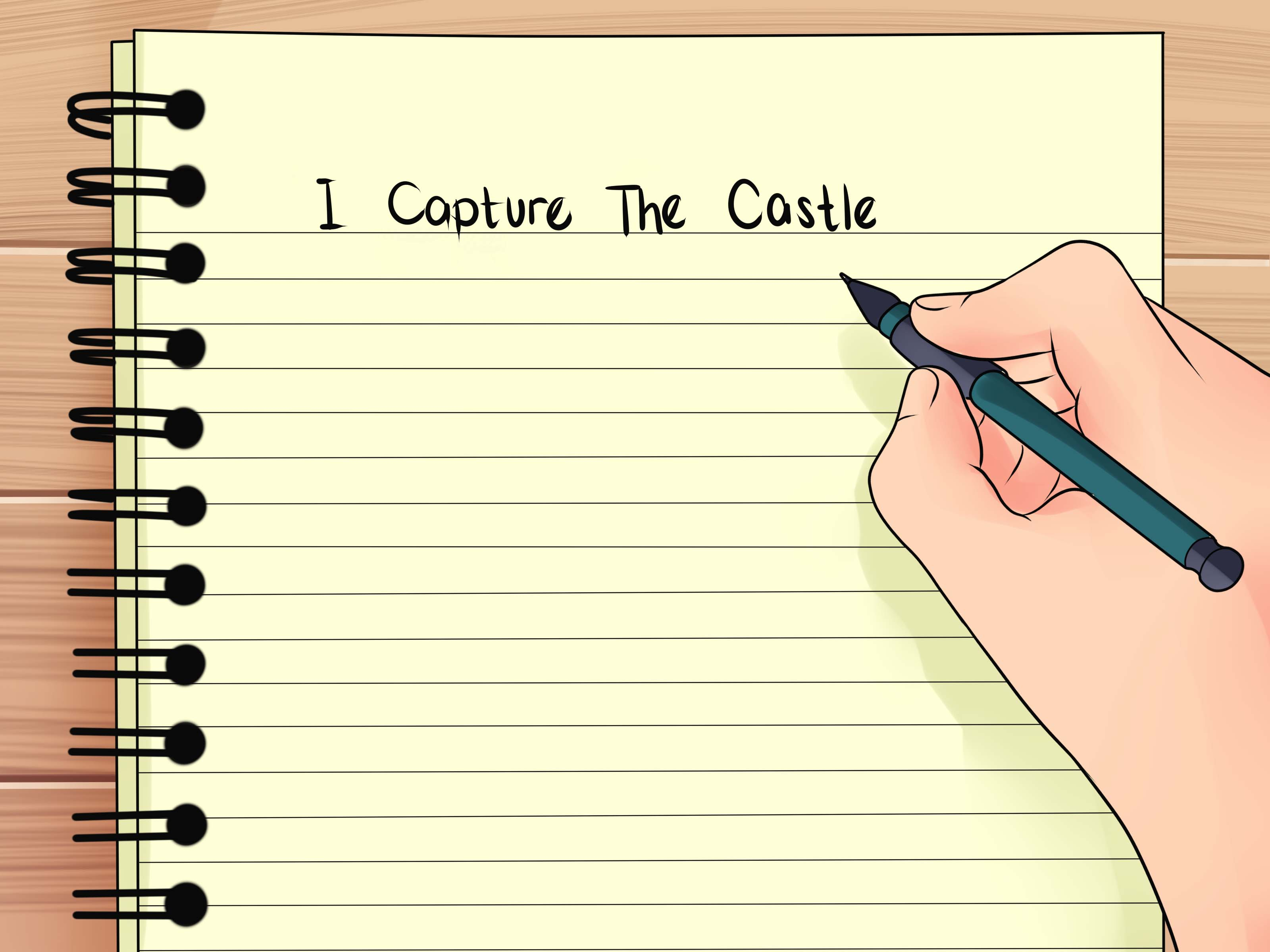
Design For Page Title
A properly formatted header will help you better sell your product or service. Or for example, draw attention here at Steem.
Perhaps, you will find these tips not so important to pay attention to them, but try it only once. I assure you, you will want more!
So here are some tips:
- Position the title at the top center of the page.
- The text should be large (but be careful, do not overdo it) and contrast with the main background.
- Use the "Title Case" technique, which consists in writing each word with a capital letter.
- Split the long title using punctuation (for example, a dash) for "eye rest".
- If possible, mark it with quotation marks.
- Strengthen the title with a subhead.
- And you can also use numbers. This will increase the conversion of views.
When you use these rules, something amazing will happen: your headlines will become noticeable, and moreover, attractive. After all, there are names for that, so that they pay attention to them. They will not only be noticed, but also read. Dare! Let the headings of your pages shine on Steemit!
Once you have the necessary data on the desires and interests of your target audience and the appropriate design will be chosen, proceed with the design of the article itself.
I'm glad to be with you
Your @vnukkarpov

good post. following & upvoted it. looking forward to ur next post. hope u will follow and upvote my top 3 post :)
Congratulations @vnukkarpov! You have completed some achievement on Steemit and have been rewarded with new badge(s) :
Click on any badge to view your own Board of Honnor on SteemitBoard.
For more information about SteemitBoard, click here
If you no longer want to receive notifications, reply to this comment with the word
STOPBy upvoting this notification, you can help all Steemit users. Learn how here!