You are viewing a single comment's thread from:
RE: Bitcoin at all time highs, whats gonna happen? and let's look at Small Account Building trades
Smooth moves @feleks , I'd love to see your screen shots.
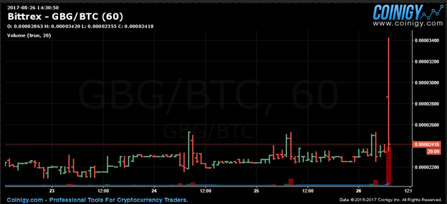
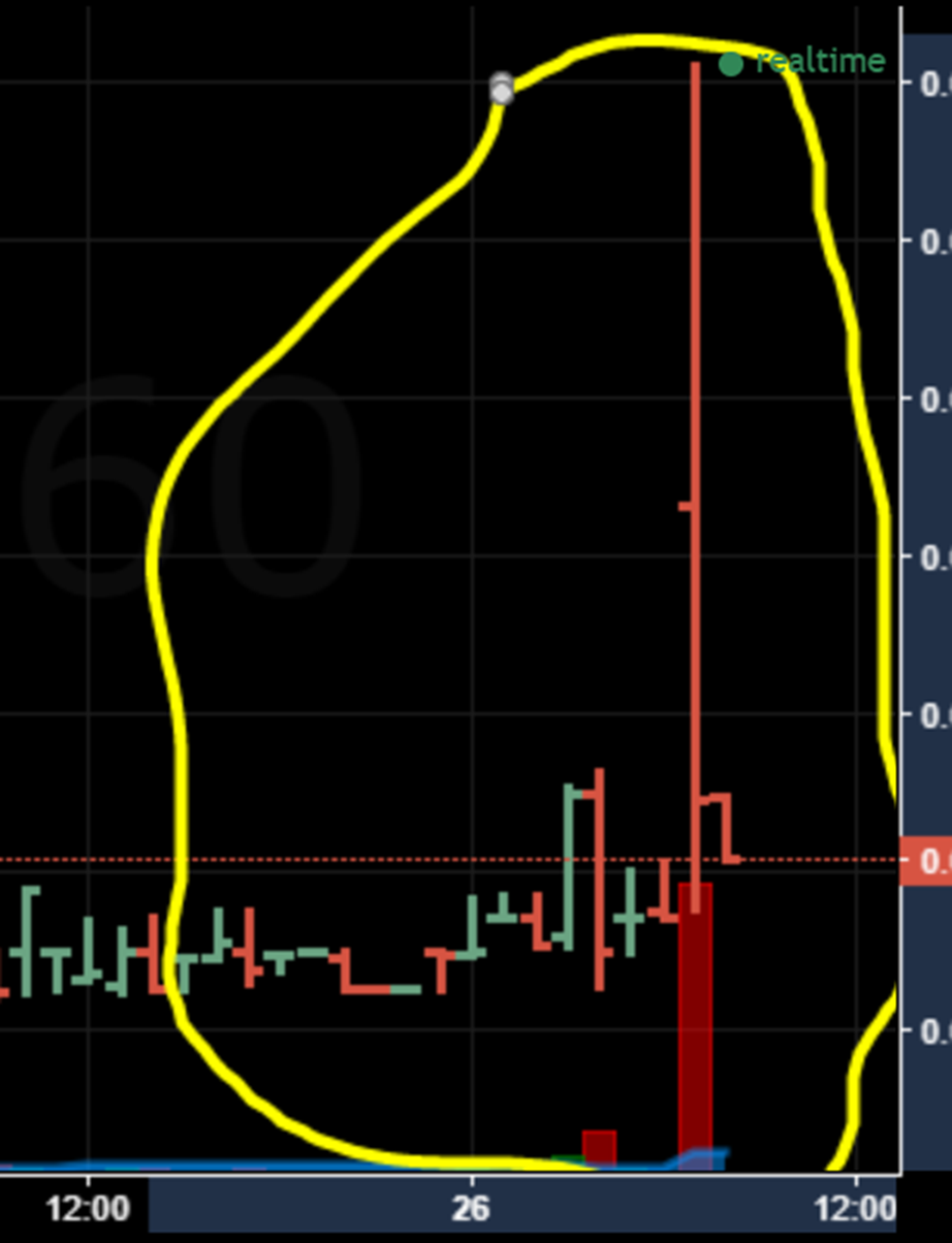
Also, what is wrong with this screenshot?
How can the price go up on a sell off. One red line down, followed by a red line up?


The candle is red when the price at the beginning of the interval is higher than the time at the end of the interval. So, for example, if it is a 1-hour chart (where each candle represents one hour) and there was a spike in price at 10:00, than it goes back down immediately after, it would be shown as a red candle, because the opening price for that hour is higher. You might be able to better understand what happened if you look at smaller resolution (but this could happen even on the 1-minute chart, for the same reason).
This is excellent work.