SEC S19W4 || Organization using CSS (Box-model,Display, Position, Flex)
Welcome to the 4th Lesson of Season 19 of the Steemit Engagement Challenge!
Welcome to you all !
We, the Dynamic Devs team, are delighted to announce the launch of our Fourth competition of the season! This time, we are going to talk about how you can organize your content with CSS using box-sizing display, flex, position properties
It's very important to always organize your content when working on a project with a lot container or div, infact this is one of the most important part of CSS. Creating a Web site that contains header, nav bars, card, even element and picture needs organization, so that the page would look appeasing and attractive.
During this competition, we invite you to explore and master these powerful tools and it's different use cases. Whether you are a beginner or an experienced developer, this challenge is the perfect opportunity to deepen your knowledge and Master your skills.
In web development there are so many ways to solve a problem, so it's very necessary to be creative enough to know how, when and why you are applying a specific type of technology/properties. This is why I would be teaching you different way to organize your content on a web page.
You might be wondering why you need this course but if you don't know how to move your box or container when developing then I promise you your job would be very difficult.
I really believe that it would be no use learning designing or creative skills, if you don't master how to organize your content because it is the first step of implementing CSS in your HTML. For example imagine sweeping a room where there are bags scattered on the ground, it would be unsuccessful because the scattered bags would obstruct your sweeping.
Join us now and let's bring all your imagination into reality. We look forward to unleashing your innovative creations and celebrating the exceptional talents of our web development community together.
Good luck to all participants and may the best one win!
Box-model |
|---|
A project I did for the sake of this course, in the project above I used all the organization properties of CSS that are stated below.
Watch the video because I would be referencing it through out the contest, please try zooming smaller images. It would be clearer.
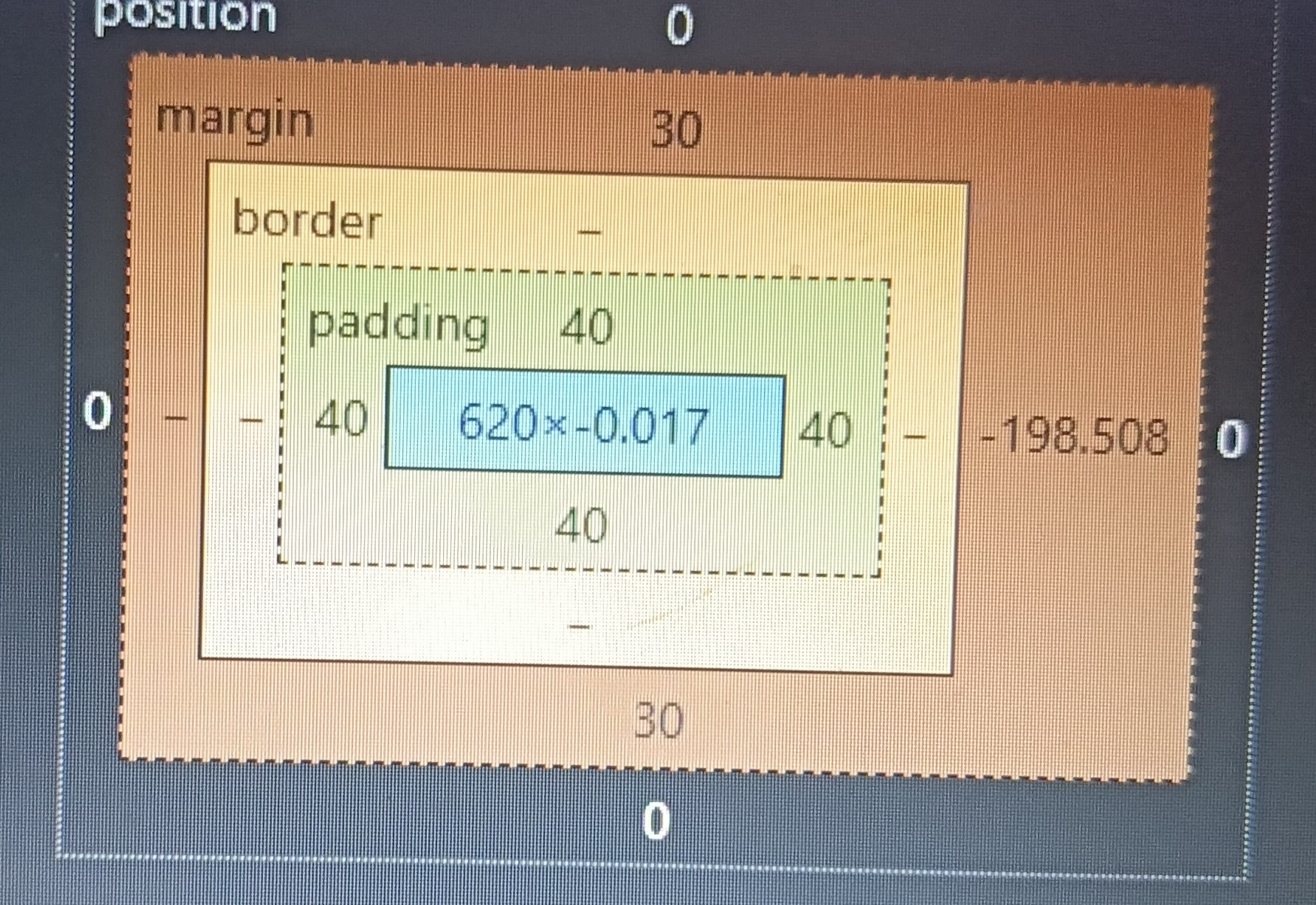
Before I start I want to let you know some vital information that would help you throughout your journey as a web developer. Every element, class div and Id div you create using your HTML, exist as a box in your web browser so therefore while working with HTML, CSS or another web development technology, it is necessary you master the box model theory.
The box-model theory basically helps developers efficiently and effectively position every existing container on your web browser, also the box model theory also help in the adjustment and arrangement of every content inside those box efficiently.
Basically there are three different forms in which the box model theory can be efficiently implemented in our code, the three of them works in similar way but they have different purposes that are at times very confusing for beginners to understand. Although the good news is that I have come up with the best form of explanations to make them easier for you to understand. The three basic forms in which box model can be implemented are:
✅ Padding
✅ Border
✅ Margin
Padding:
This form of box model implementation is very effective whenever a developer wishes to create a space between the container which is a box and the item inside the container, which could be any text or even image. Due to the fact that the padding property can be used to create space between the item and it container, professionals has come up with a format in which they could use padding to effectively and efficiently move and item to a specific location in the box. It's syntax is
• Generally padding of a box, left, right, top and bottom = 10px
`padding:10px,
• Unique padding of a box, top =10px, right=3px, bottom=4px and left=5px
padding:10px, 3px, 4px, 5px;
Border:
This form of box model implementation is very effective whenever a developer wishes to create a border line between the container which is a box and and another container. Due to the fact that the border property can be used to create a border between the two different containers. this borders could be of different types, they could be dotted, solid, unset, inset and even hidden, it all depend on the project you're working on.. The syntax for the Border property is written below:
border:10px solid black;
10px: is the size of the border
Solid: is the type of border
Black is the color of the border
Margin:
This form of box model implementation is very effective whenever a developer wishes to create a space between two container, this is used to move the entire box to different locations of the browser effectively. So therefore when using margin you move the entire box with all the items inside the box which may be text or even images. For example if you want to move your class container left or right you could efficiently do that with margins
• Generally margin of a box, left, right, top and bottom = 10px
`margin:10px,
• Unique margin of a box, top =10px, right=3px, bottom=4px and left=5px
margin :10px, 3px, 4px, 5px;
Note it moves in a clockwise direction whenever you want to uniquely add margin padding or even bother to a specific side of a container
Display properties |
|---|
Display properties:
As the name implies this unique CSS property is used to easily control how the display of your box or container would be. The are basically two types of display properties it could either be inline or block. These properties or features helps developers arrange containers they have in their project. Block display property is the default way in which element appears on a browser appears. When an element is created using HTML this element, the container appears under each other more like in a column format leaving their side empty or blank.
But on the other hand in-line display property is a very important property that helps arrange contents in row format, that is to say new containers can now appear at the side of existing containers, so therefore covering up the free side space that usually go wasted.
They are other different properties which can be used together with a display property, there are
• Inline-block properties:
This sort of display property carries the feature of both in line display and block display, It moves new content to a new line just as they block property do, but in this case the new container won't be displayed at the starting of the new line instead it will be displayed around the middle of this new line. This sort of display property is rarely used because of his complexity and the browser calculation during its implementation.
Display Flex:
Another very important and well-known display property is known as display flex and display grid. The display flex property as the name implies helps in making the block nature of the browser become flexible, that is to say with the help of display flex web developers can adjust any container with so much flexibility.
The display flex property also has so many sub properties, that grant developers so much flexibility while developing different website layout. With a flex property a web developer can move a content or a container to any part of the browser, with just few lines of code.
Display Grid :
This is another very powerful display property that when initialized gives developer full control and functionalities so to move a container to any part of the the browser with ease. This sort of display property is very similar to that of flex property just that it works in a three dimensional, while the flex display works in a two dimension .
Position |
|---|
The position properties is another very important technique in which developers can easily adjust and move a container to any part of the browser, this sort of property gives web developers permission to assign behaviors and characteristics of every container the create
The position properties comes with different other sub properties that developers use to move their container around the browser or around another container. As long as you have called the position property, you then have to power to control that container using right, left, top and button.
The are four major types of position properties, there are :
Fixed,
Sticky,
Relative,
Absolute.
Fixed properties:
As the name implies whenever they fixed position property is used, the container is expected to be set fixed at that position, that is to say whenever the user scrolls the fixed container would never leave the screen.
Sticky properties:
As the name implies the sticky position property is used to make a container scrollable but stop scrolling as soon as it hits the top or the end of the screen, as soon as they sticky position container hit the end or top of the screen, it start that behaving like the fixed position property because it's never leaves the screen. It's mostly used as for ads or to display vital pop up information on screen.
Relative properties
The relative position property is mostly used to position the child element, the relative position property helps the child container to accurately position inside its parents container. With this property a child element can be positioned around a parent element instead of automatically position itself inside the body element.
The text and images are child element with absolute position, because I they are positioned inside the card container.
Absolute position property
This is the position given to the child element to help it position perfectly on its parents container instead of automatically positioning himself the body container. In summary the absolute position property gives a container to position it to the nearest relative container
1. Theoretical Questions
Explain Difference between in-line display and block display,?
What's the difference between Margin, Padding and Border?
Define Position property?
Differentiate between Grid and Flex display properties?
2. Practical Questions
Download and install Visual Studio Code from code.visualstudio.com or use any editor you are comfortable with.
Open Your Editor and create two files name one Index.html and the other layout.css
Re-create this web page with your own unique design.
The upvote, downvotes and resteem feature are optional, every other feature is compulsory.
Contest Guidelines
Post can be written in any community or in your own blog.
Post must be #steemexclusive.
Use the following title: SEC S19W4 || Organization using CSS (box-model Display, Position, Flex)
Participants must be verified and active users on the platform.
Post must be more than 350 words. (350 to 500 words)
The images used must be the author's own or free of copyright. (Don't forget to include the source.)
Participants should not use any bot voting services, do not engage in vote buying.
The participation schedule is between Monday, July 29 , 2024 at 00:00 UTC to Sunday, - August 4th, 2024UTC.
Community moderators would leave quality ratings of your articles and likely upvotes.
The publication can be in any language.
Plagiarism and use of AI is prohibited.
Participants must appropriately follow #club5050 or #club75 or #club100.
Use the tags #dynamicdevs-s19w4 , #country (example- #tunisia, #Nigeria) #steemexclusive.
Use the #burnsteem25 tag only if you have set the 25% payee to @null.
Post the link to your entry in the comments section of this contest post. (very important).
Invite at least 3 friends to participate in this contest.
Strive to leave valuable feedback on other people's entries.
Share your post on Twitter and drop the link as a comment on your post.
Your article must get at least 10 upvotes and 5 valid comments to count as valid in the contest, so be sure to interact with other users' entries
Rewards
SC01 would be checking on the entire 7 participating communities and upvoting outstanding content. Upvote is not guaranteed for all articles. Kindly take note.
At the end of the week, we would nominate the top 3 users who had performed well in the contest and would be eligible for votes from SC01/SC02.
Important Notice: The nomination of the top 3 users in our community is not based on good grades alone, it includes their general engagements (quality and quantity of their interactions with other users' articles) to measure the overall performance. Also note that generally, you can only make one post per day in the Steemit Engagement Challenge. Remember creativity is the key to success
Best Regards,
Dynamic Devs Team
@kouba01
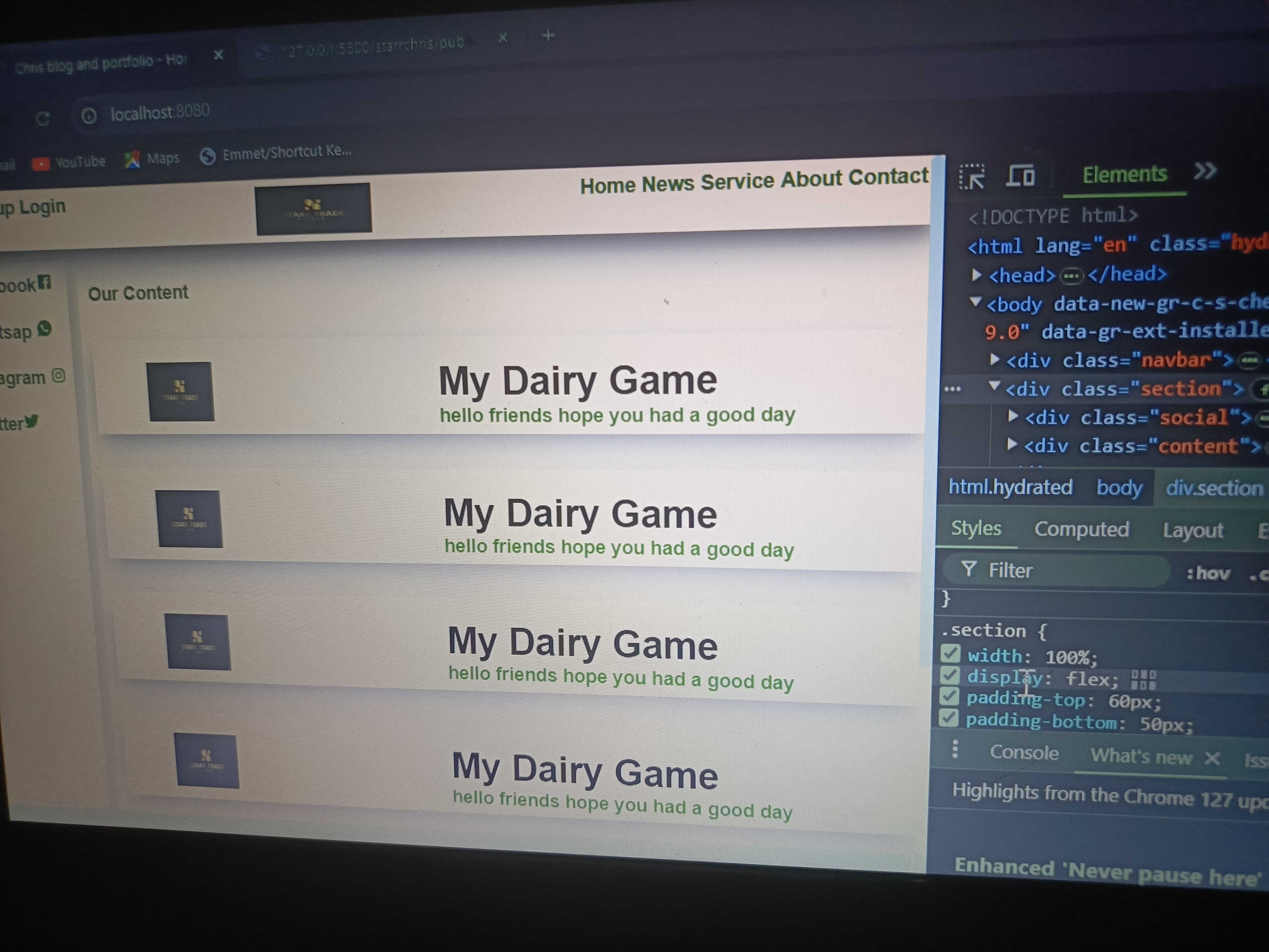
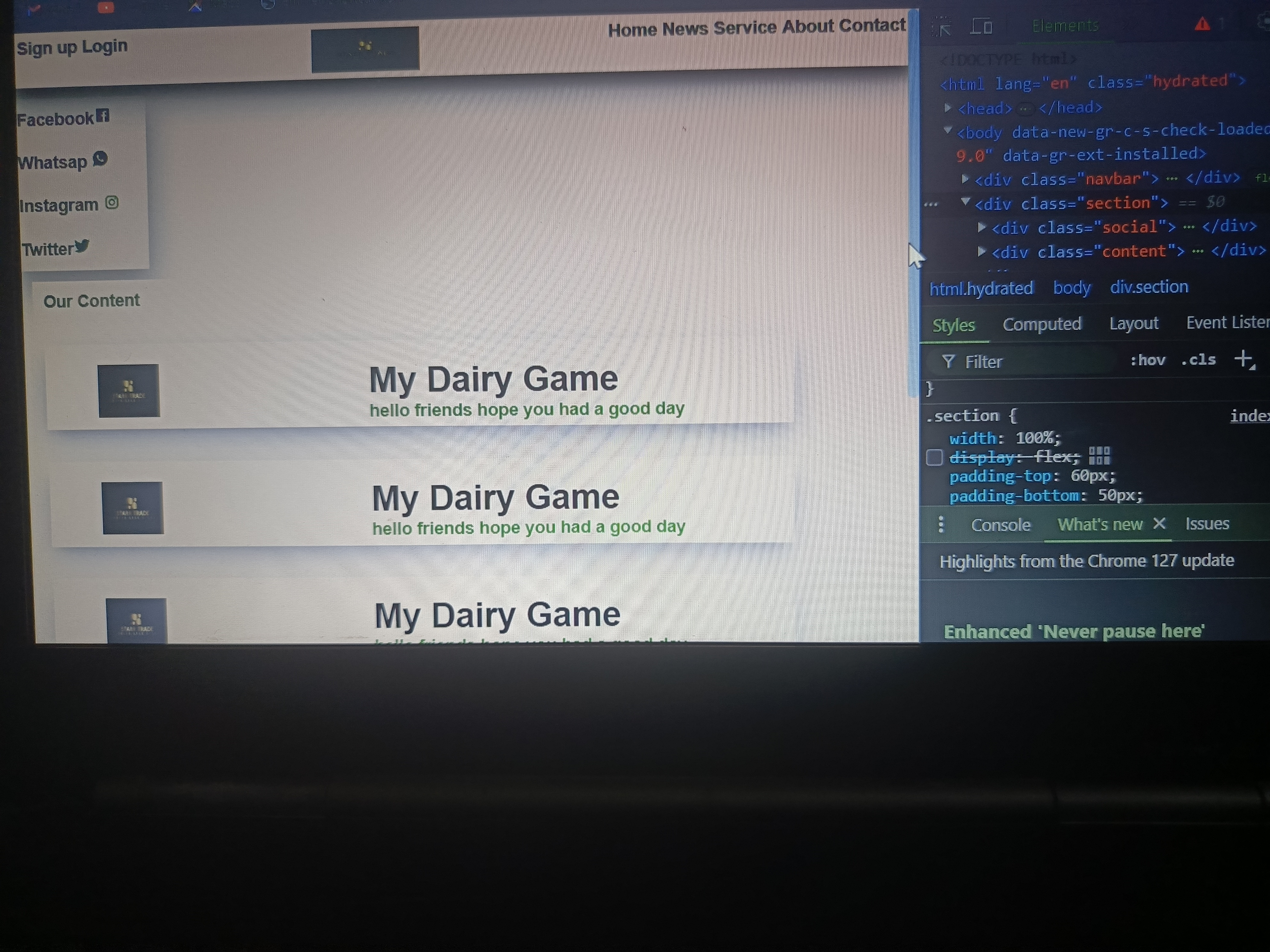
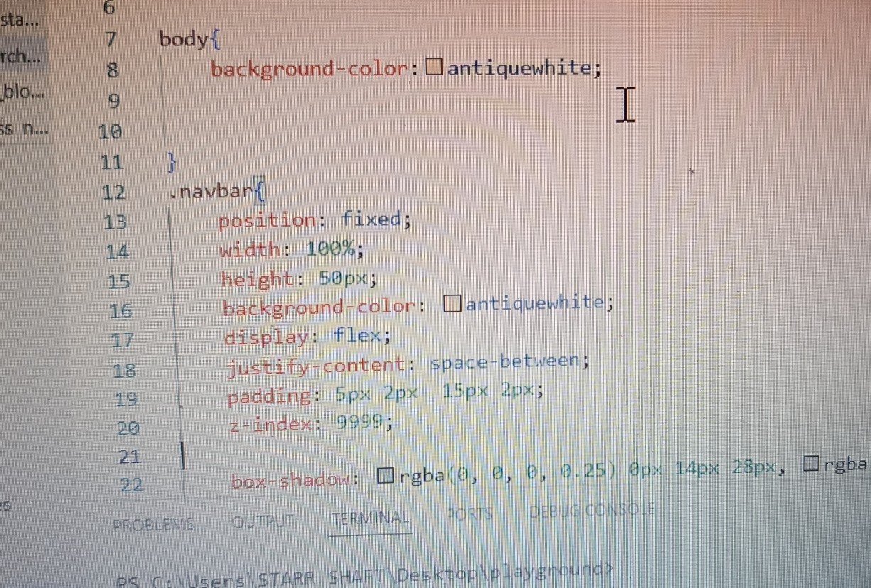
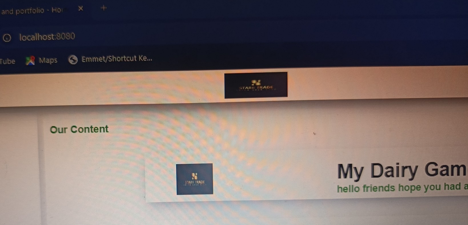
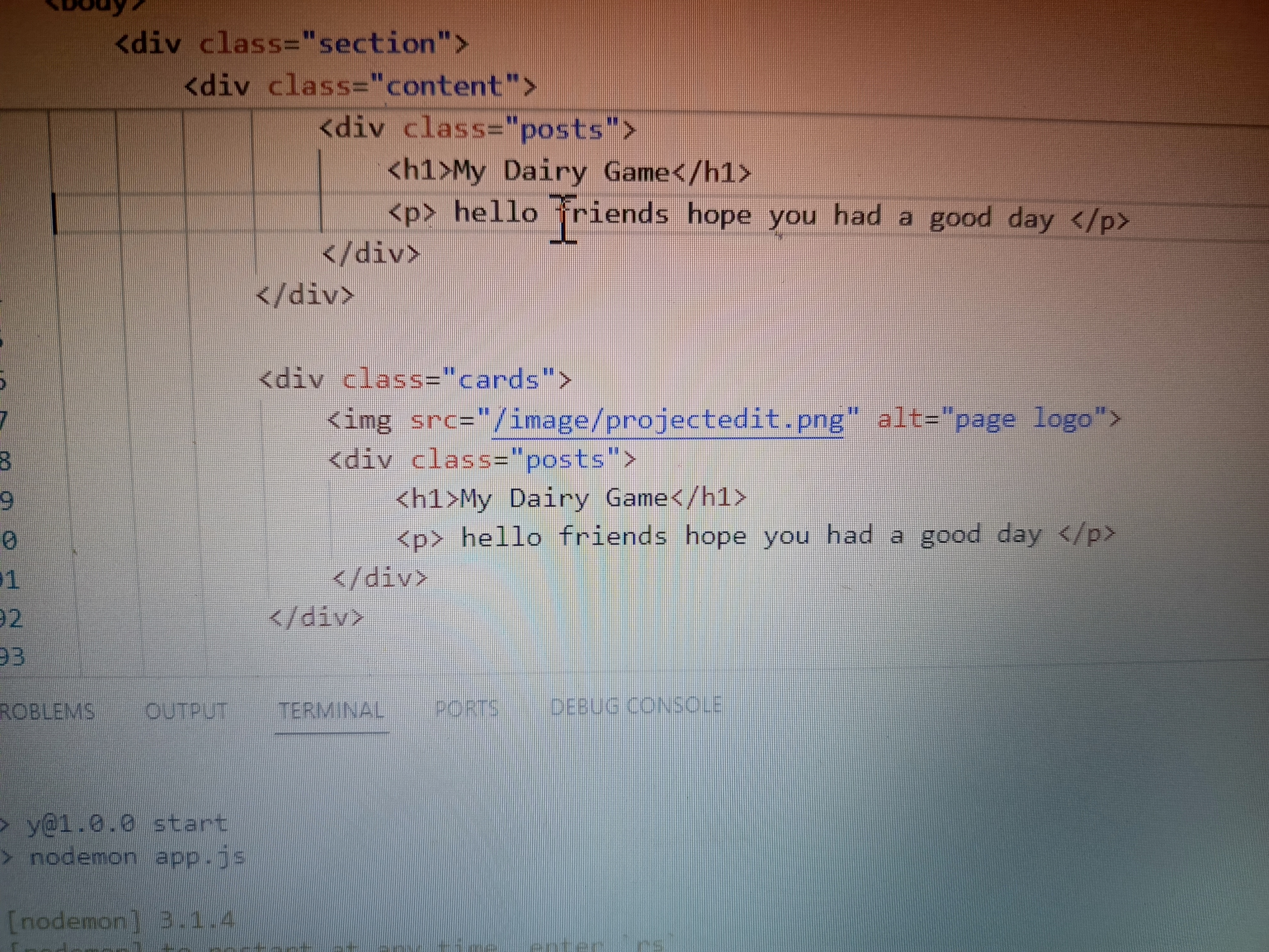
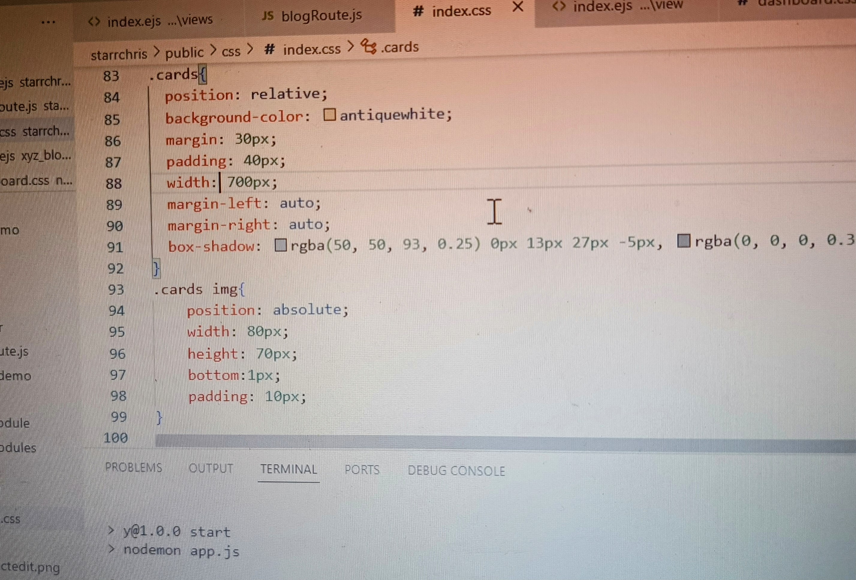
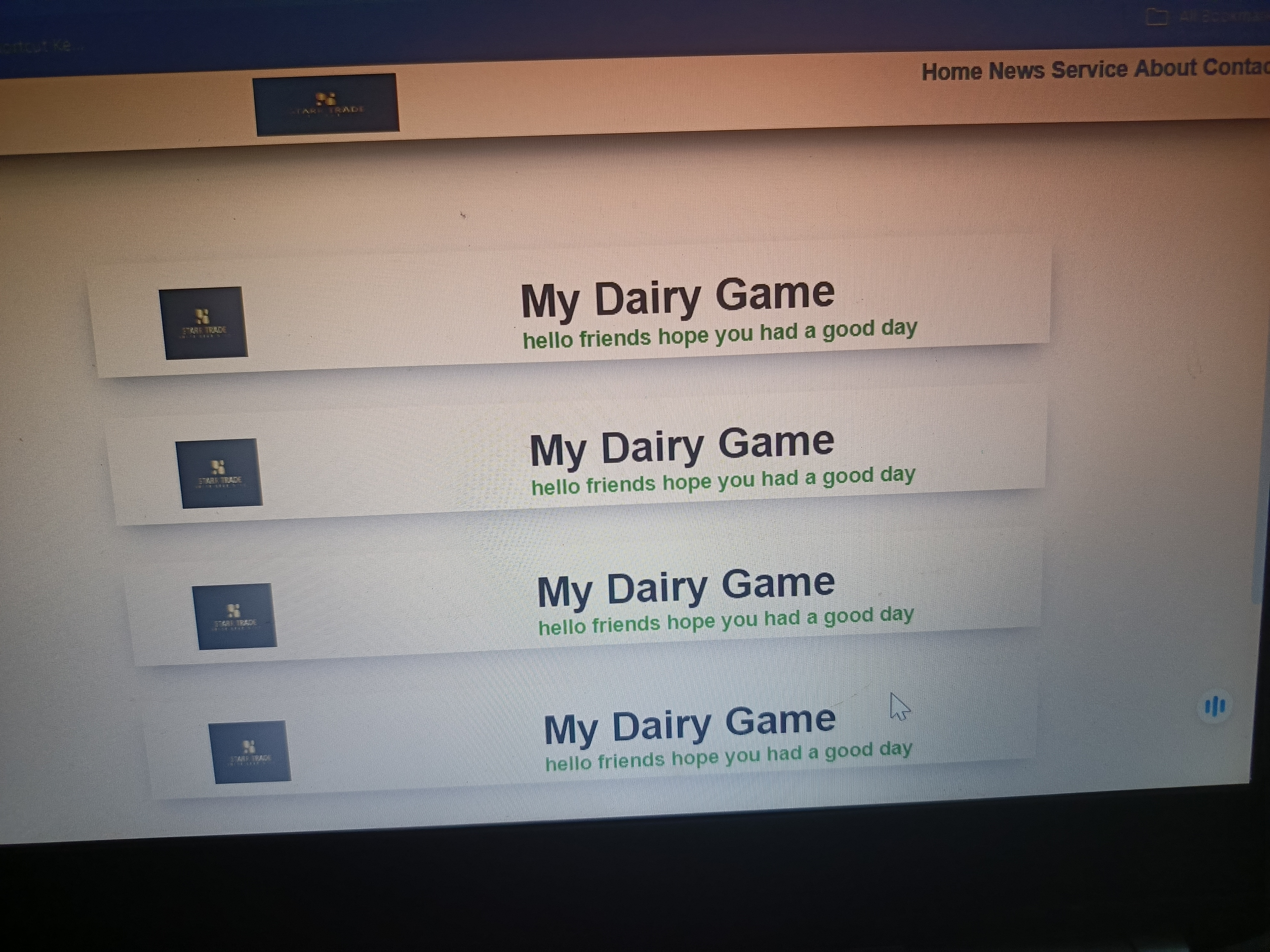



Yes, using CSS selectors, we can organize our page and present it well. These position and display properties help us create a good layout. I've learned and implemented a lot from this contest series, and I hope many people will participate. They must have learned a lot too. I'll also create my post soon and share it with everyone.
Very nice 👍
Here is my participation
https://steemit.com/hive-109435/@ahsansharif/3vzxyr-sec-s19w4-or-or-organization-using-css-box-model-display-position-flex
My homework link:
https://steemit.com/dynamicdevs-s19w4/@chasad75/sec-s19w4-or-or-organization-using-css-box-model-display-position-flex
My participation.
https://steemit.com/dynamicdevs-s19w4/@josepha/sec-s19w4-or-or-organization
My entry
https://steemit.com/hive-109435/@rafk/sec-s19w4-or-or-organization-using-css-box-model-display-position-flex
Here's my entry link:
https://steemit.com/dynamicdevs-s19w4/@hudamalik20/sec-s19w4-or-or-organization-using-css-box-model-display-position-flex
https://steemit.com/burnsteem25/@simonnwigwe/sec-s19w4-or-or-organization-using-css-box-model-display-position-flex
Here's my entry
https://steemit.com/dynamicdevs-s19w4/@growwithme/sec-s19w4-or-or-organization-using-css-box-model-display-position-flex