Pay Attention To The Message The Yield Curve Is Sending
Do you love #volatility yet?
Last week the market swung wildly back on forth on “trade talks,” “tariff relief,” inverted yield curves, and recession fears to finish the week on “hopes” banks will rescue the markets once again.
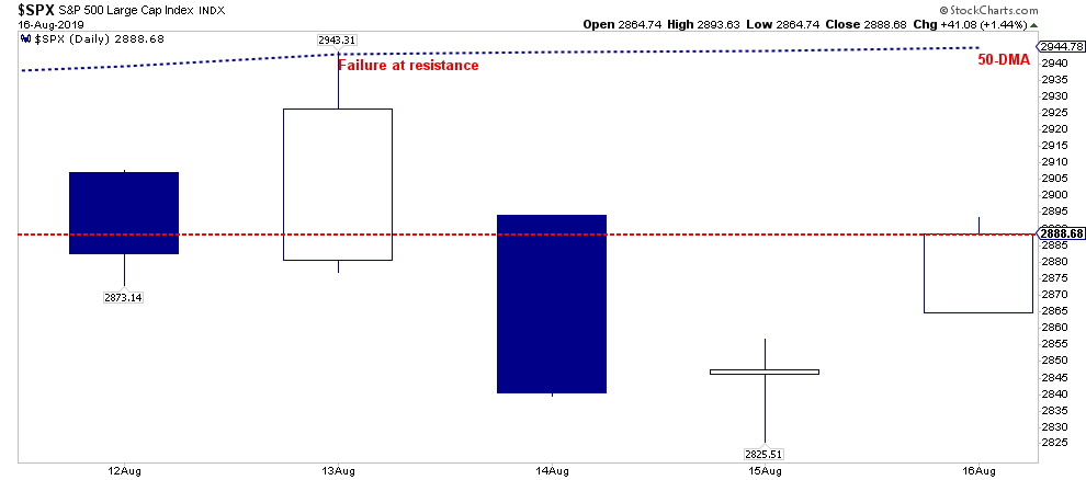
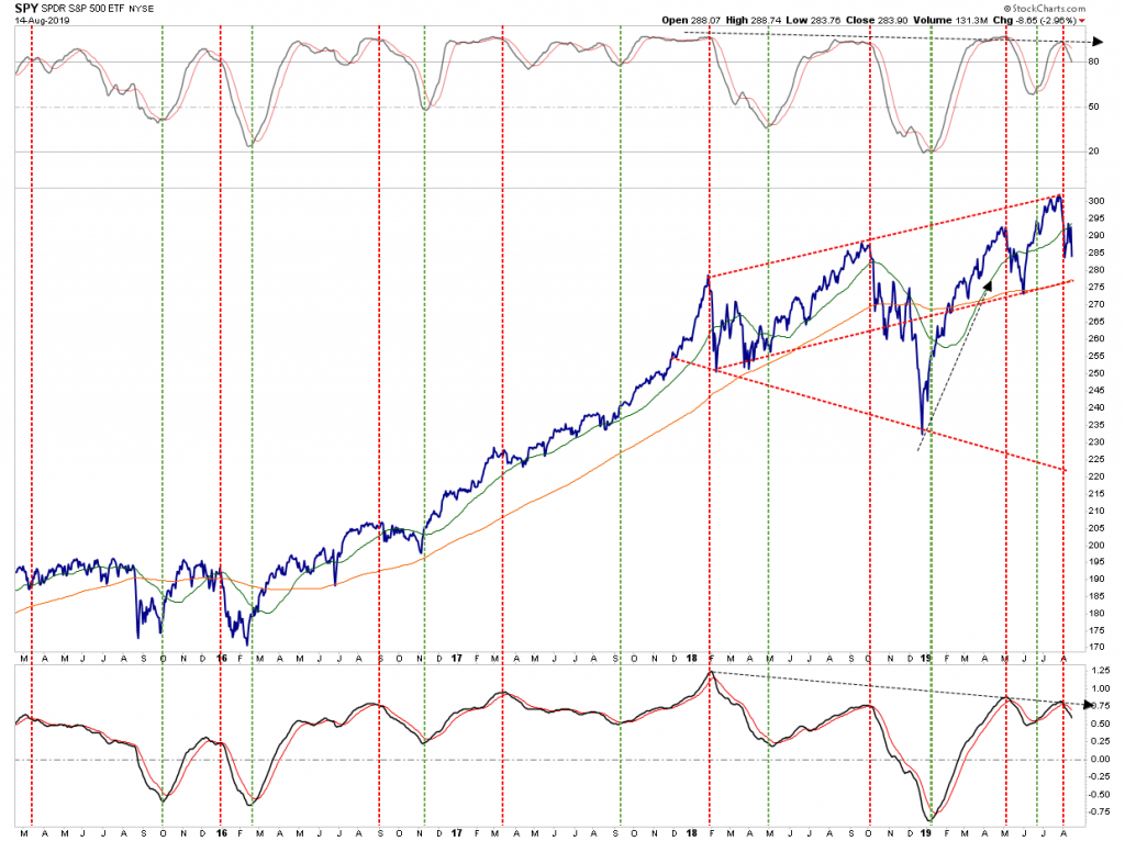
The bounce on Friday, was not unexpected as the market had gotten very oversold on a short-term basis. As shown in the chart below, the bounce off support gives the market a little room to the upside before several levels of resistance kick in.
This oversold condition is why we took on a leveraged long position on the S&P 500 which we discussed with our RIAPRO subscribers on Thursday morning (30-Day Free Trial).:
“I added a 2x S&P 500 position to the Long-Short portfolio for an ‘oversold trade’ and a bounce into the end of the week. We will re-evaluate the holding tomorrow.”
We are holding the position over the weekend, as there is still room in the current advance for further gains. Also, given the President is fearful of a market decline, we expect there will be some announcement over the weekend on “trade relief” to support the markets.
However, this does NOT negate our commentary from last week suggesting this remains a “sellable rally.” To wit:
“The market is oversold on a short-term basis, and a rally from current support back to the 50-dma is quite likely.
Again, that rally should be used to reduce risk. I wrote about this on Tuesday in “5-Reasons To Be Bullish (Or Not) On Stocks:”
“For longer-term investors, it is worth considering the historical outcomes of the dynamics behind the financial markets currently. The is a huge difference between a short-term bullish prediction and longer-term bearish dynamics. As Howard Ruff once stated:
“It wasn’t raining when Noah built the ark.”
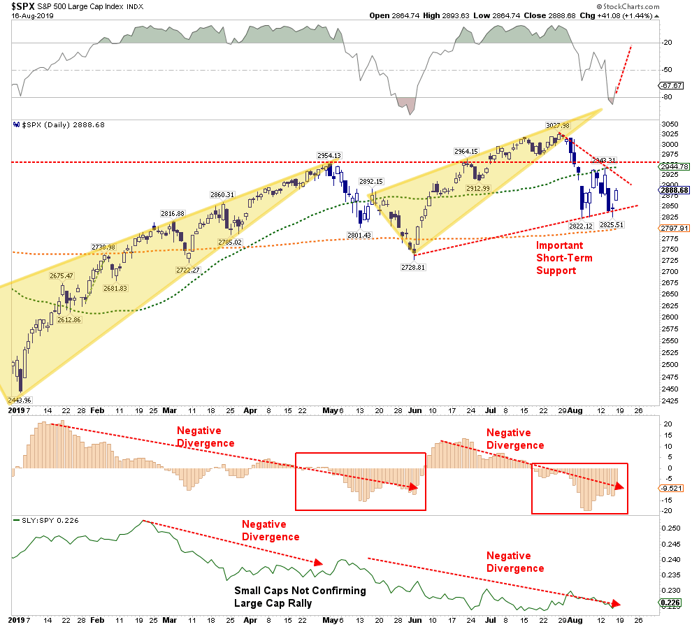
Notice that while the market has been rising since early 2018, the momentum indicators are negatively diverging. Historically, such divergences result in markedly lower asset prices. In the short-term, the market remains confined to a rising trend which is running along the 200-dma. At this juncture, the market has not violated any major support points and does currently warrant a drastically lower exposure to risk. However, the “sell signals” combined with negatively diverging indicators, suggest a “reduction” of risk, and hedging, is warranted on any rally.”
**With sell signals in place, maintaining higher levels of cash, hedging, and holding fixed income continues to provide benefits. **
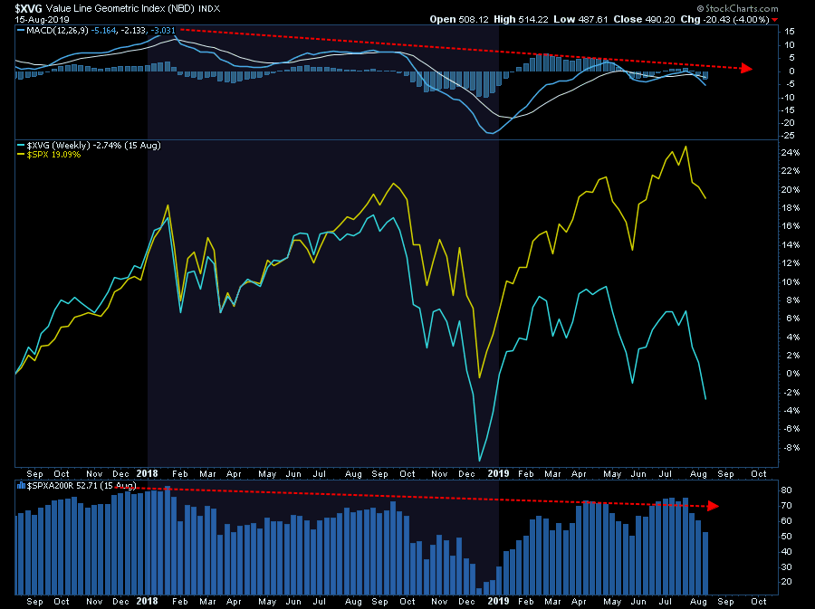
This is particularly the case given the narrowing participation in the broader market. While the S&P 500 is still holding up, that is due to crowding into the largest of market-capitalization-weighted stocks. If you look at the Valueline Geometric Index, there is substantially more damage being done beneath the surface which is supportive of falling yields as money seeks safety. The negative divergences continue to suggest a higher level of caution.
While the market did “bounce” on Friday, the media was quick to suggest it was something more than just a “bounce.” Here is the WSJ:
“The move came on top of gains on Thursday and seemed to reflect a belief that, just maybe, the U.S. economy isn’t in as much trouble as some investors had feared.”
Be careful falling into that trap.
Let’s get into our analysis for this week.
Listen To The Yield Curve Message
On Wednesday, CNBC ran the following headline:
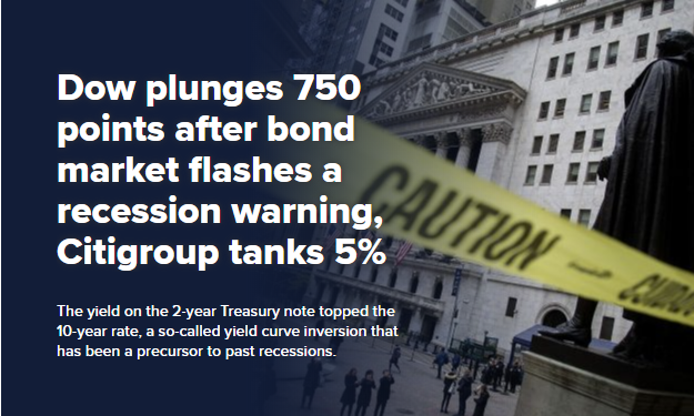
“Stocks plunged on Wednesday, giving back Tuesday’s solid gains, after the U.S. bond market flashed a troubling signal about the U.S. economy.” – CNBC
On Thursday, CNBC runs the following headline:
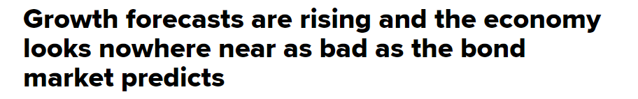
“Economists ratchet up their GDP forecasts for the third quarter to a median 2.1% after a batch of better-than-expected data, according to to the CNBC/Moody’s Analytics Rapid Update. The data paints a picture of an economy that looks nowhere near as bad as recent action in the bond market would suggest, and economists say it’s the strength of the U.S. consumer driving the economy. The manufacturing sector does show signs of strain, but the consumer is two-thirds of the economy and it is pulling its weight.”
So, which message is correct?
Let’s start with the economic data, which is showing a stronger than expected economy. The 6-charts below are the major measures of the economy most viewed by economists.
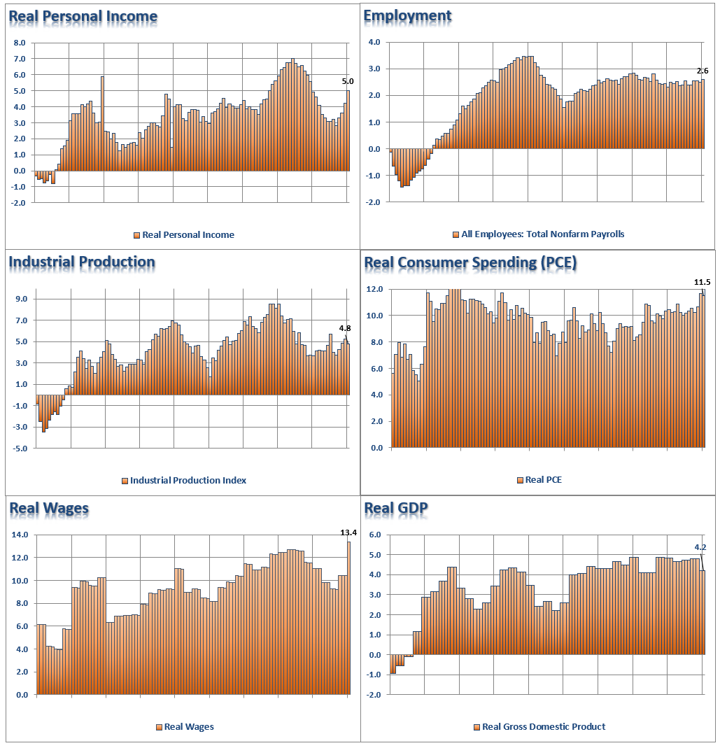
Clearly, there are NO signs of recession currently:
- 5% annualized real personal income growth
- 2.6% annualized employment growth
- 4.8% annualized industrial production growth
- 11.5% annualized real personal consumption expenditure growth
- 13.4% annualized growth in real wages
- 4.8% annualized real GDP.
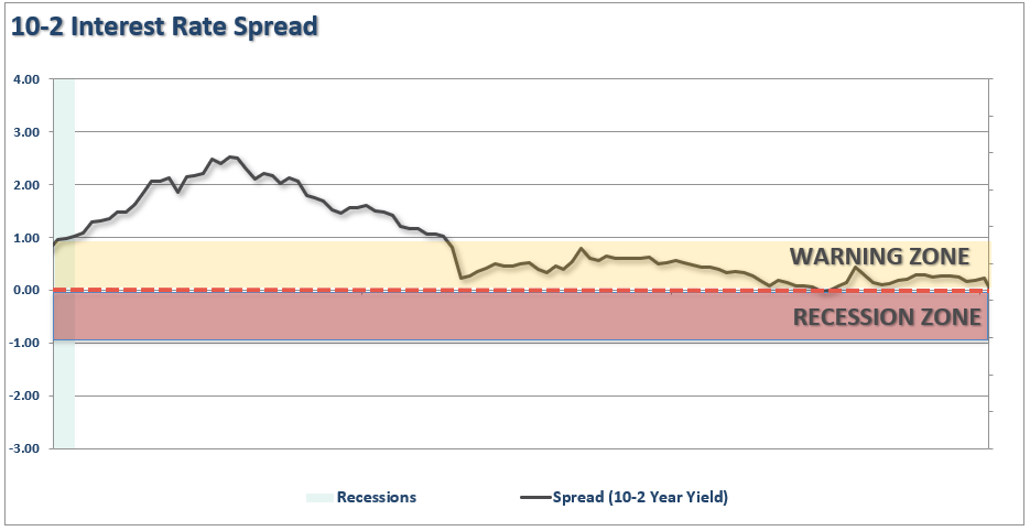
Yet, the yield curve is close to inverting.
So, which indicator is right?
As an investor, should you be betting on the economic data, or the “yield curve?”
My apologies, I forgot to add the X-Axis to the charts above. (Not really, it was intentional)
That time frame is 1991 though 1999.
I don’t need to remind you what happened next.
Now, which indicator would you follow? The yield curve?
How about the stats in December 2007?
- 1.4% annualized real personal income growth
- 0.8% annualized employment growth
- 2.2% annualized industrial production growth
- 4.6% annualized real personal consumption expenditure growth
- 5.7% annualized growth in real wages
- 2.0% annualized real GDP.
Again, there is clearly no recession in sight, right?
Here is the yield curve from 2003-2008

So, how about today.
CNBC says the consumer is strong, and the yield curve is wrong.
Here is the 6-panel chart of the current economic cycle to compare to the chart above.
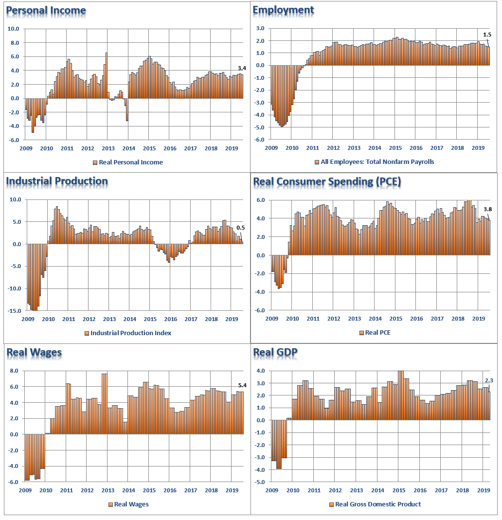
(It is worth comparing the markedly weaker economic growth statistics between today and the late 90’s. This goes a long way in explaining the disparity of wealth in the country today and surging debt levels.)
Here are the final stats as of the latest reports:
- 3.4% annualized real personal income growth
- 1.5% annualized employment growth
- 0.5% annualized industrial production growth
- 3.8% annualized real personal consumption expenditure growth
- 5.4% annualized growth in real wages
- 2.3% annualized real GDP.
To CNBC’s point, based on this lagging, and currently unrevised, economic data, there is “NO recession in sight,” so you should be long equities, right?
Here is that pesky yield curve again. (2009-Present)
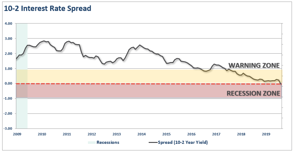
Which indicator should you follow?
The yield curve is an easy answer.
While everybody is “freaking out” over the “inversion,” it is when the yield-curve “un-inverts” that is the most important.
The chart below, shows that when the Fed is aggressively cutting rates, the yield curve un-inverts as the short-end of the curve falls faster than the long-end. (This is because money is leaving “risk” to seek the absolute “safety” of money markets, i.e. “market crash.”)
As noted above, the current economic data is only a “guess” about the current economy. In the next 12-months, we will see the “revised” data, but the yield curve is already telling you it will be weaker.
Just as in December 2007, there was “no recession.” It wasn’t until December 2008 that the data was revised, and the National Bureau of Economic Research (NBER) announced the recession had begun a full year earlier in December 2007.
By the time the announcement was made, it did little to help investors avoid the damage. The chart below is the historical track record of recession dating and market turns.
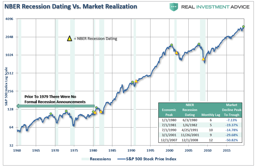
Despite commentary to the contrary, the yield curve is a “leading indicator” of what is happening in the economy currently, as opposed to economic data which is “lagging” and subject to massive revisions.
More importantly, while the consumer may be continuing to support growth currently, such can, and will, change dramatically when job losses begin to occur. Consumers are fickle beasts, and when a change in psychology occurs, it will happen very rapidly.
No One Ever Says Sell
Mark Kolanovic of J.P. Morgan penned:
“Historically, equity markets tended to produce some of the strongest returns in the months and quarters following an inversion. Only after [around] 30 months does the S&P 500 return drop below average,”
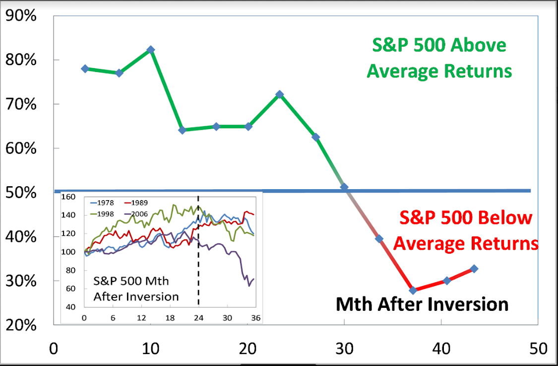
While the statement is not incorrect, it is advice that will ultimately lead to disappointment.
As discussed, in 1998 there was “no recession in sight,” and investors were repeatedly advised to ignore the yield curve because “this time was different.” Over the next two years, that advice held true as bullish optimism seemed well-founded. It was in early 2000 that Jim Cramer issued his Top 10-Stock Picks for the next decade.
**The problem was that no one ever said “sell.” **
While gains were made during the period between the initial yield curve inversion and the peak of the market, all of those gains, plus much more, were wiped out in the ensuing decline. By the time the selling was done, portfolio values had reverted to where they were roughly a decade earlier.
Since the majority of mainstream financial advice never suggest selling, investors had no clue that if they had gone to cash in 1998, they saved themselves both much grief, and years of losses to recover.
Following the “Dot.com” crash, the entire tragic event was considered an anomaly; a once-in-a-100-year event which would not be replicated anytime again soon.
Unfortunately, just 4-years later, in 2006, investors were once again told to ignore the yield curve inversion as it was a “Goldilocks economy” and “sub-prime mortgages were contained.” While many of the individuals who had told you to stay invested leading up to 2000 peak were mostly gone from the industry, a whole new crop of media gurus, and advisors, once again told investors to “ignore the yield curve.”
For a second time, had investors just sold when the yield curve inverted, the amount of damage that would have avoided more than paid off for the small amount of gains missed as the market cycle peaked.
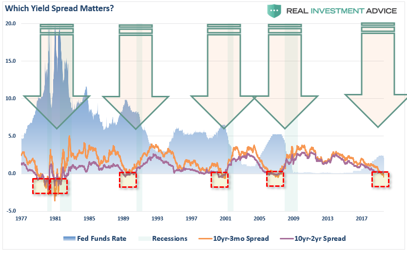
This quad-panel chart below shows the 4-previous periods where 50% of 10-different yield curves were inverted. I have drawn a horizontal red dashed line from the first point where 50% of the 10-yield curves we track inverted. I have also denoted the point where you should have sold and the subsequent low.
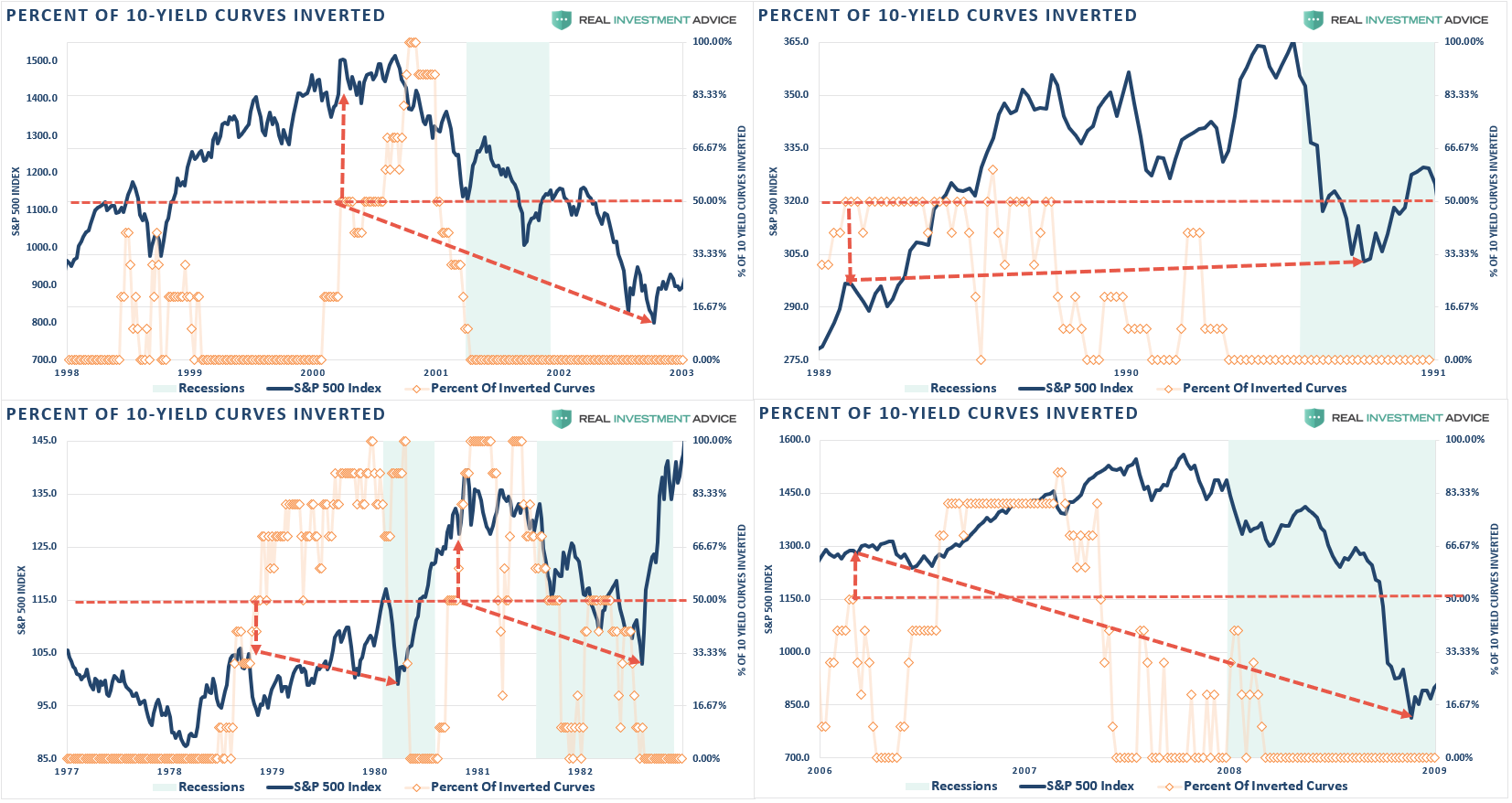
As you can see, in every case, the market did rally a bit after the initial reversion. However, had you reduced your equity-related risk, not only did you bypass a lot of market volatility (which would have led to investor mistakes) but ended up better off than those trying to “ride it out.”
That’s just history
Oh, as we noted last week, we just hit the 80% mark of inversions on the 10-spreads we track. (Historically, there has never been a point where 80% of yield curves were inverted that a recession wasn’t pending.)
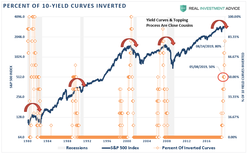
This time is unlikely to be different.
More importantly, with economic growth running at less than 1/2 the rate of the previous two periods, it will take less than half the amount of time for the economy to slip into recession.
The yield curve is sending a message which shouldn’t be ignored, and it is a good bet that “risk-based” investors will act sooner rather than later. Of course, it is simply the contraction in liquidity which causes the decline that will eventually exacerbate the economic contraction.
While it is unwise to use the “yield curve” as a “market timing” tool, it is just as unwise to completely dismiss the message it is currently sending.
Moreover, I am certainly NOT suggesting you sell everything and go to cash today. However, history is pretty clear that you will likely not miss much if you did.
https://realinvestmentadvice.com/pay-attention-to-the-message-the-yield-curve-is-sending-08-16-19/
You have a new follower
Nice content good post 👍👌
61.19$ has been spent to promote this content using Steemium.
Learn more here!
Yes people need to be paying attention to this.
Most just look at the 4 hour chart.
ZOOM OUT
Upvoted!
Sounds like the world is about to become exponentially violent.
With so many people destitute, those with Gold, Silver, BTC will be major targets.