Crypto Academy / Season 4 / Week 1 - Homework Post for [@sapwood]. Onchain Metrics
Image edited by me in Powerpoint
1- What is a HODL wave, how do you calculate the age of a coin(BTC, LTC) in a UTXO accounting structure? How do you interpret a HODL wave in Bull cycles?
The color classification is as follows:
- Warm colors: red, orange, and yellow represent the most recently traded crypto assets (hours, days, weeks, few months).
- Cool colors: purple, blue, green, and light yellow represent crypto assets with no transactions made or movement in a long time (months, years, a decade)
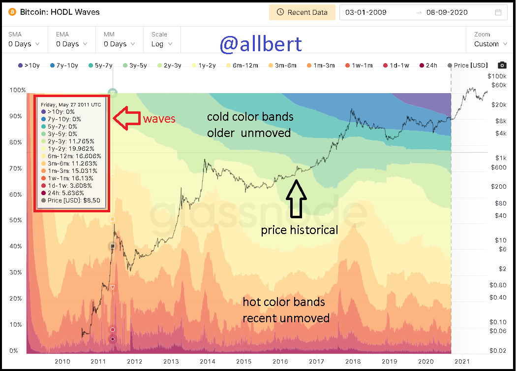
HODL Waves. Image taken from my Glassnodestudio account. Source
To each of these bands corresponds a period of time stipulated by the graph. In the graph we also find a black line corresponding to the evolution of the price (logarithmic growth) with which we can see in contrast the relationship of the price change concerning the behavior of the bands (exchange and accumulation).
How do you calculate the age of a coin?
The calculation is purely graphical and is performed by reading and interpreting the color bands. The bands provide us with the activity ratio of the currency. Fortunately for us, the structure of the indicator shows us through a box how much percentage of the cryptocurrency has moved for each of the bands at any given point. For example: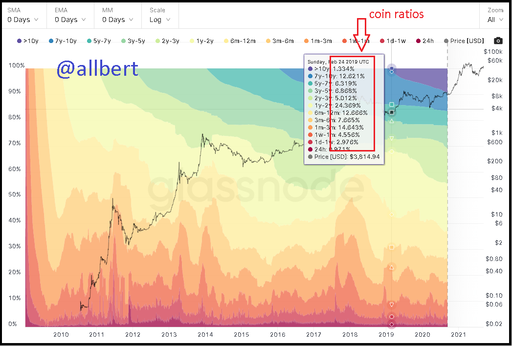
HODL Waves. Image taken from my Glassnodestudio account. Source
If we place ourselves at a point at the beginning of 2019 (the year in which the 10-year band first appears), specifically on Sunday, February 24, we can see that the radius of movement (age) for each band was:
- 10 years: 1.3%.
- 7 - 10 years: 12.6%.
- 5 - 7 years: 6.3% .
- .
- 1 - 2 years: 24.3% .
- .
- 3 - 6 months: 7.6% .
- .
- 1 day - 1 week: 2.9% .
How do you interpret a HODL wave in Bull cycles?
We must first start from the fundamental law of the market, the law of supply and demand. For a Bull cycle to occur, obviously the price must go up and up; and for this to occur (based on the law of supply and demand) there must be a shortage of the asset, or in other words, demand must increase due to the lack of circulating assets. Precisely the HODL wave is an indicator of accumulation and movement of the asset and shows us this through its bands, so during the Bull cycles, we will observe a widening of the older bands (cold colors) which in turn is interpreted as an increase in the percentage of coins that are been accumulated in a long time... and thus increasing demand.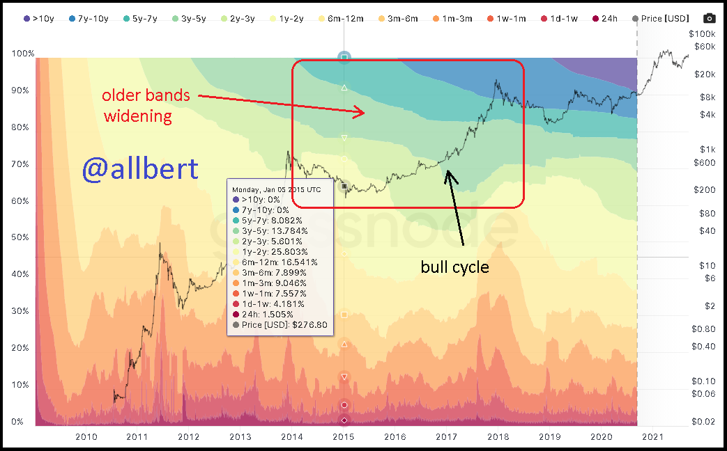
HODL Waves. Image taken from my Glassnodestudio account. Source
2- Fundamental Analysis Model
On the other hand, all on-chain data and graphs are taken from my Santiment account.
Daily Active Addresses
Short-term (3 months)
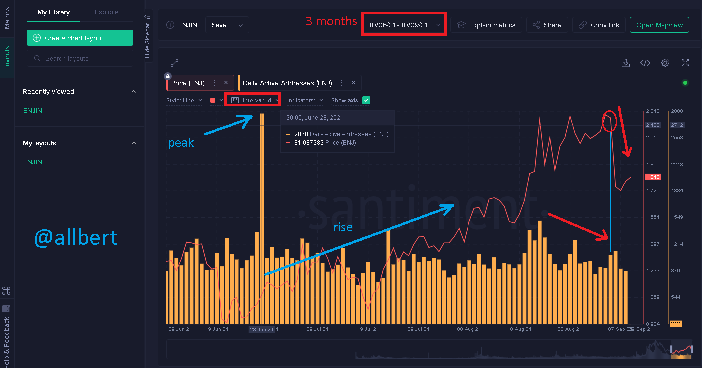
Daily Active Addresses. Image taken from my Santiment account. Source
On the short-term chart, we can see that the number of Active Addresses peaked on June 28th (2860), which coincides with one of its lowest price points (1.08 USD). However thanks to this spike in Daily Active Addresses, the price started to increase over the next 3 months.
As August 18 arrived the amount of Daily Active Addresses started to decrease, however, the price remained around 2 USD. However as a consequence of this, about a month later, on September 7 the price of ENJ dropped to 1.8 USD.Long term (3 years)
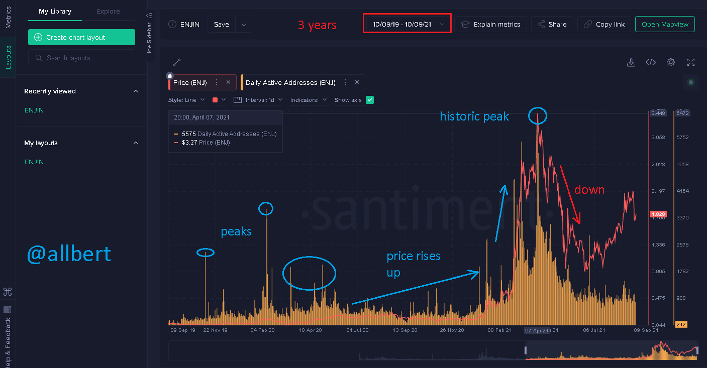
Daily Active Addresses. Image taken from my Santiment account. Source
Transaction Volume
In the case of transaction volume, it is expected to see that the price action will not vary immediately after a peak in transaction volume, in other words, the price action will react with some delay and in response to the movement of transaction volume.Short-term (3 months)
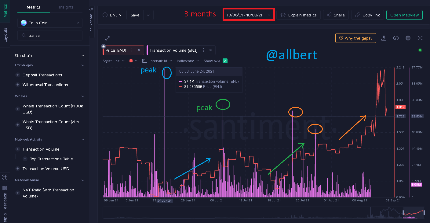
Transaction Volume. Image taken from my Santiment account. Source
Long term (3 years)
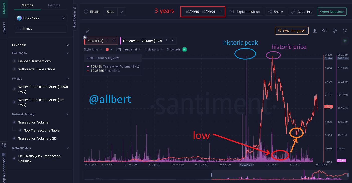
Transaction Volume. Image taken from my Santiment account. Source
NVT
The NTV or Network Value to Transaction Ratio graph shows the value of the asset concerning the market. Therefore, the graph generates high peaks and low peaks that represent that the asset is overvalued or undervalued. Whereby, after the NTV shows a high peak (overvalued), the price is expected to fall, and conversely when the NTV shows a low peak (undervalued), the price should rise.Short-term (3 months)
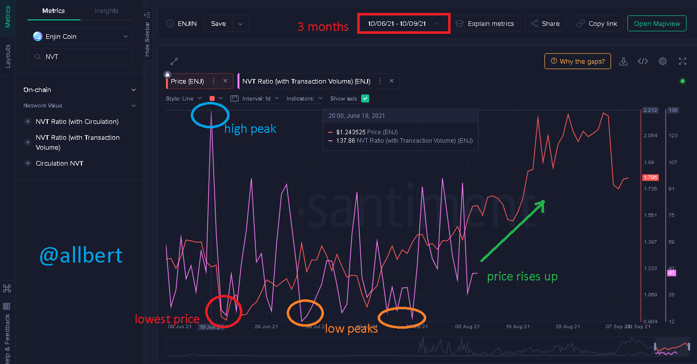
NVT. Image taken from my Santiment account. Source
Long term (3 years)
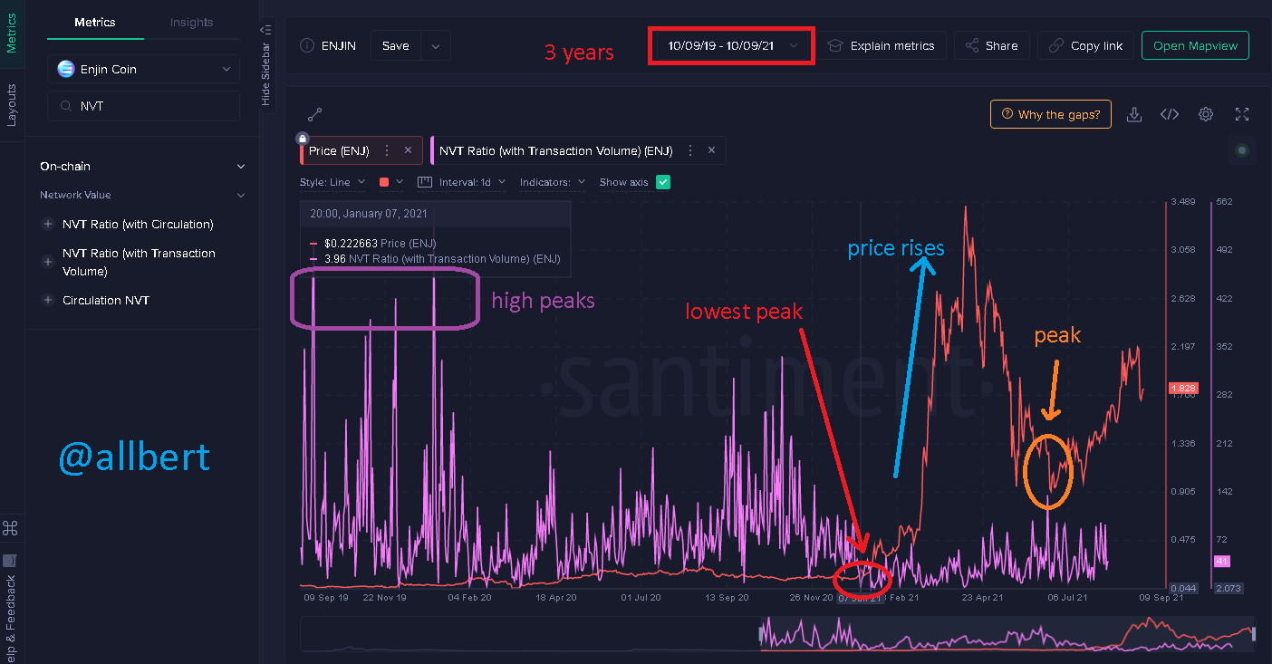
NVT. Image taken from my Santiment account. Source
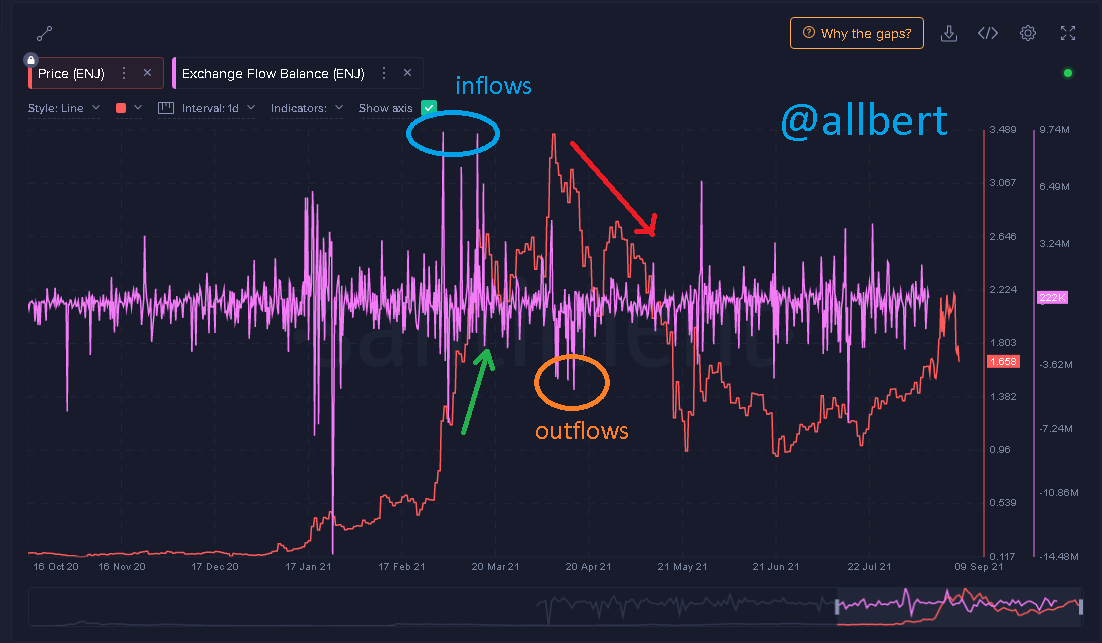
Exchange Flow Balance
This indicator is personally one of the ones I like the most and one of the first I understood. Again we will rely on the law of supply and demand. Exchange Flow Balance refers in simple terms to the balance between the number of coins entering and leaving an Exchange. It is expected that the more coins entering the Exchange the more supply there will be because there will be more assets in circulation. When the supply goes up, naturally the price will tend to go down, thus a bearish cycle will occur. On the other hand, the more coins leave the Exchange the less supply there will be and the more demand there will be due to the lack of circulation of the asset in the market. When demand rises the price will tend to rise and produce bullish cycles.Short-term (3 months)
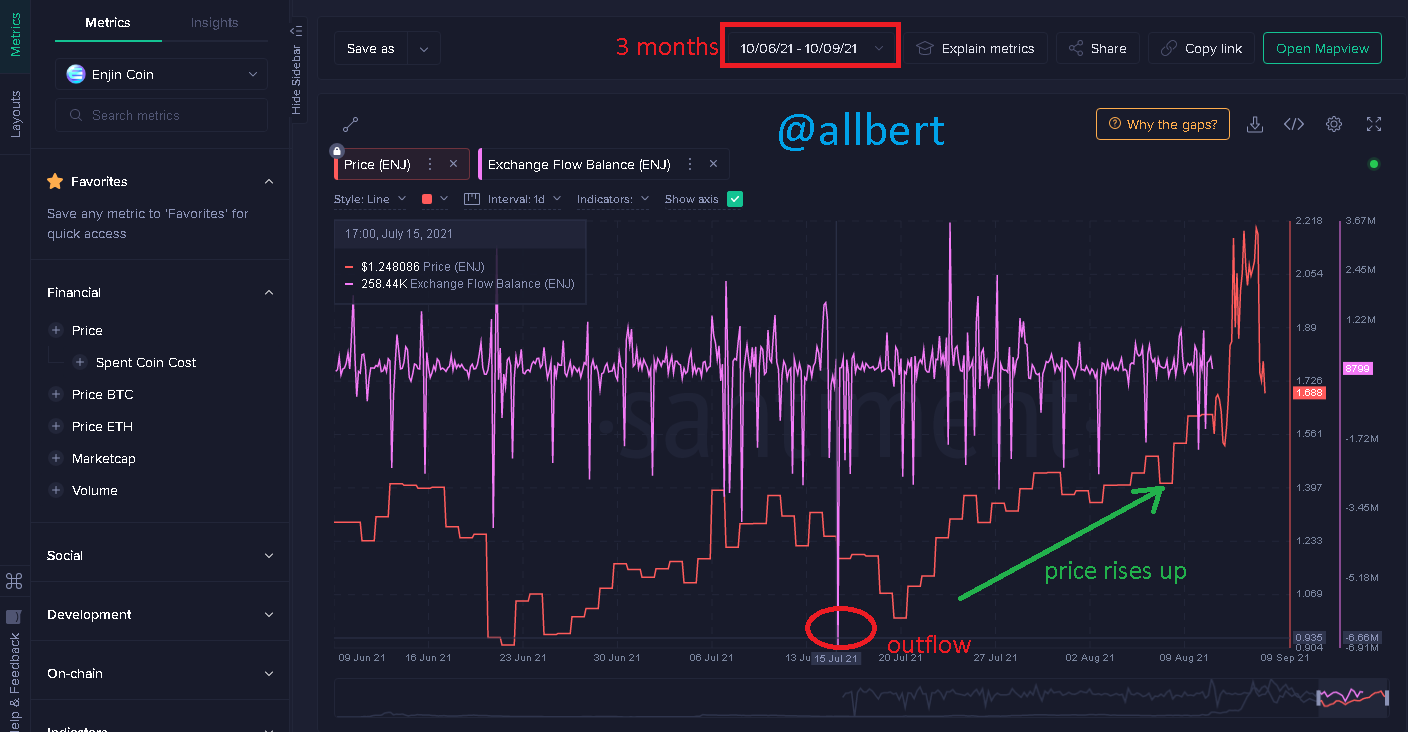
Exchange Flow Balance. Image taken from my Santiment account. Source
Long term (3 years)
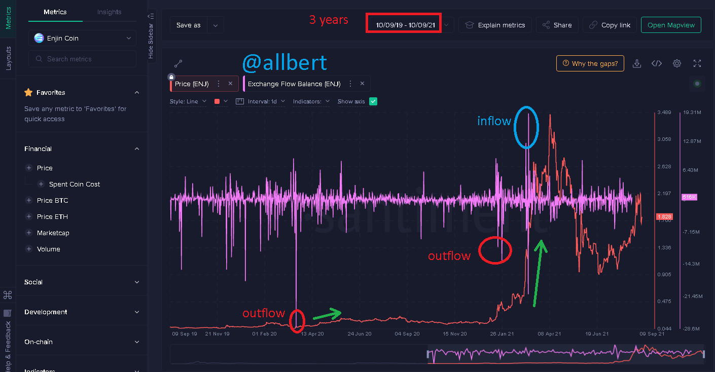
Exchange Flow Balance. Image taken from my Santiment account. Source
Then, a new inflow period occurred in January 2021 which is related to the overwhelming price increase from 0.4 USD to 3.4 USD.
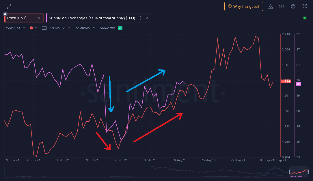
However, there are also inconsistencies in the signals, since at the beginning of March there was a massive inflow to the exchanges, and yet the price continued to rise until April, when, due to the supply of the asset, it began to fall.Supply on Exchanges as a percentage of Total Supply
This indicator, in the same way as the previous one, is a reflection of the supply in the exchanges, therefore it is expected that if it decreases, the price of the asset will increase. If, on the other hand, the percentage of Total Supply increases, the price will decrease.Short-term (3 months)
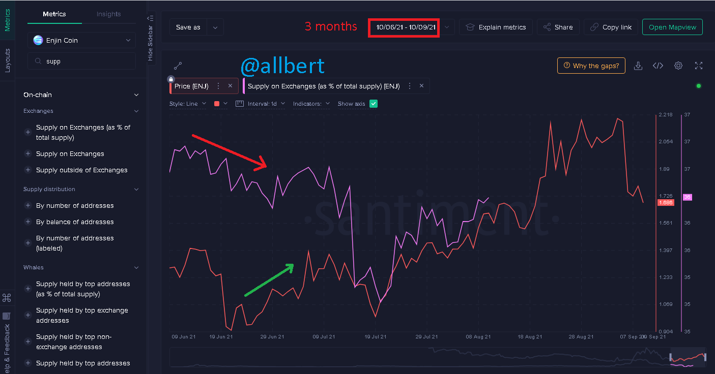
Supply on Exchanges as a percentage of Total Supply. Image taken from my Santiment account. Source
Long term (3 years)
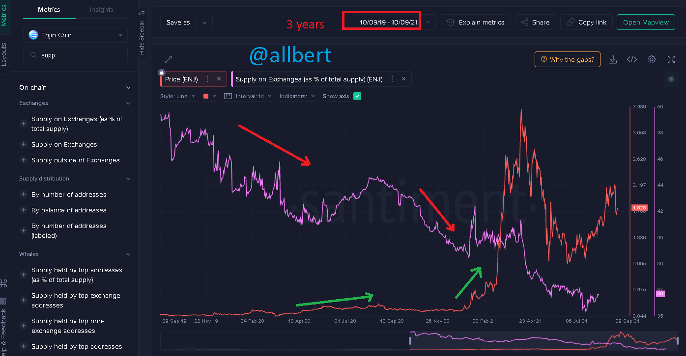
Supply on Exchanges as a percentage of Total Supply. Image taken from my Santiment account. Source
In fact, when the percentage of Total Supply has its steepest drop in January 2021, that is when the steepest price rise begins.
3- Are the on-chain metrics that you have chosen helpful for short-term or medium-term or long term(or all)? Are they explicit w.r.t price action? What are its limitations? Examples/Screenshot?
Inconsistency 1.Image taken from my Santiment account. Source
 Inconsistency 2.Image taken from my Santiment account. Source
 Limitations
Firstly I should again point out that the selected asset (ENJIN COIN) Is relatively new (2017) relative to other currencies. So this in itself represents a limitation since compared to Bitcoin or Ether, for example, there is not enough data available for this cryptocurrency to give more accurate historical data.
Another limitation is that if you don't know, ENJIN started with an ICO in 2017, and sometimes projects coming from an ICO do not possess reliable data.Remember that the purpose of an ICO is to gain capital through an offering where the developers of the project want to show an image of greatness and profitability. However not all the time this happens, so some projects alter the data that then serve as the basis for the platforms that generate the on-chain metrics. So we cannot be completely sure that all the data is true.
Finally, we must clarify that some indicators such as Exchange Flow Balance and Supply on Exchanges as a percentage of Total Supply are not absolute data, but reflect a limited spectrum of the entire real movement of the asset in the market. Still these on-chain metrics are a relative but not 100% accurate measure.Conclusion
As I said before, on-chain metrics are wonderful tools to complement our analysis and to be able to see data or information that remains hidden to most people.
This hidden information, if well interpreted can give us a great advantage over the rest of the traders, however, there are some principles that we must manage.
Personally, I believe that fundamental analysis is best done on a long-term basis, therefore we should always take time periods in our charts that show us the complete development of the asset over time. On the other hand, it is not enough to handle only one on-chain metric scam, it is necessary to know how to use and interpret several, as all together they can give us a more correct view of the underlying data of an asset.The on-chain metrics are not 100% infallible, so if there is a false signal in one, it can be filtered out by looking at two or three others. The problem comes when we use only one because if there is a false signal, there will be no way to corroborate it.
Good day sir @allbert please don't keep me mute 🙏🙏🙏🙏
I'm really sorry 😭😭😭😭
What happened to @allbert?
I hope it's not worst?
😭😭😭😭😭
Hello professor @allbert, I haven't once used bid vote to gain reputation. Please reChecked clearly. The attempt was meant to verify something else entirely. And ofcoz I wasn't voted.
This happened before the rules.
I verified what I wanted to clear out and Fortunately I wasn't voted while I carried out my task.
You can see I didn't give a second try, even though i wasn't aware it will be included in the rules for the academy
That's why other professors marked my post and I was upvoted.
Please reverify
Thanks
Cc: @allbert
Cc: @sapwood