[ Effective Trading Strategy using Line Charts ]-Steemit Crypto Academy | S6W1 | Homework Post for @dilchamo

1. Define Line charts in your own words and Identify the uses of Line charts.
In technical analysis, we normally use the candlestick pattern because it gives more details to price movement. However, for simple analysis with less noise, it is best to use a chart pattern that provides basic information on price. This simple chart pattern is the line chart and is drawn as a line connecting the closing prices over a period. It filters out noise by not regarding distractions like opening price, high price and low price, but only showing closing prices.
The line chart shows price information as a linear connection of closing prices into a continuous line. Just like with a candlestick chart, the line chart shows price on the vertical axis plotted against time on the horizontal axis. Showing only closing prices, the line chart is drawn with a single line and is pretty simple to understand and use, even for amateur traders. It is especially useful in identifying good and strong resistance and support levels.
Uses of Line Charts
Line charts work really well in identifying strong resistance and support points, especially when used in combination with Moving Averages.
Filters out noise by not regarding distractions like opening price, high price and low price, but only showing closing prices.
2. How to Identify Support and Resistance levels using Line Charts (Demonstrate with screenshots)
Professional and experienced traders tap into strong support and resistance point to make entry and exit points in the market. These levels either denote prices at which building buying pressure is strong enough to barricade an asset from further declining in price or prices at which building pressure prevents an assets price from further sky rocketing.
To identify support and resistance levels using the line chart, we identify those points which price constantly retests but never breaks. For a support level, a horizontal line drawn to connect the points is below price movement and forms a barrier which price retests a couple of times but doesn’t break. For a resistance level, a horizontal line drawn to connect the points is above price movement and forms a barricade which price retests a couple of times but doesn’t break.
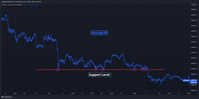
In the 30-min BTCUSDT chart above, we can see certain points marked in rectangles where price reverses to the upside after it hits these points. These are support points. They resist price moving further down because there is strong buying pressure at this points to push price up again and stop it from moving further down.
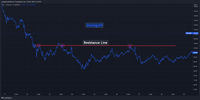
In the 15-min SOLSDT chart above, we can see certain points marked in rectangles where price reverses to the downside after it hits these points. These are resistance points. They resist price moving further up because there is strong selling pressure at this points to push price down again and stop it from moving further up.
3. Differentiate between line charts and Candlestick charts.( Demonstrate with screenshots)
The basic difference between line charts and candlestick charts is that whereas candlestick charts show more price information like opening price, high and low price, line charts simply use only closing price connected by a continuous line over a period of time.
Visually, we can see that a candlestick chart has candlesticks representing price information including the high, open, close and low price, whereas a line chart is represented by a continuous line drawn to connect closing prices over a period.
Showing only closing prices, a line chart is a lot more simpler to understand and use, and less prone to false signals by filtering noise. This is unlike in the case of a candlestick chart where opening, highs and lows could cause noise and lead traders to make decisions based on false signals.
Considering attention to detail, the candlestick chart provides more detailed information than the line chart. Hence in making research that requires information like opening, highs and lows, the candlestick chart would be the most appropriate. An example will be if we needed to calculate a moving averages value, we would need to use information from a candlestick chart since this is more detailed and will provide us more price information.
Looking at timeframes, line charts are mostly used on higher timeframes since traders that use line charts are mostly looking at price direction and not quick moves happening in the market in the present.
4. Explain the other Suitable indicators that can be used with Line charts.(Demonstrate with screenshots)
Indicators form a vital part of a trading strategy irrespective of whether you’re using a line chart or candlestick chart. However, instead of using any indicator, it is best to use indicators that suit the nature of a line chart. Let’s look at some of these indicators now.
Using The EMA With Line Chart
Let’s understand how moving averages work first before we take a practical example from a chart. Moving averages are widely used by traders for a variety of things: identification of resistance and support levels, and for identification of trend reversal signals.
We know that price makes retracements to moving averages as strong trends unfolds, whether bearish or bullish. The moving average marks support level when an uptrend retraces downwards to touch it before continuing in the uptrend, and a resistance level when a downtrend retraces upward to touch it before the downtrend continues.
To identify trend reversals, we look at the orientation or position of the moving average relative to the line chart. If the moving average crosses above the line chart, we can expect a downtrend soon, and an uptrend should be expected if the moving average moves below the line chart.
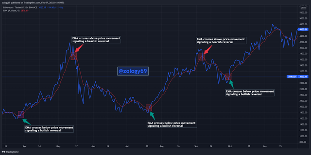
In the 1-day ETHUSDT chart above, we can see the EMA showing several reversal signals by either crossing below or above price movement indicated by the line chart. When the EMA crosses above the line chart, we’re signaled of a bearish reversal and a bullish reversal when the EMA crosses below the line chart.
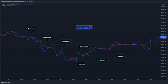
In the 30-min BTCUSDT chart above, we can see how the EMA shows us good resistance and support levels where the line chart bounces off of. Once the trend progresses in whatever direction, the line chart retraces the EMA to test resistance and support points to pave way for the trend to continue.
5. Prove your Understanding of Bullish and Bearish Trading opportunities using Line charts. (Demonstrate with screenshots)
Just like we use the candlestick pattern to sport trading opportunities, we can do same with the line chart in a much simpler approach. In identifying trading opportunities, it is generally better to look for scenarios with more confluence as this increases your chances of successful trades and helps filter false signals.
We understand that there are generally 2 market movements: bullish and bearish. I will be demonstrating some trading opportunities with these two market trends using line charts.
Bullish Trading Opportunity Using Symmetrical Triangle In Confluence With EMA.
Since I already explained how a moving average works, let’s now understand how a symmetrical triangle works. A symmetrical triangle has price making lower highs and higher lows. This causes a downward sloping resistance line and upward sloping support line. Symmetrical triangles are mostly trend continuation signals. If a symmetrical breaks out in the upward direction, that is a bullish signal and a bearish signal if it breaks out in the downward direction.
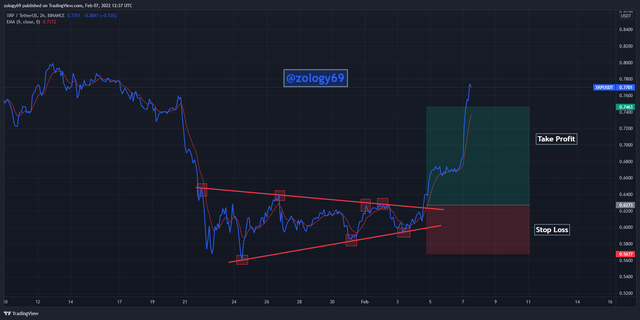
In the 2-hour XRPUSDT chart above, we can see I used the EMA with a symmetrical triangle to identify a trading opportunity. We see that the EMA crosses below the line chart signaling a bullish trend and this is immediately confirmed by the symmetrical triangle breaking out in the upward direction, giving more confluence. Entry is made at the point which the symmetrical triangle breaks out with a stop loss placed just below the triangle support line and take profit at a 1:2 R:R.
Bearish Trading Opportunity Using Descending Triangle In Confluence with EMA
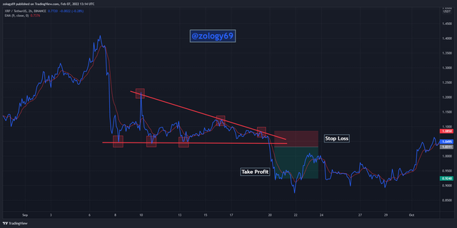
In the 2-hour XRPUSDT chart above, we can see I used the EMA with a descending triangle to identify a trading opportunity. We see that the EMA crosses above the line chart signaling a bearish trend and this is immediately confirmed by the descending triangle breaking out in the downward direction, giving more confluence. Entry is made at the point which the descending triangle breaks out with a stop loss placed just above the triangle resistance line and take profit at a 1:2 R:R.
6. Investigate the Advantages and Disadvantages of Line charts according to your Knowledge.
The simplicity of line charts gives it great advantages, but at the same time, puts it at some level of disadvantages too. Let’s talk about them.
Advantages of Line Charts
Simplicity: From the beginning of my publication to this point, I have stressed a lot on the fact that line charts are simple to read and interprete even for beginners.
Prevents “paralysis by analysis”: Paralysis by analysis is something that occurs when a trader becomes confused by the availability of too much information, in this case too much price information. Since line charts only show closing prices, information is brief and precise but enough to make trade decisions.
Filters out noises: noise and distractions that could be caused by extra price information like opening, highs and lows are eliminated since the line chart will only show you closing prices. The line chart is also generally preferred to be used on higher timeframes which shows price action more clearly.
Easy identification of support and resistance levels: Most traders especially amateur traders who do not understand candlestick structure fumble with identifying support and resistance levels because the candlestick is divided into several parts and they’re confused which parts to connect to make the resistance and support levels. With line charts, is more visual and easier to identify these points.
Disadvantages of Line Charts
Simplicity: Now you’re probably going to be thinking “but you said that was an advantage”. Yes, it is both an advantage and a disadvantage. The fact that the line chart is too simple means that it doesn’t provide enough information for a trader to make good trade decisions.
Restricts Trading Strategies: Some trading strategies require extra price information like open, highs and lows. Also, to calculate indicator values for example, we will need this information. Placing stop loss and take profit will also require more price data than just a closing price.
Timeframe Restrictions: The line chart works best in higher timeframes and has a lot of noise when used over a shorter time frame.
Narrow Attention To Detail: The line chart leaves out a chunk of important price data that might be critical in making trade decisions.
The line chart is a very simple way to look at market action if you’re a trader doesn’t need too much detail. Also amateurs who are confused by the detailed information candlestick charts provide can use the line charts to first master their analysis before they proceed to learn to analyze the candlestick chart.
It is however important to note that the line chart comes with some disadvantages too. It is noisier when used on a shorter timeframe and it provides less information for traders whose strategies require analysis of open, high and lows.
CC: prof @dilchamo