You are viewing a single comment's thread from:
RE: FABRIANO® - Tiziano pastel paper - Prato
This makes so much sense! I remember painting white-on-white being so difficult—you have to tilt the paper at every angle just to find the missing spots. Even painting a wall white is a challenge because there are always those tiny spots that stay unpainted and you can't see them until the light hits just right!
I’ve seen videos where people layer crayons until they’re perfectly smooth; does using this textured paper mean you don't have to layer as much to get that effect? Also, I actually have a can of fixative spray I bought for a sticker project I gave up on.
The crayons can be used in different ways. It also depends on the type of cratyons you use. Some are hard while others are extremely soft and creamy and break as soon as you lift one. Mine (Rembrandt) are somewhere in between.
The idea indeed is to be able to add more layers on textured paper, but I do believe the sandpaper type is better, also wat more expensive.
I still don't see the benefit of this brand.
I just finished the portrait or should I say I gave up the stubborn paper won?
Here is the girl @aellly once drew. I believe mine looks more sad just like the original one, though it's by far not a copy. I also noticed that the pastel pencils not always cooperate on the layer of soft pastel I added with the crayons. Some colours only.
What do you think @iamguchidanart and @almaguer? If you ask me the zipper looks best. 🤣🤣🤣
@solperez here is the fun. @dreeyor what is your last drawing about?
Both drawings captured sad moments. I can’t really say which is more sad than the other ahhahahahha But one thing about the works is that it speaks and conveys a message which is so relatable to everyone.
We all experience sad moments in life. Conveying such expressions takes a lot of strength to pull.
Both drawings are the same painting. I continued with it.
If it comes to me I find faces always difficult. I will see if I can make the changes @aellly suggested. The paper has a very hard time to be covered and fill those spaces between the texture. I already added some hairspray.
I will give this one a new try in some time.
Thanks for stopping by.
Won't deny the person looks sad and but I think it's still looking nice.
Apart from the image for today's freewrite which is still coming up. This is what I'm working on.
Sorry for the smokes screen.
She should look sad, so does the actrice in the movie. Then at least that expression is good. Thanks for stopping by and the nice.
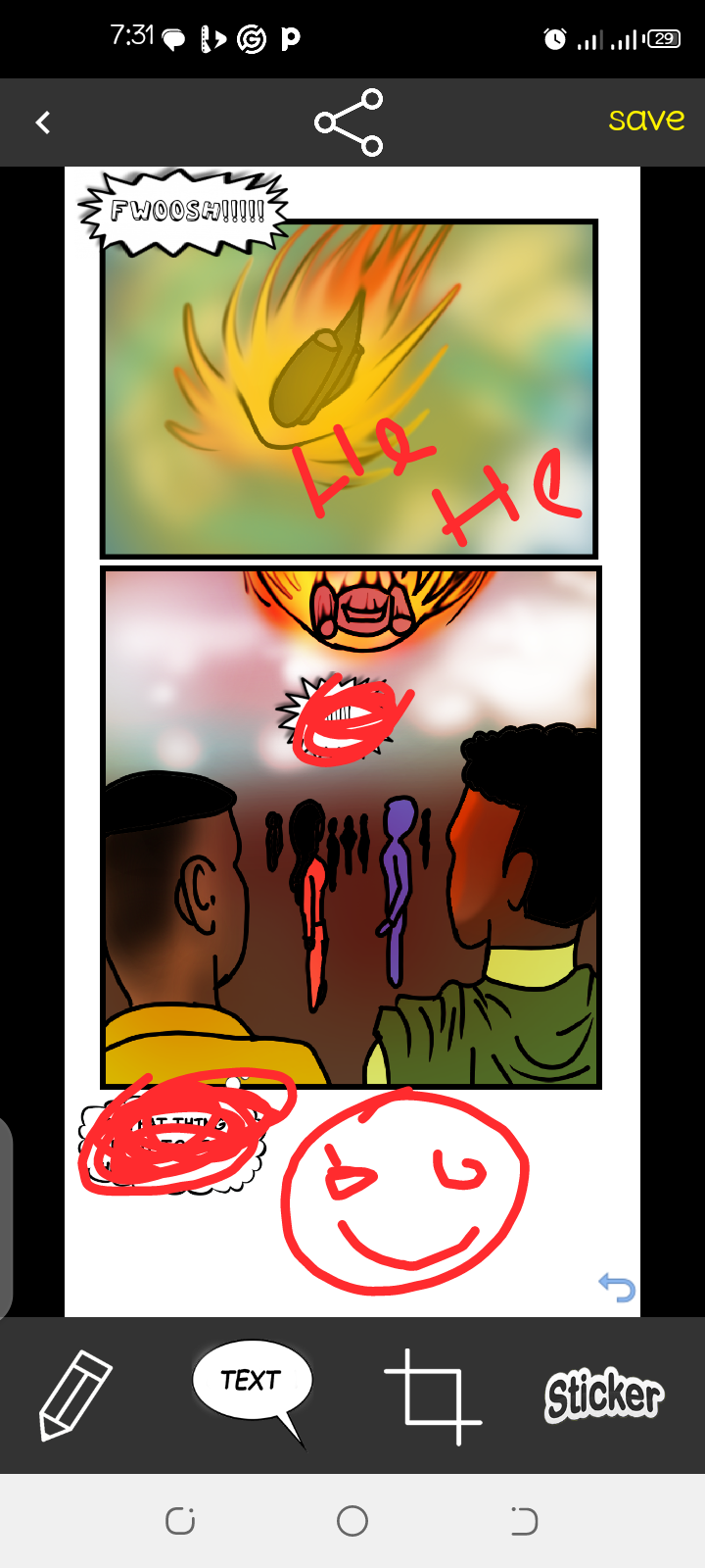
If it comes to your comic: what is the first picture about? It looks colourful but those pics seem to be the opposite. I'm looking forward to see more
I should have asked @rashid001 to join too.
Well I just decided it's time for an alien from the first EP to come back to Earth.
To be honest, this is completely unique for me. I will give it a try . perhaps I’ll be able to do it. :-)
Super! Don't forget to mention me!
I think the hair is nice too, you can see the strands of hair.
I remember @aellly's version. That sad girl's face is unforgettable. Your colored version is incredibly expressive. She manages to convey not only sadness but also frustration. We could write a story about what happened to this girl. It would be great to do that.
I already changed the girl a bit after he told me where to add a bit more shadow and what to change. I assume he watched the film or even wrote what it was about. I should check it.
For now, we can only guess, my guess is that the life of this schoolgirl is harsh, both at school and at home. I would say she is leaving.
Admiro tu talento para escribir y pintar. Realmente, eres una artista integral. La chica triste quedó linda y las peras también. Se ven muy reales.
Gracias. Me alegra tu cumplido.
❤️🍀