Learn with Me - Basics of Watercolors
In my childhood, I hated watercolors. I thought of those as low quality kids' paints due to their transparency and the mess that was created by water on paper.
I used to watch a show, Mad Art in which the guy used Acrylics. The color pay off made me think of Acrylics as superior quality paints.
But back then, mom always used to get me watercolors. 🤷🏻♀️
Little did I know, the transparency of watercolors can add depth and layers into a painting and the mess was because of using the wrong paper.
I wish I was an artist but I am not, not even close. I am actually fascinated by colors and the magic they create on canvas which results in an impulsive purchase every now and then. I have almost all the material at hand but I am scared to use. Don't want to admit that I can't use. 😁
I got a pretty watercolor set few weeks ago and since then I am super motivated to learn about it. I am not a born artist but I can try to learn some artistic things. 🤷🏻♀️
I will share with you whatever I learn, it might help someone else like me. Let's Begin...

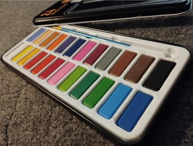
Watercolor Palette
There are student quality and artist quality watercolors available in the market. The difference lies in the quality, transparency, permanence, staining or non-staining of the color.
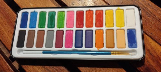
When I got mine, I didn't know any of this. It says the High Quality but I haven't kept my hopes high. The color pigment is very good and transparent. Permanence will reveal with time.
Transparency of the color can be checked by drawing a line with permanent black marker on a paper and then swiping the color on it. If the black line still shows that means color is transparent.
If you are looking for the same set as mine, here's the link for online purchase.
Paper
Watercolors shouldn't be used on flat computer papers. The reason is quite simple, water can make valleys in the paper. Sometimes, a technique requires excessive water which can destroy the fibers of the paper.
A textured paper is recommended to use watercolors so that water doesn't absorb in the paper and stays on the surface.
Taping the paper is also recommended to avoid buckling of paper due to water.
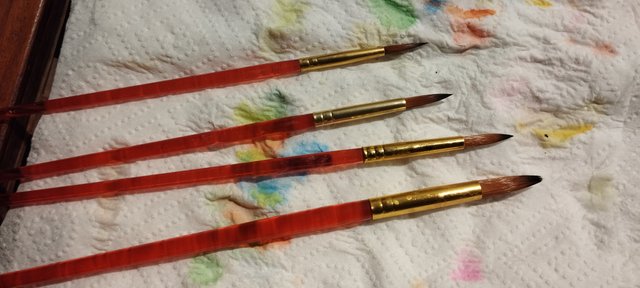
Brushes
Beginners can get started with only three round brushes of small(3), medium(6) and large size(12).
I have these brushes but they are of not good quality so I plan to get a better set on my next visit to the market.
Keep different cups of water for rinsing cool and warm colors
Always keep your warm and cool colors separate. If combined they make a brown murky color. So it is advisable to use two cups of water. Rinse your all warm colors in one cup and all cool colors in the other cup.
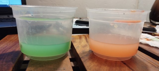
Warm colors are with yellow undertone like red, orange, yellow etc.
Cool colors are with blue undertone like blue, green, purple etc.
Watercolor Techniques
To get started, it's important to get yourself familiarize with some basic techniques. Here are some:
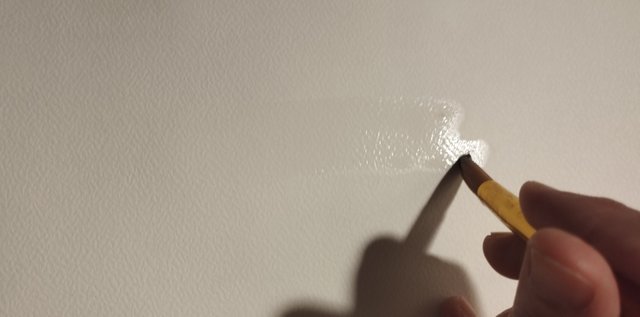
- Wet-on-Wet
Wet paint is applied on the wet surface in this technique. Paint keeps transforming into a different shape until it dries.
.gif)
This method is used in painting landscapes or sky.
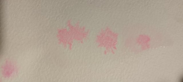
- Wet-on-Dry
Wet paint is applied on a dry surface in this technique. This method is used for painting more defined shapes like here I tried to draw leaves. These were my first attempts at leaves so excuse some funny shapes.
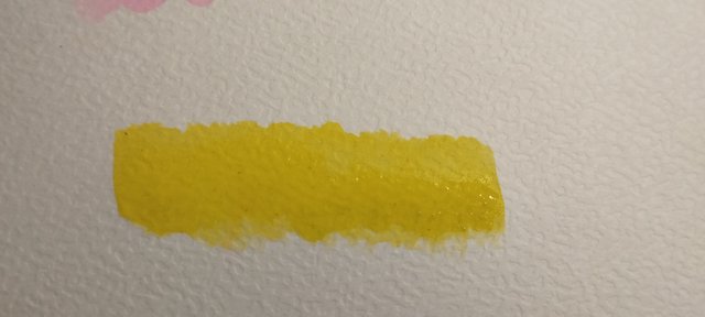
- Building Color or Making different colors from one Hue
This can be done by wetting the brush and picking up some color and drawing small rectangle. Rinse the brush a little, pat on the towel gently and make another rectangle. Repeat the process, each time the rectangle will be of different color.
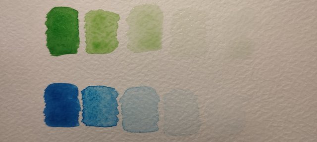
This way we can make different shades and tints by just taking one color(hue).
- Hue is the color in its purest form.
- Tint is the color we get by adding white color (or water) to a hue.
- Shade is the color we get by adding black color to a hue.
- Tone is the color we get by adding grey (black and white) to a hue.
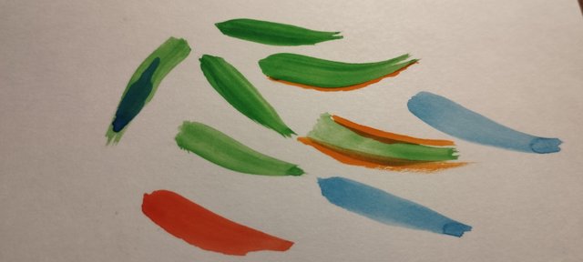
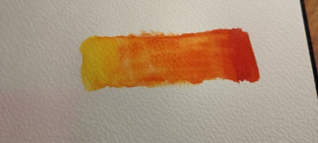
- Gradient
Gradient is also similar to building color technique but here we use at least two colors to show the transition. I'm still practicing it so at the moment my gradient is not smooth. Hopefully it will get better.
Learn the Color Theory
Here I will shift the topic slightly to color theory which is equally important. Choosing the right colors is essential for visually good art, I will tell you why.
If there is a pile of different chocolates in front of you and want to eat only Toblerone, how would you find it? There are two ways:
- You will read the name of each chocolate.
- You will only look at the ones with yellow packaging.
What will you do? Of course the latter option is more practical and easy for eyes as well.
In the next post, I will explore the color wheel. Till then I am going to practice the above techniques again and again.
Thank you,
event-horizon

I like to paint any thing on paper because my father was very good textile designer of GulAhmad brand. So definitely i like to follow him but unfortunately my painting is not well. Your guidance is help me. I think you use canvas for painting.
That's good. You must know the basics because of your father.
I love painting as well. I think maybe if I practice daily, I could get better.
Greetings. I am an art lover and with your content you have taught me a lot, thanks for these techniques and advice, have a nice night.
Good to know that. 🙂
Thankyou so much for this review @event-horizon. I used to do paintings in my free time on sketchbook canvas etc. I've Arcylic and poster color because Like you I also think water colors are low-quality.After this review I am going to buy this definitely and whenever I got that I'll do paintings and share with you. In Shaa Allah.
In reality, watercolors are the toughest to handle.
The art also looks more alive, in my opinion. I have challenged myself to learn it. 😁
Congratulations! This post has been upvoted through steemcurator07.
Curated By - @kiwiscanfly 🐔
Curation Team - The7up
Thank you @kiwiscanfly for the support. 🙂
Woahhh ❤️ amazed by how you explained 👌👏 very informative
Thank you. 🙂
Beautiful post! Very beautifully explained 🥰
I'm glad you liked it.
Excelente publicación sobre las acuarelas muy bien explicado.
🙂
Waoooo....
Great post @event-horizon ..... ❤❤❤
🙂
Wow, You made beautiful color combinations by adding light and dark water paint 🎨 colors. And your post presentation is very artistic. Thanks for sharing with us 💖
Thankyou 🙂
Wow great.you have explained everything in detail
🙂