Painting Steemit Logo on PixelCraft
This is actually my first time playing the pixel craft game and I enjoyed it with this creativity even though the logo looks like a comic relief. I want to sincerely appreciate the host @kafio for his ability to guide me through as I was confused at first and was very reluctant to participate in the contest.
So in this post, I'll be telling you how I came about this craft or paint using those pixel colourful boxes. I'll also share a direct tutorial on how you can create your own craft. This was the hardest I did. I actually thought of doing a house, a name or something simple, but I decided to try the impossible since marks were attached. Are you new to pixel craft game?.
It actually runs on weekly basis and I think since disconnect is no longer publicizing contests, getting to the reach of everyone may be somewhat difficult. I saw it today and it was by the grace of God, if not..... How to play this game? Permit me to teach you before showing you how I did my craft.
How to do? — Step-by-step Guide |
|---|
I know there's already a tutorial on this, but using the tutorials wasn't clear enough for me. The Step-by-step method was missing and I became confused at some point.
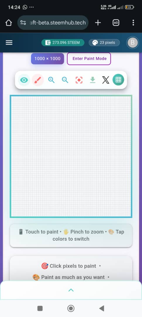
To create a design in pixel craft, click on the link to open the page. Pixelcraft
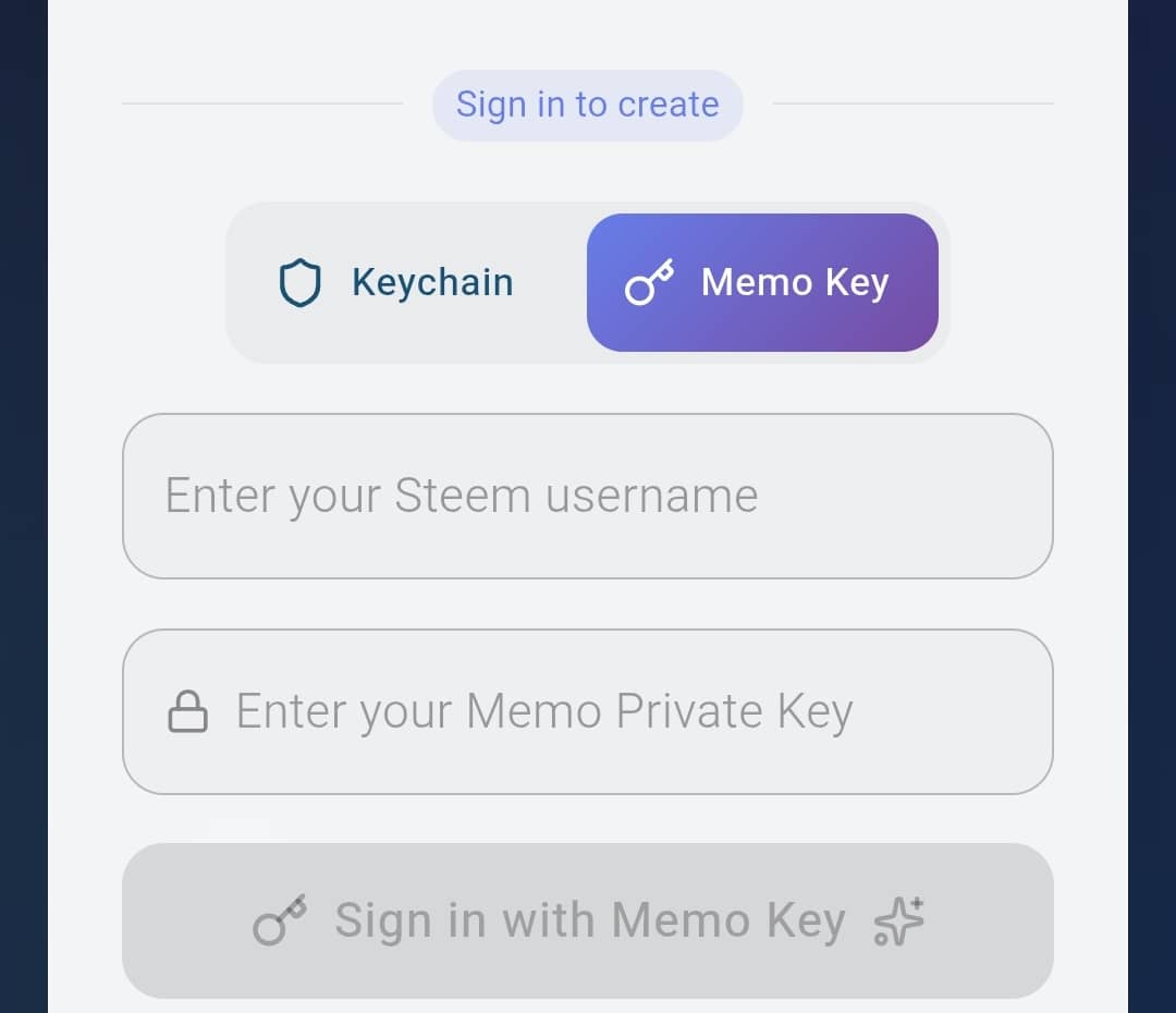
Once you're done clicking, you'll see a page demanding you to choose how you want to login. You'll be shown Keychain and Memo Key. Since you can use your keys to login, it would be advisable to use Memo Key.
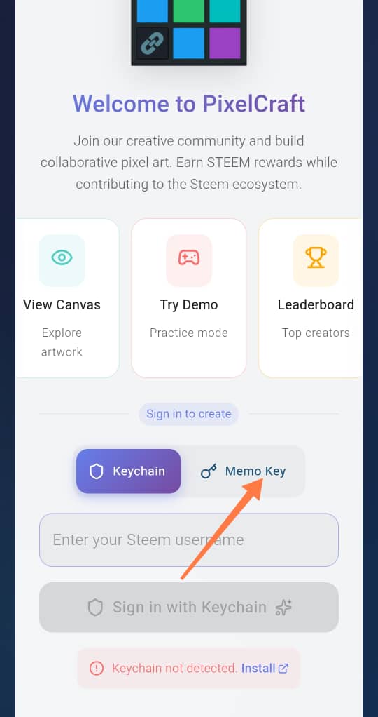
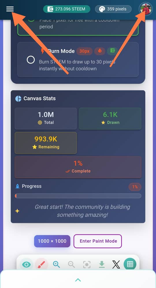
- Input your memo key and username and login. Once you're done, you'll see three parallel lines at your top left and your profile at your right. You can click on either of the two to check your progress and tyo check the leaderboard.
 |  |  |
|---|
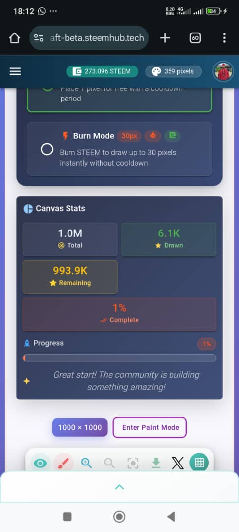
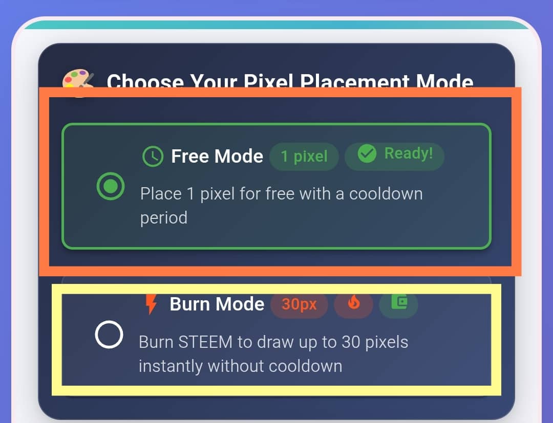
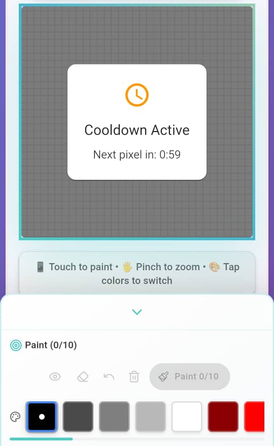
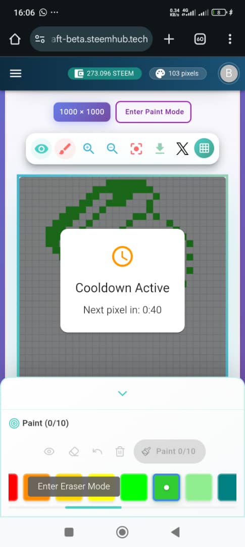
- This screenshot contains play mode. You can burn steem and play or play for free. The advantage of playing for free is that you'll not have to burn Steem. The disadvantage is that you'll have to wait for a minute after painting 10 times. This is so annoying. To curtail this, burning steems helps prevent that after 30 pixel paints.
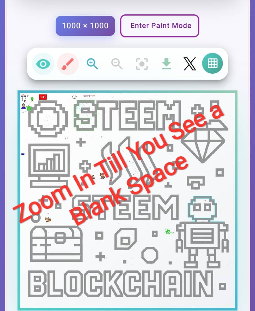
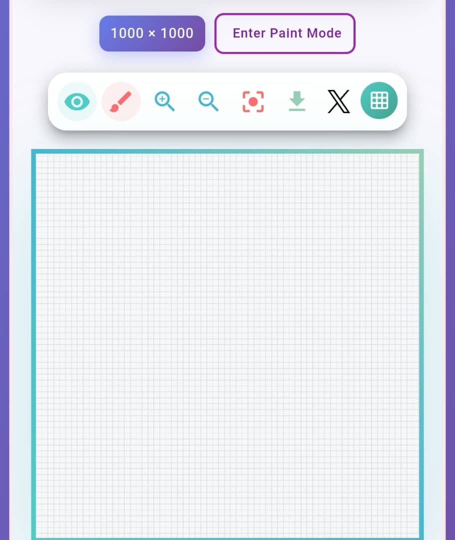
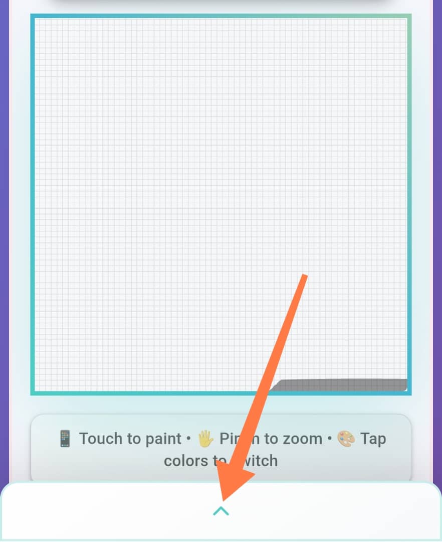
- After choosing your mode, you can start with the free mode, you scroll down to where you have a big box with steem for related stuffs. This is where you paint? How? Use your fingers and zoom in on the box till you get a free space to work on. You can move the right or left. Once you're done with that, check the next step.
 |  |
|---|
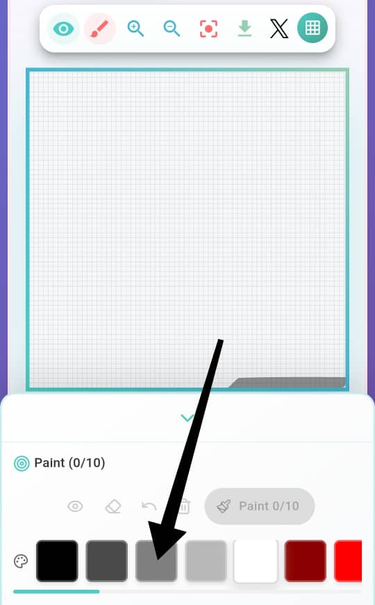
- Click on the drop-down arrow for the colour palette to show. Once it shows, you have to take note of the following.
Click on the colour you want to use
Tap on the white space and start creating something.
You're doing so with small boxes
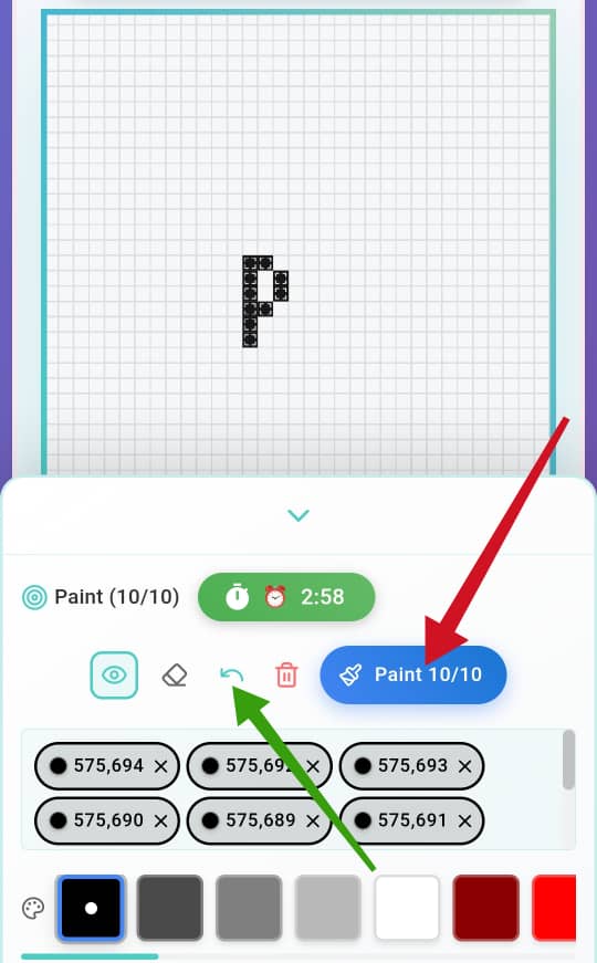
If you make a mistake in dotting, you can erase by using the green arrow which stands for return.
Once you're done using these small boxes 10 times, you'll have to click on Paint and wait for 1 minute before you resume.
You can zoom your phone to get a closer range and enable you tap well.
You can screenshot your progress by zooming out
The more you create, the more pixels you have
 |  |  |
|---|
Note: I don't know if there's a way to erase things you've already painted, but don't click on "Paint" if you're not sure. I made some mistakes that can't be undone.
How I did mine? |
|---|
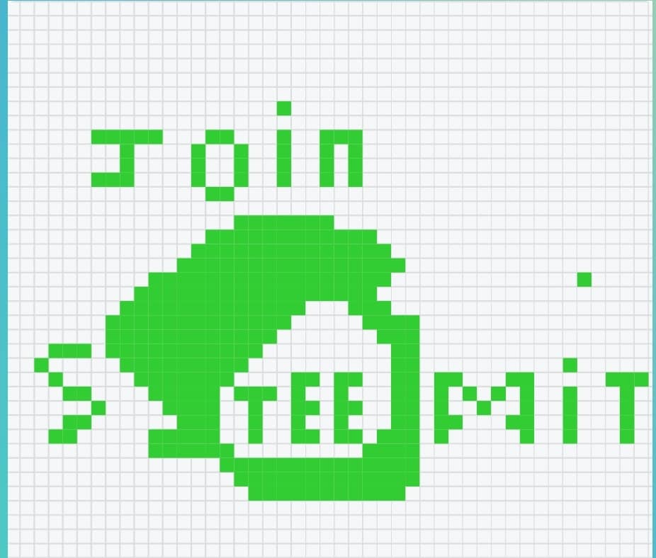
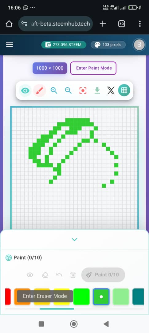
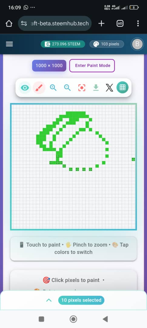
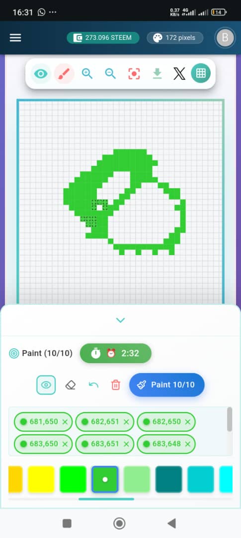
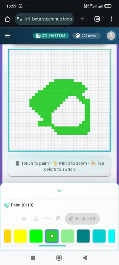
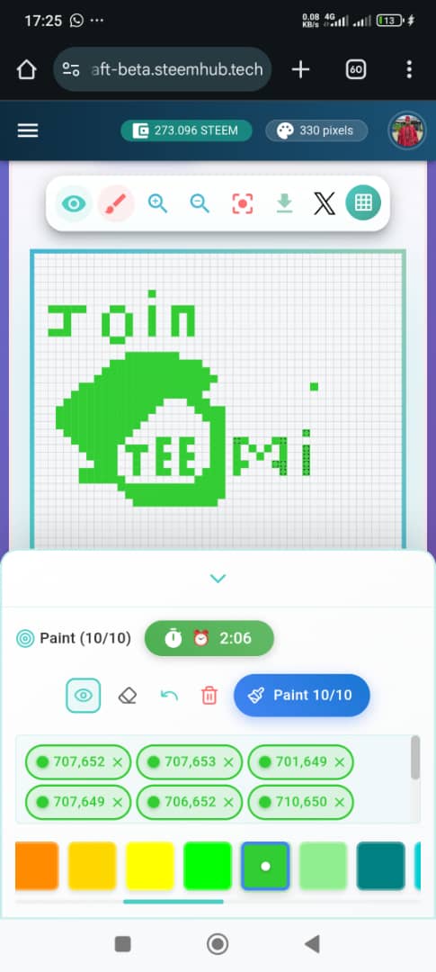
- I started by choosing what It wanted to do and getting that picture in my mind. Yo grasp steemit logo in my mind was difficult with these pixels until I started painting. That's when I could see the full picture.
 |  |
|---|
- Everything about this logo was curvy which made it difficult to know which box to place and how to bring out the curves, even though it's not entirely. I selected a light green colour since steem colour is green.
- I started by making a sketch of the curve top part of the logo with my boxes. After getting that right, I focused on making the head slant. If you look at my logo, I definitely suffered in getting that well. I did a rough sketch first to see if it would be good in the eyes. Since it was my first time playing, I did want to burn steems. I had to develop patience with the Cold time stuff. After getting a sketch of the top and putting a tail at the end and at the top, I decided to bridge. I focused on the extended thin line of the logo which protrudes like a stomach. I still had difficulties producing a curve
 |  |  |
|---|---|---|
 |  |  |
 | 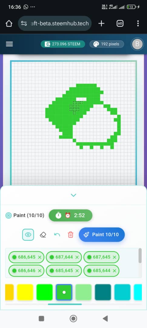 |  |
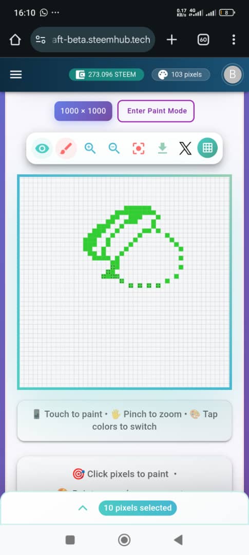
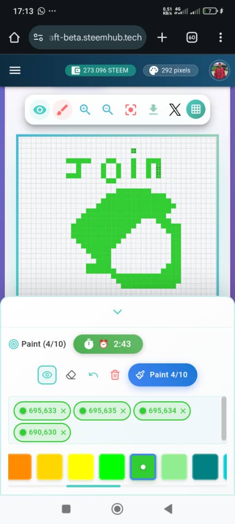
- Why? The spaces were just so empty and scattered. So I had to join and make it straight. Anyways, it's not far-fetched from the actual logo. After placing all the sketches together, I decided to complete the spaces in-between so that it would be beautiful. I made everything green and avoiding the use of different colours since Steemit logo is just green and white.
 |  |
|---|
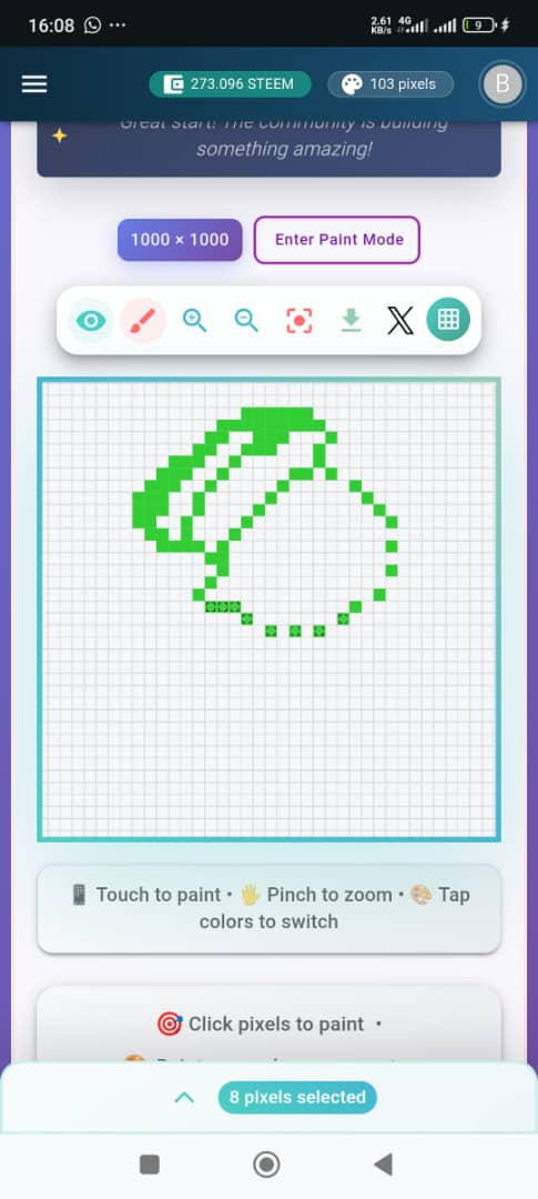
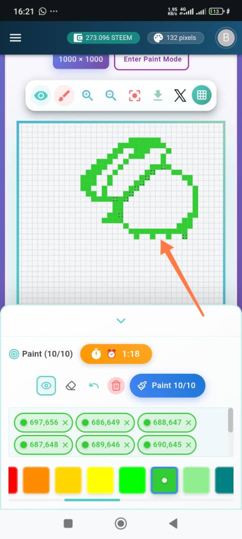
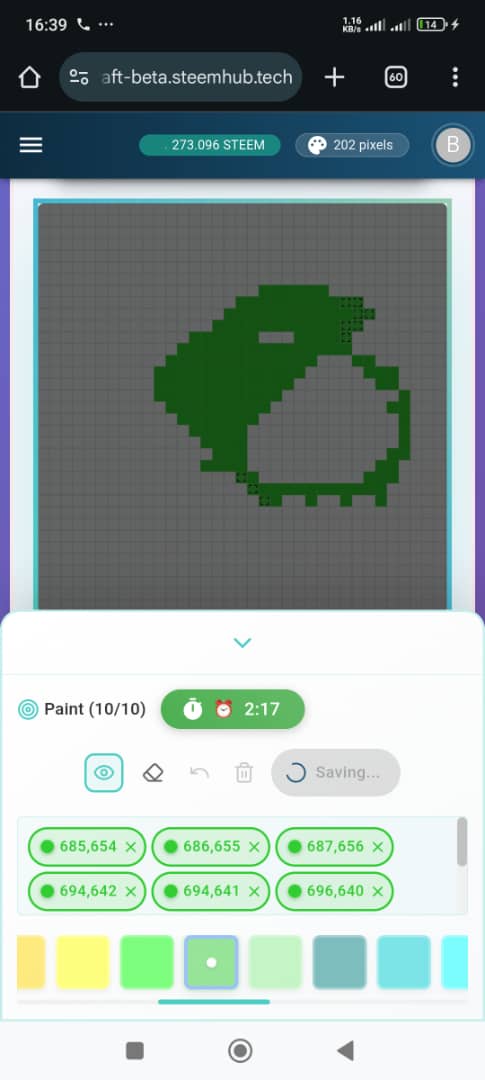
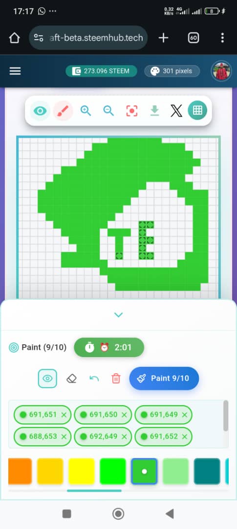
- Still not satisfied with the logo, I decided to put the spelling of Steemit in-between the open white space. I don't painted it as letters . Before painting Steemit, I painted Join which serves as an action word. The logo may not be neat, but if you look at it from far, it's beautiful.
 |  |
|---|---|
 |  |
 |  |
Evaluation |
|---|
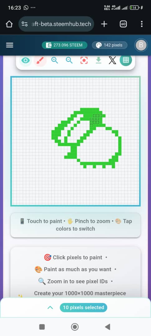
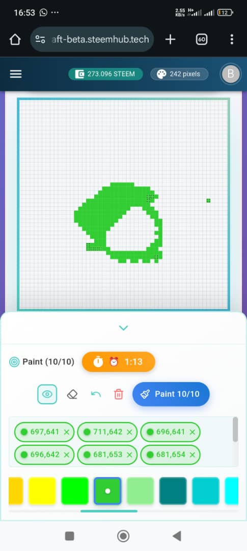
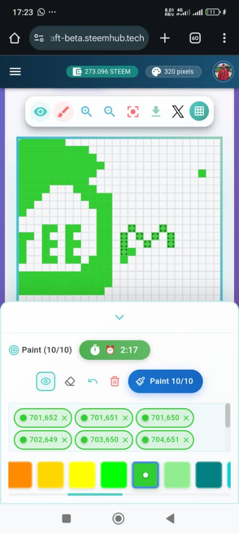
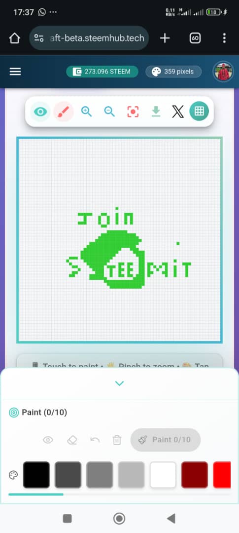
After painting the steemit logo, I checked my total pixels and saw that it was above 300 and I used just one colour which was green. I came third in the leaderboard because of the pixels I used in painting. I spent nearly 3 hours trying to do this because of the 1 minute. I never knew I could be so impatient and that 1 minute can be a very long time.
| Time spent | 3 hours |
|---|---|
| Mode | Free Mode |
| Colours used | Green |
| Type of painting | Logo |
My Experience |
|---|
It may be very discouraging with the 1 minute rest time 😁, but once you get to the heat of the game, you become used to it. I didn't feel it again and I saw the painting as a challenging one. I learnt some beautiful lessons while painting. I learnt that that opportunity comes but once and once you make a mistake after the given opportunity, it's very difficult to erase or undo.
The undo icon gives us the opportunity to correct and make the eyes feel comfortable with what it's seeing, but once you click on paint, the opportunity is gone. You get to receive another opportunity. It's a mind game of solving complex problems. Your mind and eyes must align to bring a beautiful and structured painting.
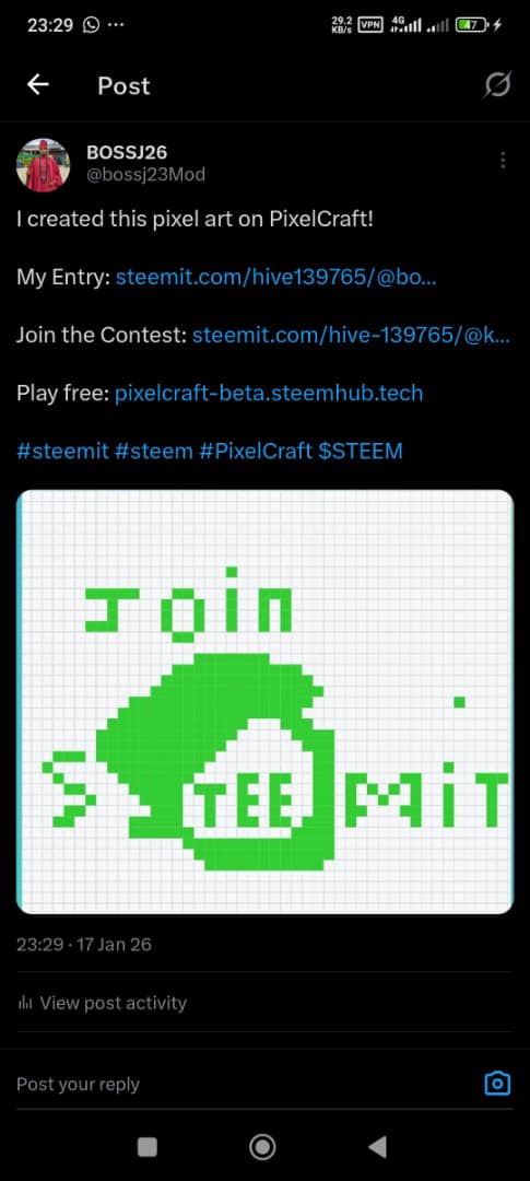 | Twitter Promotion Evidence |
|---|---|
| Twitter Link Evidence | https://x.com/i/status/2012653466858996063 |
I invite @lilly1, @sirstephen @etified01
Judge Comment:
Ambitious logo design! Your tutorial is incredibly helpful for beginners - the best educational post in the contest. The logo shows good effort, though curves are tricky in pixel art. Your honest documentation of the process is valuable for the community!
I really appreciate the time you took to guide me. 🫂
Upvoted! Thank you for supporting witness @jswit.
Nice, you really took time to design this
This is a truly wonderful and painstaking post. You have described the entire process of creating the Steemit logo in PixelCraft in great detail. Your step by step info making it easy for the me to understand how the game is played. It is especially interesting that you used only green. You created the curves and details of the logo with great patience and effort. Working with dedication and patience for 3 hours is highly commendable. The lessons you learned in the experience not being able to undo a mistake and the need for mind eye coordination. It is also very valuable. Your hard work and patience are highly commendable. This post is also a great guide for new players.