Graphic Design made Simple (G101) #lesson 5 - Hands-on Practical session.
Happy new month friends, am happy we all made it into this month. Welcome to another beginners graphic lesson. I deemed it fit to continue with another practical class just to solidify what we started last week.
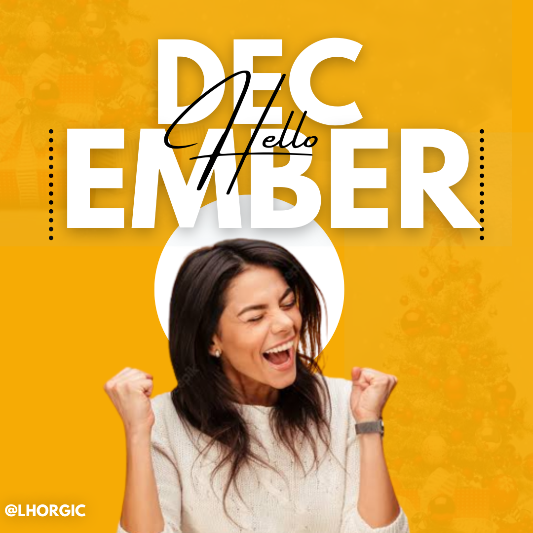
So I made another simple and catchy flier. Well simplicity has always been my watch word when it comes to design. Every good designer must learn to come out with simple and less complicated designs.
I made that cover design to welcome us into the new month and also to teach us how to create stuffs like this. As you can see, it looks really simple, you can try it out as well. You can actually step up your graphic design game by trying out the practicals.
So without mincing words, let get straight into it.
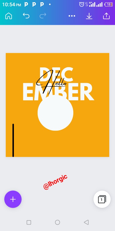
I hope we have not forgotten the app we are using for the time being, Canva app. Below is the design we will be reproducing.
 |
|---|
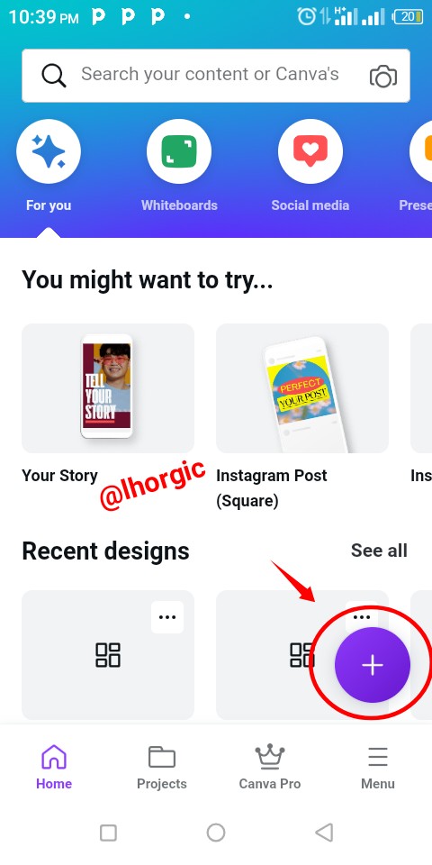
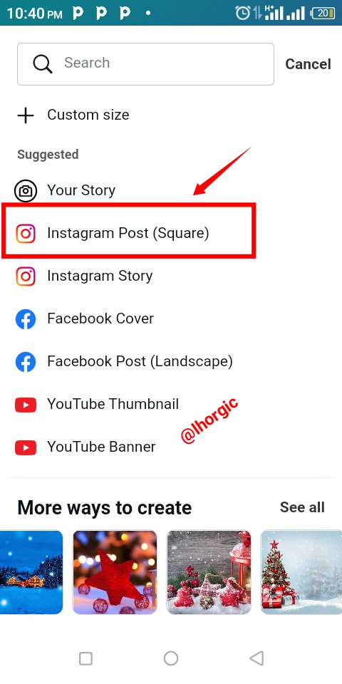
Step 1:
Open your canva app,click the circle"+" icon, then go ahead to select the instagram post (square). The reason why we did that is just for the default size that comes with what we opted for.
 |  |  |
|---|
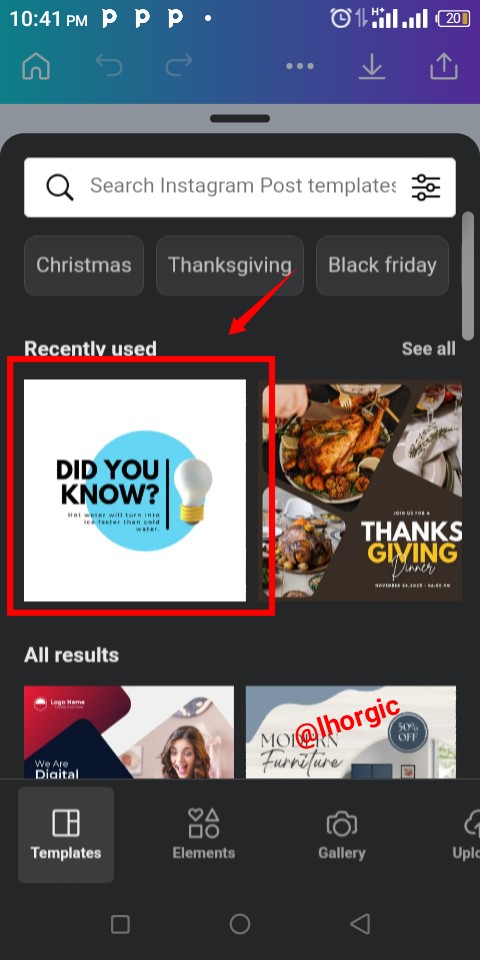
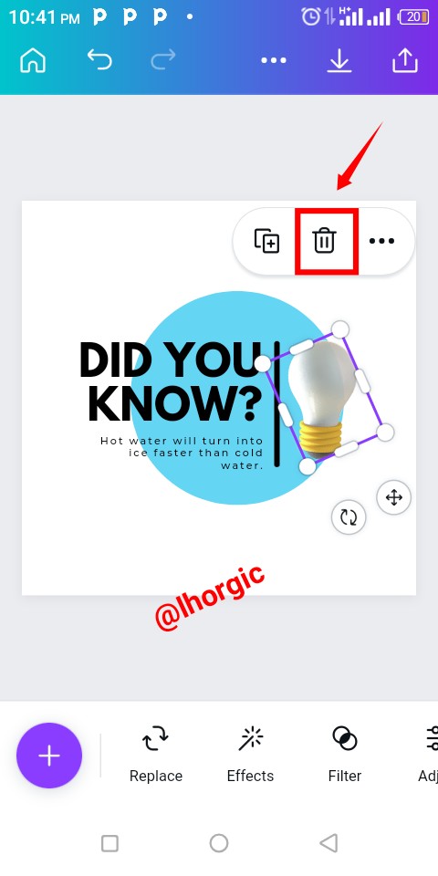
Step 2:
You are brought a list of template as usual. Locate the one I selected or any other with a circle shape. The shape is the only relevant thing I used. After picking our template, delete the unwanted elements just as highlighted in the images below.
 | |
|---|
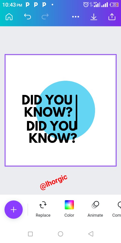
Step 3:
Duplicate text and edit to our desired text just as seen below.
 |  |
|---|
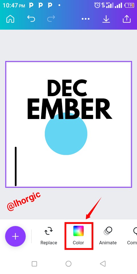
Step 4:
Resize your text by dragging text by the tip/edge and then select the colour icon to change the colours of our shape and text.
 |  |
|---|
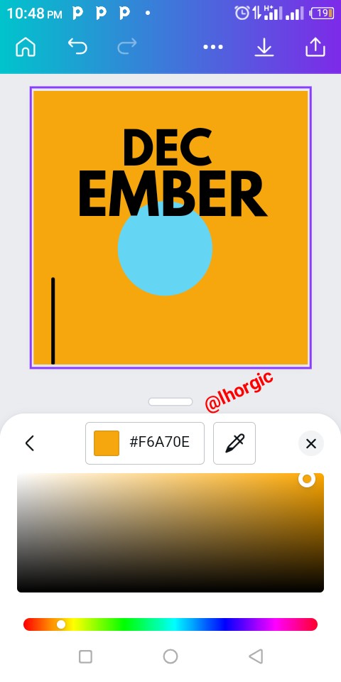
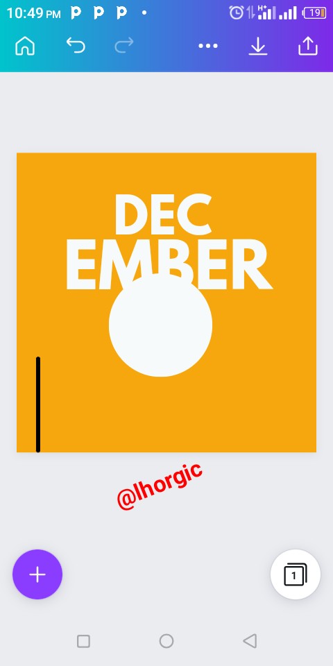
Step 5:
After clicking the colour icon, do well to choose your desired colour for both the shape and the text. I chose white and yellow. Yello for background, white for our text and circle shape just as seen in the images below.
 |  |
|---|
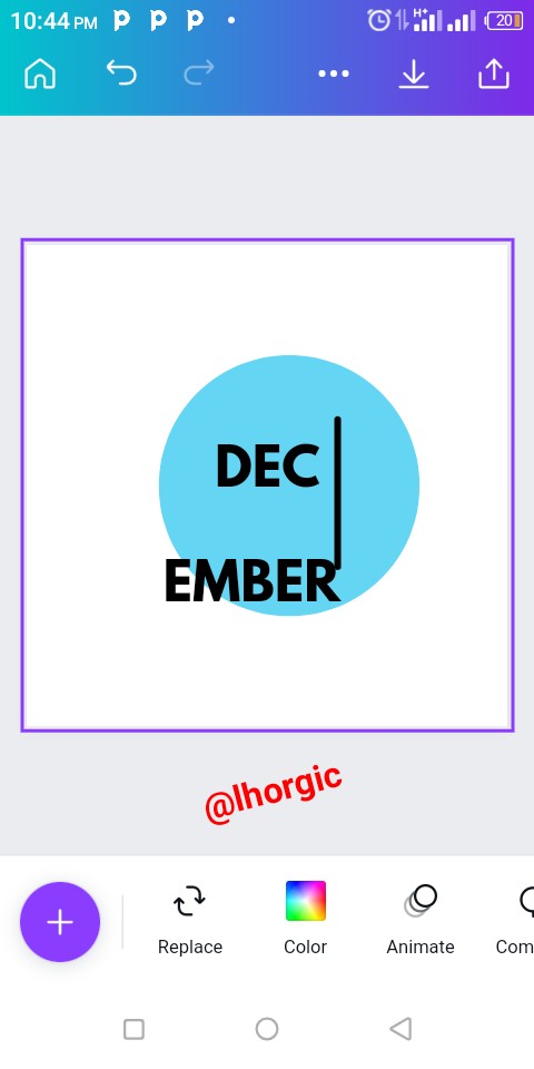
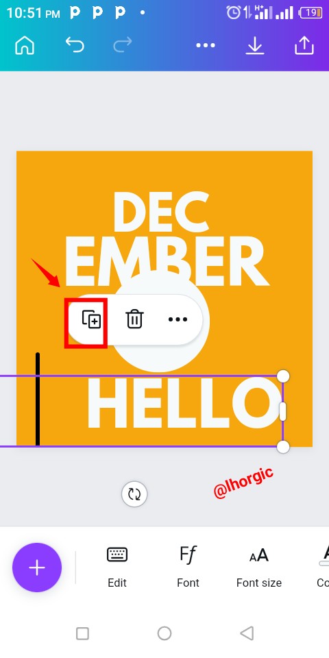
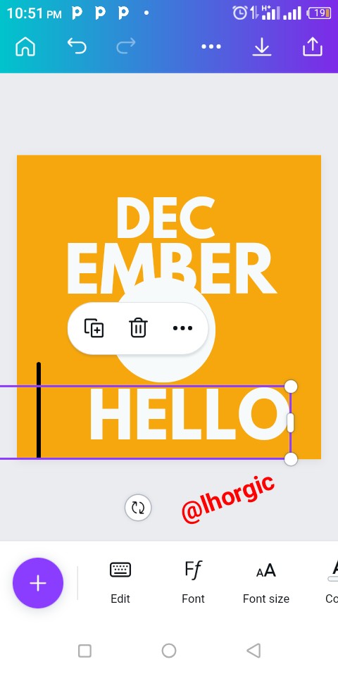
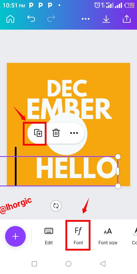
Step 6:
Duplicated any of the text using the "+" just as highlighted so we can input our Hello. This would automatically appear in uppercase, you have to adjust it by clicking the font icon denoted with Ff. It has also been highlighted below.
 |  |  |
|---|
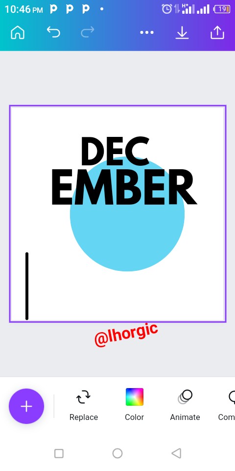
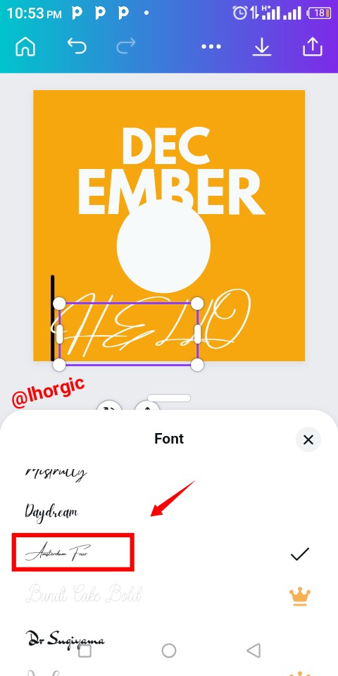
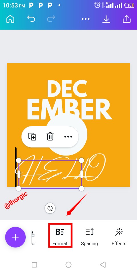
Step 7:
The font used for "Hello" is "Amsterdam Four". Then you proceed to tweak the letter format by clicking the "B" icon and then change it to "Aa". This automatically changes the format.
 |  |  |
|---|
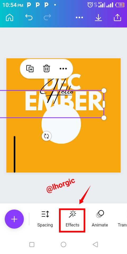
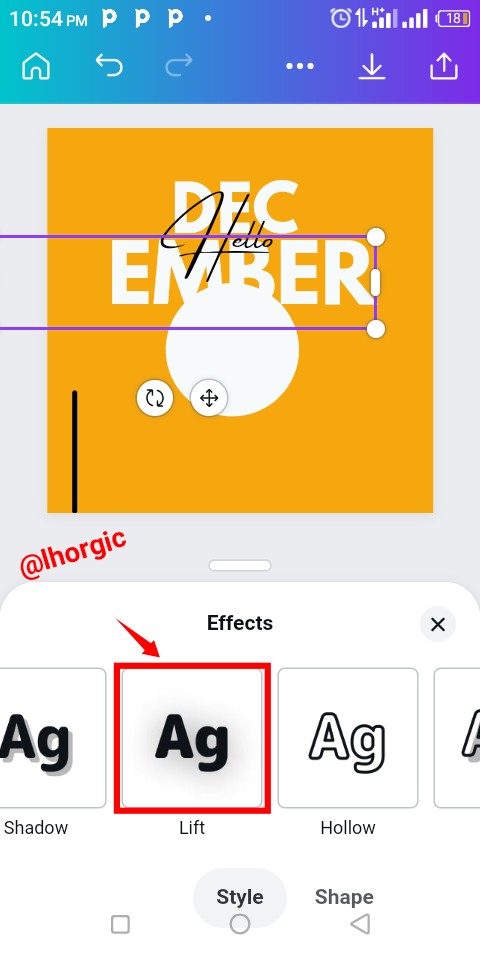
Step 8:
Apply effect to our text ( Dec & Ember) by clicking "Effect", select the "lift" option.
 |  |
|---|
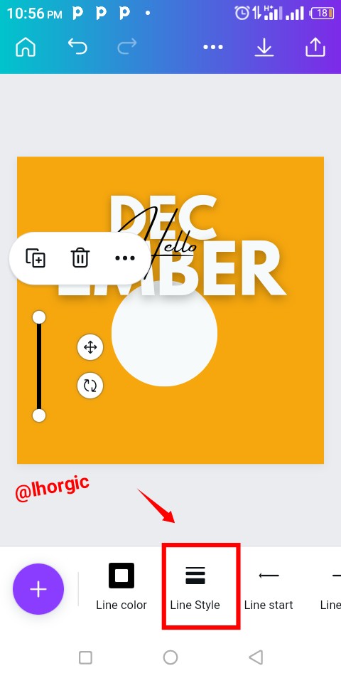
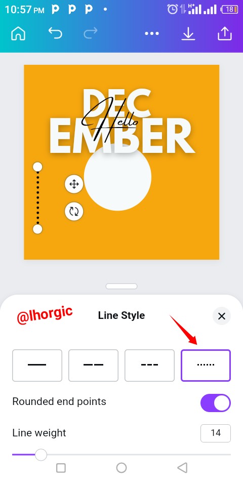
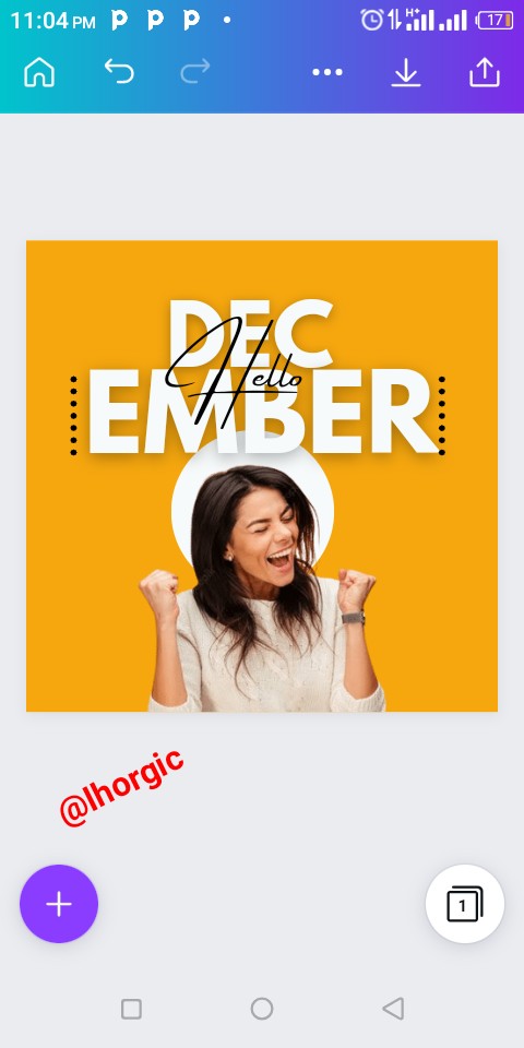
Step 9:
Now to the black line in our design, we need to tweak it by selecting the line styles option we can then choose any style of our choice. You can decide to choose the one I used.
 |  |
|---|
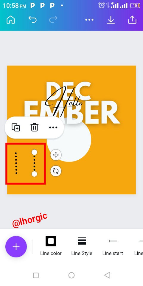
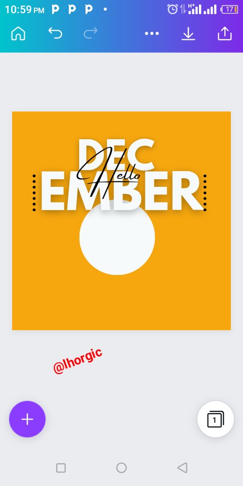
Step 10:
As you can see,the style chosen has reflected, you can then duplicate it and position it by dragging.
 |  |
|---|
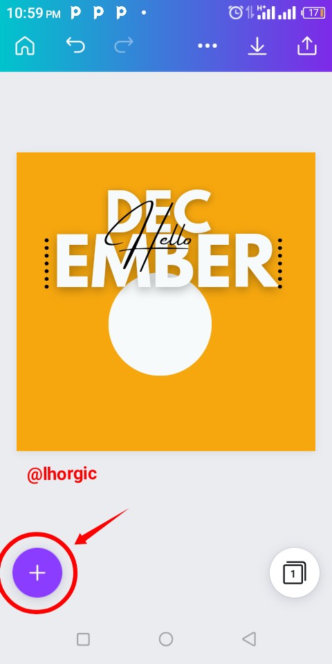
Step 11
Now it's time to add our image, be sure to have it in your gallery, get png image or use a site called remove.bg to crop out your image. Now click the "+" just as highlighted to bring in the image.
 | 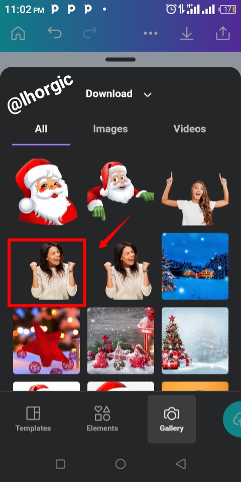 |
|---|
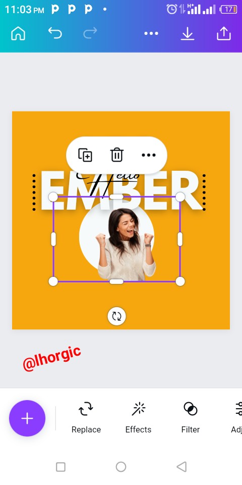
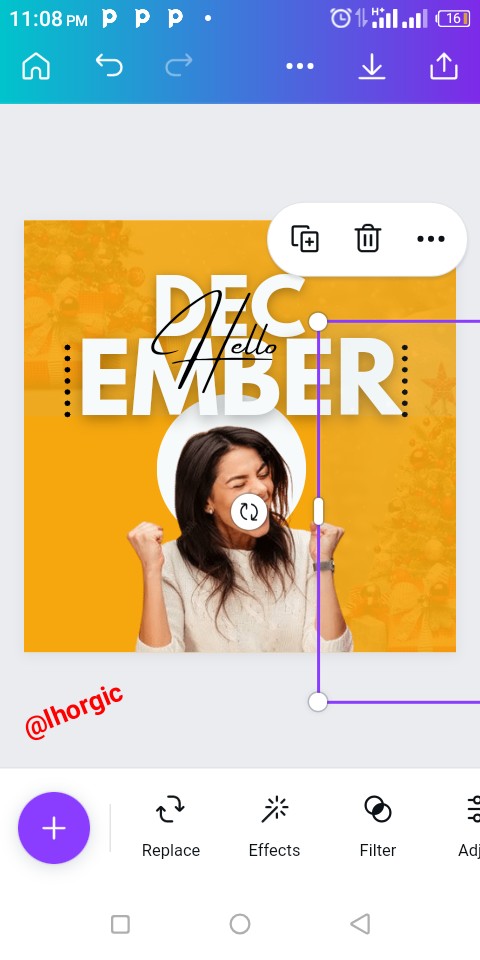
Step 12:
Do well to resize the image by increasing it size and then positioning it between our circle shape for a very nice effect.
Note: You resize by dragging the tip of the image.
 |  |
|---|
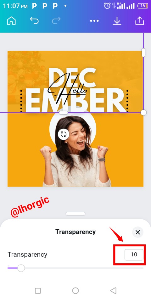
Step 13:
If you observed our sample image you would see that there are two faded image in our background, you can decide to add it as well using position & transparency. Bring in the image as usual, use position icon to send to back and then transparency icon to faint/fade the image into the background.
 |  |
|---|
This is where I will be wrapping it up for this lesson. I really appreciate you for coming this far with me. I trust you got value from this post. Feel free to share your thought on today's lesson. If there is anything you would love me to add to improve the lesson, be free to share.
Special mention:@franyeligonzalez @fonjougiresse
@ruthjoe @xkool24 @chukwu10 @richy20
If you missed the previous posts on this beginners class, kindly check them out here.
Introduction post
Lesson 1
Lesson 2
Lesson 3
Lesson 4
Graphic Design Instructor
@lhorgic♥️
Cc: @ubongudofot.
TEAM 1
Congratulations! This post has been upvoted through steemcurator04. We support quality posts , good comments anywhere and any tags.Sorry I didn't meet up with the last lesson,will be dropping my entry tonight.
Never a problem. Just take your time and enjoy the process.
Very educative. Learnt something new.🙏🙏
Am glad you did. Keep following, you will learn more.
Wow !! This is so cool.