You are viewing a single comment's thread from:
RE: 👨🏼💻 #Proposal-86: Navigation Implementation for Desktop
I've been playing with the desktop version for a while now. I have to say, really great, I felt right "at home" despite the changed navigation.
The speed was comparable to steemit; certain things, such as displaying the menus, were even very fast. Only the first call took a little longer, after that everything ran smoothly.
Other User's Profiles… but I wonder if this has become "Icon overkill"
I also like it better without icons. It's nice and tidy this way and the indentation makes it easy to understand visually.
A few thoughts:
- It would be worth considering keeping the "My Profile" item in the visible area, perhaps even above "Explore".
- if "Posts" instead of "Blog" was displayed immediately when a profile was called up
- comments sorted by age and not by trending by default
But those are my personal preferences.
Anyway, respect for your great work, I'm looking forward to your further ideas. And if there's anything else you'd like me to test, just let me know.
This is great to hear, thank you. It was especially pleasing to read this:
I was concerned that experienced users would feel less comfortable with the update so I'm relieved to hear that it wasn't a problem.
Would you be able to send me a screenshot of how it currently looks to you please and the screen where it's not as visible as you'd like? I know that on the Profile screen, the Masthead and Profile Header push everything down - I adjusted the white space in an attempt to keep as much in view as possible when in this view and I could adjust the white space even more to accommodate this.
Good suggestion - The response to the quick user test had Posts as the clear "winner" so I should adjust this. Thank you.
"Comments" should be sorted be age although "All Posts" currently defaults to trending (I assume this was a translation difference) - I suspect that I'll need to leave this on "Trending" for now although it's a discussion that's worth having (I think that "Steemit" use Trending to entice people into thinking that they can earn mega-bucks).
Thanks again, it's so helpful to get additional perspectives.
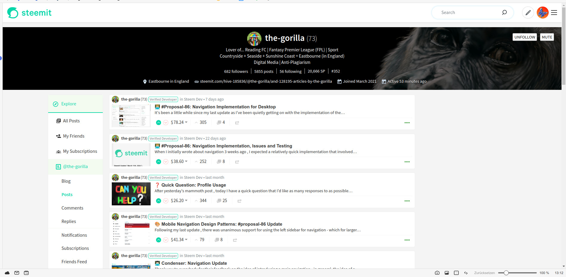
The area framed in yellow is outside the visible area for me. My screen has a resolution of 1920 x 1080 px.
This is what my entire screen looks like, browser window maximised:
Haha - yes, that would be possible! Clicking on "age" has become a habit for me, after a change I might accidentally switch to "trending" :-)
I've had a play with it and uploaded a revised version (with an updated implementation in an individual post view). I've tried to be careful not to reduce the white space by too much so that it doesn't feel squashed.
My Profile is now visible for most profiles, except for gorillas, which take up a lot of space :-)
I have a long description which I think contains the maximum number of characters so mine is probably worse case scenario🙂