👨🏻💻 Condenser: Introduction of Navigation into Feeds Screen
At the end of my previous update, perhaps lost amongst the documentation, I proposed that the first interface item that I work on is the introduction of a navigation menu at the top of the Feeds Screen as well as an adjustment to the existing "Profiles" menu.
My intention is to be consistent with the design used in the Profile area and introduce menu items:
- All posts
- Announcements
- My Friends
- My Communities
The motivation behind this is to remove the left or right sidebar from the Feeds Screen, allowing more room to be used for blog content without losing any of the existing information/functionality - so this is the first step to achieving that... perhaps I've explained this better elsewhere:
...to create a "menu bar" for the "Feeds" area like in the "Profile" (Blog, Posts, Comments, etc.) - this menu bar would include the navigation items that are currently in the left panel - with a view to removing it and only having one panel (perhaps the right one, displayed on the left).
I've mocked up the following image to visualise my proposal (click to open in higher-resolution):
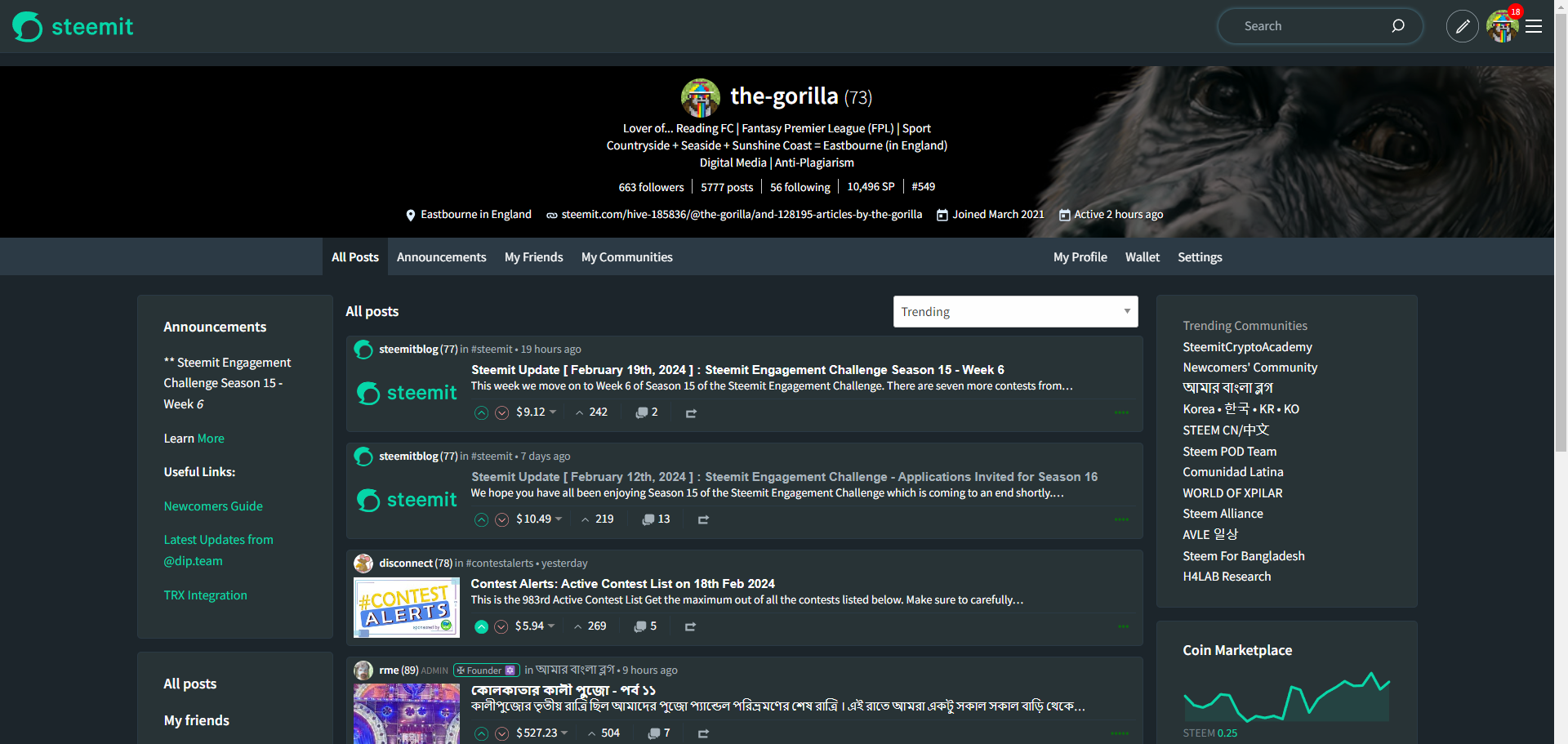
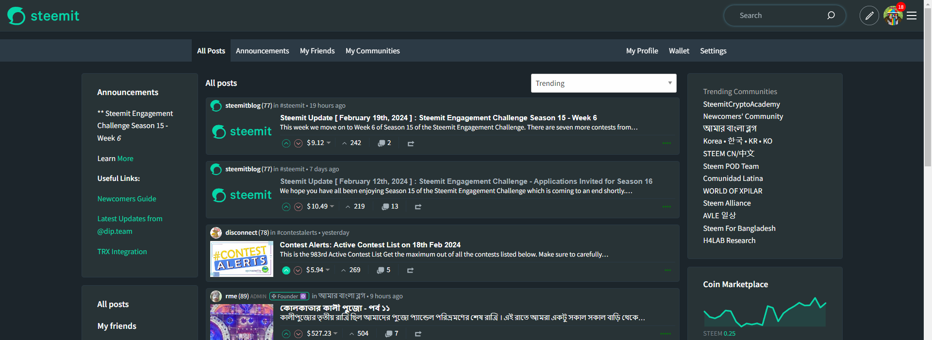
This also brings some visual consistency across the user experience as I have included the users' Profile header throughout. Without this, the screen might look as follows:
An additional suggestion being that an additional link to My Profile or My Feed is provided alongside the Wallet and Settings (if logged in) Links in the "Profile Menu" as well as the following for a "Feeds Menu":
- to allow users to remove the need for the left sidebar,
- to allow users to more easily switch between Feeds and Profile and provide a clearer "Location" within steemit.com.

Profile Implementation
I've not just been playing with Photoshop and have also got my head into some code.
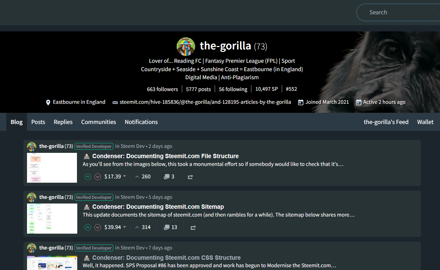
In the Profile area, I've added a link in the right to take the user to their friends feed.
{isMyAccount && (
< li>{_tablink('feed', tt('g.my_feed'))}</ li>
)}
I use the existing check isMyAccount to see if the user's viewing their own account (when logged in) (using the same logic as the Settings option).
This calls the _tablink function which is defined earlier in the file. This function takes 2 variables;
- tab which is the URL that the element will link to
- label the label which will appear on the screen.
The _tablink function also takes care of highlighting the active tab.
const _tablink = (tab, label) => {
const cls = tab === top_active ? 'active' : null;
return (
< Link to={_url(tab)} className={cls}>
{label}
</ Link>
);
};
Within the label variable, the tt() function acts as a translator, looking within the /src/app/locales directory for the g.my_feed declaration: "my_feed": "My feed",.
This implementation works on the basis of the user being logged in.
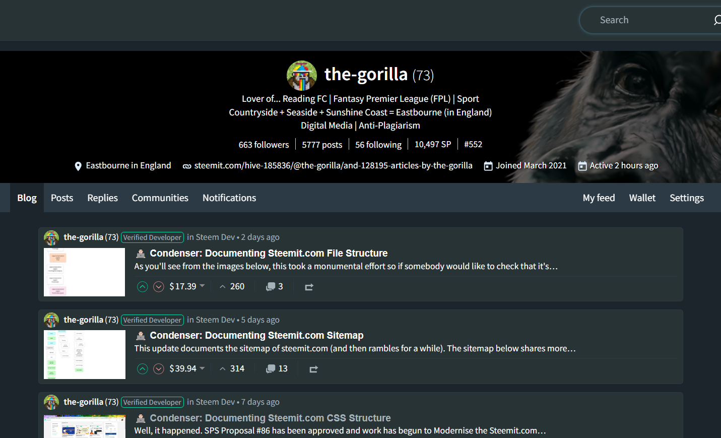
An alternative implementation that I've played with is for the Feed link to be available whether you're logged in or not - which will take the user to the "My Friends" Feed of whichever profile they're on. This is perhaps a little known URL that's available if you want to see another users' Friends feed.
For example, https://steemit.com/@the-gorilla/feed will display what I would see if I click on "My friends".
< li>
<a href={"@"+accountname+"/feed"}>
{accountname}'s {tt('g.feed')}
</ a>
</ li>
I quite like this option and found myself skipping between different users' Friends feeds.
What do you think?
Which implementation within the Profile Menu do you prefer?
I very much like the idea with the top menu allowing to access most important pages directly from a menu bar. Also having the direct link to the own profile etc. would probably save us a lot of additional clicks on the hamburger toggle menu.
Not sure about removing a panel and/or changing the existing page structure though. I like the current width of the center panel, which allows to see the important content without moving my eyes from left to right. So, when scrolling down per mouse, I basically don't need to move my eyes very much and this makes exploring the content very comfortable to me.
If the standart setting would be like it currently is, but the left and/or right panels would be collapsible/resizable, I would see that as a good compromise between both worlds. For pages other than the user profile I prefer the version with only tabs and without the profile header.
Thanks for the suggestions. Once a top menu is introduced, then we can decide what supporting information would be relevant to support the page and how that could work (best placement, interaction, etc.).
Depending upon how wide the page goes, the removal of a side panel shouldn’t have much impact upon where you’re looking (like your personal blog feed or replies) but we can experiment and get a better feel for how it’ll work once I’ve got the top menu up and running 👍🏼
I liked the Feed link idea.
I also agree that one panel can be removed. At the same time, the list of "My communities" can probably be useful for many users. There is also an ad in the left panel, which you probably have to leave.
"Trending communities" can definitely be deleted, hardly anyone uses them.
😊 I use an AdBlocker so I might have accidentally missed that one.
My idea with “My Communities” is that the tab in the top navigation would load the feed and then the right (or left) sidebar would have a list of communities they’re subscribed to and the option to “explore”.
I think it's nice to be able to do that
👍🏼
In my opinion, you are retiring the benefits of left and right pannel. It's an advantage and ease of use for large screen users.
Using the long strings is just a waste of space. You can manage the feed in the centre panel easily. Why is there actually the need to remove those panels
Other than the community information on a community page, what benefit do we receive from either left or right panel?
They consume almost 1/3rd of the screen which could be better used for more valuable content.
I shared more detailed thoughts in this post which explains why I believe the panels are pointless. There are also a lot of thoughts in the comments from other users regarding this.
It will be good if you use these side panels to show valuable information rather than flexing the feed to the whole screen for large screen users.
And can add the tabs for small screens.
My intention is to keep one panel for contextual information - for example, the communities information is particularly valuable. This would also help break up the design of the page, allowing it to breathe.
At the moment, the information in both columns combined doesn't warrant the amount of room they're consuming and can be merged into a single, more useful, more contextual sidebar.
peakd flex the feed to the entire page and whilst it's not quite to my liking, I know that it's the preferred interface amongst Hive users. Perhaps interestingly, their "List" and "Blog" views maintain a sidebar whereas their "Grid" view doesn't - I would also critique the lack of design consistency across the 3 views as it appears that little care has been taken in the execution of their design.
I think the feed in the profile is very good as an additional link/additional subpage. Especially if you want to develop the profile page into the start page. In this case, I would even set up the feed as a "standard tab" and not just as a link to https://steemit.com/@the-gorilla/feed. Personally, I don't need an overview of my own posts.
The distinction between the own and external profile would therefore only make sense if the feed is displayed in the own profile and the blog in the external profile.
It's really bad when there are so many options ;-))
The distinction that I’m working to is that Profile contains things that the logged in (or viewed) user has produced whereas the feeds is content that others have produced “for the logged in user”.
I think what you’re suggesting would be an overarching page which combines both into the beloved Dashboard 😊
I’m trying to simplify things in my mind as I’m getting a lot of conflicting suggestions that have started to confuse my thoughts (not you 😉)
This seems to be a retro design, can we introduce a thematic approach? Let the user select up and down or keep the left and right menus?
The left and right forms are more in line with the usage habits of x users
personal opinion for reference only😃
(Published through Steemit Dapp https://boylikegirl.club)
By "thematic approach", do you mean allow the user to decide whether the navigation is at the top or on the left?
The left and right forms are also used on Facebook although they have their primary navigation across the top... The left sidebar is then used for secondary navigation (it's customary for navigation to be either top or left) and then the right panel is generally used for additional context (less frequently used for navigation but can be).
I opted for the primary navigation to go across the top because it makes it consistent with the Profile page - if we move it to the left panel (like your dApp), then I'd also need to reimplement this on the Profile page too. That'd then create a challenge with mobile users where if the left menu becomes collapsible, it'll be competing with the burger menu in the top right. Which would lead me to thinking that mobile users would want an "app style" tabs across the bottom.
Once I've completed this version of the navigation (I'd also like to follow Facebook's lead and introduce icons (my MSc dissertation concluded that icons improve the usability of computer systems)), then I'd like to produce some ideas and mock-ups of what the left and right sidebars could be used for with contextual relevance. At that point, they could become collapsible but with the primary navigation still available, these could be hidden from mobile users (like they currently are) without the user having difficulties introduced.
Hopefully my thoughts make sense!
This means I can stalk your feed now. (:
I'd want to see general profile information like club status, profile visitor count, VP in a side panel (VP should be displayed on all pages).
I’ll have to see what data’s available to the page - club status won’t be but there’s no reason why a “user profile” couldn’t be in a side panel of a post you’re reading.
Steem 2 moon now
This post has been featured in the latest edition of Steem News...