👨🏼💻 #Proposal-86: Communities and Updated steemitdev.com
It has been a little whilst since my last update during which, a lot of time has been spent testing the integration of the navigation as well as the beginning of the next stage of development. Testing has generally gone well with 3 bugs being identified and fixed:
- Empty secondary navigation in the "Explore" tab for logged out users on mobile devices.
- The "Load more..." link on the "Notifications" screen being inaccessible behind the navigation on mobile devices.
- Trending communities displaying under "My Subscriptions" after refreshing when logged out and then logging in.
In addition to this, the indentation and spacing has been subtly tweaked on both mobile and desktop views.
These updates have been deployed to https://steemitdev.com and are working as expected.
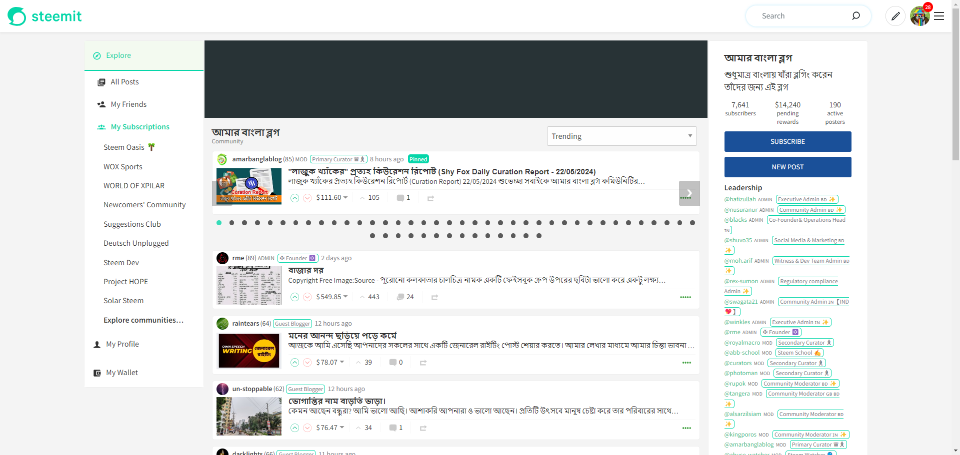
Communities
Whilst fixing these bugs, I also fixed a couple of other bugs that had been submitted to GitHub (more on that later) and whilst looking at these, I found this "issue" raised which was an idea of how to redesign communities.
There were some consistencies in this design with what I was already considering with the following objectives in mind:
- Make it prettier.
- Reduce the need to scroll past 100 pinned posts.
Make It Prettier
I've found these objectives extremely challenging so far. I want to use the community's avatar and cover images to "jazz up" the screen, similar to how it's implemented on peakd.com - bringing the information that's currently in the top right into the cover image.
The cover image alone proved to be more difficult than expected (although the final solution is actually quite simple) and instantly brings a community page to life (when used).
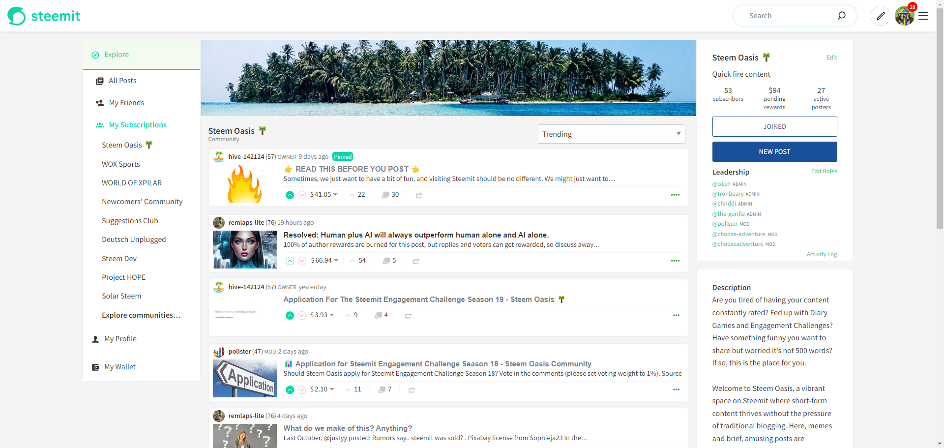
It's a 1st version so a long way to go but a good indication where my thoughts are heading.
__
Reduce the need to scroll past 100 pinned posts.
This also proved to be more difficult than it should have been. It was easy enough to separate out the pinned posts from the data returned for "Trending" and "New" options (they're not prioritise (i.e. pinned) for "Payout", "Muted" or "Hot) and subsequently wrap them in their own list. I was then able to easily wrap them in their own element with a "scroll" effect using overflow-x: scroll.
Unfortunately though, this introduced a vertical scrollbar where the Payout Information, Downvote Information, etc. was on the screen but invisible. Setting overflow-y: visible conflicted with the overflow-x property with either x or y being set to "scroll", automatically (and unchangeably) setting the other to "auto". I tried tons of solutions which either resulted in the aforementioned issue or the overlays being hidden within the wrapper.
After a huge amount of frustration, I discovered a simple solution. A new CSS class introduced in 2023 (which a lot of comments were rather negative about) of overflow: clip. The negativity stemming from the fact that it can only be used on x OR y, not both. For me though, the perfect solution.
So once again, huge frustration and much experimentation to eventually reach an incredibly simple solution.
After some time styling it up, adding in some navigation (no auto-scrolling carousel yet), it finally looks like this:
It still needs a lot of work, especially on mobile and I'd like to give the pinned posts a bit more prominence now that I've hidden most of them.
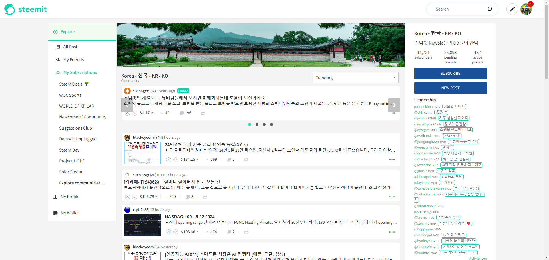
It works for an unlimited number of pinned posts (although obviously won't look great) - the biggest example I could find was 54 pinned posts:
It's instantly made a lot of communities much more user friendly and will hopefully discourage community admins from pinning everything just because they wrote it.
The progress is available on my dev. server: https://condenser-web-r64jisicxa-od.a.run.app/ and I invited you to have a look and let me know what you think of the general direction.
As I've mentioned, this is an early look and there's a lot of effort still required.
I'm a little late... but... ;-))
Yes, as we have seen and are pleased to note, this happened very quickly so that we can all test the new design.
I have now reactivated my server (https://steemit.moecki.online) and integrated your changes (in the PR branch) there. This means that I may soon be able to add the bookmarks live so that other users can also use them. :-))
I have created the branch
integrationin my Github for the code version of this server (https://github.com/only-dev-time/steem_condenser/tree/integration). So everyone can follow the changes if needed.I also find that very appealing. You have my support for that :-)
That is definitely very desirable. I've already thought about it a few times. On the one hand, there is a reason why the communities have pinned posts, and on the other hand, I don't want to scroll through 100 pinned posts to reach the first new post.
I think your solution with the carousel is good so far, but as a user I probably won't click through all the pinned posts, so they will be lost in the future. An automatic scroll would make sense, but that might get a bit restless...
I will test it further :-))
Please check the following behaviour:
When I scroll to the top of a page in the mobile version, the main menu at the bottom disappears. The secondary menu remains, but it is cut off on the right. I will provide a screenshot with my smartphone.
Edit:
I’m just heading out so will reply fully later. Does this correct itself when you scroll down?
I’ve noticed that on the existing Steemit.com, when you’re at the top of the page there’s an additional margin on the right which disappears when you scroll down.
That doesn’t explain the bottom menu though. Have you pinched to zoom in at all?
Yes. It only occurs when you are at the very top of the page. It's the same on steemitdev.com.
Nope.
Something I've noticed on my server that doesn't affect your modification: I often see "Na" instead of the reward amount. I thought that this had to do with an unreachable trongrid.io domain, but it was obviously not the reason. Did you have the same problem on your server?
I knew this would be a nightmare. I think it's got something to do with the Node Package "Headroom" which is being used to pin the masthead when scrolling. I think there's something happening when the headroom--unfixed style is being added. It only happens on actual mobile devices so you can guess how much fun I'm having with this 😢
EDIT: I've replicated it on desktop now so that'll save some time. I'm 90% confident it's the headroom package.
Another EDIT: It's not the headroom package (which is probably a good thing). It's the Avatar's VerticalMenu which has visibility hidden pushing the screen width out. For some reason, the overflow's hidden as you scroll down and not when it's at the top. Don't know why - there's no obvious adding or removing of styles. What a pain in the butt.
Das kann ich bestätigen! Just like the pain in the butt. :-D
Maybe this is the same phenomenon as with the VotingBar, where the right border is sometimes outside the window (especially if nobody has voted yet). Or the PayoutPane, which is partially displayed outside the bottom edge if there are no comments yet...
I've struggled with replicating this. When I'm in the mood to fix it, I can't replicate it. When I'm browsing and not in 'dev mode', it doesn't do it. If a post having no votes is an indicator, then I'll be on the hunt for that!
I've fixed the bug where the downvote button doesn't appear if you're at the bottom of the screen (although not merged it in yet as I don't want to confuse things) but not played with the PayoutPane.
I'm really not happy that this is the problem. The fix has required the removal of 2 styles but since the component is used in other places, I now need to find a load of other scenarios to test.
I'm away this week but trying to get some work done... which means my link to my dev server is unreliable and I can't upload.
Oh dear. I just know this is going to be a pain to fix. It happens on the existing Steemit.com too but because the navigation isn’t pinned to the bottom, I don’t think anybody’s noticed. You’ll see that when you’re at the top, a bottom scroll bar appears with some spurious margin-right or padding-right which disappears as you scroll down.
Are you using an Android phone? I can’t replicate it on my iPhone (beyond the right margin issue).
I experience that problem occasionally but it tends to fix itself after a page refresh and then everything works as expected. It hasn’t done it to me for a while though and didn’t ever investigate its cause.
That's right, and I never noticed that before.
I can confirm that, in the meantime it no longer appears :-)
It's good to wait and see...
Good idea for a way to deal with the excess pinning.
Maybe it would be ideal to display 2 or 3 pinned posts for ensured visibility of key current posts.
I think that this would work well on a Desktop and could vary 2 or 3 depending upon screen width 👍
Would it be possible to choose what you want to see regarding pinned posts?
For example contest posts. That would be awesome.
I think that might be too resource-intensive - especially in the communities that have 50+ pinned posts!
I could potentially include a link to "see all pinned" or similar - which would return the user to the existing view if they didn't want to tab through 🤔
Umh.. the latter could work. Thank you!
I wish those "old pinned" posts could be removed automatically after seven days, as nothing frustrates me more than seeing contest posts that are two months old still pinned.
On the flip side, there are posts like information or meet the team posts that needs to stay pinned.
Yes, it's generally the "welcome" or "community rules" that are pinned for a long time, sometimes years and I feel uncomfortable that these will be hidden from initial view.
I could work on the opposite approach where the initial view shows all of the pinned posts and when the user selects "Collapse Pinned", then they can disappear and that setting can remain stored on their computer. It's probably the people who visit a community regularly that get most annoyed by having to scroll past the pinned posts every time so this feels like a better solution. Thank you BFF3Bs.
The pleasure is all mine!
Thank you for the suggested solution. We have this saying in my home language, Afrikaans. "Dit is vreelik dat so 'n brein moet vrot."
Greetings friend @the-gorilla
I am glad that you are moving forward with your project, and that you have the wisdom to correct the errors that appear. I think the ribbon for pinned posts is very good, this will give more visibility to the posts of participating users in each community.
Какой интересный пост, @the-gorilla! Надеюсь мы увидим в нем захватывающее обсуждение! ^^
Кстати, как вам наше сообщество RU Steem? С удовольствием приняла бы от вас делегацию 2000 Steem Power, либо донат 500 steem на его развитие.
Great work! Thank you!! 🤛
I am really happy to actually see that you are actually moving forward in your project and I am so sure it is just a matter of time before we see it
This post has been featured in the latest edition of Steem News...