👨💻 #Proposal-86: Communities Update & Bug Fixing
It's been far too long since my last update so please accept my apologies for that. A combination of school holidays, illness, teeth brushing, IT problems (i.e. Google Cloud Hosting) and struggling to get my head around (and subsequently fix) some issues with the recently launched navigation have also meant that progress has felt extremely slow. I certainly don't feel like I'm delivering the progress that I was planning to at the moment - a situation that I'm intending to rectify.
Enough rambling - what have I been up to?
👨👩👧👦 Communities Update
I feel happy with the robustness of the solution now. The Settings screen is working well and the banner / avatar are updating as expected. The collapsing and expanding of pinned posts has immeasurably improved the browsing experience (in my opinion) so the next step is to get these changes committed to GitHub so that we can get them deployed to steemitdev.com for even more testing.
🪲 Bug Fixing
A number of issues have been highlighted to me which I can summarise in 2 parts:
Android Posting / Commenting (Issue 3923)
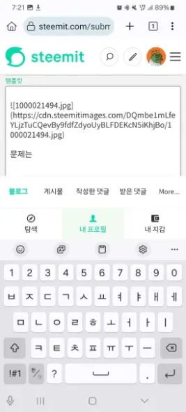
The combination of Masthead, Navigation and Keyboard visibility has made the "Post" experience in the Kiwi Browser on Android extremely difficult / unusable (screenshot to the right).
There aren't many options available that would work as a solution and I considered the following:
- Automatically hiding the (primary and/or secondary) navigation when focus shifts to an input field
- Hiding the (primary and/or secondary) navigation when writing a new post or viewing a post
- Introducing the ability for the user to hide the navigation whenever they want
I probably considered more options but these are the main 3.
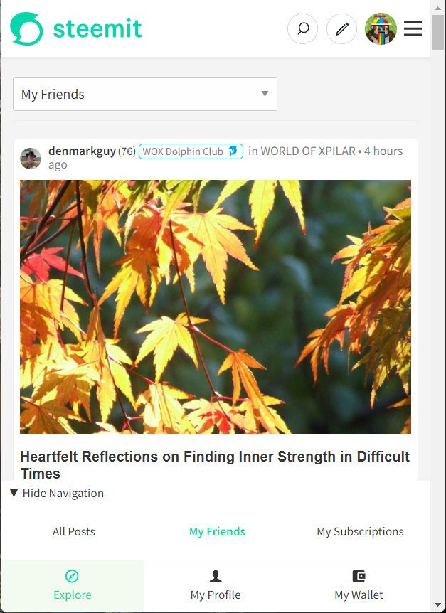
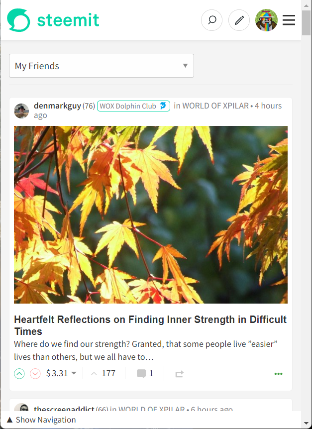
Whilst it doesn't feel perfect, option 3 stood out as the best option as it keeps control within the hands of the user and is the solution that I've been working on. It still needs some more work (I only completed implementing an initial version of the functionality this morning) as it currently stores the "show/hide" in State - meaning that navigating to a different area of the site will make the navigation reappear. This was my original intention but whilst testing, I've realised that once I've hidden the navigation (for whatever reason I decide upon), I don't want it to reappear until I tell it to. Which means that I've got to adjust the storage to being lcoal, rather than state managed.
My hesitance with this solution links back to the design patterns that I spoke about many months ago - particularly the thoughts around Hamburger Menus. This solution feels a lot like I'm hiding the navigation behind a hamburger menu although I key difference is that it's the user's decision to hide something they've seen - rather than not being able to find something that's initially hidden. So I need to get over this hesitancy.
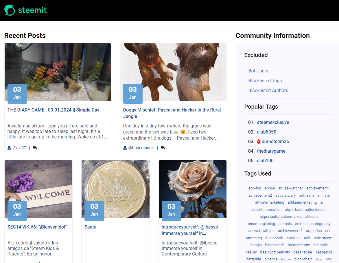
Anyway, current version looks a little like this:
Screen Overlays on Mobile Devices
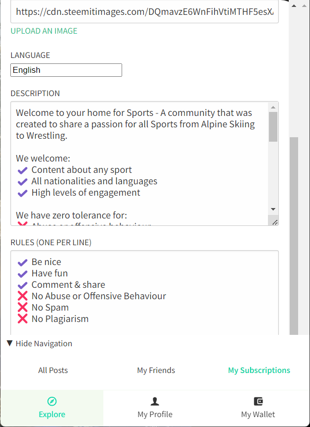
Another issue that has been highlighted to me is that when an overlay appears (e.g. adding beneficiaries to a post), the bottom of the content appears behind the navigation - something that's also noticeable in the Community Settings Screen (see screenshot to the right).
In the example shown, it means that you can't submit community updates on a mobile and similarly when setting beneficiaries, adding multiple users prevents you from seeing the "Save" Call To Action.
Both annoying and unusable for mobile users.
Fortunately, the solution I've discussed above also solves this problem.
I've uploaded these changes to the following location:
https://condenser-r64jisicxa-ul.a.run.app/@the-gorilla/communities
Please take some time to have a look and play, in particular is you're one of the Android users that has been affected by these issues.
Next Steps
- Listen to feedback
- Update the code to use local storage, rather than state, for the show/hide
- Submit changes to GitHub and seek deployment to steemitdev.com
- Document the Code Changes (including all bugs)
- Improve more things and try not to break anything.


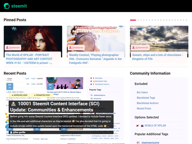
the-gorilla's Alternative Steemit Interface
In case you didn't know, I've created an interface to help you find content that you're interested in more easily.
Posts by voting bot users, abusers and spam tags are hidden and you can search by multiple tags - allowing you to find the content that you're interested in more easily.
👉 Launch Alternative Steemit Interface 👈
the-gorilla's Club Status Tool
I've also created a tool to help users review their club status - showing them where their power's coming from, how much they're powering up, transferring out and who they share a wallet with amongst other things.
Please use it wisely.
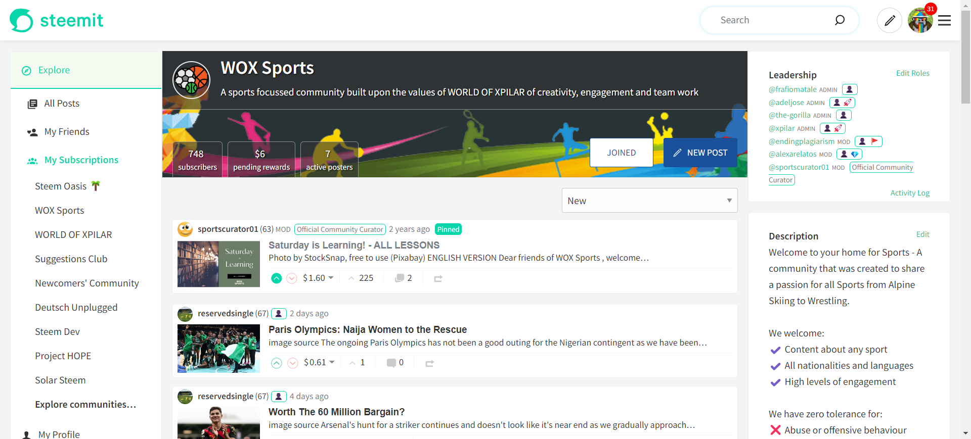



Well, there really isn't much to say. I think hiding the navigation is very good. In my experience with the new interface so far, I rarely need the navigation. That's why it wouldn't be a problem for me to hide it.
Sometimes when I visit a user's profile page and want to look at their comments, I have to think for a moment about how to access the comments. This might be even more unfamiliar if the navigation is hidden, but I don't think that's really a problem.
That's why I think you should implement it like this... after you have thoroughly brushed your teeth ;-)
School holidays? Illness? IT problems?
Sorry, but the only excuse I'll accept is brushing your teeth thoroughly - we all know that health is the most important thing. #clubteethbrushing
Applies to everyone's health... #clublivingsheep
That is why I can only tell you: it looks great, it feels great after years, unfortunately I have no head or heart for explicitly field-tested feedback at the moment. But feedback... :-)))
Feedback is always wonderful, especially when supporting the most important aspect of any post -the teeth.
In these modern, hectic times with so much to think about, it would be easy to forget about teeth but with advances like Steemit and especially the plethora of Diary Games, we can all be confident that teeth will NEVER be forgotten.
Believe in the power of the universe.

Everything will be fine in the end, otherwise it's not the end!
This post has been featured in the latest edition of Steem News...
Love the progress update!
This post has been upvoted/supported by Team 7 via @philhughes. Our team supports content that adds to the community.
Thanks for the update👍
I want to ask a question.. although it isn’t related to your post but I figured out, since you are a programmer, you might be able to help out.
Whenever I make a post, 2 moderators have complained to me that each time they try to view my image, it takes them to “download”.
It’s there something that I’m doing wrong when uploading my images??
Can you point me to a specific image in a post to look at?
https://steemit.com/hive-168072/@sbamsoneu/choices-what-will-it-be-52#comments
This is the link to the image…
If you check the comment section, you’ll see where she was telling what to do and that’s exactly how I “source” my images but each time I participate in her challenge, she still encounter same challenge..
I don’t know if it’s my fault or it’s from her end?
I've just read your comment and I'll chime in.
As patjewell wrote, you have linked a URL that leads directly to the Content Delivery Network. Only the download is possible from there.
So instead of https://cdn.pixabay.com/... you should link to https://pixabay.com/... .
Ok sir… thank you very much for the assistance..
I checked, no errors loading the images
Ask them to clear their browser
If that doesn't help, they have a slow internet connection
Thank you sir!!
The community view is great.
I can't say much about the mobile version after my WEF anti-big-brother hardware update. I have the latest "Orwell knew it" 42.1.1 version installed. The other 3
millionapplications (phone calls, SMS, Snake) work correctly. I think the error is not due to your programming, might be because the display is a bit scratched.A suggestion for the future: Someone should remove these TRX fake rewards. As a new user from the Tron universe, I would feel cheated. The TRX Rewards should be replaced by TBT Rewards! (Teeth Brushing Token)
If you were to replace the Voting CSI with the TBS, the TBT would go to the moon and pull the STEEM price up with it.