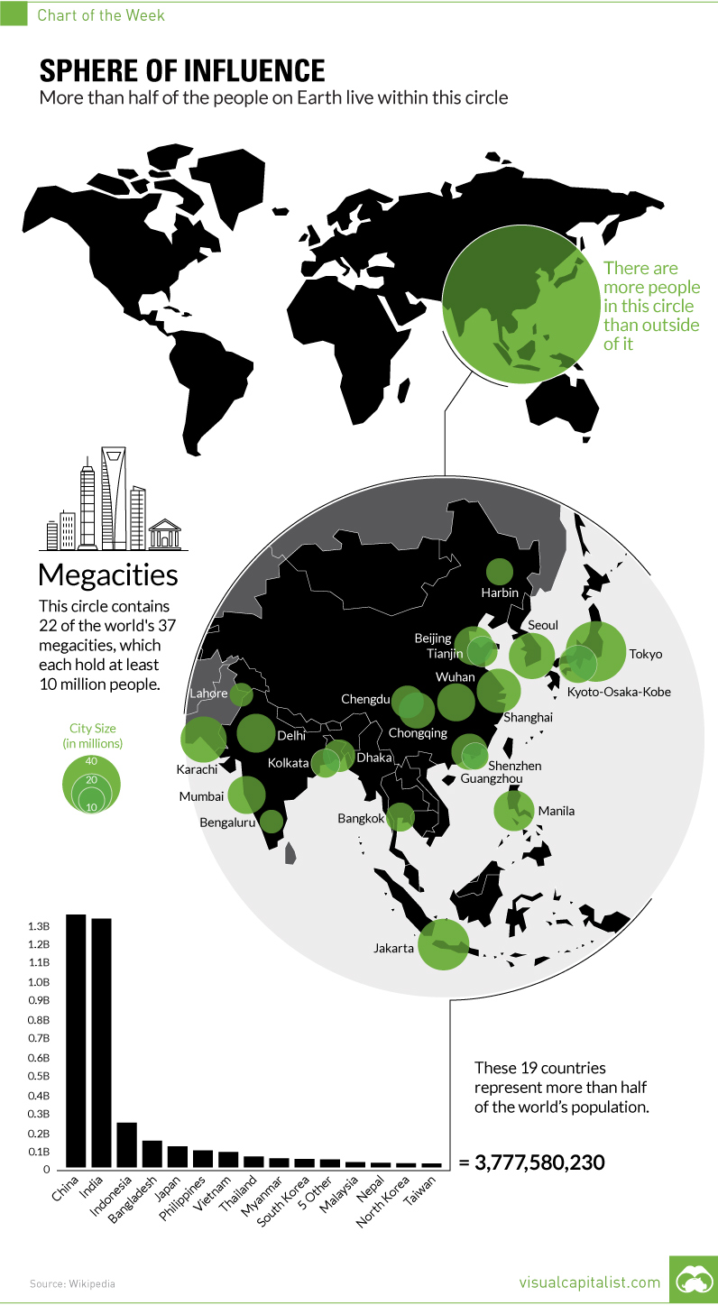
The Majority of the World’s Population Lives in This Circle
(September 9, 2016; Visual Capitalist)
Back in 2013, a meme circulated quickly off of a Reddit post that showed the incredible population density of the southeast corner of Asia.
...
We are in the business of explaining the world through compelling and intuitive visuals – and we thought that this powerful “meme” could use a refresh with some additional graphical context.
Read the rest from Visual Capitalist : The Majority of the World’s Population Lives in This Circle)
I usually post links to articles that are relatively recent (within a week prior to posting), but this seemed too fascinating to ignore. Populations in the graphic have certainly changed between 2016 when the graphic was created, and now. And this graphic is a refinement of a Reddit post (with a link to an imgur page) from 2013. But, the extra context here is lovely.
In addition to supplementing the map itself, this article some geographic and more detailed demographic info that make the story all the more fascinating.
I haven't read from Visual Capitalist before; it looks like it's a source worth keeping in mind.