On web design and development
Recently I entered a Harvest Finance contest which consisted of creating a new design for their website. Since I'm not a web designer, but a software engineer, I decided to take on this job the way I knew best: by writing some code. I never used tools like Photoshop or other design software so picking any one of them up seemed too much of a hassle right now. You can check the full demo here by the way: https://chad-farm.vercel.app/#/
The tools I used
While it may look like a lot of stuff this is a basic development setup that any frontend software engineer is familiar with:
1. Vue.js - The frontend framework
Using a framework more often provides a much faster way to develop reusable components and do a bunch of cool stuff like passing data around from one component to another.
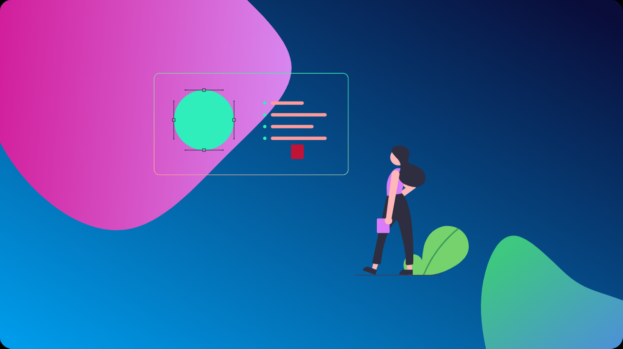
Take for example the following screenshot:
Here there is illustrated one of the screens in my redesign containing both a dark and a white theme. To achieve this I did a simple trick in Vue.js. The way you usually structure a project is that you have one root component called App.vue and then all the other components and views are nested inside it.
Let's take a look at the code:
<template>
<div id="app">
<navbar @theme-changed="changeTheme" :mode="this.mode"></navbar>
<router-view :mode="this.mode"/>
<img id="chad-glory" src="@/assets/landscape.png" alt="Chad in all his glory">
</div>
</template>
<script>
import Navbar from "@/components/reusables/Navbar";

export default {
    name: 'App',
    components: {
        'navbar': Navbar
    },
    data: function() {
        return {
            mode: 'light'
        }
    },
    methods: {
        changeTheme() {
            if (this.mode === 'light') {
                document.body.style.backgroundColor="#121212";
                this.mode = 'dark';
            }
            else {
                document.body.style.backgroundColor="white";
                this.mode = 'light';
            }
        }
    }
}
</script>
<style lang="less">
    @import "../node_modules/uikit/src/less/uikit.less";
    @import "../node_modules/uikit/src/less/uikit.theme.less";

    #chad-glory {
        width: 100%;
        object-fit: cover;
    }
</style>
If we focus on the <div> with the id="app" attribute we can see that the <navbar> is constant, the image at the bottom is constant and only the content in the middle changes when we navigate through our app. This allows me to emit an event from my navbar (when you press the theme changing button) and listen for that event in the App.vue component.
Remember, this is the root of our app so we can just create a mode variable and pass it down to all the child components. This combined with different stylesheets for light and dark mode lets us switch between themes.
2. UIkit - The CSS framework
Why use a CSS framework? Well, a CSS framework allows you to use ready-made styles and components, plus they usually offer a bunch of utility classes that you can easily plug into your design to obtain the desired layout. I think the most used style in my design is the card component.
Using UIkit, with just two classes uk-card and uk-card-default, you can get a nicely styled card component that you can populate with whatever content you like.
3. FontAwesome - The icons
Icons are everywhere. From the closing x on mobile devices to the burger menu, to link icons, they are everywhere. In my opinion FontAwesome is the most complete icon set out there. Besides that, the other illustrations that you see in the images are taken from various sources and edited by me to match a certain style.
Other design needs
To create a nice design though you also need a couple more things, this time not software related. If you lack any form of knowledge about the color theory you can use a website that I have suggested in the past as well, ColorSpace where you can start with a color you like and create some palettes that complement it. This time, in order to bring something new to the table I'll suggest another great tool that I use: Coolors.
This one can do a couple of things from creating color palettes to gradients, but I like to use it for its contrast checking functionality.
You can use it to check if the colors you're using can be easily distinguished when placed one on top of another. This is especially important for dark themes where you might have to use less vibrant colors to gain some readability.
The last element you might need to create a nice design is some great fonts. Don't use a bunch of fonts, one or two are probably enough for 99.9% of any website you'll ever design. Including many fonts on a website can be annoying to the user. For this design I used Lato all throughout and instead of using other fonts, I played with the text shadows and the weight of the font.
Fluid typography
This might not be for everybody, but I like to experiment with this thing in all of my designs. Instead of using some fixed measurements like
font-size: 1.5em;
I like to use a trick that creates fluid typography, which means that the size of the text depends on the device you're viewing it on. This is every designer's dream come true I think. Why change the font to match a couple of popular form factors when you can have it all. Here is a function written in LESS (a CSS preprocessor) which I use to have fluid text:
// Fluid font sizing
.fluid-font(@min-font, @max-font, @min-screen, @max-screen) {
    font-size: calc(unit(@min-font, em) + (@max-font - @min-font) * ((100vw - unit(@min-screen, px)) / (@max-screen - @min-screen)));
}
This way I avoid writing a bunch of media queries to handle the font size and instead make it dependent on your device. The CSS calc() function is standardized and supported by all browsers.

I think having those things is a nice point where you can start if you have no experience as a web designer or developer. Oh, I almost forgot, let me share with you a nice site where I get my SVG files from. As I've already mentioned, I don't consider myself talented, quite the contrary so I rely on the creative work of others to put together most of my web designs. In this process, SVGRepo is quite a helpful site that has a bunch of high quality, and most importantly royalty-free, SVGs you can find on the internet.
Ending thoughts:
This was a nice experience for me, especially creating the dark theme as I never did something similar before. Am I satisfied with the design? Sure I've seen numerous entries which are much better than what I was able to create, but all in all, I think my work iterates on the current Harvest Finance design, while adding some elements of modernity like the card layouts.
Enough rambling for today! If you've done web design before, what are some of the best resources you use from around the web, I'd really like to find out.