Collage contest third edition "LETTER A THEME" | ENG / ESP
Hi @silviadiez and all collage lovers.
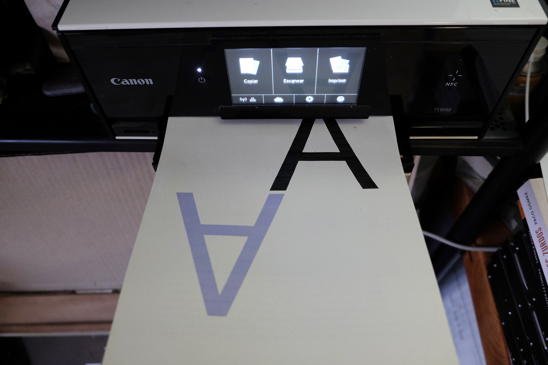
In order to participate in this contest I initially thought of doing it completely analogue, but due to the difficulty of finding letters to cut out of a considerable size and with a clear typography, I decided to look for that letter "A" in the typographic catalogue of my computer and then print the base of what should be the composition, to continue with the analogue phase of collage. On the other hand, I was looking for simplicity of elements and execution..
ESP
Hola @silviadiez y todos los amantes del collage.
Para participar en este concurso en principio pensé en hacerlo completamente analógico, pero ante la dificultad de encontrar letras para recortar de un tamaño considerable y con una tipografía clara, decidí buscar esa letra "A" en el catálogo tipográfico de mi ordenador e imprimir después la base de lo que debía ser la composición, para continuar con la fase analógica del collage. Por otro lado buscaba simplicidad de elementos y sencillez de ejecución
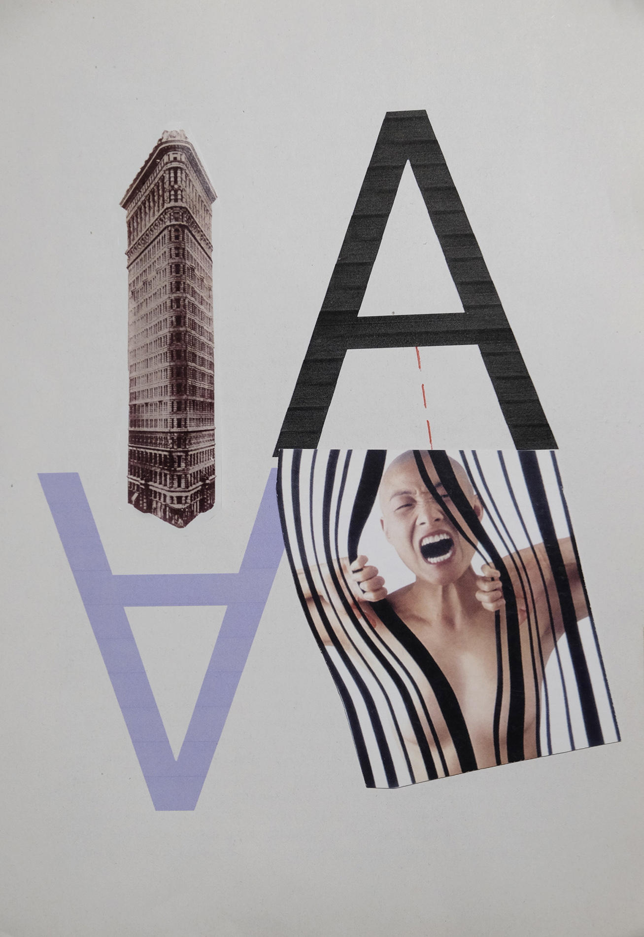
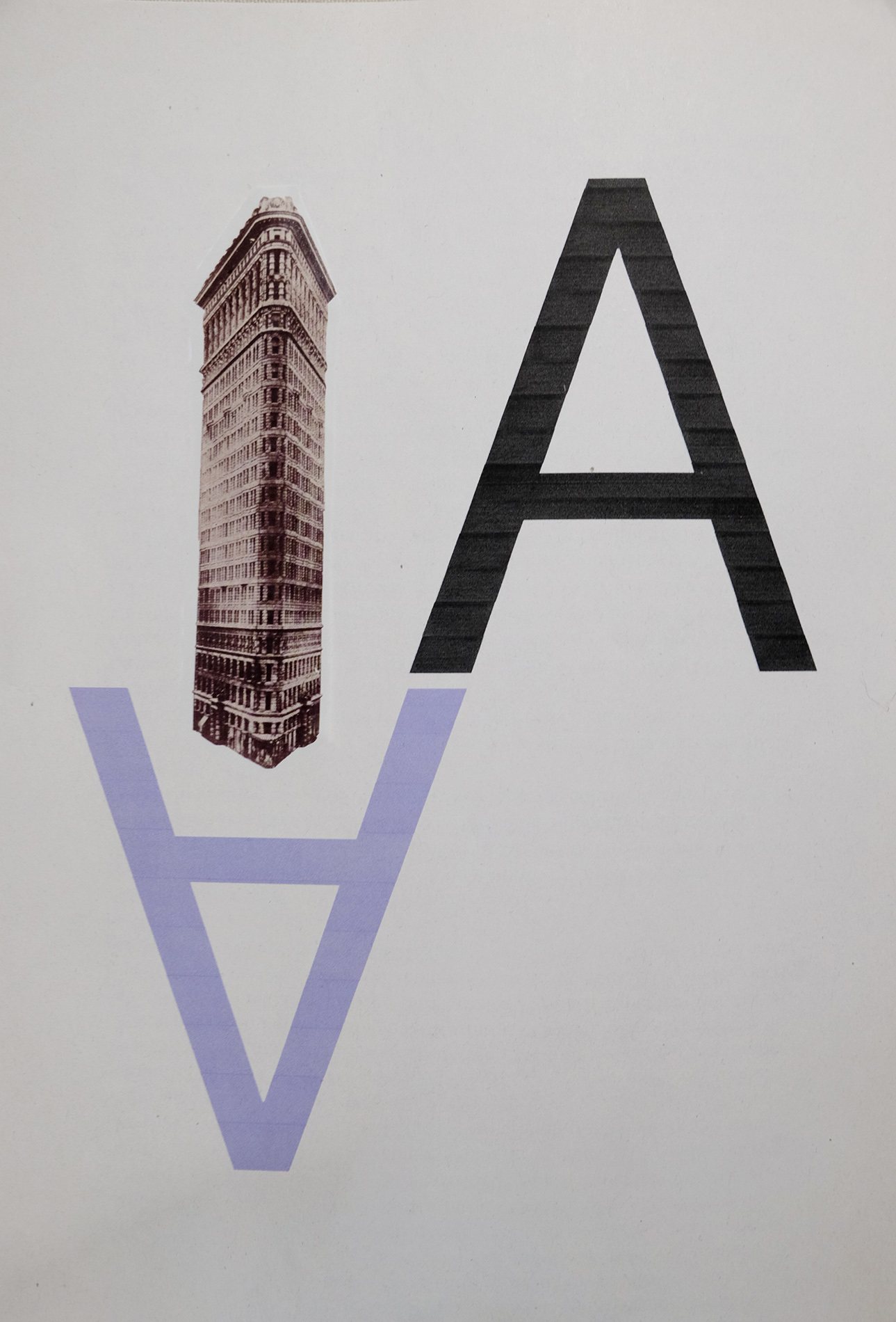
The idea of putting the letters opposite each other and in different colours is to give the sensation of positive and negative. From the inverted "A" should emerge an element that evokes the ground, but not something related to nature, but something that is the product of human creativity. And what better than architecture? An iconic and aesthetically brilliant building such as the Flatiron Building in New York's famous Times Square was ideal in terms of size and proportion.
ESP
La idea de poner las letras contrapuestas y de distinto color es para dar la sensación de positivo y negativo. De la "A" invertida debía surgir algún elemento que evocara la tierra, pero no algo relacionado con la naturaleza, si no que fuera producto de la creatividad humana ¿Y qué mejor que la Arquitectura? Un edificio icónico y estéticamente brillante como el Edificio Flatiron en la famosa Times Square de Nueva York era ideal por tamaño y proporción.
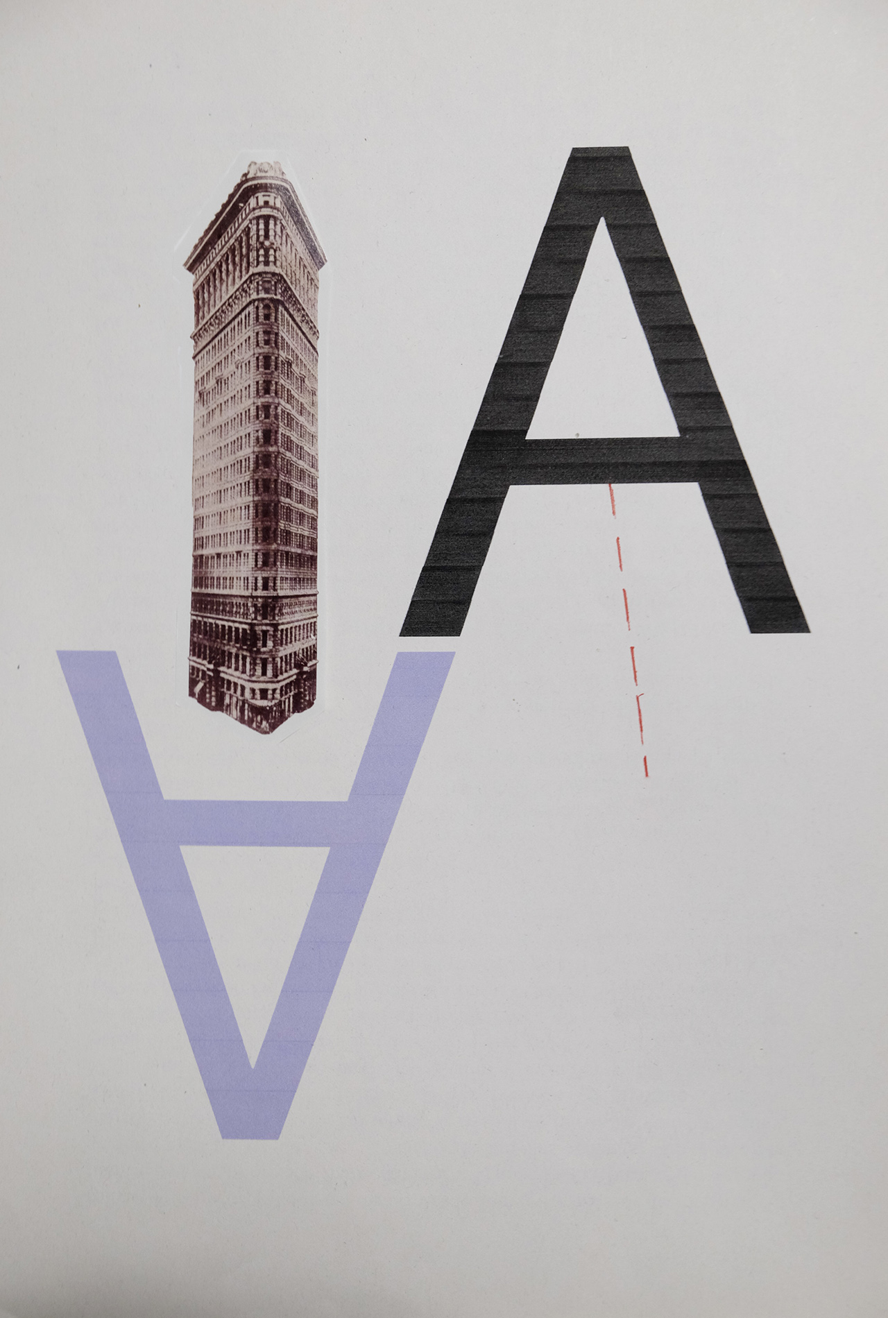
In the part of the negative expression, the idea was that the naughty letter "A" was the mast holding up some kind of human concern, linked to the image by a fragile intermittent thread, and the "A" for anguish fitted perfectly with the message to be conveyed.
ESP
En la parte de la expresión negativa la idea era que la traviesa de la letra "A" fuera el mástil de sujeción de algún tipo de preocupación humana, unida a la imagen por un frágil hilo intermitente, y la "A" de angustia encajaba perfectamente con el mensaje a transmitir.
Here it is the final result.
ESP
Y aquí el resultado final
Unless stated otherwise, all the pictures and the words are mine.
Do not use this image without my written permission.
Proudly free of AI.
Thanks for stopping by and taking a look.
The pictures of the process were taken with:
Camera: Fujifilm X-E2
Lens: Fujinon 18-55mm f:2.8-55
Processed with Capture One
Many thanks to @stef1 and @worldofxpilar for supporting creativity and this beautiful contest.
Your post has been rewarded by the Seven Team.
Support partner witnesses
We are the hope!
TEAM 1
Congratulations! This post has been upvoted through steemcurator04. We support quality posts , good comments anywhere and any tags.Many thanks @o1eh and the team @steemcurator04 for supporting my work.