0000000000000101 - Steemit Interface PoC - Some Polish and Enhancements
I've had another productive couple of days and have enjoyed discussing progress with you in the comments so thank you for your feedback so far.
My focus has been primarily on tidying things up a bit, making the site more "on brand" (i.e. the blues from the logos), enhancing the use of tags and sorting the code out so that it's easier for me to work with.

Tidy Up
I've made some subtle changes to where the posts are displayed which allows more posts to be visible on the screen - Reducing the font sizes and line spacing slightly, with the title limited to 2 lines and summary limited to 3. I've also made a subtle change to the images so that they're not curved at the bottom and introduced a hover state to help show that they're clickable.

The screenshot doesn't really do it justice.
I've also introduced some fontawesomeness next to the author and the comments received. Other things like number of likes (i.e. upvotes) need to get added and this needs quite a lot of work still. It would be nice to include the author's avatar here too.
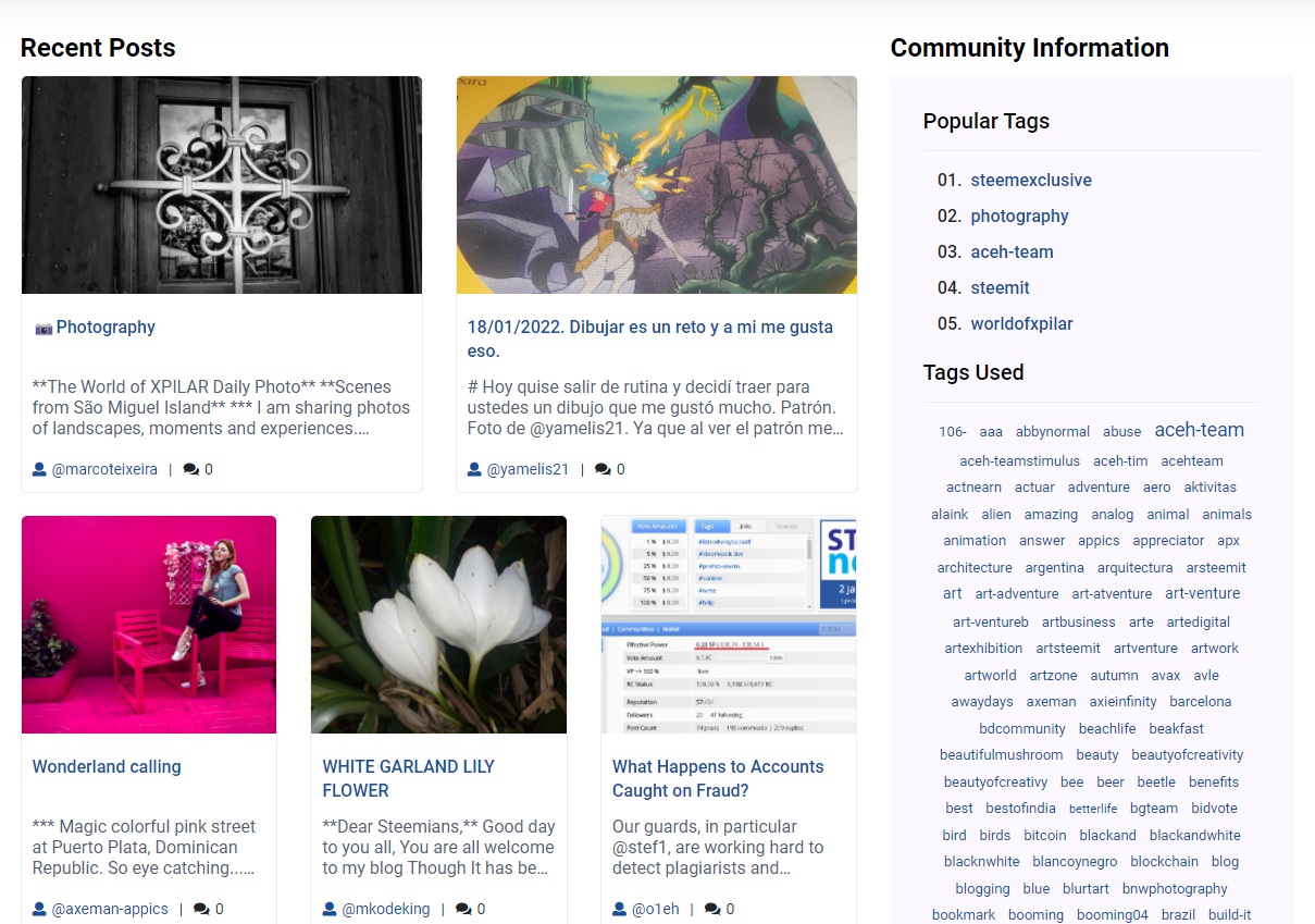
Tags
In my last post, I asked if you could guess which tag was the most popular within World Of Xpilar and the screenshot above provides the answer where I have included the list of 5 most used tags within the community. These tags are clickable like those within the tag cloud and allows you to filter the posts within the community (as per my last update). The other addition I've made is that once a tag is selected, it is listed above the other tags and you have the option to remove it.
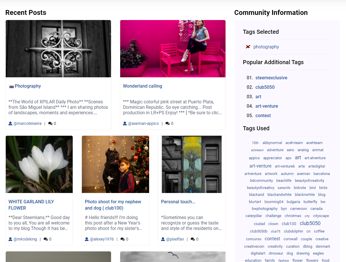
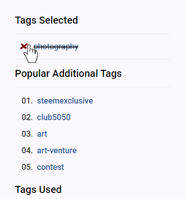
With the option to easily remove the selected tag:
This also has the flexibility to have multiple tags selected which is the feature that I'll probably add next. I'm also thinking of including a toggle so that the tags can be "and" (i.e. a post must include all selected tags) or "or" (i.e. a post can include either of the selected tags). So if you're interested in "club5050" and "club100" you can select posts with include both or either tag.
Other Bits
So that the pages load within a reasonable timeframe (when you're searching through tags, you could hit 5,000 posts without enough matching the tag), I've put a limit on how many posts will get looked at and if they limit's reached, a message will appear saying there aren't many posts that match the filters.
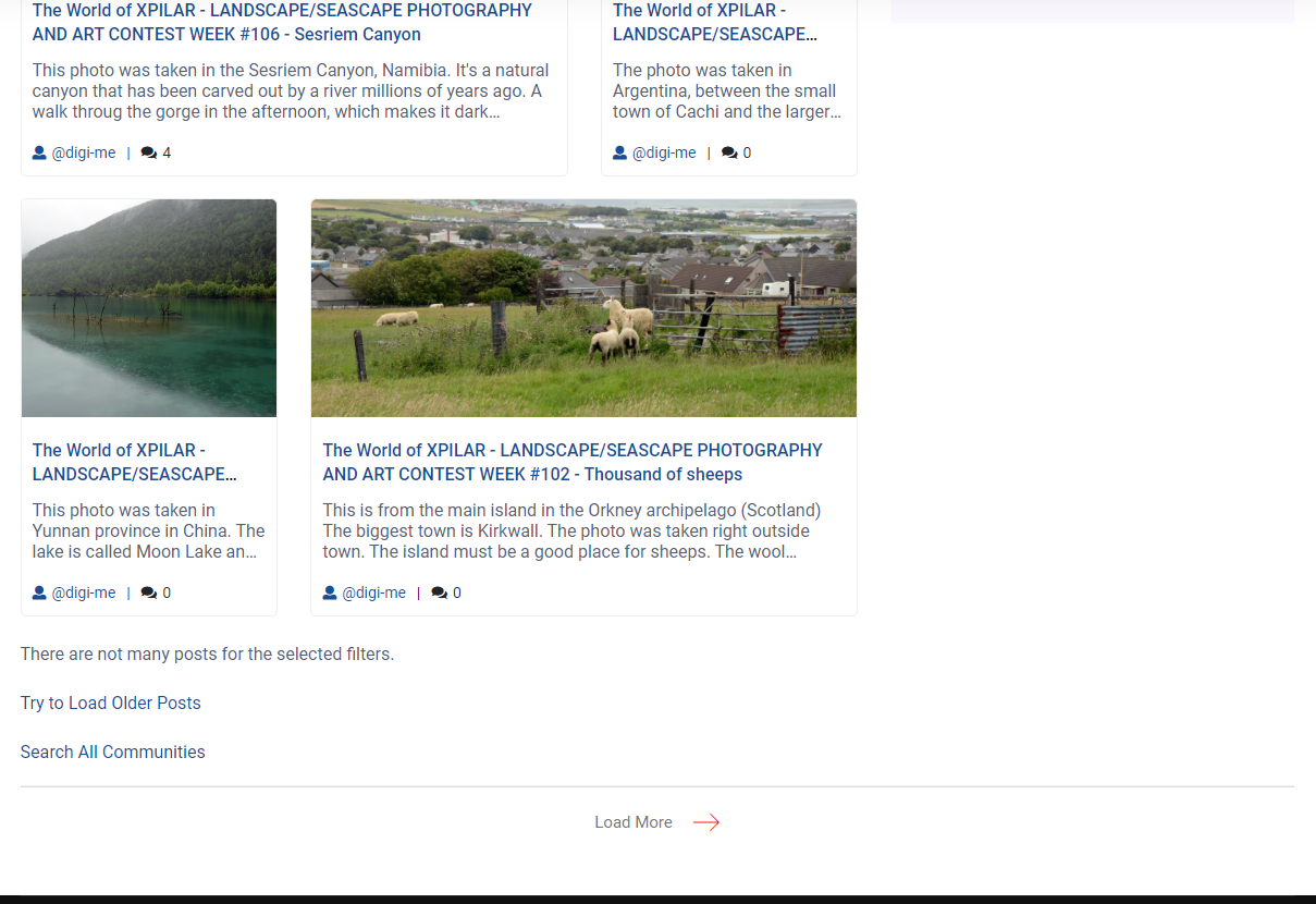
This has the added benefit that it future proofs it somewhat for other filtering criterion that get added (i.e. the multiple tag selection). My intention here is to improve the message to include the dates that the search includes. i.e. "There are not many posts for the selected filters. The posts above are from 1st March 2021 until 18th January 2022."
I have also tidied up the code and made it a bit smarter - allowing for an easy transition from one community to another to no community at all without having to duplicate the page or have multiple instances.
I'm also pleased to share that steemchiller is working on some updates and new API which will allow me to include "pinned" posts and existing community information which will provide me with another challenge 🙂 papi-mati asked me if I can improve the "search" in the comments to my last post. Whilst I'm not planning to work on this for a while, I had a little play with steemchiller's API for this and it worked well so I'm optimistic we can improve things here too.
I've had quite a lot of time to spend on this yesterday and today and I've changed a lot of bits, some of which I've certainly forgotten to mention.
I'm finding the HTML / CSS template and steemchiller's API easy to work with which has allowed me to make good progress in a relatively short period of time. Perhaps oddly, it's the small details like lining up the 'x' and getting the spacing around elements that takes a lot longer than populating a page with data. Which I need to do if I want it to be sexy and not look like it's been designed by a developer.

Hi buddy! I appreciate the work you do. The appearance of the tags does not look very aesthetically pleasing.
This is how tags looked in 2016.
https://web.archive.org/web/20160704203813/https://steemit.com/
I recommend you to look at the previous images of steemit.com from archive.org.
I've gone for a classic tag cloud because you can get a feel for how popular a tag is as well as how frequently the tags are used - the old Steemit version doesn't seem to have any order to it although this page is interesting.
I prefer the version I've created although I'm interested as to what you don't like about it?
One idea I've had is that the full tag cloud is not displayed by default and instead, I have a "see all tags" link underneath the "most popular tags"
Looking promising 😀
Mungkin ia sih🤗
👍🏼
I think the post layout is nice. Lillte bit tag heavy on the right? Community page can use more of that space for something else?
But overall, it looks pretty good.
I'll have a better idea once I've been able to include more community information - which I might even put somewhere else. One idea is that I leave the "Popular Tags" and then have a link to "see all tags" which expands and displays the entire tag cloud.
I'm using the tags as my "navigation" so that users can explore and get lost in the content - in one sense, dismissing the idea of a sitemap / site structure. (I just corrected a type in shitemap 🤣)