Using Colour In Home Decor
Hello Steemians!
Today I thought I'd share a few tips for decorating with colour.
Using colour strategically by employing a few basic principles of colour theory is a very economical way to make your house look great, and, more importantly a happy place to be. Colour enriches our lives and feeds the soul. Regardless of your budget, if you know how to make the most of colour, you will be able to create a wonderful living environment.
Basic techniques for combining colours in pleasing ways based on the colour wheel are broken up into 6 categories, which are:Complementary, Analogous Triad, Split Complementary, Rectangle, and Square
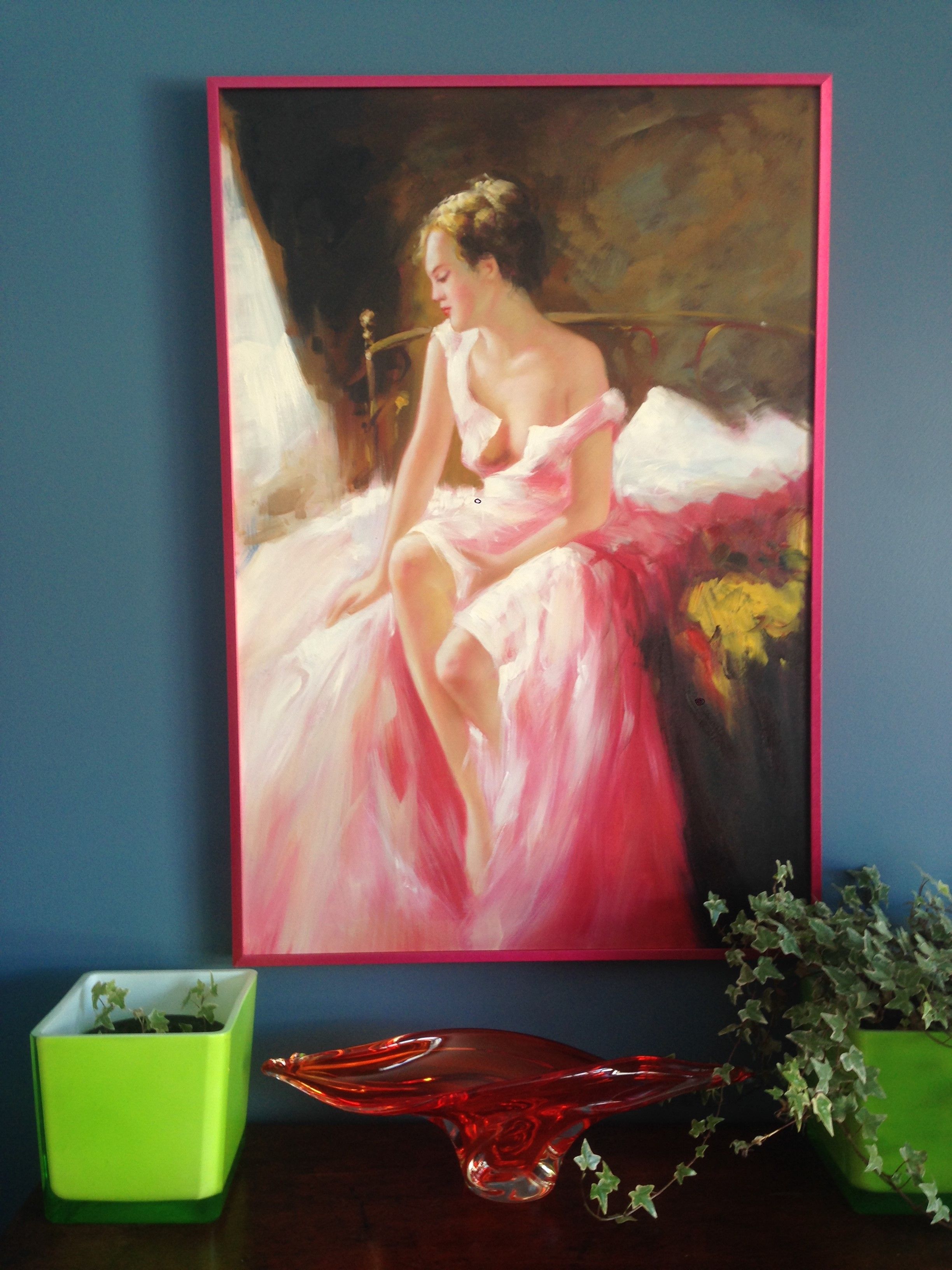
Here I am using a rectangular or tetradic colour scheme, which uses 4 colours (pink, orange, green, and blue) arranged into two complementary colour pairs (pink-green; orange-blue)
Here is a triadic harmony (if you count the wall!) As you can see, I really love lime green and hot pink. In fact, I think this is my favourite colour combination! It's just so happy.
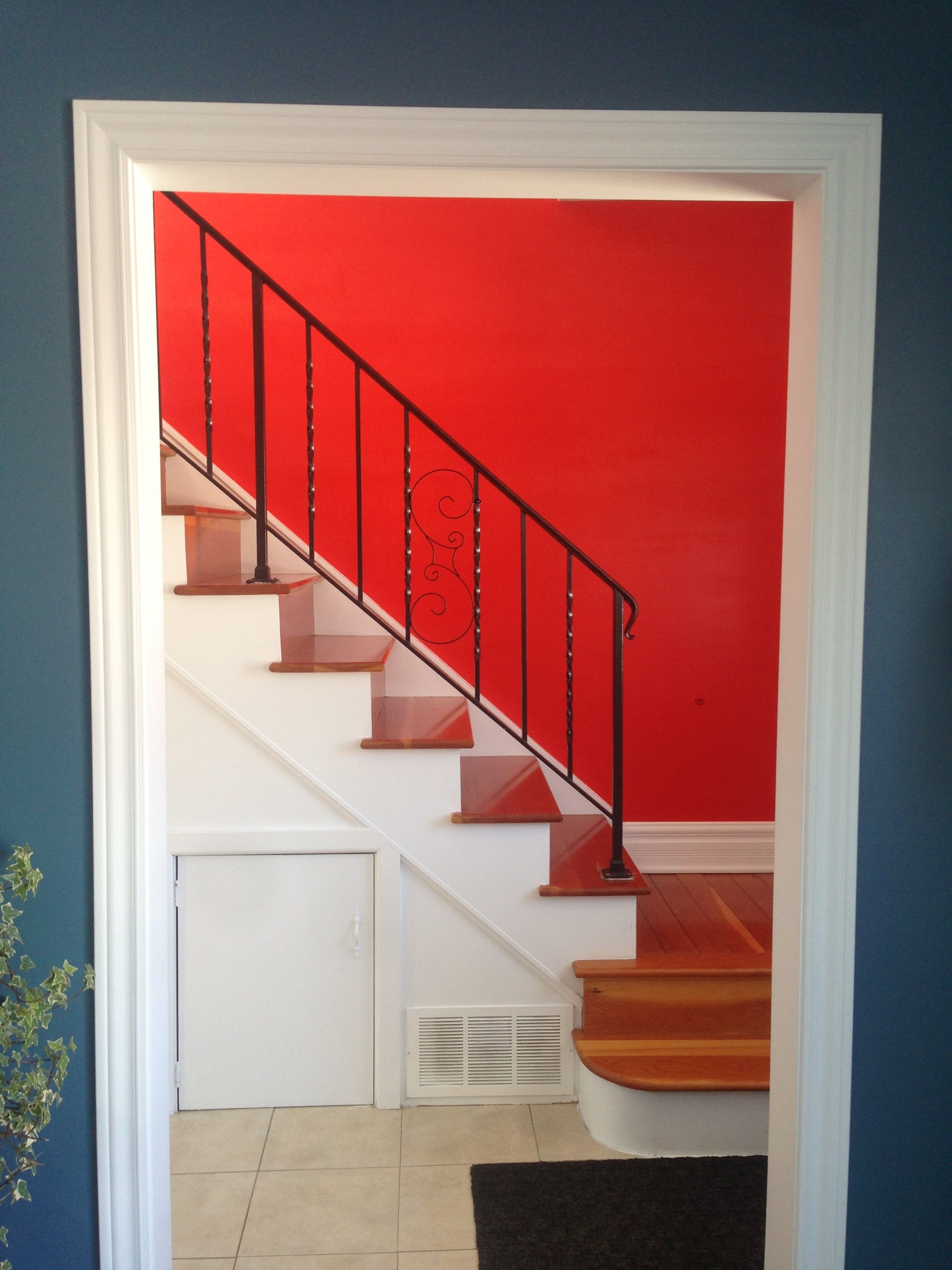
Bold walls are a great opportunity to use complementary colours; here, the bright coral energizes the deep Wedgewood blue.
Sometimes beautiful colour combinations are fleeting glimpses of colours that look glorious together, as is the case with this bright orange mug set against a deep emerald green wall.
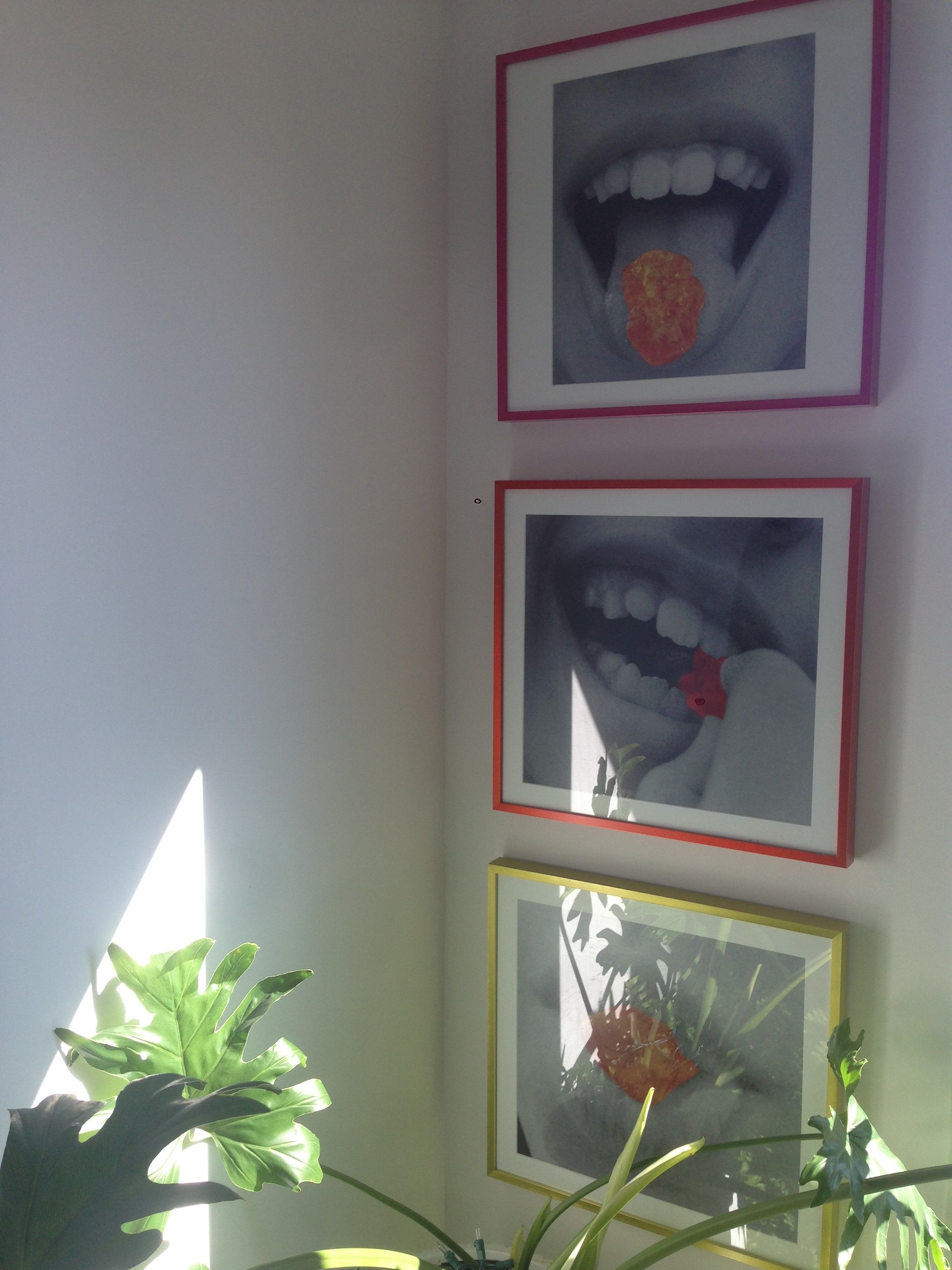
Brilliant accessories such as metallic picture frames, look beautiful on a white wall. this is an nalogous colour scheme, where colours next to each other on the colour wheel are used.
Finally, here's an analogous colour scheme. I've put red and orange objects against the backdrop of my bright yellow kitchen wall.
Have a great day!

.jpg)

.jpg)

