How to Extract Brand Color Palettes From Reference Images
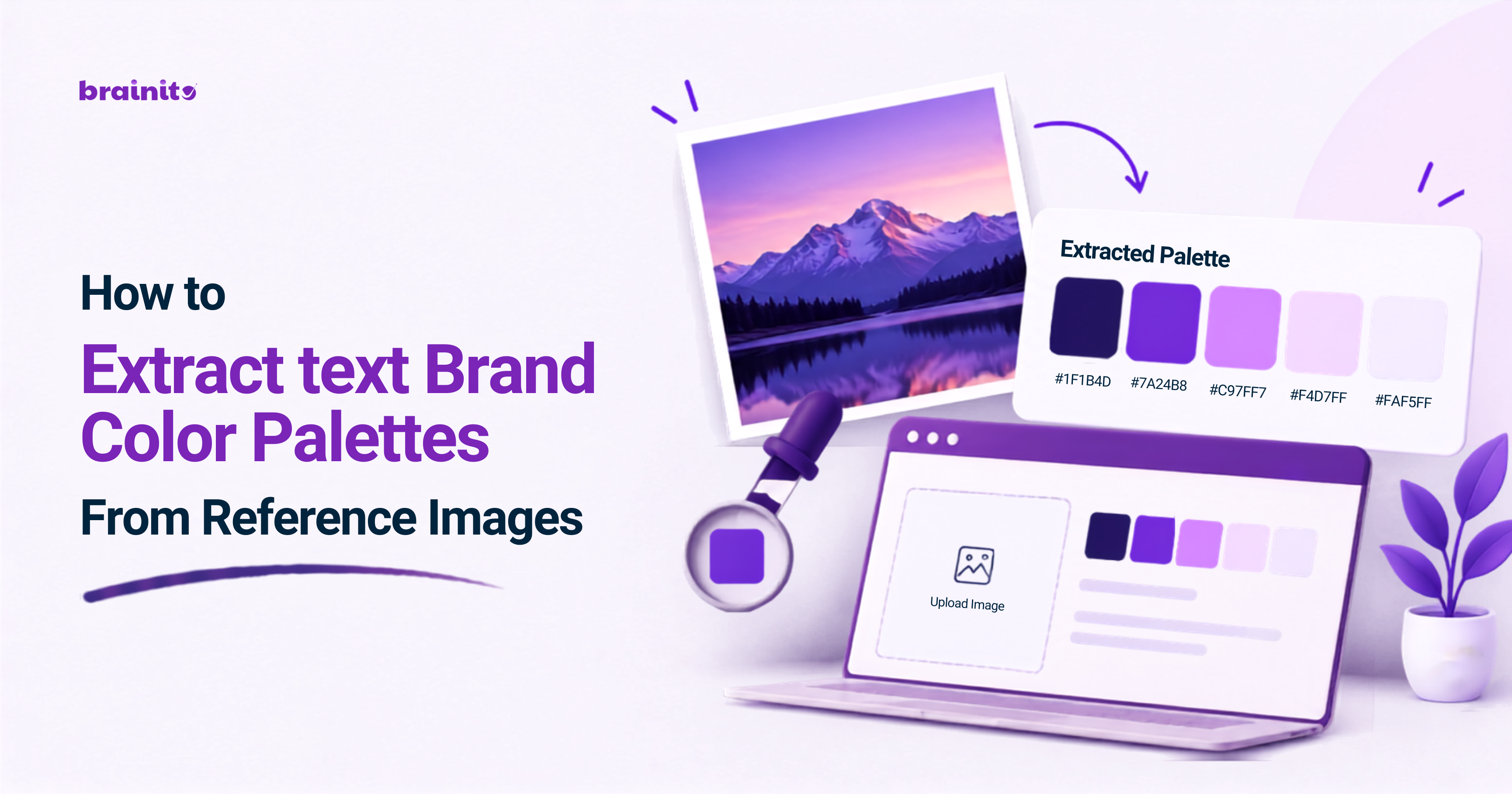
A strong color palette can give a brand a professional and recognizable look, but finding colors in a reference image can seem surprisingly challenging.
Instead of using an eyedropper tool, extract the dominant colors you want to use and turn it into a palette. Here is how you do it:
Pick a strong reference image
Use an image that gives the visual direction your brand should take, a product photo, illustration, or website screenshot works great. Pick colors you want to be part of your palette from an image that has a strong color direction. Avoid using an image with lots of colorful elements if you want a clean palette.Pick the image's dominant colors
The first step is to extract the dominant colors, or the colors that stand out the most in the image. These are the colors that defined the image's visual direction.
Leave out colors that are used as background textures since those are usually not necessary in a palette. Pick four to six colors in your brand palette, ideally. It will give you enough variety to create different shades while working with one visual direction.
- Extract the colors' exact values
When you have the dominant colors picked, write down their exact values. Using HEX codes is best for working with digital media like website design, graphic design, or social media content.
A visual palette will usually have one dominant background color, one foreground color, one light background color, and one accent color. Having the exact values makes it possible to recreate the exact look in different media.
- Leave out unnecessary colors
The colors in your visual palette do not need to all be the same type. Some colors work better as background colors or border colors while the other colors work well as foreground colors.
Pick one to two dominant colors for your foreground, and use the other colors as accents or background colors to give your brand different shades to work with.
- Test the color contrast
While colors that look good in an image can sometimes be unusable in practice, test the color contrast before using colors in your brand media. Text and background colors need enough contrast to be readable, and colors in general should have enough difference between them to be distinguishable.
Avoid using colors with too similar hues or values, and change a color's value if a color is too light/dark to be readable over a background color. Using colors that looked good in your reference image is fine, but prioritize functional colors when a color cannot work.
- Remove unnecessary shades
The colors in your image might not all be relevant to your brand, especially if your reference image has colors that are only there because of the lighting in the image or other objects in the image.
Ask yourself if the color would make sense if you use the colors in a website, presentation, social media post, or advertisement. Remove colors that are only relevant to the context of the image.
- Prioritize having different shades
Color palettes that only have one type of color are harder to work with since you cannot make anything pop out, so pick different shades of color when possible.
This could mean using different lightness values for the same color or using complementary colors to create a color scheme. Use colors in different shades to make your media stand out while you follow the visual direction of a reference image.
- Document the visual palette you created
Document the colors you have picked by writing the name of the color, its value, and what you will use them for next to the color swatch. The documentation will make it easier to create new media with your palette, and keep the colors of your website, social media posts, presentations, and other media consistent.
A Documented visual color palette makes it easier to work with different types of design media while keeping everything cohesive.
Use an Image Color Palette Extractor to Speed up the Process
Finding the colors that make up a reference image can be a tedious process, especially if you have to go through several images. The Brainito Image Color Palette Extractor makes it easier to pick the colors that you will want to use for your brand by helping you recognize good colors to use based on the colors in an image.
Creating a brand color palette from a reference image is about finding the colors that define the visual direction and use them as a base for your brand colors. Pick a strong reference image, extract its dominant colors, use the colors as accents or background colors, prioritize colors that will work well with text, remove unnecessary shades, and document the visual palette.
Written by:
Brainito Intelligence
www.brainito.com