RE: SteemPress 1.2 Update: New logo and design, curation, work on a new front-end, new features
id take this one in my professional opinion
Occums Razor - simplist , minimalist... easier to relate to, more playful, expressive and easier to read from a universal translation direction of different cultures accessing.
much easier to streamline vector based i think as well when you decide to modify it to simpler iterations.
I think the "steempress" text works great... the way its done. simplified, a block font, provides easy legibility from far away...
heres a fun test step 4 ft back from all the logos and see which one you can legibly read easiest
from blog to blockchain i would consider ditching and use that on a case by case basis for branding. it could work well in the header of a website for example but i wouldnt have it associated with everything. i think having the mystery to allow someone to click it has value vs a phrase to have them read... in a way its negative bc it may create user disconectivity bc it doesnt assosciate to them... where as if it were missing a user would click on it and discover it. etc
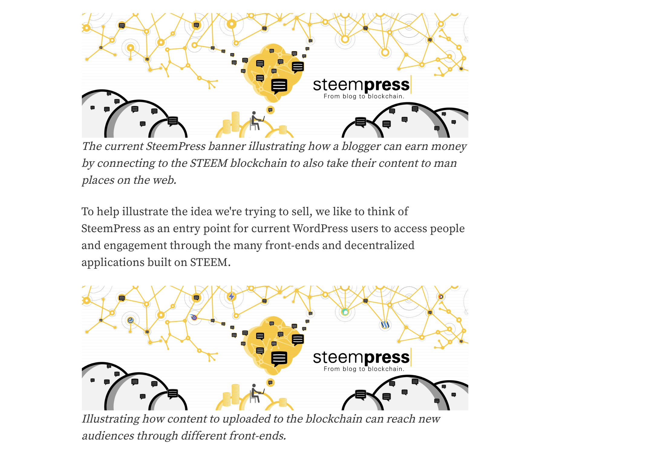
the banner illustration needs work
i see the added logos on the below, they were buried and if not seen side by side i wouldnt grasp the connection at all , i would consider a rework on the banner for sure, its too busy and most wont get it. although a gif animation could help accent the connectivity. perhaps even a 15 sec animation describing what you do on the home page etc would allow for easy adoption as well
unsure if using the Amazon branding will work as well it feels stolen a touch but we already know the colors work for amazon so why not steempress right ?
happy to help always. lmk,
Thank you for the great feedback!
I actually never thought about the similarities with amazon. I'm not sure if it is something a lot of people will see, as none have mentioned it so far of the people I've shared it with. If anything, it sounds good that we've arrived at a style that has also worked well for what is now the second most valuable company in the world. ^^
AS for the banner, I still like it for the specific purpose we're currently using it for on wordpress.org where it helps provide some further information to the people that bump into it on the plug-in store. While I totally agree that one should stay simple and not include too many elements at once, the banner in the plug-in store will mostly be seen by people who are already looking it up and reading the description. Helping to visualize what they read about it there is the main purpose.
I also want to create some animations for marketing videos, gifs and a prezi presentation. For that, I think it provides a neat starting point to tell the story, but yeah you'll then need a format where you are guaranteed 10 seconds + of the persons focus. But yeah I also think we could do with a general banner that carries the core design elements but does not try to explain everything at once. Perhaps limit it only to the nodes and the network branching out of the steempress logo? (Basically the top part of the current banner).
As for including the "blog to blockchain":
I see what you mean. Perhaps it should not go with the logo everywhere it is used. However, as mentioned in the post, our main purpose of the current design is to maximize our impact and conversion rate when we go to our next target audience: Bloggers that are looking to advance their blogs in some form and not shy of trying something new / typical early adopters. For them, I think the text is quite powerful, it states very clearly what we do while also carrying a slight promise that going on a blockchain is a "level up" from a regular blog.
Anyways, your feedback really helped me see things differently and I appreciate it a lot :)
@fredrikaa I love it. first off. great styling and direction. For early adoption i always err on the occams rfazor side ..so keep it simple. Presi is a fun animation for sure. we used to use that format for BCG execs to convey a direction that they couldn't see. I think what you have is rather solid. be careful using yellow though, at certain depths it can become lost and for some its already an impairment for focal cognition. There is a safe for web scale for the hex color hue i can send you if you are concerned or care. as for the banners. I think they work but for example go in aftereffects and make the logos twinkle like little stars at the top. I think that subtle visual gif animation part will convey the banner nicely in a way to really accent the brand. thats just my two cents for free lol...
As we get deeper for your brand i can review the UI and see how effective and easy or hard it is to use if youd like me to audit i can... Overall a solid homerun and great first round. Always hit me up on discord whenever. I appreciate your consider my opinion in evaluating your brand and im always happy to provide a different perspective if youd like .