Life as an Artist #1: Visual Graphics Design Student PART 4
This is the 4th part of my story, my life when i was studying at Philippine Graphics & Print Training Center Inc, In line of our study which includes Visual Graphic Design, we are taught on how to design website using Photoshop, by making its front-end, but before we start,
I hope you might find it interesting, the 1st, 2nd and 3rd part of my story.
https://steemit.com/art/@isaganicabrales/life-of-an-artist-visual-graphics-design-student-part-1
https://steemit.com/life/@isaganicabrales/life-as-an-artist-1-visual-graphics-design-student-part-2
https://steemit.com/life/@isaganicabrales/life-as-an-artist-1-visual-graphics-design-student-part-3
On this part, I would love to show you our activity about Website Design, so as I first told you I'm a coffee drinker, so I relate my website to coffee, and being my product's name is KAPENALIG I made it so it will be the one running my website named iLOVECoffee by KAPENALIG, and with the help of my brother in law, Peterson Recto, we actually put it up on the Internet, though it's a training school activity, so it doesn't function like any other website, but it's pretty cool having it online :D
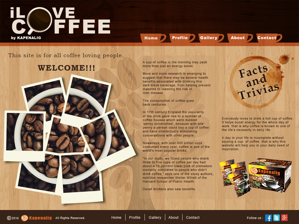
http://kapenalig.ga/
It's pretty amazing looking back how we started learning the basics of Photoshop, then within a month we actually able to create all of these amazing activities,
On this particular activity, we simply add research to it, because you can't just put random contents on your website, it has to be in relation to what you want to relay to the users, because as our instructor taught us, you can't have a children themed website and put some dangerous stuff in it simply because you feel like it.
We learned that by using Photoshop you can actually design the front end of your website, and with the proper knowledge of a web designer you can add some coding in it and make it function as a real website, to show you a glimpse of how it is done, here's some screenshot of my website design on Photoshop,
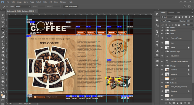
We used a particular tool to achieve this, the Slice Tool and Slice Selection Tool, you can literally see how many slices does this page have,
This is what they call Web Image Mapping - Process of Mapping URL to Images
First, using Slice Tool, slice a part of the image where you want to be made clickable or input some link in it, but remember the page of which your website will be consisting will depend on how many links you make,
then right-click and choose Edit Slice Options, and a dialog box will appear,
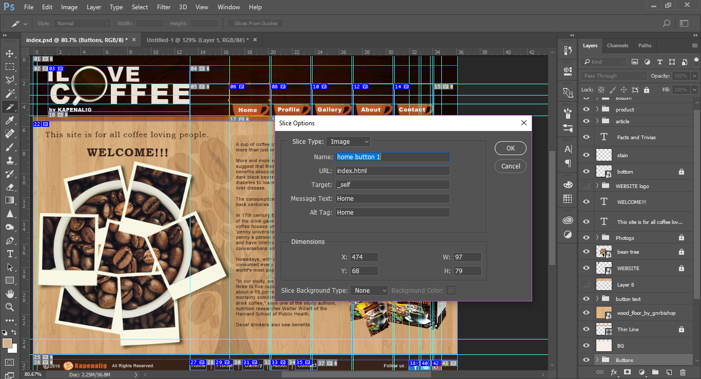
the options would be:
- Name - always use a unique name every page
- URL - Link to Sliced Images, only the homepage uses index, other URL is [(name).html]
- Target - Behavior of link action
_self - Opens in own Page
_blank - Opens in new tab - Alt Tag - Alternate tags for link (optional)
- Alt Message - alternate text if image failed to load
- Message Text - when cursor hovers over button, a message is shown (Caption of Sliced Images)
By default, its Name will be corresponding to how many slices you have on your image, and you can rename it what you want, but make sure to put a UNIQUE Name to it, do it to all your Clickable links to finish it up,
and to add a bit of animation to it, using the Timeline,
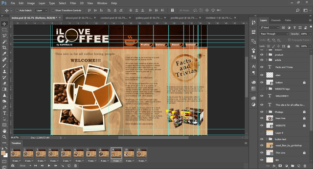
This is actually the brain wrecking part of it because it has to be planned before you actually execute it because, without proper planning, you could waste so much time on the process
after finishing your Homepage, you must retain the image used for your Header, Footer as well as it's positions and functions, so you need to duplicate it to have consistency on your website.
It's a bit different how you save your website than what we normally do on Image only, you must go to File > Export > Save for Web or simply press Alt+Shift+Ctrl+S then click Save, after that a save dialog box will appear, select the format html and Images it will save the html file and automatically make a folder for you images, and be sure to save all of it in a single folder so the html will be able to find the image liked to it.
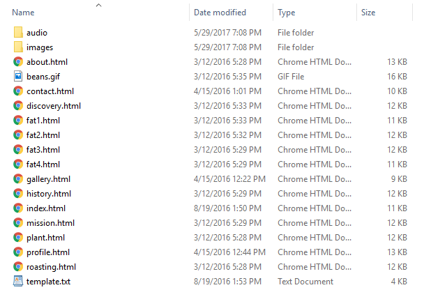
And as our instructor taught us, always save .psd file for future use and revisions.
We made our website implementing the "E's of Use":
- Effective - successful in delivering a desired or intended result.
- Efficient - accomplishing maximum productivity with minimum wasted effort or expense.
- Error Tolerant - always double check or even triple check for error, you don't want your client going back to you for misspelled words.
- Easy to Use - is it user-friendly, does your client didn't have a hard time figuring out how your product functions.
- Engaging - tending to draw favorable attention or interest.
And also, we should give our best in creating the desired outcome for this activity and so we follow the,
Structure of a good Electronic / Web Design:
- Text is readable
- Images are relevant (Clickable / Usable)
- Simple and Uncluttered Design
- Important Links Appear or Evident
- Important Contents are Placed on top of site or on the LEFT side os site (sidebar)
- Navigation bar can be easily Identified
That is all for this activity, I hope you find it interesting and entertaining to read my blog, it's quite long so i prefer to continue my next activity on my next post, Thank you for reading my Blog!!
If you like my blog, you can FOLLOW, UPVOTE, and leave a COMMENT Thank you very much, my Steemit Family!!!
I like your work :) Make sure to also follow me, I post my Original Photo-Story Series everyday :D
I'm Glad you liked it, Thank you! I'd love to see your blog, best of luck for both of us!
Ang cool naman ng ginagawa nyo
Nakaka engganyo tuloy mag-aral maging graphics artist
^o^
keep up your good posts bro!
yes bro, actually libre po yang course na yan sa tesda accredited training center, meron 1month course for 8hrs/day meron dn nmn 2month course for 4hours/day, kaya ansarap matuto,, kasi libre
waaaaaw free!
o(^∀^*)o
lahat ho ba ng tesda courses ay libre or selected lang po?