Attention Artists and Graphic Designers - Help Design the "10,000 Flyers" Marketing Campaign Flyers (300 STEEM Bounty)
The 10,000 Flyers marketing campaign is a low-cost idea that will help get the word out about Steemit to thousands of potential new users.
The plan is to have the community design several 8.5 x 11 flyers that can be printed out and hung up in coffee shops, book stores, colleges, etc. Once the designs are done, users can pick their favorite one(s), print off a few color copies at their local print store, and then hang them up in their local areas. (Prints should be less than $1 per color copy, and 10 cents for B&W.)
My goal is to have 10,000 flyers printed out and hung up by the community before the end of July!
This post is for the artists and graphic designers of the community to submit their entries for the flyers. My budget for this will be ~300 STEEM. 100 STEEM will be awarded to the 'best' flyer, 50 STEEM will be awarded to the two runners up, and 10 STEEM will be awarded to anyone who submitted a reasonable quality entry.
Bounty / Contest Rules:
- The flyer images must be designed to attract new users to the platform.
- They must have some info on how to get to the platform (i.e. the website Steemit.com).
- They cannot contain links or information to specific user's blogs.
- They must be 'safe for work' (something that can be hung up in a public area where kids may be present).
- They cannot mislead people or give false expectations for joining.
- Entries must be submitted in the form of an image that can be pasted into a Word document and printed on an 8.5 x 11 piece of paper.
- Entries will be accepted until the payout for this post closes.
- I will be selecting the winners based on my own personal preference, but I will take comments and upvotes from the community into consideration.
- All payouts will be made within 48 hours of this post closing.
- Each user can submit as many entries as they want, but I will only be paying out one bounty per person.
Image Guidelines:
- 2550 x 3300 or 3300 x 2550 images are what Google recommended for 8.5 x 11 paper.
- Black and White or Color are accepted. (Submit two versions if you think both will look good.)
Some Tips:
- If you are looking for inspiration, check out some of ideas suggested in the comments of Steemit Marketing Idea - 10,000 Flyers (Brainstorming Session).
- If you are looking for some "talking points" on what to include to 'sell' the platform, you can check out this post: You should join Steemit. Here is why.
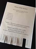
- A section on the bottom with 10-15 'tear off tabs' that say "Steemit.com" (or something along those lines), could be good to include.

- You can target the general community (i.e. everybody), or specific audiences (i.e. artists, writers, etc.).
- Keep in mind that we want people to stick around, so enticing people with things like "earn tons of money on Steemit" is generally not a good idea. Set realistic expectations so they end up sticking around :)
Good Luck Everybody! I look forward to seeing the submissions =)
Reminder to vote for witnesses!
The Steem witnesses are the elected leaders of the community that power the blockchain. Everybody should learn about the Steem witnesses and vote on who they think is best. If you don't know much about witnesses or aren't sure who to vote for, you can check out this Witness Voting Guide. If you think @timcliff is doing a great job, please consider voting for him as witness! You can vote for witnesses here: https://steemit.com/~witnesses

This is a simplified version with no details:
Blue
.jpg)
Full Size
Black & white:
Full Size
Cool!
Here you go ^_^

Did you know Yellow is the most visible color in the spectrum?
This ad is made to look inconspicuous, as if they discovered a secret club.
The colors are very purposeful, and it's intended to look anti-corporate.
see it full size here:
https://steemit.com/marketing/@alphacore/10-000-flyers-marketing-campaign-graphic
I suggest printing 2000 of 5 kinds if there are enough good ones. This would allow the same person to see multiple ads and have a larger impression than seeing the same one several times.
Awesome!
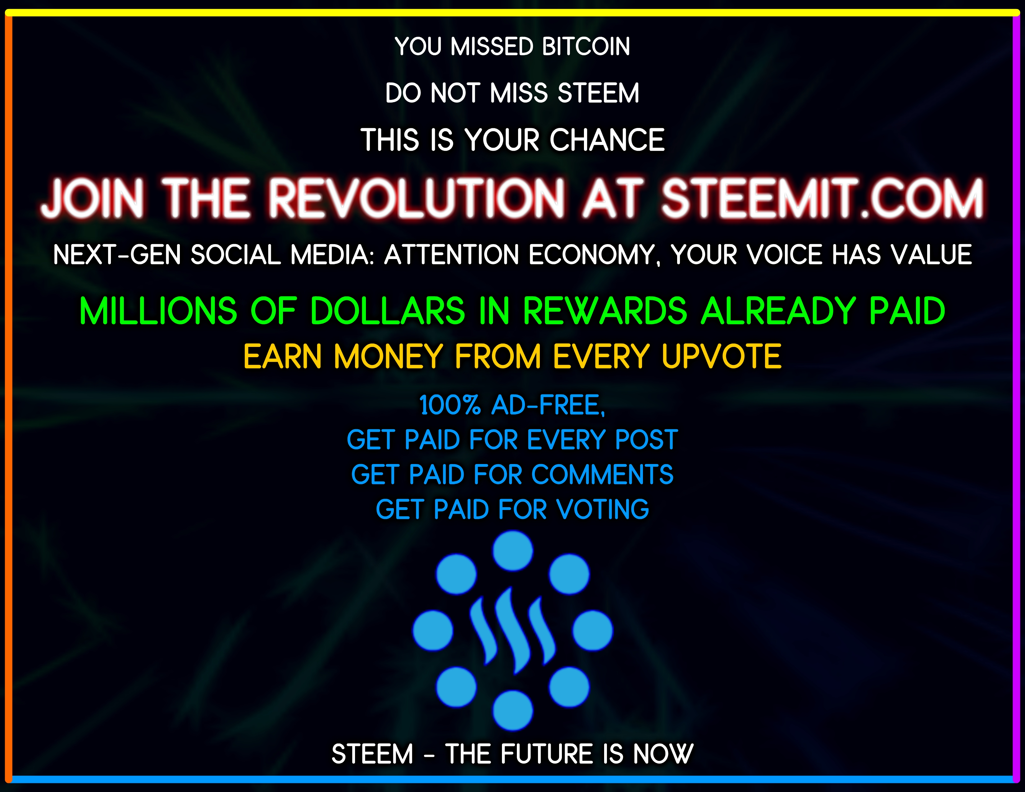
alternate version:

These are community ads. Keep it simple, keep it black and white if possible, and don't make it look pro. The less we say about it the better, to quote a song :) Let it generate intrigue.
Here are some old flyer designs I worked on, using these principles.
Simple variations in color:
The above is a bit more friendly, and artsy. This one is more of an appeal to the more technically aware, counter-culture, free speech, or possibly nerdy crowd (location dependent):
Get in touch if you'd like these made into the full resolution. Right now I don't have the time.
Also @timcliff, consider using a half-sheet size as well, as community bulletin boards often don't have a ton of real estate. Obviously the bigger the better, but be prepared :) Use very high reflectivity paper.
Thanks @pfunk!
These flyers could be made for STEEMFEST². Then everyone would get around 10-20 of these and take them back with them to their country where they spread it? Or we just give it away in Lisbon! But I agree less is more sometimes! :)
One last one xD with no details at all this time
Full Size
I'm not a graphic designer, so I took the liberty to use Canva to create something that I like. Don't know how everybody else made theirs, but I did use elements based on a template, so if that excludes me from having a chance at winning the reward, that's fine by me. That's not the point anyway, just trying to get people flyering :-)
High res version
Awesome job!
😊
There you go, it took me a few hours, i hope you like it :)
High Resolution Image
Now i can finally sleep (-.-) zZ
Wow, nice job!
Alright alright, here's my submission.
Download Link: SVG Download
Best
Cool :)
Black & white version:
Full size
Nice!
I did another one using Canva but it ended up looking more like a book cover, Steemit The Story, haha! I figured I might as well post it anyway, since I went through the effort of making it.
High res version here
Cool :)
I love making infographics! So contact me for more!
Cool :)
Here is another if you prefer this style better. I've been trying a few other styles hoping that will put a finger on what you're looking for.
Nice!