Lightroom tutorial: a basic workflow from start to finish
After this tutorial you will know how to edit your pictures from beginning to end. :)
As promised, I created a Lightroom tutorial to explain you the basics of the program. In the beginning, Lightroom can be very overwhelming, since it has many features. However, you only need to know a few of these options to get started. In this tutorial, I am going to show you which features I use in order to edit my photos. So let’s get started!
Opening Lightroom
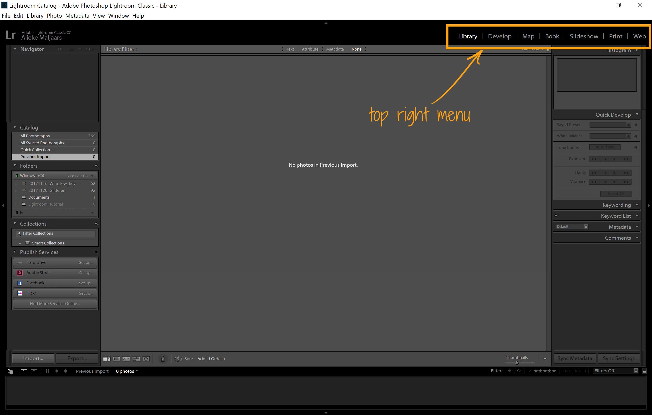
When you open Lightroom, you see menu items on all sides of the screen. However, Most of them are not important right now. On the top right, you'll see the following items:
- Library
- Develop
- Map
- Book
- Slideshow
- Web
The only ones that are important for editing are library and develop, so forget the rest for now.
Importing pictures
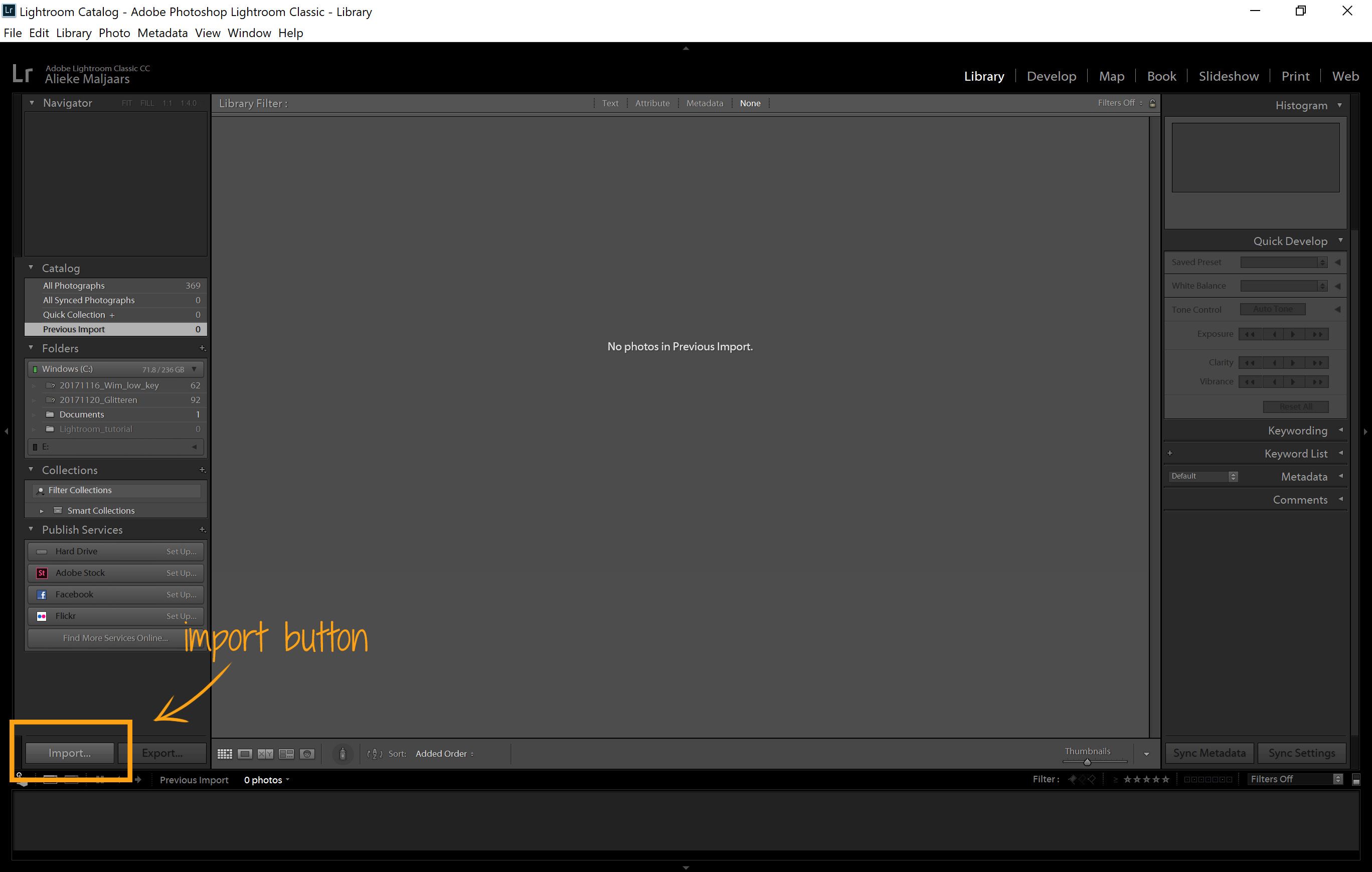
If you open Lightroom for the first time, you won’t see any photos. This is because you’ll first have to import them into Lightroom, by telling the program where you stored your pictures. To do that, click on the button: import on the bottom left.
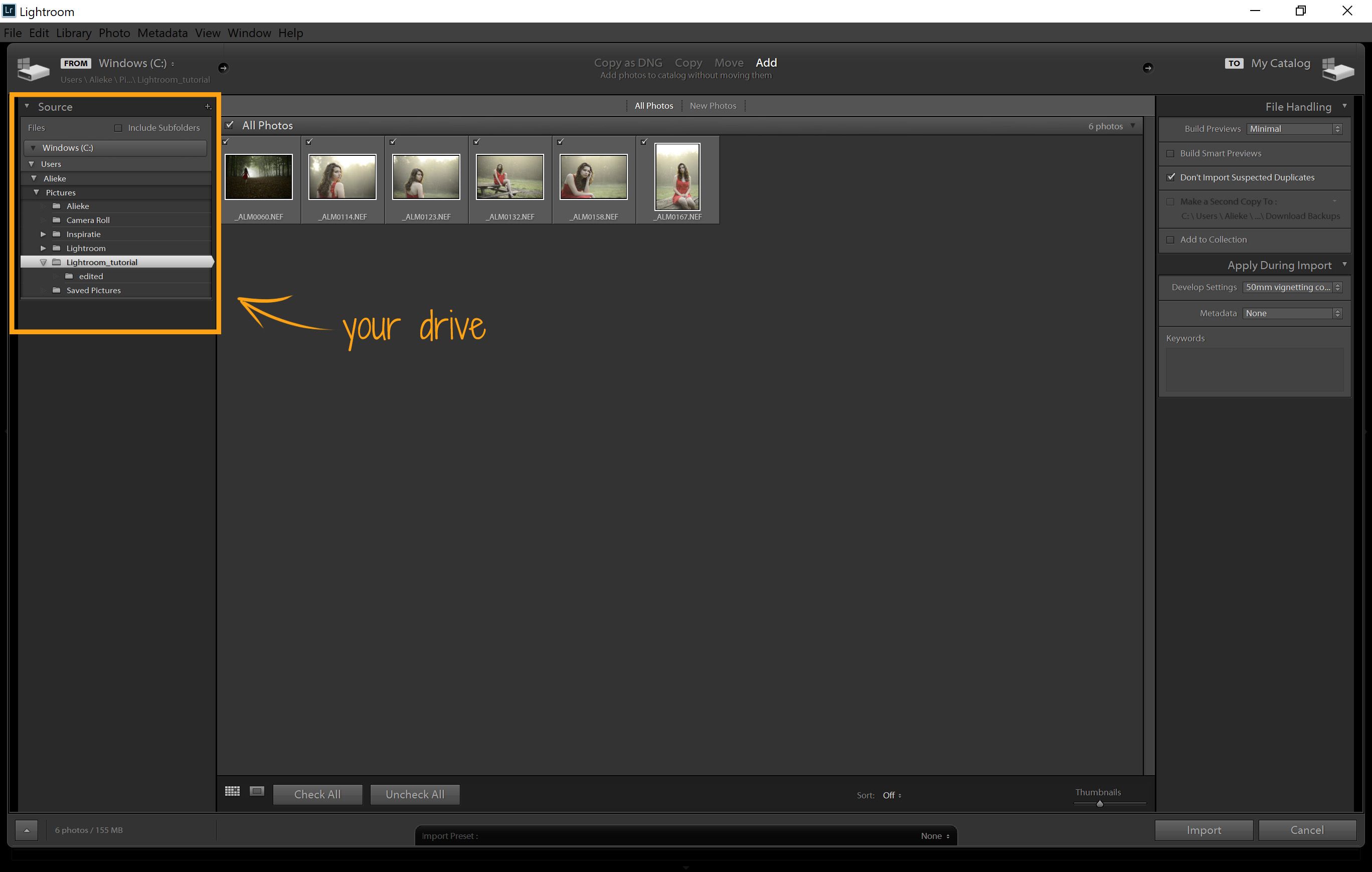
A new screen will pop up. Here, you can browse to find the photos you want to import. When your camera is attached, you may import them directly from your camera. I prefer to transfer them to my computer first, and edit them from there. Once you have selected the folder where your pictures are located, they will appear in the main area. Here you can select the pictures that you want to import. (In my case, I usually import all of them. )
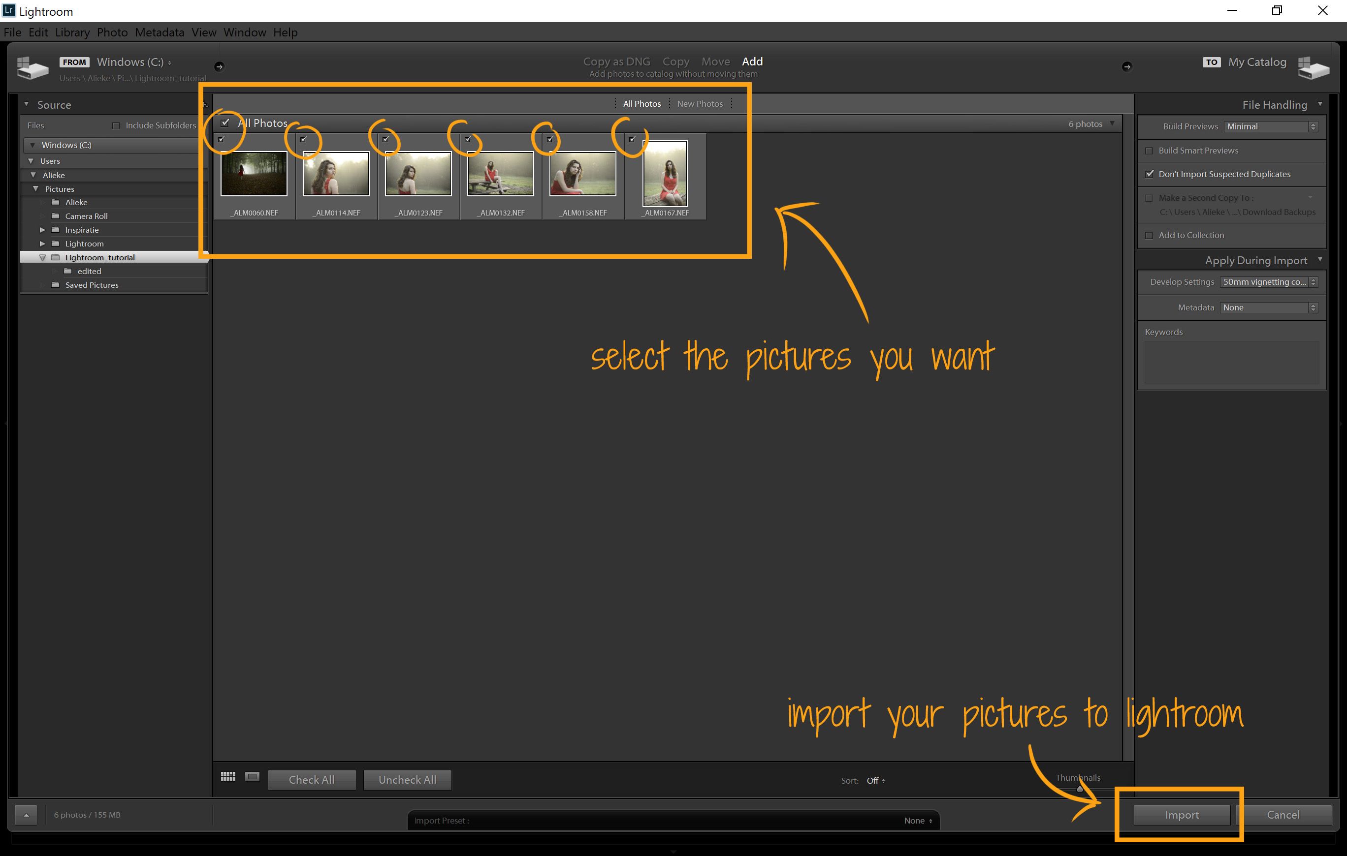
When you have chosen the pictures that you want, you can click on the import button on the bottom right of the screen, and we get to the fun part!
How to start editing
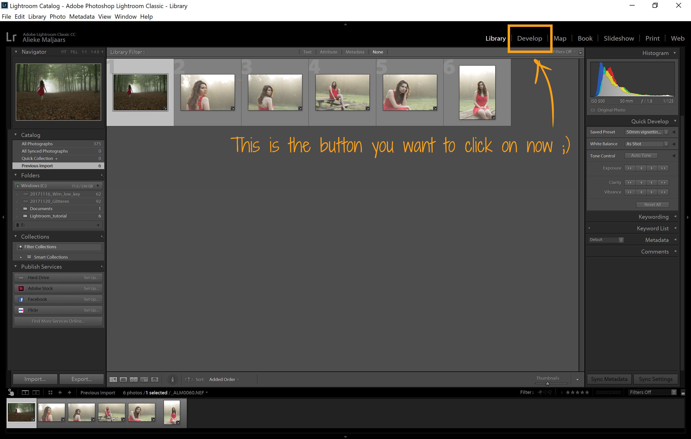
Now that you imported your photographs, they will appear in the library (this may take a while, depending on the amount of files that you imported). Your photos will also appear at the bottom of the screen, which is called your import. Here, you will always see the pictures you are editing. However, from this screen, you are unable to edit your pictures. Therefore, you need to go to a different part of the program. Remember the menu I told you was important at the beginning of the tutorial? This is where you will find the option: develop. When you click on this, you’ll go to the screen where the interesting things happen :).
The basics of editing
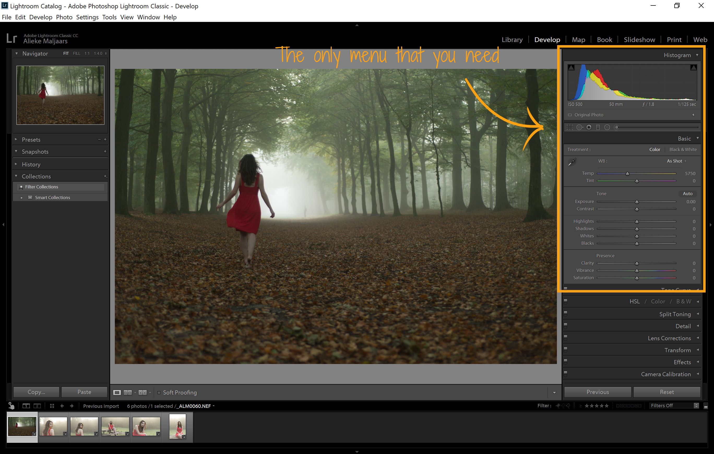
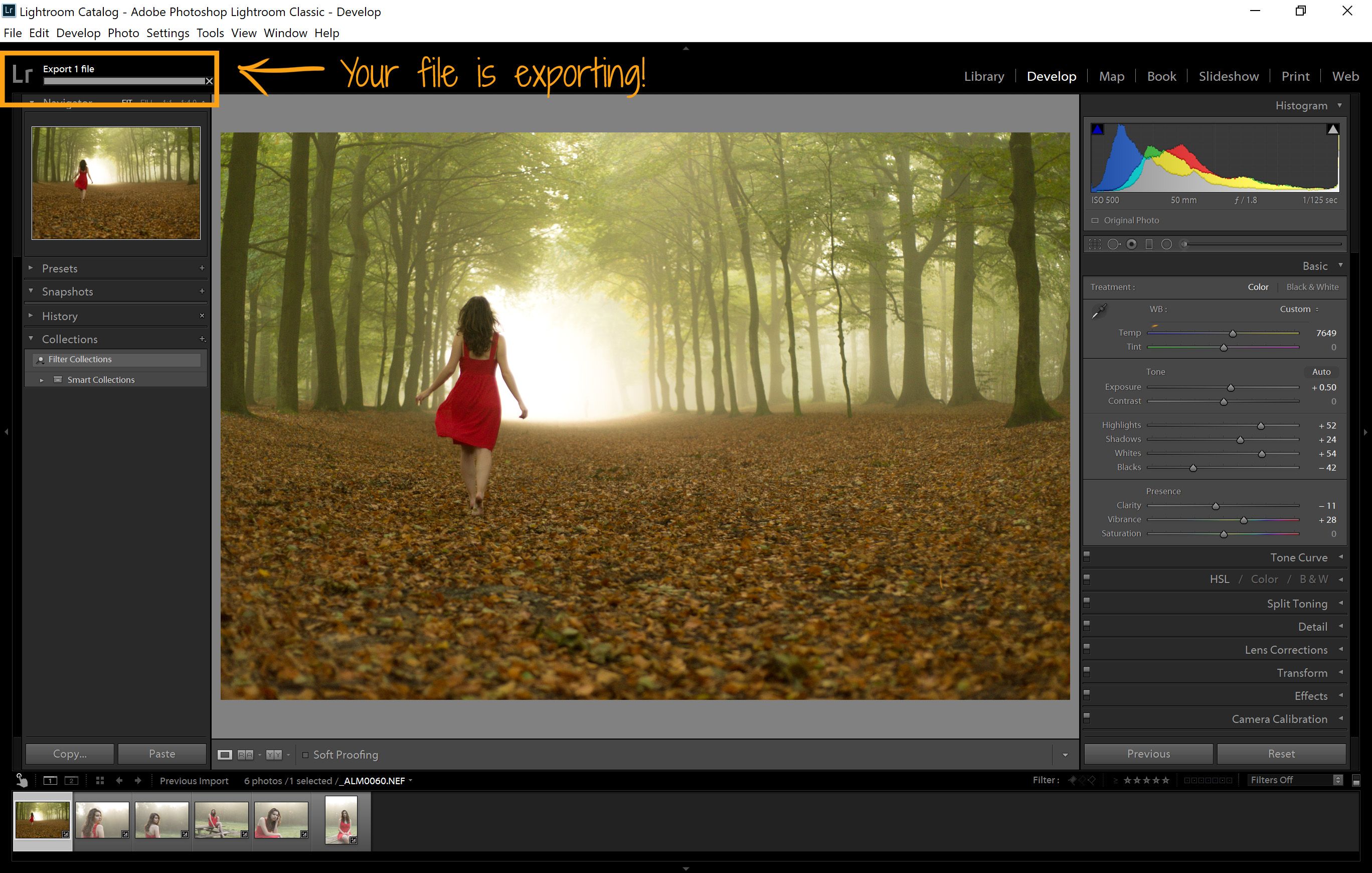
The develop screen, again, can be a bit overwhelming. There are many options to see. However, most of them can (again) be ignored for now. In later tutorials, I will go into the advanced options of Lightroom. Right now, the only menu you need to look at, is the one called basic.
In the middle of the screen, you can see the selected picture. To select another picture to edit, click on another picture in the import overview at the bottom of your screen.
On the right, you will see a histogram at the top. That graph will tell you whether your photo is under- or overexposed. If the graph has more volume to the left, your picture is most likely dark. When there is more volume on the right, your pictures is very bright. In this example, the photo is slightly underexposed. We are going to fix that :).
White balance
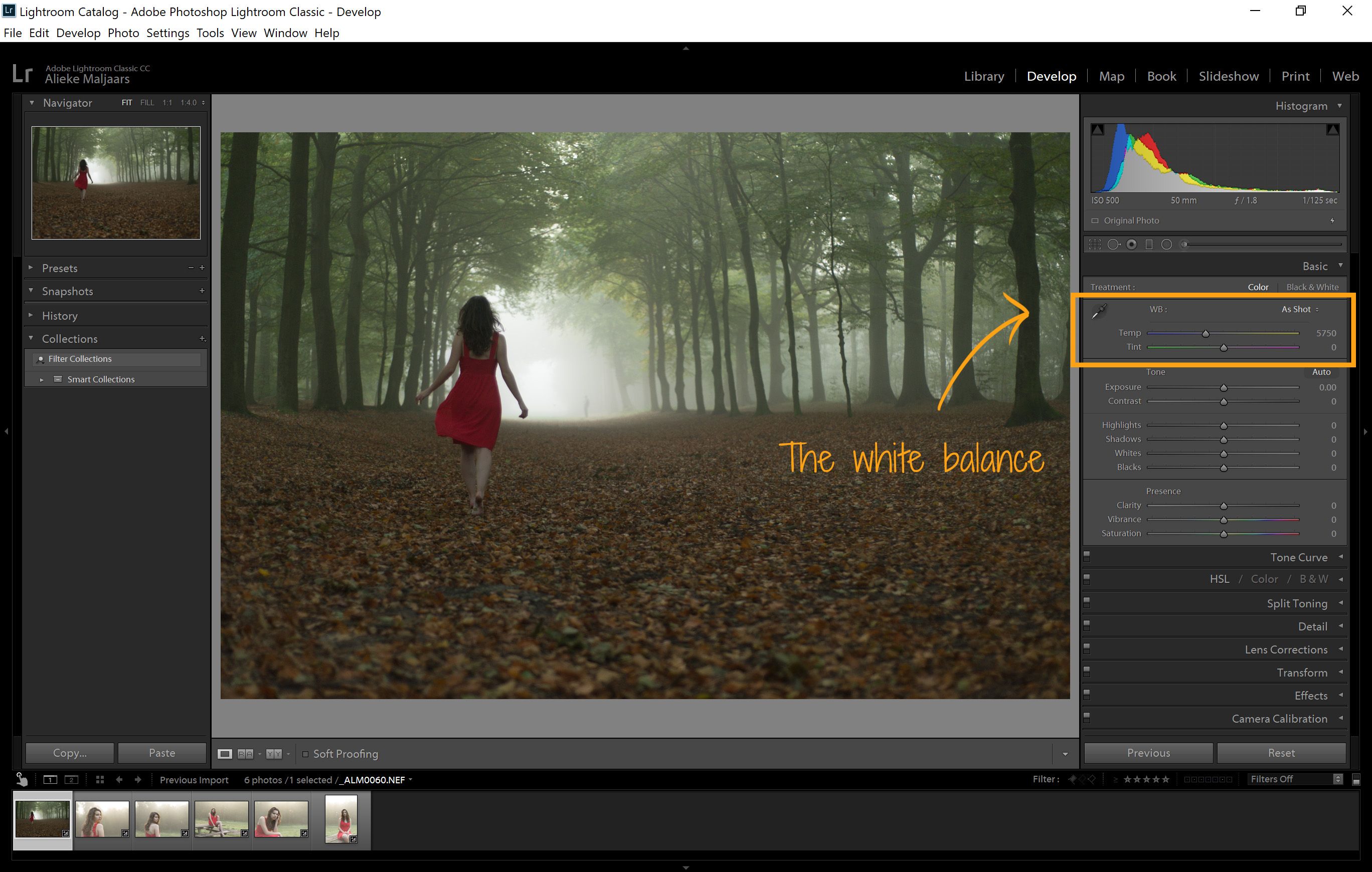
The first thing that I notice when looking at my imported picture, is that it is a little more blue than the scene was in reality. It was shot during golden hour, and therefore, I want the photo to look more like it indeed was golden hour. This is where the white balance comes in. In the right menu, you can find two sliders:
- Color temperature (blue to yellow)
- Tone slider (green to magenta)
The first slider, the color temperature slider, is the most important one, and the one you will need most. It can change how warm or cold a picture feels. The more yellow you add, the warmer the photo will feel. The more blue you add, the colder the photo will seem. Now this is something of your own preference.
The second one, is a bit more tricky. Sometimes, you need it to correct when a pictures looks too green, or too pink/red. However, this has the possibility to negatively effect the skin tones. So, when editing portraits, I often avoid using this slider, unless I need to correct a photo that had the wrong white balance set.
A helpful tool when setting the white balance, is the eye dropper tool on the left. When you click on it, you can select a color that you want to appear gray/white. When you click on it using the eye dropper, Lightroom will edit the photo in such a way that the color you selected is now a gray tone. If you click on a yellow area for example, the picture will become blue to compensate for the yellow and vice versa. Using the tool on eyes, clouds or rocks can be useful to correct the color.
Exposure
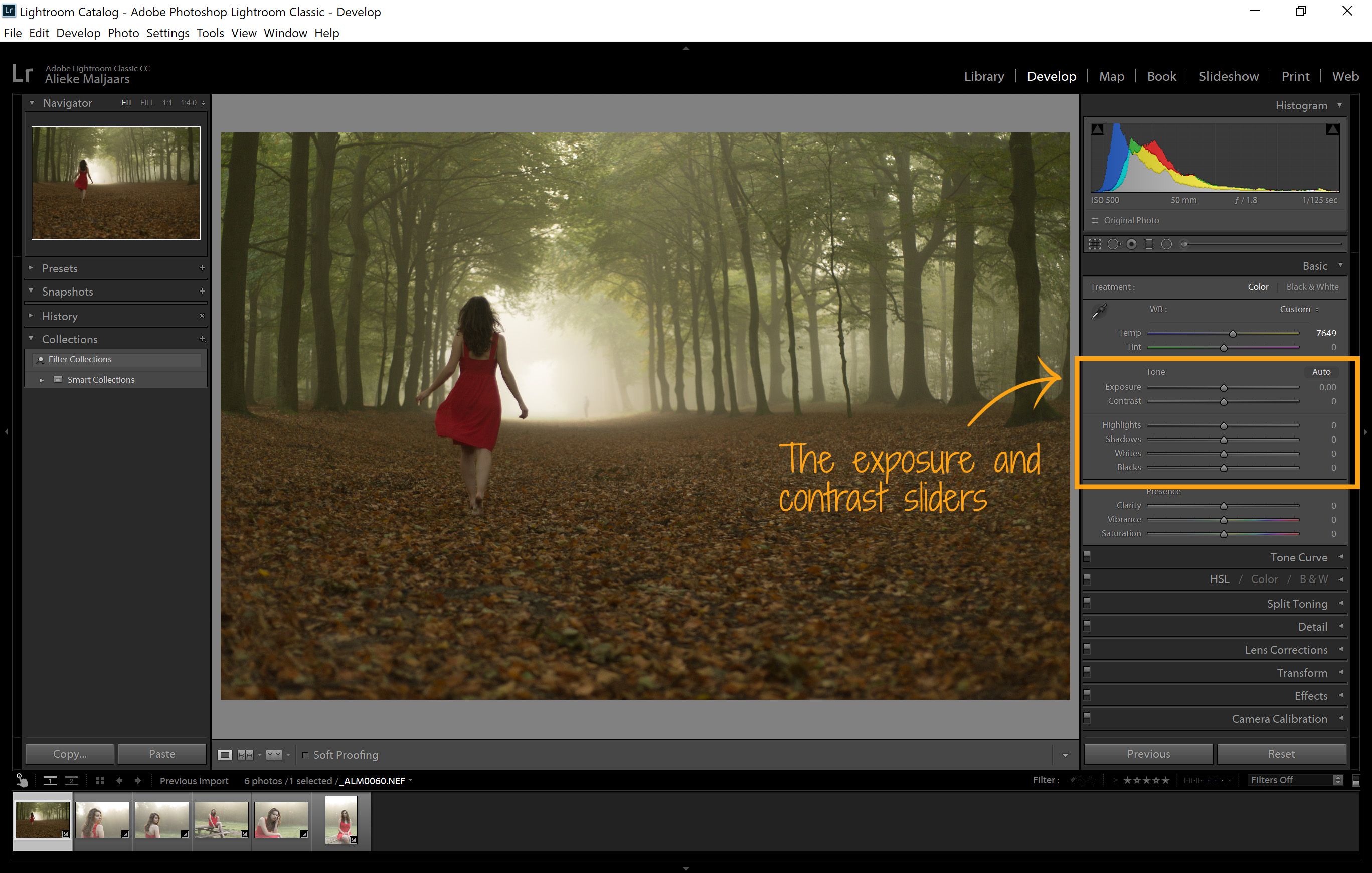
Fixing the white balance already made sure that the photo looked less gloomy. However, it is overall still a bit dark. Therefore, I want to chance the exposure of the photo a little. Underneath the white balance sliders, the exposure can be changed. Sliding the bar all the way to the left will make the photo very underexposed, while sliding it all the way to the right will make the photo overexposed. (Unless your photo was 3 stops underexposed I suppose, however, I doubt you can still fix it then).
I am going to make my photo half a stop brighter. I slide it slightly to the right. If I already know how much brighter I want the photo to be, I can type in the required change in the area to the right of the slider.
Below the exposure, the contrast can be heightened or lowered. I don’t often use this slider, because the sliders below give more control over the shadows and highlights. However, see for yourself what it does and how you can use it.
This brings us immediately to the sliders below. One is the highlights, which helps you to reduce or enhance the highlights in your photo. In this case, I want the highlights to be a bit lighter, so that the model walks towards a brighter light in the photo. All of this is just personal preference. I find that if you shoot in RAW, the highlight slider can help reduce blown out skies. In JPG, this is also possible, but if the skies are fully white, they will never become visible again in this case.
The shadows slider is exactly the opposite of the highlights slider. The shadows can be made a bit brighter. Since the picture is pretty dark, I am going to lighten up the shadows a bit.
Since using the highlight and shadow slider can make that the photo seems flat, you can use the black and white sliders to help introduce the contrast back into the picture. When you slide the whites slider all the way down, the whites become more like grays. Unless you don’t want any white in your photograph, I won’t recommend sliding the slider all the way down.
The same goes for the blacks slider. If you pull it up, your picture won’t have any real black colors anymore. When you pull it down, you will end up with darker grays.
Since I think that since pulling up the shadows, my photo lacks a bit of black, I am going to slide it slightly down to re-introduce the blacks in my picture.
About clarity, vibrance and saturation
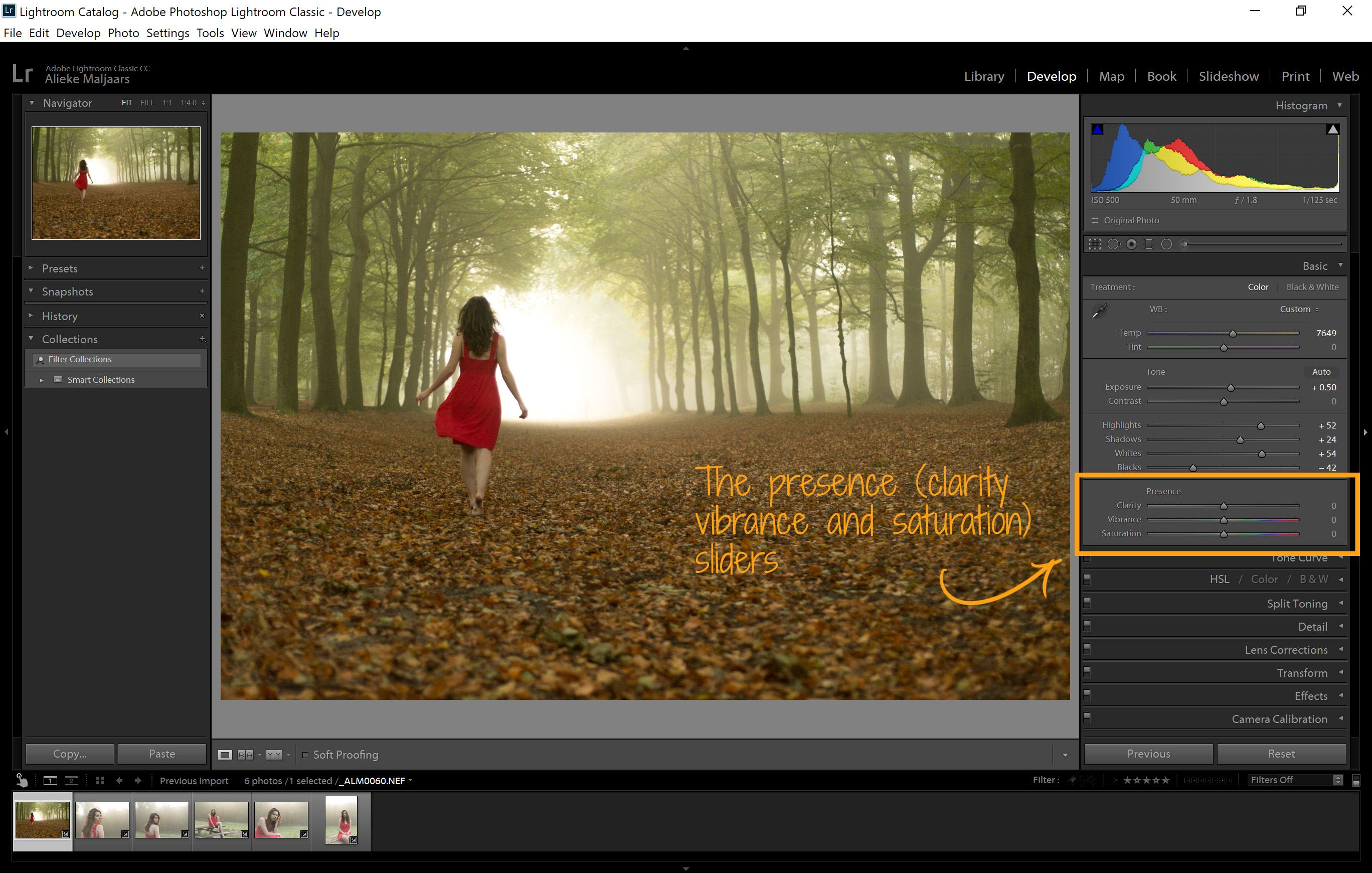
Now that we have fully corrected the exposure of the photo, there is little more to be done that is necessary. However, there are a few more sliders that can enhance your photos greatly. The first one is the clarity. The clarity adds some contrast to your pictures. What it does, is that it enhances the contrast, but only in the midtones of your photograph. If you pull it all the way to the right, the photo looks really crisp. When you slide it to the right, the photo gets a soft look. When you slide it to the right, the photo may look a bit less saturated than when you pull it to the right. Therefore, if I change the clarity of a photo, I also chance the vibrance.
The vibrance and the saturation are really similar to each other. There is, however, a very important distinction, which makes that I rarely use the saturation. The vibrance enhances the colors that are more muted, while the saturation enhances all colors in the picture. When I slide the vibrance completely to the left, I can still see some red in the dress, because that is a color that is less targeted by the vibrance. Using the saturation slider can generate unnatural colors, which is why I don’t regularly use this one, unless I want to remove color from my picture.
In this case, I am going to slightly remove clarity and enhance the colors just a little bit.
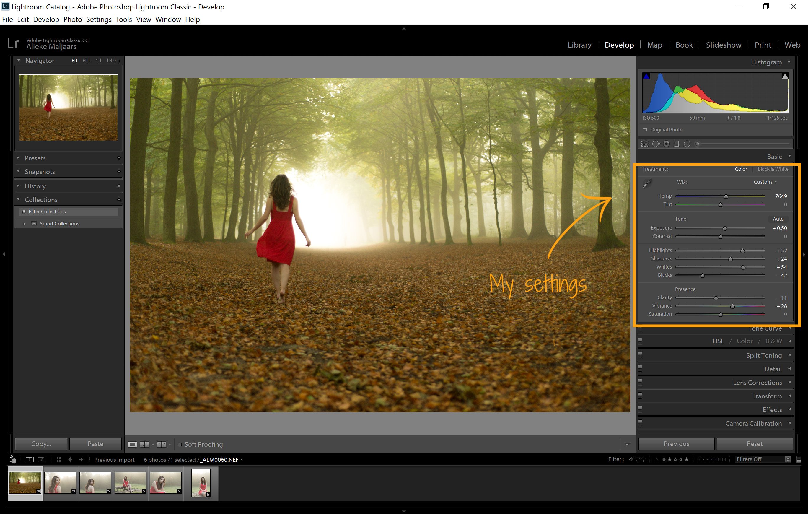
The key to good editing, (in my opinion), is that you keep it very subtle. However, when you see the before and after, subtle editing already makes a huge different! You should try to have the photo still look natural, and decide carefully what changes it needs.
The best way to learn what these sliders do, is to try them out, and see what each of them does to your photo.
Exporting
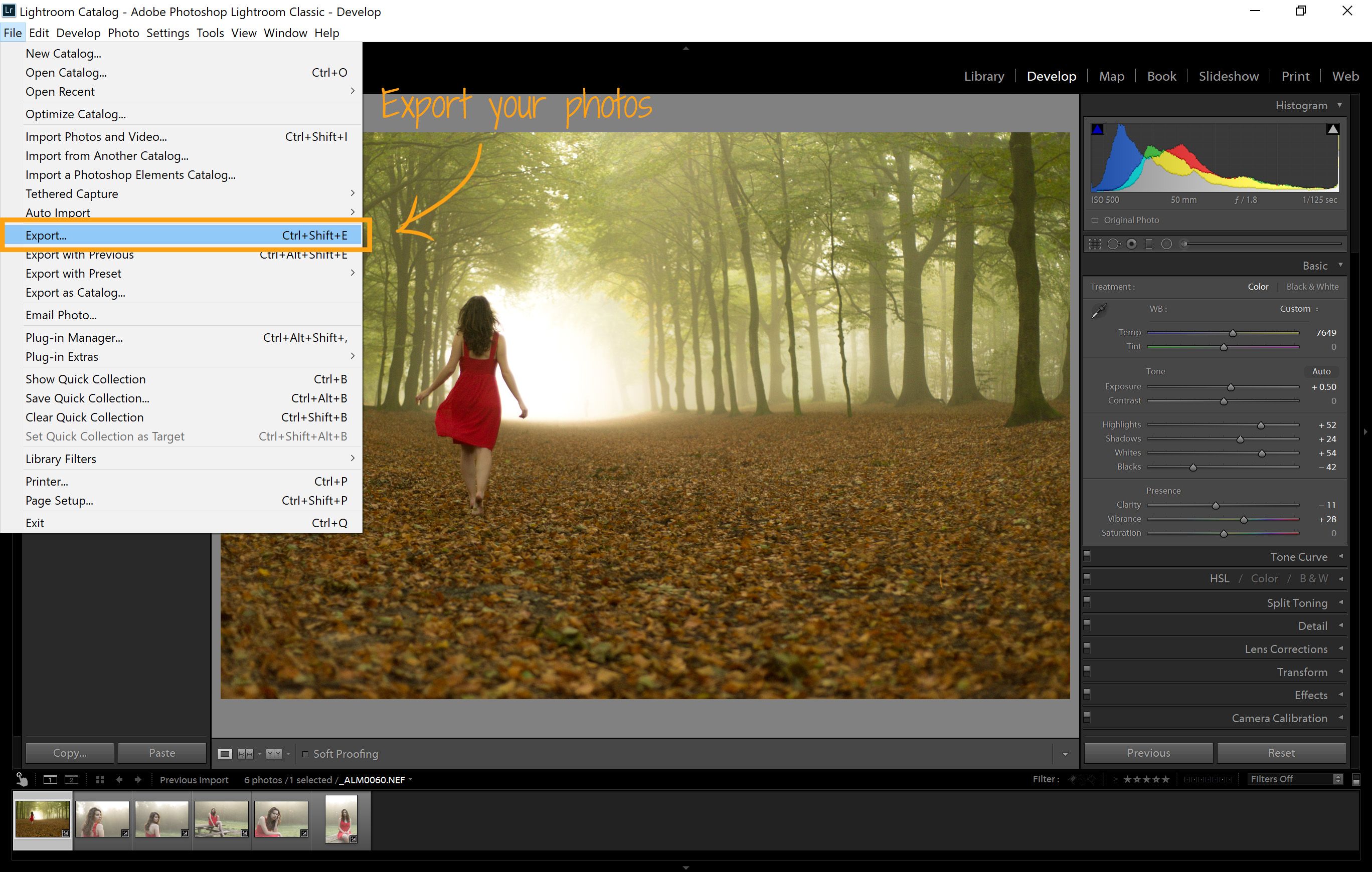
Once you are happy with the changes you made to your photo, you’ll want to export the files, so you can share them with others.
To do this, you should select the photos that you want to export. Now, you should click on file, in the top menu, and then export. A menu with selections pops up.
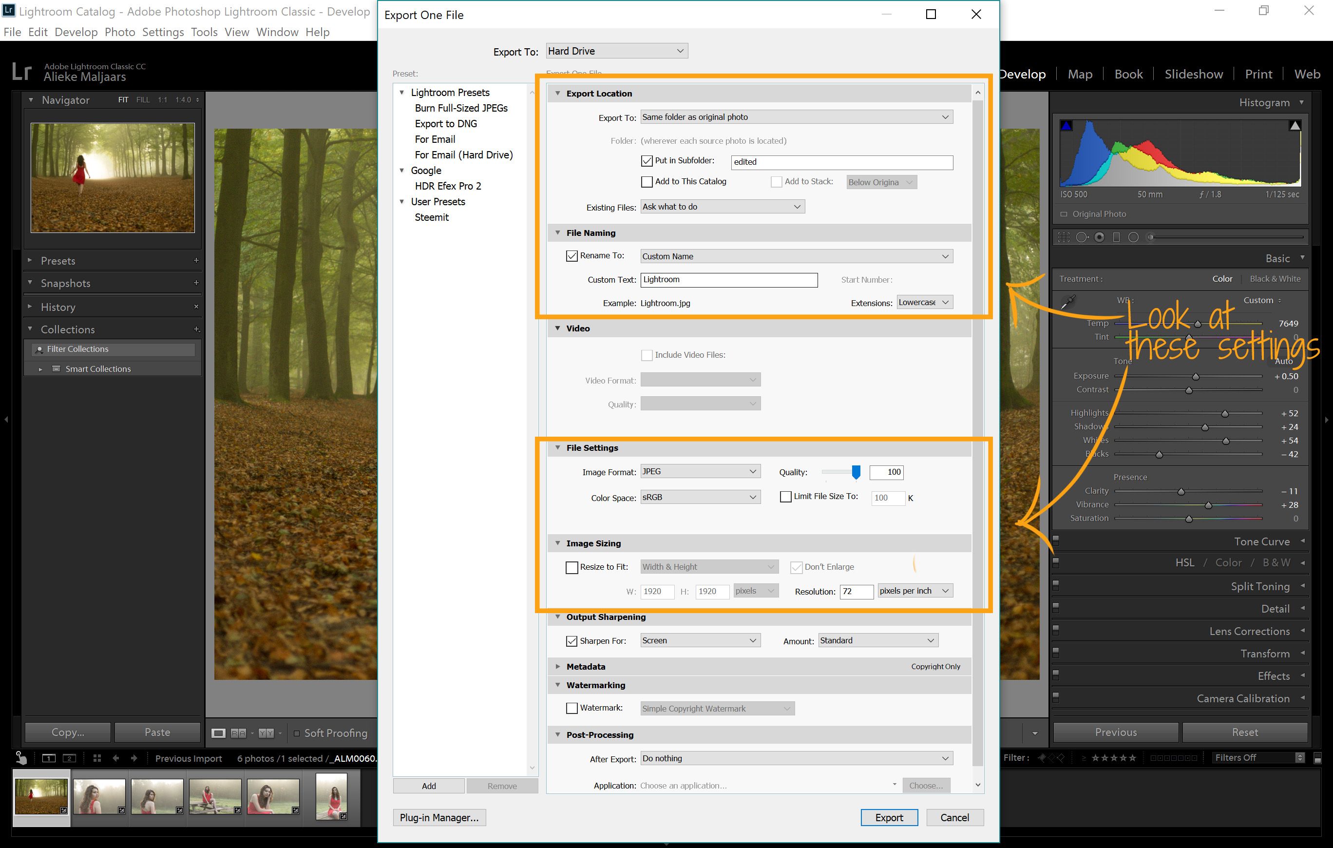
In this selection menu, many of the settings you can (again) ignore for now ;).
It is important that you:
- Know where you’ll save your file
- Name your file
- Export with the right colors
- Determine the size of your photo
- Click on export button ;)
The first item depends on your workflow. Determine how and where you want to save your photos. I usually put edited photos in a subfolder, so that I can quickly find them.
For naming the file, there are several options. If you export multiple, I like to choose the option custom name – sequence. That way, the exported photos remain ordered after exporting them.
The most important step of exporting, is that you choose the right color space. In the file settings, choose the image type that you want to save. I usually save the file as a JPEG file, for most people are able to open this. When choosing JPEG, you can choose between different color spaces. If you want to save an image for the web or computer, you should always choose the sRGB option. If you want to print the image, the color depends on the settings of the printer.
When you have chosen all your settings, all you need to do is export the file!
Now for a before and after picture:
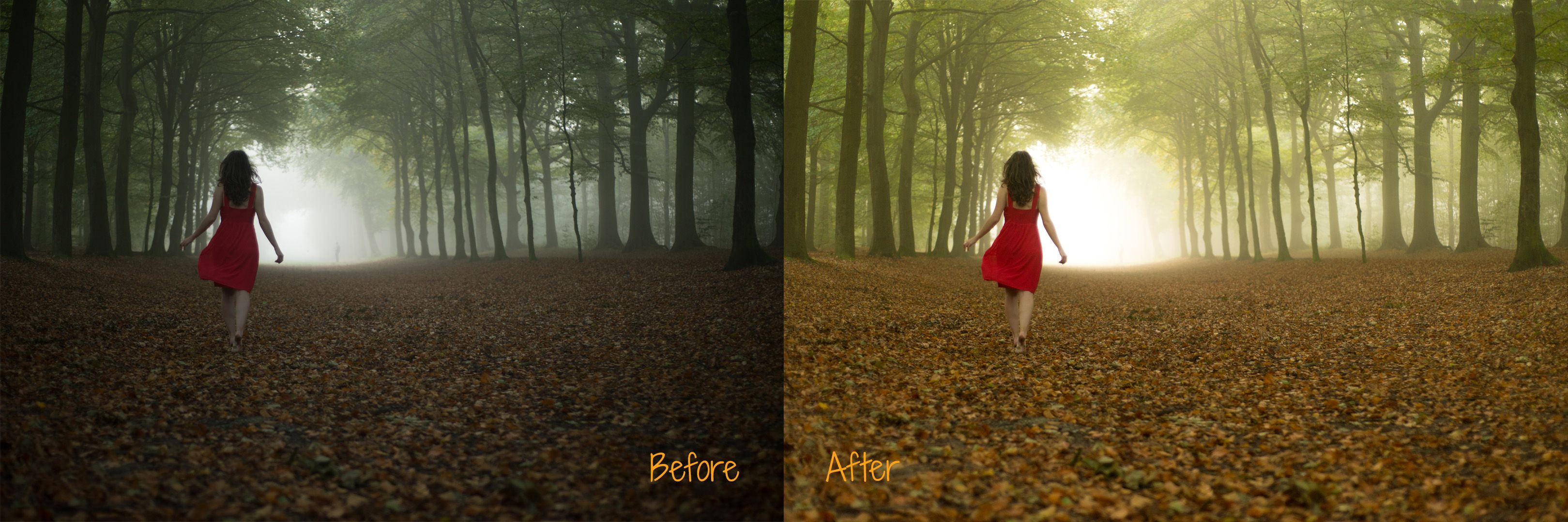
Quite a difference, right?
I hope you learned something from it :).
In other Lightroom tutorials, I shall describe more advanced features, but these are the basics you need to get started. Thank you for reading!
Putting this tutorial together is an immense amount of work. So generous of you. I love the edit
Thanks! No problem, I loved doing it! :)
Nice post ! Upvote!
Can i get one too? :D
Thanks! I will check out your work as well :)
This is very important. Good work! :)
Thank you! Appreciate it! :)
Congratulations @alieke! You have completed some achievement on Steemit and have been rewarded with new badge(s) :
Click on any badge to view your own Board of Honor on SteemitBoard.
For more information about SteemitBoard, click here
If you no longer want to receive notifications, reply to this comment with the word
STOP