Fix It Friday Submissions
Fix It Friday Submissions
One of my favourite competitions on Steemit is the "Fix it Friday" contest run by the team @photogames.
This week i didn't get chance to finish all of the entries, but here are the ones i did do.
First up was this awesome Dani Diamond esq portrait by @caseygrimley
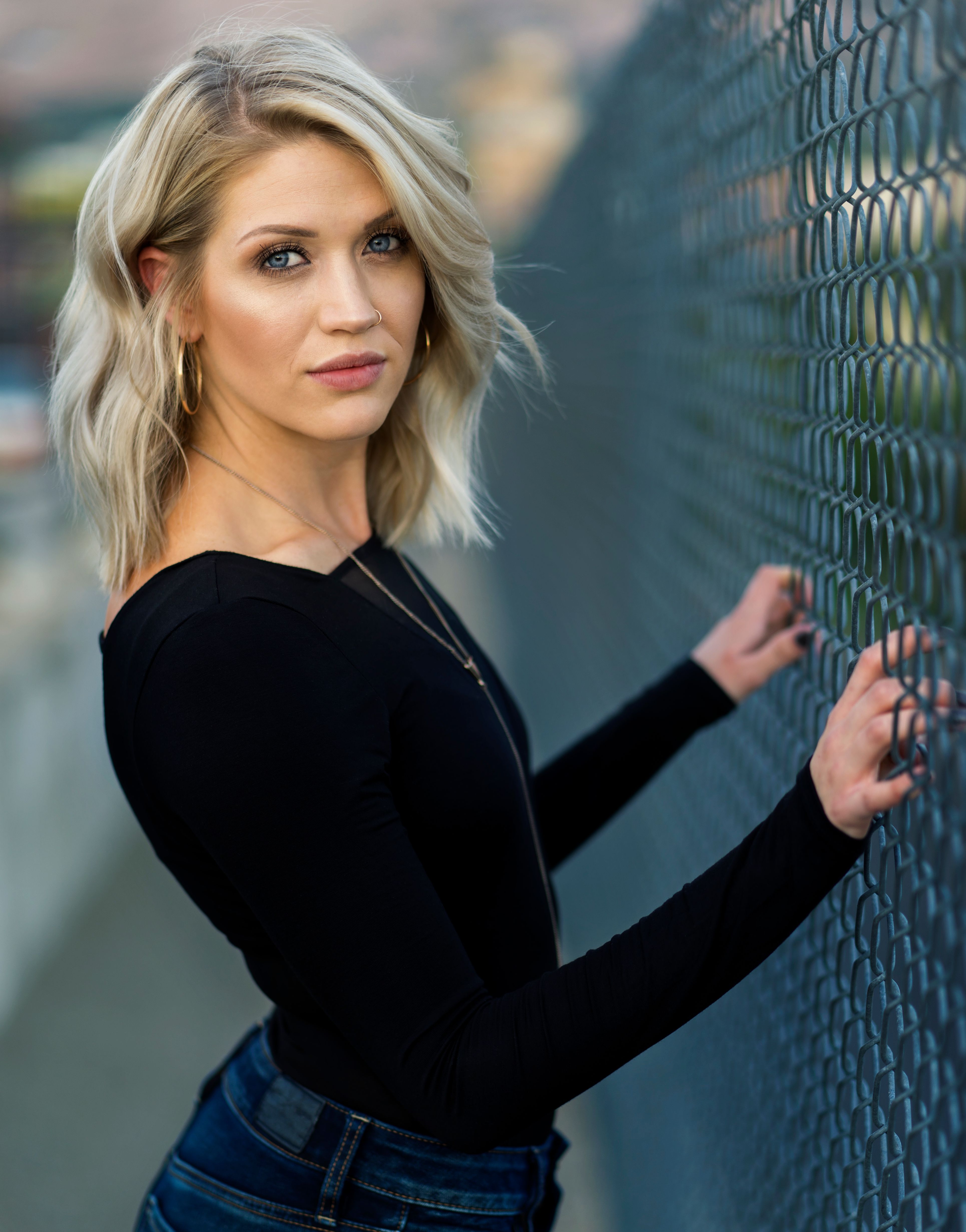
For this one i wanted to keep it somewhat natural, but give it that filmic look.
Here's the steps i made in editing this image.
- First off I adjusted the crop slightly because I wanted the image to draw you more into her face than her body.
- Usually i leave the eyes to the end but i was drawn to them on this image, so i dodged and burned her eyes. Adding some light specs on the inside and darker edges. Also darkening up the lids to draw more attention to the eyes. I finished them off by adding a little bit of blue.
- Micro dodging and burning. On a 50% grey layer I used a 3% opacity brush to slowly dodge and burn out lil imperfections so that you get rid of blemishes but without losing the texture of the skin.
- I added Frequency separation layers. But i also added a Blank new layer between them set to Luminosity, and a black and white layer above the HF layer. First step with BW layer disabled remove any remaining blemishes/ skin lines using HF layer then slight colour smoothing with the LF layer.
- Turn on the BW layer, then with the brush at about 10% opacity Sample the skin colours (in greyscale) and paint over the skin to smooth the transitions. This way you retain skin detail but get rid of any harsh shadows.
- I created a merge visible layer to clean up fly away hairs and hairs on her sweater. (Usually i would've cleaned this up earlier before starting the FS but i wasn't sure how far i was going to go with this image when i first started editing it.
- General DB to draw more attention to her face. Darkened the surroundings etc.
- I colour tone in many different ways usually but for this image i created a soft light layer and using a blue brush at low opacity i added colour to the shadow areas without effecting her skin tone.
- Again i don't usually use this method but in interest of time i used a gradient map of teal and orange to add extra difference between shadows and highlights then reduced the layer opacity to about 30%
- To finish it off i added a lil bit of selective sharpening to her eyes to make them stand out even more.
Here is the original....
Ok next up was this awesome wedding/ truck (although not in my version) / landscape shot by @jarvie......
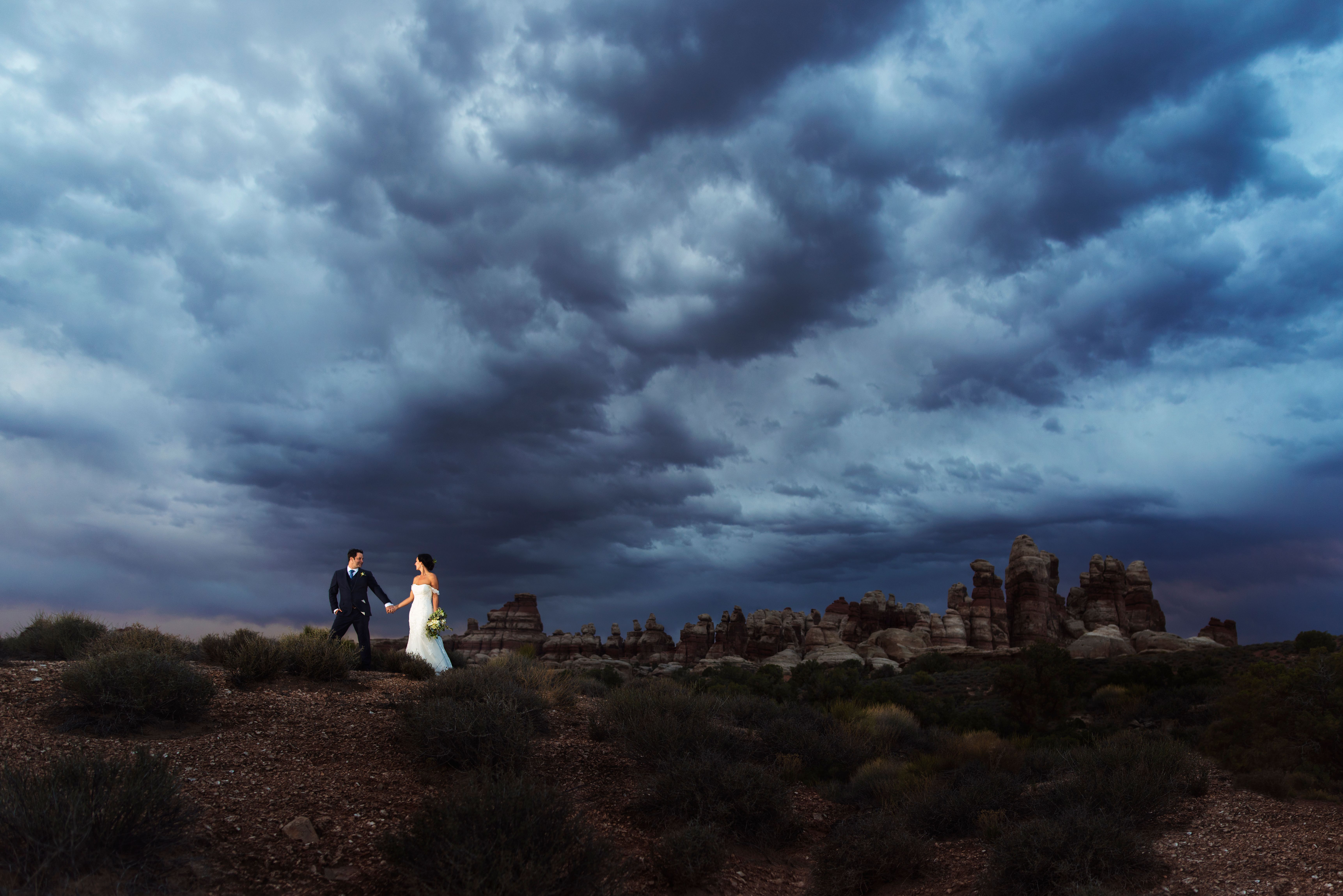
Here's my workflow.
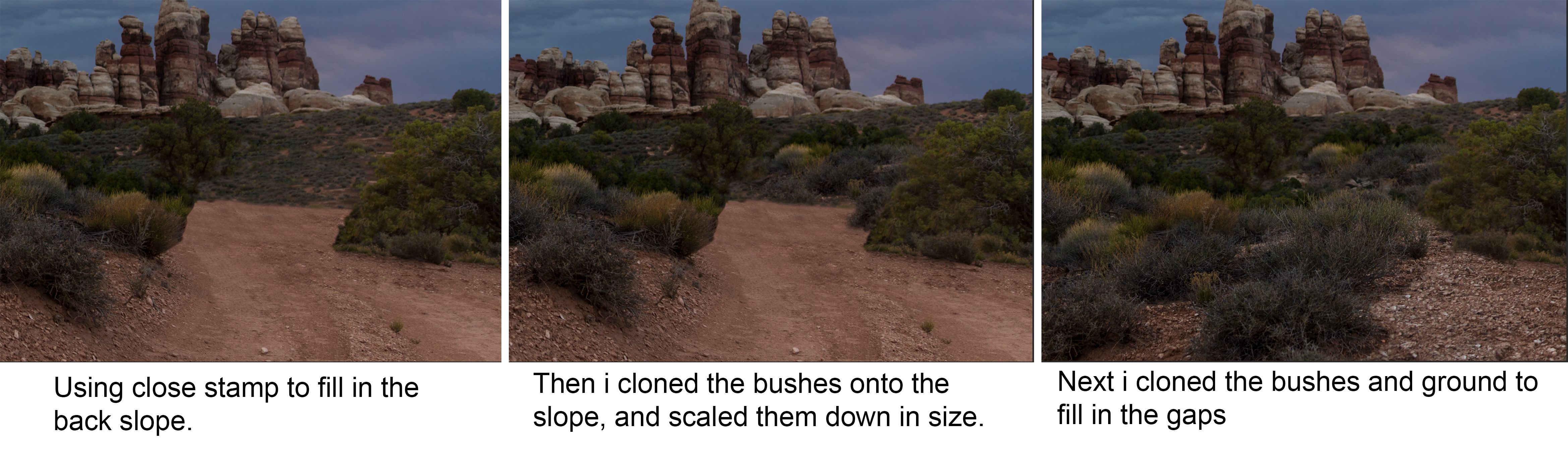
- So i decided early on that i was going to remove the trucks from the image, mainly because i wanted to see if i could do it. So with that in mind my first step was to change the crop to include more sky. So i lessened the ground but moved upwards this meant however that i would need to increase the size of the sky.
- To extend the sky i use the rectangular marquee tool to select all of the sky that was touching the rocks, then using the transform tool i scaled up the size of the sky.
- Next using the clone stamp and the patch tool i started working on removing the trucks. I got rid of them quickly but i wasn't liking how the road was looking and because i didn't have any other source images to work from i decided the easiest thing would be to remove the road completely.
- Added some DB to darken certain areas and make the clouds stand out a little more.
- Added a colour balance layer and added a little red to the shadows, then masked this to the shadows using apply image.
- Colour balance layer for the highlights, and again masked using apply image.
- Wasn't happy with the overall light level of the image, was still a little too bright, so i added another curve layer and darkened it down a lot. But masked out the couple so that it didn't effect them. And this also helped to make the pop out of the image a little more too.
8.Final step, add a little selective sharpening to the couple.
Here's the original....
Ok, moving on. This beautiful shot of Norway from @asgarth that really made me want to go there.
So this was actually a 3 shot panorama (all of which were slightly different exposures) So here's how i dealt with that.
- Opened all 3 images as a stack in Photoshop. Selected them all then went to edit>auto align layers>auto. This matches everything up in the images to the right spots. But when it's finished they are all still different exposures.
- So select them all and go to edit>auto blend layers> panorama This then matches their exposures
- Next i selected the crop. I went for an anamorphic look as the shot looked very cinematic to me.
- Added a curve layer to brighten it up slightly.
- Cloned out some little details like the tree in the top left corner, the buoys on the water etc.
- Added a black to transparent gradient over the sky on overlay blend mode to bring out some details in the sky.
- Hue /saturation mode to alter the blue of the sky to make it a little more turquoise.
- DB water and clouds.
- Colour balance layer, adding blue to the shadows then masking it using the apply image technique.
- Added a little yellow to the highlights using the same technique.
- Added contrast using a curves layer.
- Little bit of sharpening and finished.
The originals....
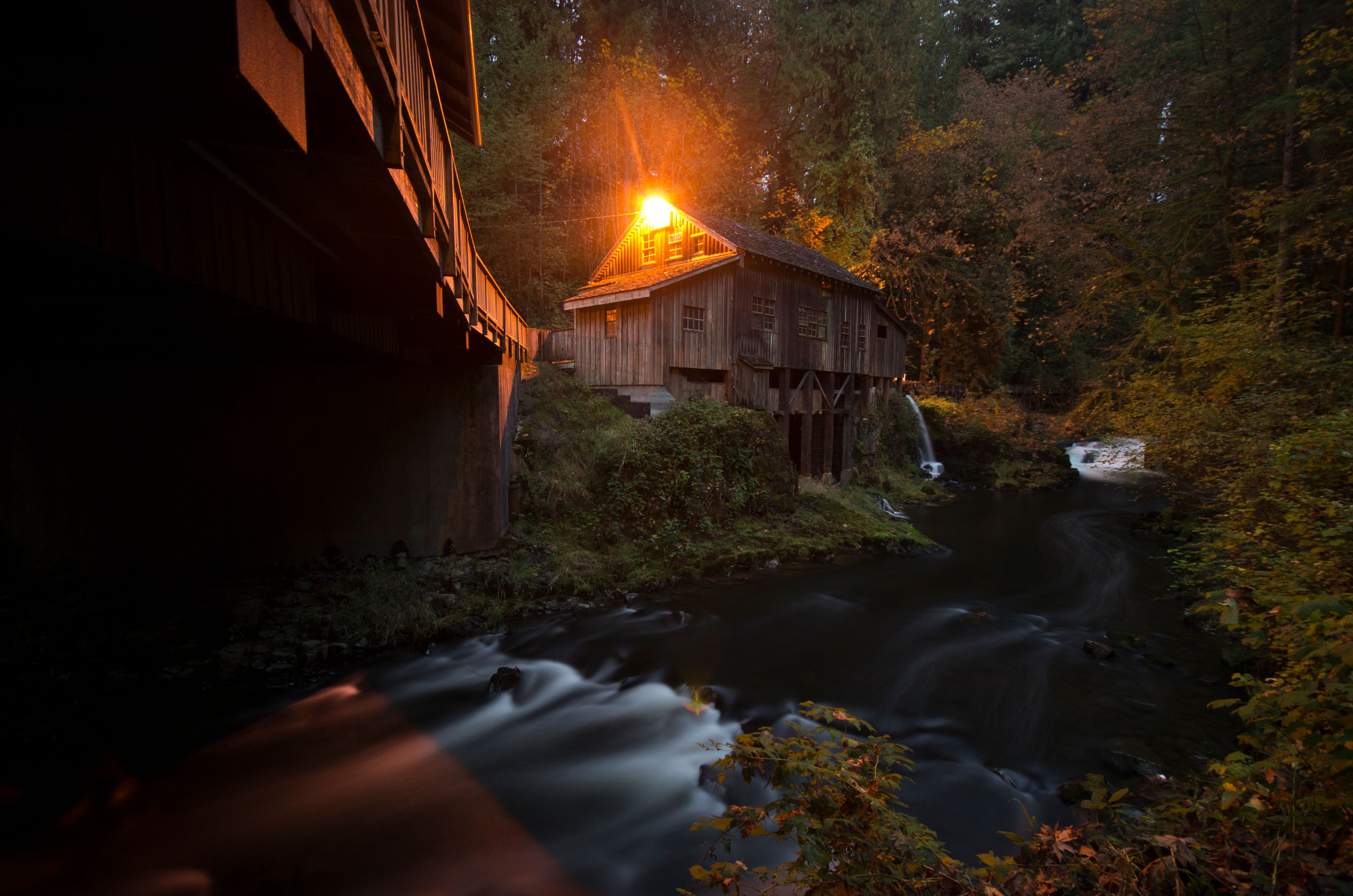
Only two more to go... Next up. @Derekkind's spooky house of horrors in the forrest. This was a great out of camera shot, colours were already really vibrant. So took me a while to decide what to do with this one.
- The one thing that stood out to me when looking at the image was the sudden blue to orange transition on the water, and i knew i wanted to get rid of that. So i simply got a black brush and painted it out.
- Using the same technique i did the @jarvies to stretch the sky. I used the rectangle marquee tool to stretch out the water that already was there. The i used the clone stamp to tidy up the edges. It was around this point i started to think of the movie IT, with the water running into the sewer. So i decided to add an origami boat to the river.
- I used a Hue/ Sat layer and curves layer (linked to the boat layer) To make this blend into the existing colours. I also added a little noise to the boat.
- Using DB i added a shadow for the boat to help it blend in. I also added the name S.S. Georgie in homage to IT.
5.I experimented with trying to add pennywise into the darkened corner but i couldn't find a suitable image to use so gave up. - General DB layer to darken whole image.
- DB layer to add a little texture to the cabin.
- Added some selective sharpening to the cabin.
- Added a teal and orange gradient to help separate the shadows and highlights, but reduced it to about 30% so it wasn't too overpowering.
Here's the original.....
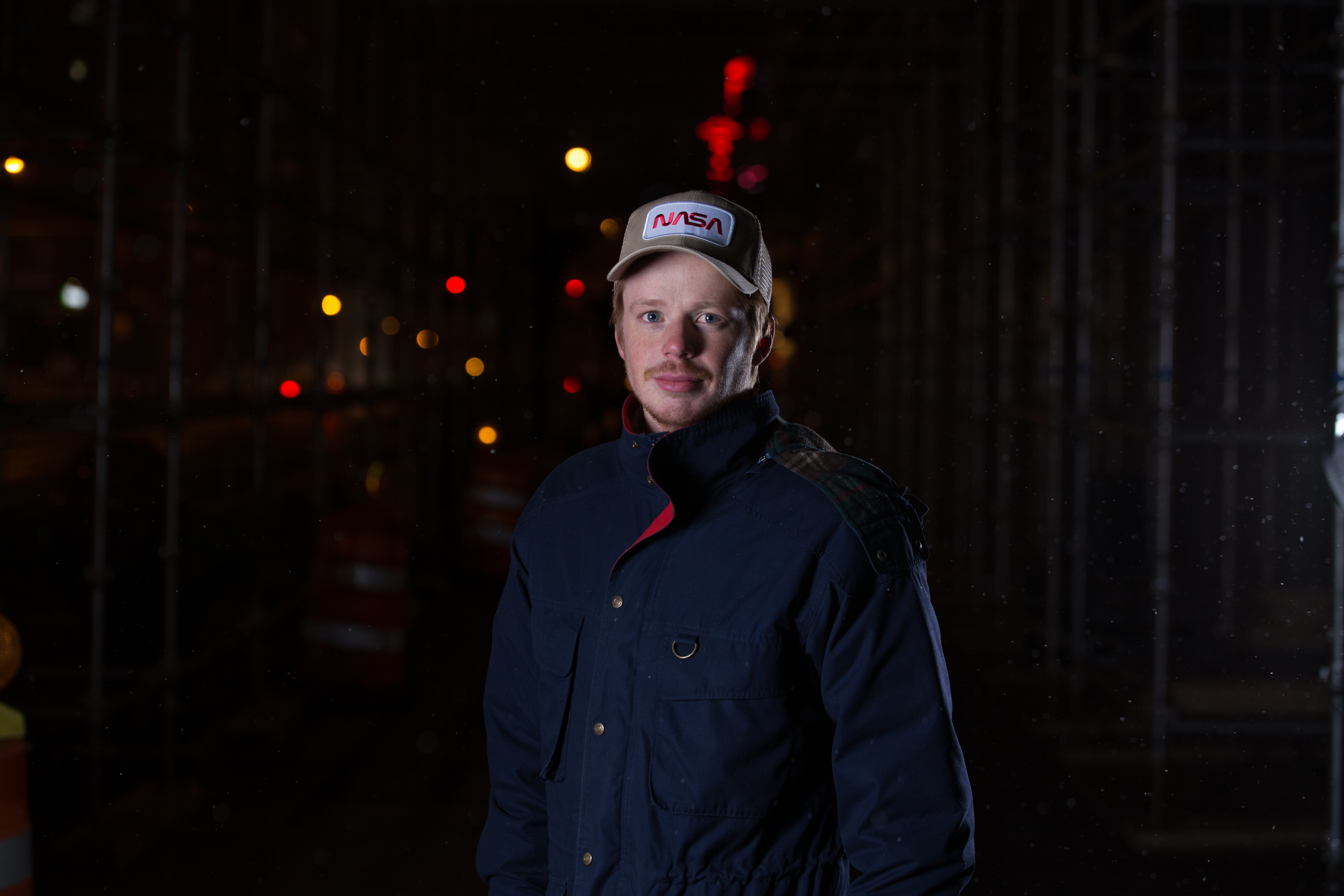
Ok Last one i managed to get round to editing was from @aweber. Again i was unsure what to do with this one too. I started off editing it like a normal portrait but by this time it was 2am and i decided just to have fun with it.
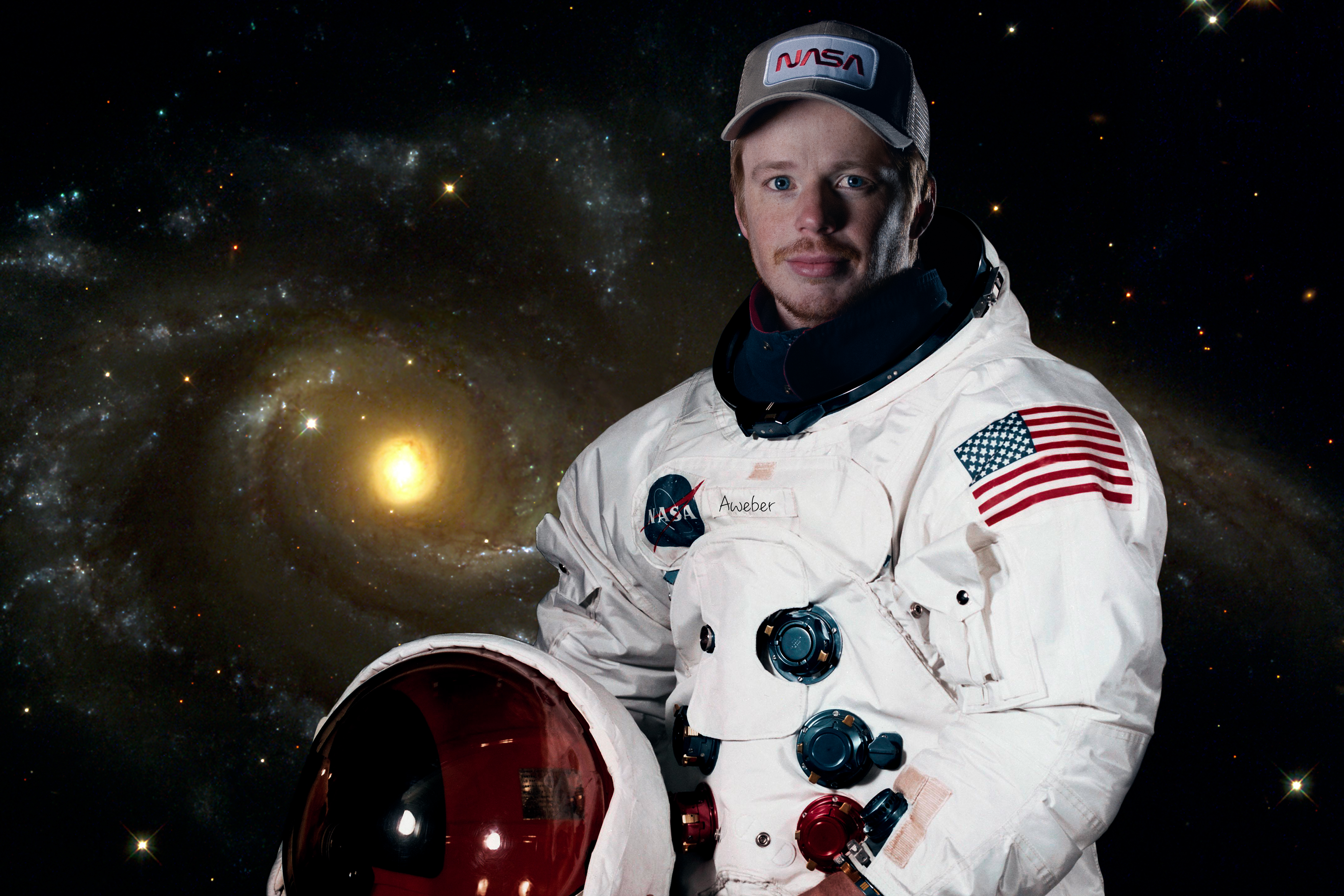
- So i started off with the usual DB layers, Some eye colour editing etc. Then i just stared at the photo for a while thinking what to do. I toyed around with adding more bokeh to the back, the i thought about changing the backdrop. And then i noticed his hat and though i wonder what i can do with that theme. So i went onto the NASA creative commons and i saw a portrait of Neil Armstrong that just got my sleep deprived mind going. So i decided to run with it.
- Using a layer mask i added the head onto Neils Body.
- I desaturated the Neil Armstrong photo slightly to match the look of @awebers.
- Then i masked out the whole body/ head. I did this the manual way cause i'm a sucker for punishment. By that i mean i didn't use the pen tool and i used the brush tool. For some reason this felt like the right idea at the time. I think i was thinking that i wanted softer lines and that the pen tool would be too sharp.
- I found another image for the background from the creative commons and dropped that in.
- Quick colour balance layer to the whole image, and that was it.
Here's the original.....
Unfortunately i just didn't have time to get to the photo from @gabyoraa. ( So sorry). Looking back at my images now i think i was a little heavy on the colours and DB in a few of them, but what do you guys think? Anything you would've changed?
If you have any questions about any of the techniques i used then please feel free to ask.
Thanks again @photogames for providing the images to play with. :)
Instagram: @Jgalione
https://www.shotandcapturedby.com
https://www.gettyimages.co.uk/photos/jgalione
oh my god, that girl is so hot... so beautiful as well
You still have time to do mine :)