Geometry of light and shadow
One of the challenges of being a background artist in an interactive medium is that often a designer requires us to leave a large surface free of detail or clutter, so that characters can move around on it uninhibited. This means that backgrounds can sometimes look sparse and empty, which is fine in some cases, but often the urge to decorate, to break up those large areas is strong, and there's a number of ways that we can do that. Decorative floors are a good option, especially when using higher camera angles, as are things like rugs, changes in floor coverings, and the like. One option, which can be a bit less obvious, is to use lights and shadows to create shapes and silhouettes on those surfaces, thus breaking them up without actually relying on a change in material to do so.
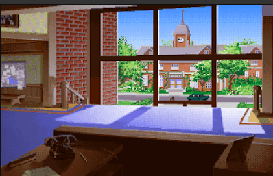
A good, simple example is Barnett College from Indiana Jones and the Fate of Atlantis. Here you can clearly see the large, glass windows let the light in, which is broken up by the window frames, creating a bold set of quadrangles on an otherwise fairly plain floor. The variety this brings to the scene also helps guide our eyes - it's fairly natural to look first to the lighter parts of an image, and having such a strong highlight in the very centre of the composition helps to reinforce the darkness of the framing elements such as the foreground desk.
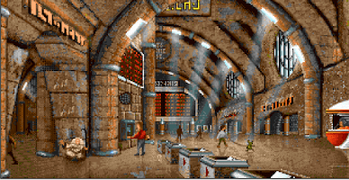
Another way lights can break up a composition is by use of rays, such as in this scene from The Koshan Conspiracy. Here the bold, curving arches of the ceiling are broken up by spokes of light, 'filling' the empty space these arches span with forms that, while not tangible, are certainly visible. Because they're translucent, the scene also manages to maintain the appearance of great size, where filling these same positions with solid supports would make the scene feel much more cluttered.
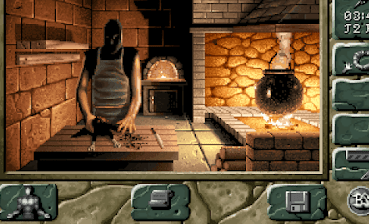
Strong shadows can add bold shapes in any situation. Notice the back wall in this shot from Black Sect, and how the flat plane is broken up by a nice diagonal cast by the shadow. This also helps to frame the shadowy figure in the foreground, by surrounding him with a lighter colour that's framed in by this silhouette on the wall, which follows his form quite closely. Another nice trick is how the arch of the furnace stands out nicely, and feels much hotter and brighter, because it's been surrounded by this much darker colour. As always, contrast and juxtaposition reinforces an element and makes it seem more powerful.
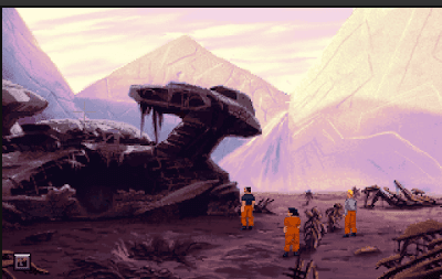
Another great use of silhouettes in light to break up a large area, and focus a composition, is in this scene from The Dig. Here the large, distant mountains are dissected by the looming shadows cast by neighbouring mountains. This adds some diversity to these large, fairly plain surfaces, but it also helps to separate the composition into three very distinct areas of value - the light shades in the top third, the middle shades in the centre third, and the darker shades in the bottom third. This clear division of values in the landscape also means that the bold silhouette of the wrecked craft stands out nicely by being an anomaly withing these value ranges
This backdrop from Rise of the Dragon is another lovely example of adding variety to plain surfaces. Notice how the flat, square panels of the wall have nice curves given to them by the pool of light from an unseen light source. Without relying on any actual solid, material addition, the artist has given this composition a series of bold, rounded shapes that break it up nicely.
An even more clear example is this scene from Dune. The floor beneath the stillsuits on either side of the scene would, if not for the pools of light, be textureless, almost formless planes with no variety. The pools of light provide a strong indication of the angle of the floor and they also add ovals into a scene that's otherwise formed entirely of hard angles.
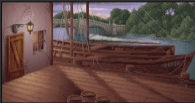
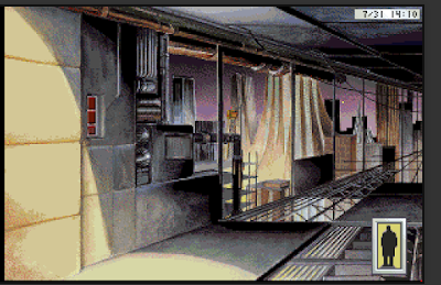
This scene from the Lost Files of Sherlock Holmes: The Case of the Serrated Scalpel uses both light and shadow to add shapes to the wooden docks - the angled silhouettes cast by the ship's masts, and the edge of the building, break the sunlight up into areas of shadow, and then the largest area of shadow is broken up once again by the pool of light cast by the lantern. This ends up being a slightly odd effect, mostly because the lantern casts a light that's the same hue and value as the sun, but still showcases two examples of the idea in a single scene.
An especially wonderful use of light and shadow to create and accentuate geometry is this scene from Full Throttle, in which a hidden light source from the left, shaped by a hidden shadow source, shines onto the large, flat section of ground, centralising the composition and breaking up the plain surface once again, while a hidden light source from below lights the faces in the distance, and uses the shadows from this to accentuate the structure of these. This shows light both creating its own geometry on a flat surface along with the traditional technique of light showing physical geometry in the distance - a wonderful, powerful use of light and shadow that evokes an excellent atmosphere.
Light, then, can bring geometric forms into a composition where there would otherwise be just a flat surface. Doing so can add diversity, focus, and balance, and this makes it an exceptionally useful technique, particularly in a genre where we're often required to use these large, plain surfaces in order to accommodate the needs of a designer. Any artist faced with a large wall, floor, or other large, empty space and is having difficulty filling it with detail would do well to keep these ideas in mind, and will find them very effective tools to have at one's disposal.