Programming Diary #3 - Post Voter Efficiency Graphical Display
Hello everyone! Today I’m going to be attempting to add something important to my father’s browser extension:
- A visualization of the efficiency statistics for the different voters on each post
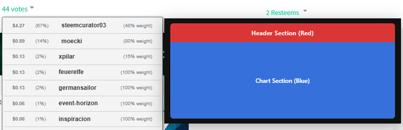
The goal I’m chasing with these changes is to make it easier for manual voters to look at the same information bots consider when they evaluate posts. I think one of the most useful pieces of information is data about the voters who have already voted on a post. Let’s get started!

Programming
Adding the display
What am I displaying?
The main thing I want to accomplish today is a graphical display of voter’s efficiency in the week prior to the post. You may ask what efficiency is. Here’s a formula for it:
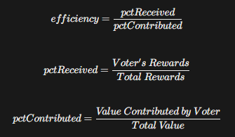
In otherwards, efficiency is comparing how much a voter received from a post in rewards to how much they contributed to the post’s value. An efficiency of 100% means the voter earned in rewards exactly how much value they contributed by voting. An efficiency of less than 100% means that a voter earned less in rewards than they contributed to the post; in other words they would have earned more by simply making a post and voting for themself. An efficiency of more than 100% means that the voter earned more in rewards than they contributed to the post.
Creating the functionality
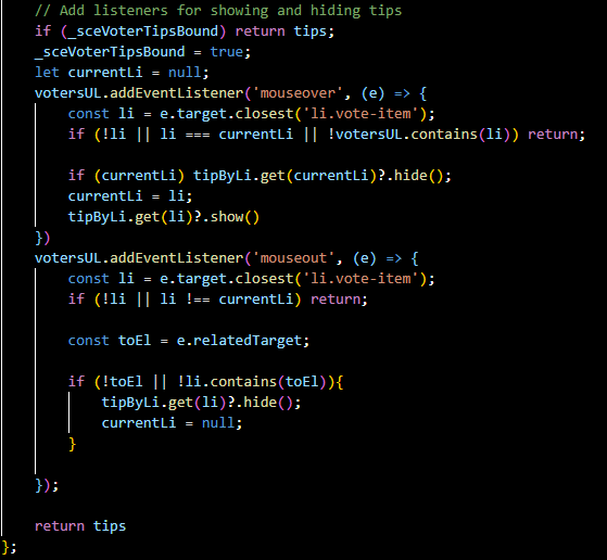
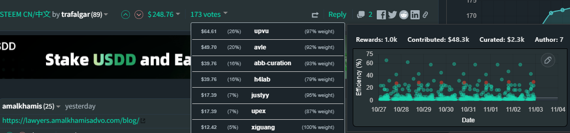
The first thing I’d like to do is add a display that pops up when you hover over a voter in the list of voters. This display will include several pieces of information, so will take up a decent amount of space.
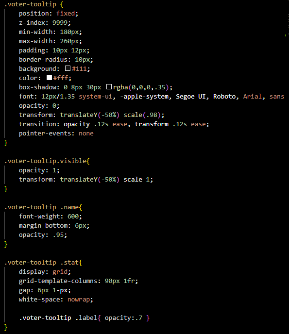
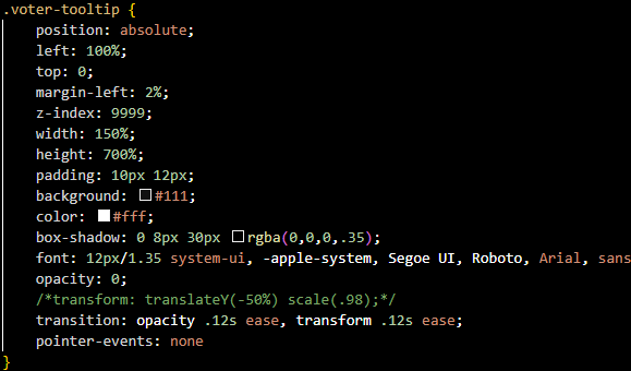
This is a pretty complicated problem, and I’m not great at front end development so I will need to use ChatGPT a lot today. First I asked it to design stylings for me. This is what I have:
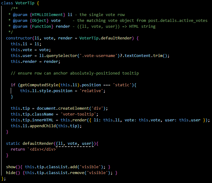
In order to see this, I will need to add in the functionality to have it display when the user hovers over a voter. There are probably millions of ways of doing this, but right now what I thought is best is to actually create a class called VoterTip which will systematize displaying these tips by storing data as attributes, and having methods that each tip will need.
I will pass the vote list item into this class, a JSON vote into this class which will eventually contain the data I need to display (collected when the page is loaded), and html to render which will be typically handled by a method in the class. I created this method and called it defaultRender . Eventually, it will contain the dynamic html which I will display (interacting with the class’ vote attribute, but for now it will just return an empty div. Lastly, I created show and hide methods for displaying and hiding the tip when the user hovers over the vote:
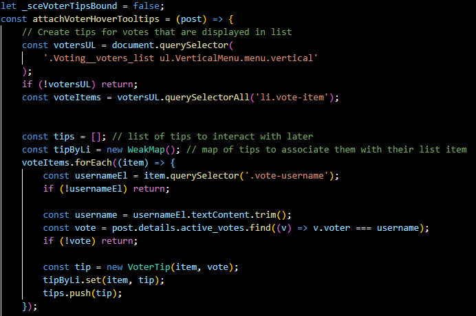
Next, I made a file called votes.js that will contain the javascript for the vote features (I may move some of the code from the post display file into this one so that it’s better organized). For now, I made a function called attachVoterHoverTooltips that creates all of the tool tips for the votes that are displaying (we don’t need to display data for votes that aren’t displaying), and then adds an event listener that shows or hides the tip for a vote that is hovered over:
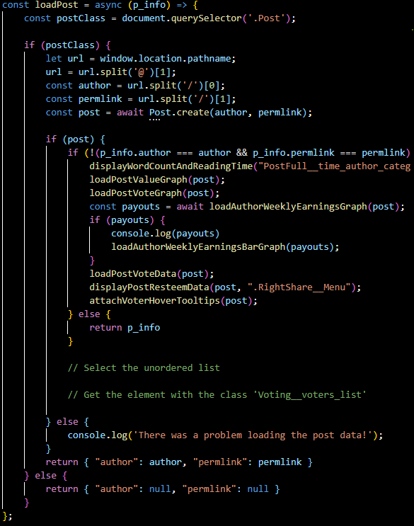
Lastly, all I need to do is call this function from the loadPost function I wrote for displaying all of the other features on posts in the extension:
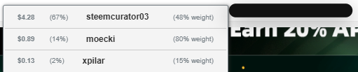
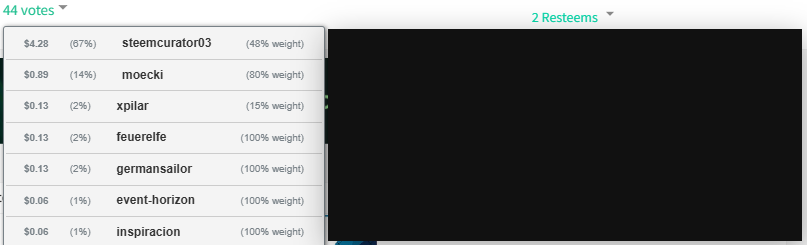
Let’s look at what the tip looks like when I hover:
As you can see, ChatGPT’s styling is everything I imagined it would be. Now all I have to do is add the data. Just kidding, let’s style it properly. Fortunately, the functionality works great so all I have to do now is update the styling.
Updating the styling
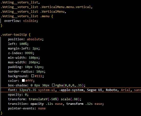
First of all, the current display is blocking all of the data that we want displayed. I want it to be all the way over to the right. The way I did this is by setting left to 100%, and adding a very slight margin. I also had to set overflow to visible on the outer elements because whatever was outside of the list item was disappearing:
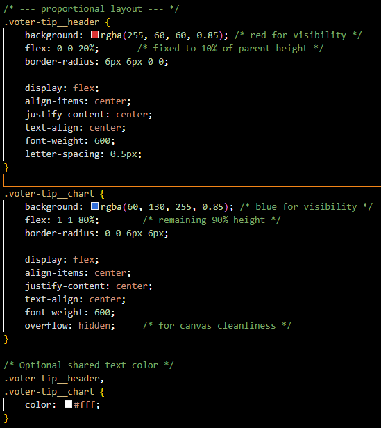
Next, I want to actually make the box pretty sizeable so that it can fit all of the data in it I want to display. I will try to make it vertically 5x the size of the vote item next to it ( so it takes up the space of 7 voters in the list vertically). Horizontally, I will try to make it the 1.5 times the size of a vote item.
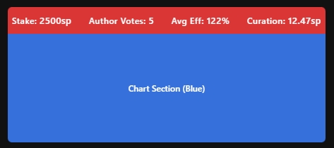
That looks pretty good! Obviously, the coloring is not good right now, but I’m going to wait to update this. First I’d like to add two inner sections to this element. A top section that will eventually have the following stats:
- The total number of curation rewards the voter received in the week before the post
- The total dollar value the voter contributed to posts in the week before the post
- The total dollar value the voter received in curation rewards in the week before the post
- How many times the voter voted for the author of the post in the week before the post
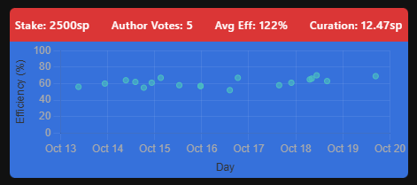
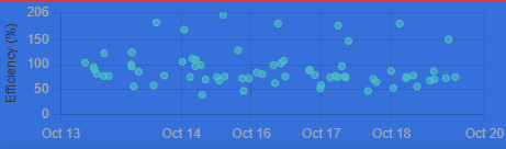
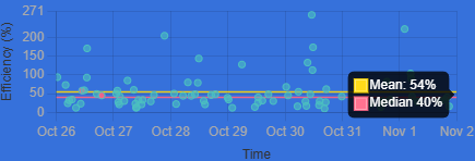
The bottom section will be a graph of the user’s efficiency in the week before the post (a scatter plot showing efficiency over time)
Communicating with ChatGPT, and making tweaks, I managed to make this:
That looks pretty good. Now, I want to actually throw in some fake data and display it, then adjust the stylings. Ignore the actual labels. I’ve changed my mind about what data I want to display in the top of the graph (what I previously listed is the final goal).
This doesn’t look terrible. I created CSS to style each metric section, the metric label, and the metric value:
Now let me create a fake chart. Eventually, the chart will be displaying real data, but for now, here’s a fake chart. Making this chart required a lot of code, so I invite you to check out the repository if you wanna see what’s going on under the hood.
Ok, before I complete the stylings, I want to make it so the chart is working with real data, so I’m gonna set it up to collect real data.
Collecting the data
First, I will work on collecting the data we are going to work with. As mentioned earlier, efficiency is a comparison of rewards to post value. This means we will first need the voter’s curation rewards.
Curation Rewards
Luckily, @steemchiller has an API call that we can use to get this data. We will need to convert our post’s created date to an integer (in seconds) to work with the API. Then we will need to calculate the upper and lower days (based on how far back we want to go):
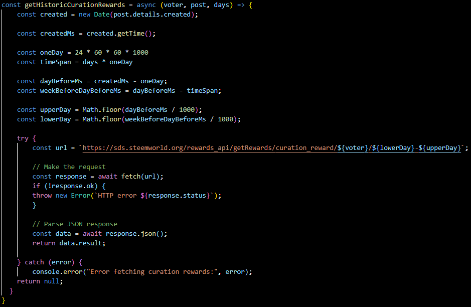
If all goes well, this will return a JSON object we can parse for the user’s rewards. Each object contains the time of the reward, the vests in the reward, and the reward’s post author and permlink.
Getting Rshares
Much of the underlying data we need relates to the overarching post. In order to look at value, we will use Rshares; specifically the voter’s contributed Rshares and the total Rshares. Luckily, we already calculated this for other features in the extension, so I just need to make an instance of the Post class with the author and permlink contained in each reward, and call the fetchDetails method and the getVoteData method.
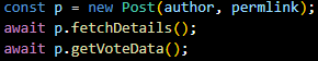
This means we have the values we need for the denominator of our equation. All we need now is the numerator.
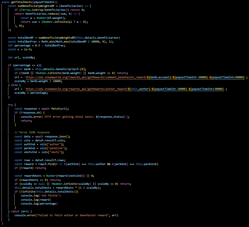
Getting Vests
As stated before, we actually already have the voter’s reward vests. They came with the curation reward data. So all we need is the Total Vests. My initial instinct was to simply add all of the reward vests together, but I realized there’s no easy way to query all of the reward vests in a given post (at least that I’m aware of).
Then I realized, I can get the author reward vests and just multiply them by 2 to get the total vests. The problem here is that the author isn’t necessarily receiving 50% of the reward vests. They could have delegated as much as all of their rewards to a beneficiary. So I added up all of the beneficiary weights and subtracted them from 0.5 to get the percentage the rewards going to the author. Then I once again queried the Steemworld Api for the author reward (or for the first benefactor if the author didn’t get any rewards). Then I multiplied the reward vests by the reciprocal of the percentage to get the total vests.
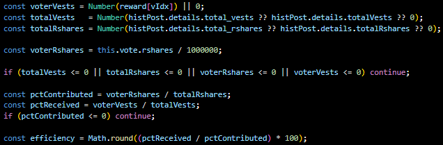
Calculating Efficiency
Now we have all of the values we need to calculate efficiency, so all I have to do is do it:
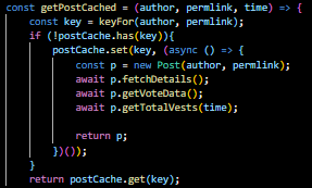
Posts Cache
This is a very network heavy feature which will unfortunately have to make a ton of queries. This reflects the value it serves because knowing voter’s efficiency data can be really useful in evaluating the likelihood that a low value post will do well. I tried to save the user from too many requests and make the program faster by using a cache. This means if multiple voters in the post voted on the same posts, the data won’t have to be queried because it will be stored in the cache.
Visualizing the Data
One change I decided to make is instead of visualizing all of the efficiency data when it’s collected, I want to visualize it as it comes in point by point. This is because in some cases it can take a while to collect, and I want the user to see the progress. So I created a class object for the scatter plot, and made a createChart method which creates the initial empty chart, and a pushPoint method which adds each point to the graph.
Hover Data
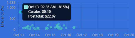
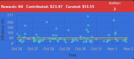
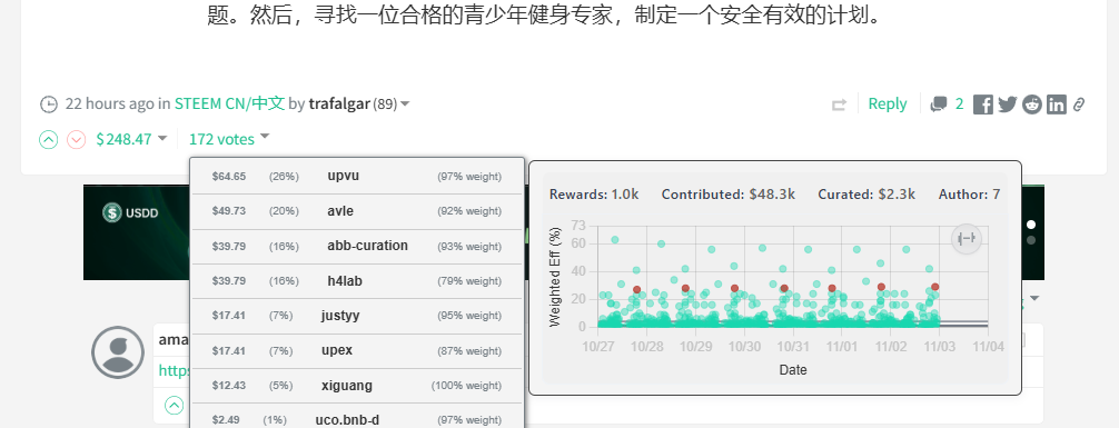
So before moving on and styling everything, I want to make it so that if you hover over a dot it shows you the post’s total value and the voter’s reward value. This is because a high efficiency isn’t as meaningful if the post value was very low. It may just mean the user had a very low stake. I also made it so that if the post the dot represents has the same author as the current post the user is on, the dot is red.
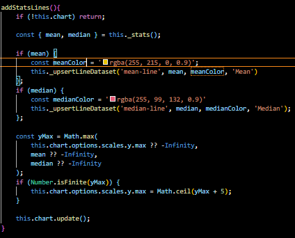
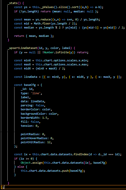
Mean and Median
Next, I’d like to add lines that represent the mean and median, and make it so if the user hovers over them it shows them the value:
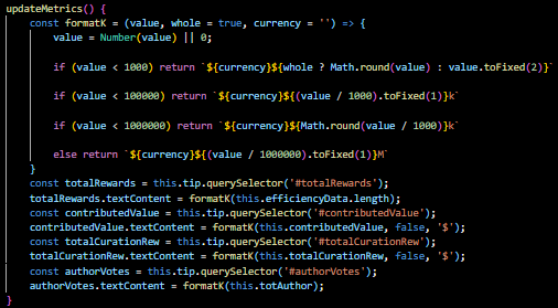
Metrics
Lastly, I added some metrics to the top of the post that may be useful and aren’t easily discoverable in the graph. The total rewards the voter had, the contributed dollars, the total earned reward dollars, and the total number of votes for the post’s author:
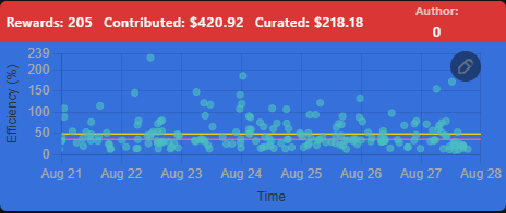
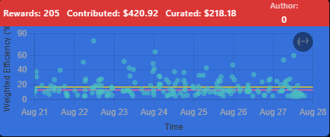
Switching to Weighted Efficiency
The last thing I want to do before formatting the tooltip window is make a checkbox the user can select to switch between weighted efficiency and efficiency. This will be useful in factoring in how much weight users vote with on low vs high efficiency posts.
This turned out to be quite complicated so I can’t show the code, but I made it so an icon is visible in the top right of the graph which represents what is currently displaying. If it is a feather, it is the normal efficiency. If it is a dumb bell, it is the weighted efficiency. The user can toggle between them to change the current graph.
Styling Everything
Non-Night Mode
First, I wanted to style everything for users who aren’t in night mode. I converted the dates to be in digit form so that it will be easier to deal with when switching languages, and made the dots Steemit’s brand green. I made the background similar to the generic page color, and made the text color similar to the color of account names for the labels, and similar to the color of the account reputation for values:
Night Mode
Next, I wanted to style everything for night mode (which is typically the mode I use). I kept the point and line colors in the graph the same, but made the background similar to the background of the Steemit page, and made the text similar to the account name for the metrics and axis titles.
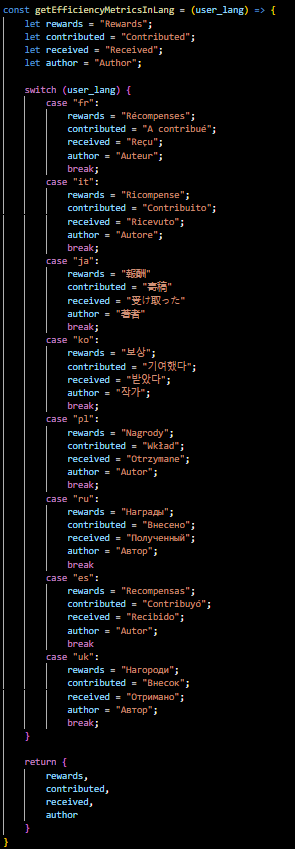
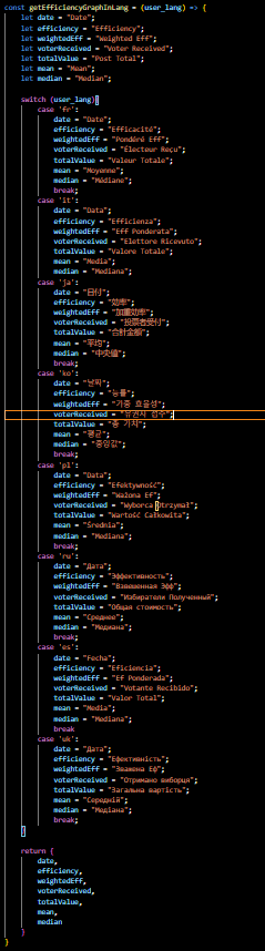
Handling Multiple Languages
With the last feature I added, @remlaps informed me that I have to consider not everyone using the Steemit website speaks English. So I created a language.js file to hold the functions for dealing with different languages. The first function I made for today is a function that returns the metric labels in the different languages (taking the user language as an input). These labels were made with Google Translate. Please let me know if a label is wrong:
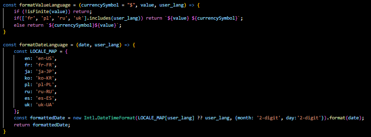
Next I made functions for formatting the value and date based on the language. Some languages put the currency symbol after the value. It seems to me that Steemit consistently displays the value in dollars no matter the language, but I used a variable for currency symbol in case this ever changes:
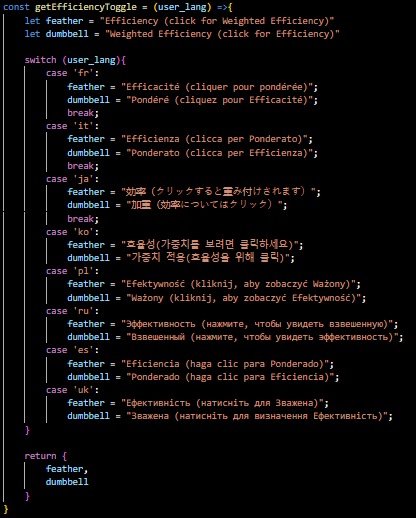
Lastly I made functions for getting the words displayed in the Efficiency graph and Efficiency toggle icons in each of the languages:
I then went back through all of the code and converted the label strings to use variables retrieved from these functions so that the user will see everything in their language.
Conclusion
Thanks for reading this! I hope you find this new feature useful in the browser extension! For right now, these changes will be available in the postVoterStats branch of @remlaps' repo. If you notice any bugs please submit an issue. Otherwise please let me know any useful features you’d like to see added! Have a nice day!