The steps of developing an App - Part 2 - Making mocks
Us developers and Engineers tend to get very excited when we get an idea for a new project. We can't seem to wait to jump in and starting building from the vague picture we have in our heads - only to stop halfway when we hit a roadblock or another idea pops into our minds.
In this series of posts I will attempt to go through the steps necessary to take the ideas we have and turn them into a finished project that we can be proud of.
This is part 2 of the series where I am going to be discussing getting some basic visual representations of what we want our apps to look like when they're finished, affectionately referred to as: The Mocks.
If you missed part 1 where I went through the process of writing down a specification for our app, you can read that here.
What's a Mock?
If you've never heard about a mock before, what it basically is, is an image or drawing - usually in digital form, but not necessarily - that gives a simplified view of what your app is going to look like. The idea here is that you don't want to go all out and make a pixel perfect version of the end product, but you also don't want to leave out any important artifacts/widgets/features.
Creating mocks in a professional environment is usually done by UI/UX designers and sometimes by the project managers. I've talked about some of the core principles of UI design in a previous post if you're interested in reading that.
Since I'm not a really a designer, I won't be able to show the best tricks or tools to use, but hopefully you'll find some value in me showing you how I go about designing my little project - even if it's just getting a laugh out of how inefficient I am...

Choose your tool
What you use to create your mocks really don't matter at all. As long as you're comfortable using it and can get something done quickly - we don't want to first go through a bunch of tutorials before starting. In fact, you could even use a paper and pencil if you'd like. I personally like using Inkscape for making everything - it's free and you can create some pretty impressive graphics with it. I might do a few posts showing how I use Inkscape in the future, let me know in the comments if that's something you'd be interested in.
No lets begin, shall we...
Start with your spec
What we really have to have handy is the spec that we've made previously, read about that in Part 1. Just for reference I'm going to add the spec as we left it last time here again:
Web-Resume will be an online platform to create and share one's resume. Following is a list of specific features that should be implemented on the release version of the platform:
Content
- The resume should be split up into different sections specified by the user
- A section consists of a title, default sort-order and entries
- A section could have either a single or multiple entries
- An entry could consist of text (including dates and numbers), an image or a data structure
- A user should be able to manually show/hide a section or entry
- The content should be formatted so that it could easily be printed
Filters
- There should be a way to enable filtering of the content
- A filter consists of a field name, a condition and a switch to determine whether to show entries that does not contain the field
- An entry should be filtered if it contains the field name and does not match the condition
- A filter condition could be one of the following types:
- date or number range
- contains (or does not contain) text
Sort
- There should be way to specify how both entries and sections are sorted
- The sort order setting should contain the field to be sorted by and whether to sort ascending or descending
Versions and Sharing
- There should be at least two versions of a resume - with more that can be specified by the user:
- A public uneditable version
- A private version which can be edited by an authenticated user
- Each version of the resume should have a unique URL
Optional features
- A way to download the resume as PDF (or other formats)
- A way to customize the appearance of the resume - colors and fonts
- There should be a strategy to monetize the app
Now we start iterating
First step
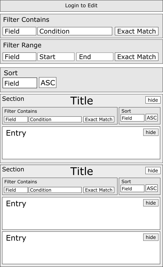
Right, so we have our spec handy. Now just like last time we're going to be throwing down whatever elements that we've mentioned in the spec. Doesn't have to be pretty yet:
Second step
Wow that's a mess, let's clean that up a bit - line everything up, maybe add some contrast between elements. If you had some foresight you could have done that from the start:
That's looking pretty ok already. Now just as before we can continue to refine as we see fit - change the sizing a bit, move some stuff around. Just take it to the point where it looks ok to you.
You might have noticed that I didn't use any colors yet. Remember we're not aiming for perfection or a final design. Just a visual reference that as all the elements we want. We want to be able to easily make changes and add new elements as necessary.
That's all I have for today. There's definitely more work to be done on these mocks, but I think I've explained the process well enough - at least I hope I did. I'll be making updates as the project progresses. I definitely need to add some general headings with the resume owner's name, add a logo at some point, maybe move the filters and sorting to a side panel so they don't appear in the way so much, etc.
Happy mocking...
Apps I mean. Make mock-ups for apps, don't go mocking people...


Congratulations @hendrikcrause! You have completed some achievement on Steemit and have been rewarded with new badge(s) :
Click on any badge to view your own Board of Honor on SteemitBoard.
For more information about SteemitBoard, click here
If you no longer want to receive notifications, reply to this comment with the word
STOP