DIY Steemit Statistics with Python: Part 3 - Counting Posts, Comments and Upvotes
In the previous posts of this series (1, 2) we counted users. Next stop - counting posts, comments and upvotes.
Preparation
Before we start, we prepare the workspace as usual (see the first post for explanations):
%matplotlib inline
import sqlalchemy as sa, pandas as pd, seaborn as sns, matplotlib.pyplot as plt

sns.set_style()
e = sa.create_engine('mssql+pymssql://steemit:steemit@sql.steemsql.com/DBSteem')
To save a bit on typing today, let us define a short function sql for querying the database:
def sql(query, index_col="Day"):
    return pd.read_sql(query, e, index_col=index_col)
New Posts and Comments
We already know that all posts and comments are recorded in the TxComments SteemSQL table. A short examination of the entries in this table can tell us that:
- Post records have their
parent_authorfield set to an empty string, while the entries, which correspond to a comment, have the author of the parent post there. - A single post or comment may have multiple entries, corresponding to consequent edits. The entries which correspond to an edit will always have their body starting with characters
@@.
Consequently, we can count all new posts and comments per day with the following query:
posts = sql("""
select
    cast(timestamp as date) Day,
    sum(iif(parent_author = '', 1, 0)) as Posts,
    sum(iif(parent_author = '', 0, 1)) as Comments
from TxComments
where left(body, 2) <> '@@'
group by cast(timestamp as date)
order by Day
""")
Plotting should already be familiar:
posts.plot(figsize=(6,2.5));

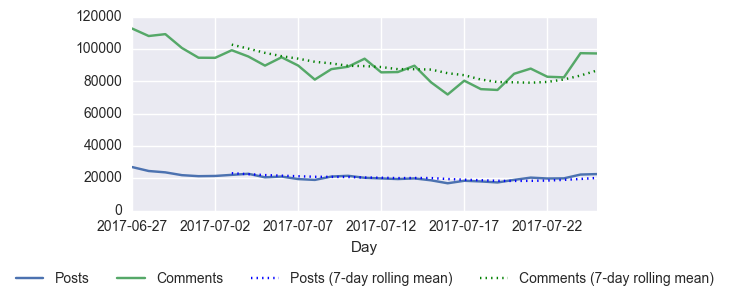
If we need the plot of the last 30 days, which also includes the smoothing lines (the mean of the last 7 days), we can obtain it as follows:
df = posts[-30:-1]
df.plot(figsize=(6,2.5))
df.Posts.rolling(7).mean().plot(label="Posts (7-day rolling mean)", ls=":", c="b")
df.Comments.rolling(7).mean().plot(label="Comments (7-day rolling mean)", ls=":", c="g")
plt.legend(loc='upper center', bbox_to_anchor=(0.5, -0.25), ncol=4);

Upvotes
To count and plot the upvotes we repeat the same procedure, except this time we query the TxVotes table. Note that, in theory, a person can also vote several times on the same post (e.g. removing a vote is recorded as a vote with weight 0), however we will ignore this issue and just count all vote records per day:
votes = sql("""
select
    cast(timestamp as date) Day,
    count(*) as Votes
from TxVotes
group by cast(timestamp as date)
order by Day
""")
votes.plot(figsize=(6,2.5));

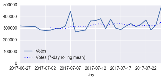
Plotting the last 30 days with an added trendline:
df = votes[-30:-1]
df.plot(figsize=(6,2.5), ylim=(0, 500000))
df.Votes.rolling(7).mean().plot(label="Votes (7-day rolling mean)", ls=":", c="b")
plt.legend(loc='lower left');

Transactions
To conclude this part, let us also count and visualize the number of daily transactions (these include posts, comments, transfers, powerups, and any other operations supported by Steem). The process is the same as above, except now the table name is Transactions and the expiration field works instead of the timestamp:
sql("""
select
    cast(expiration as date) Day,
    count(*) as Transactions
from Transactions
group by cast(expiration as date)
order by Day
""").plot(figsize=(6,2.5));

We will continue reproducing other @arcange charts in the following posts. The presented source code is also available as a notebook on Github.