Slothicorn Logo Contest Entry
Concept
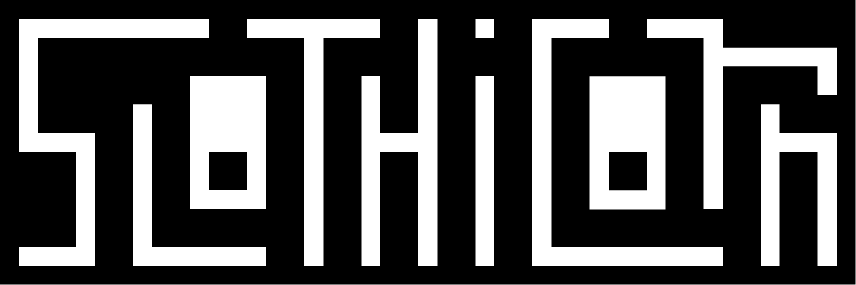
- Geometric type + slothicorn's face
- Reference a binary/QR/barcode aesthetic
- One-color
- Small file size
- Slow movement
- Surprise teeth
- Should feel simultaneously sleek and clunky
- Like the Batman logo is also a bat, the Slothicorn logo is also a slothicorn
Logo + Footer
This entry contains an animated logo. Since the footer can be a GIF, why not an animated one? It can be big or small. Links to other websites as indicated in the design brief can simply be included as text links.Icon
The icon should work as color or as no-color. It is a crop of the logotype and also a face.The icon is a good place to say "Hi!".
And in color, too! The relationship between unicorns and rainbows is well-known, but I am not well versed in the relationship between slothicorns and rainbows. I will assume they are at least on speaking terms.
Header
Designing a header really means for designing to ensure the legibility of text that's placed in the center. Also, it's nice to change it out seasonally, or at least on some regular basis. For example, let's take this logo......and reduce to simply a framework for a seasonally updated photo:
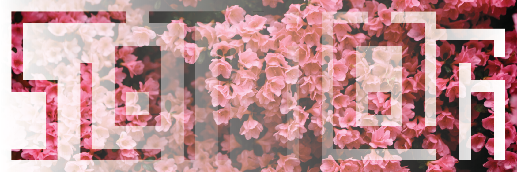
Here's spring, courtesy of Wikimedia Commons.
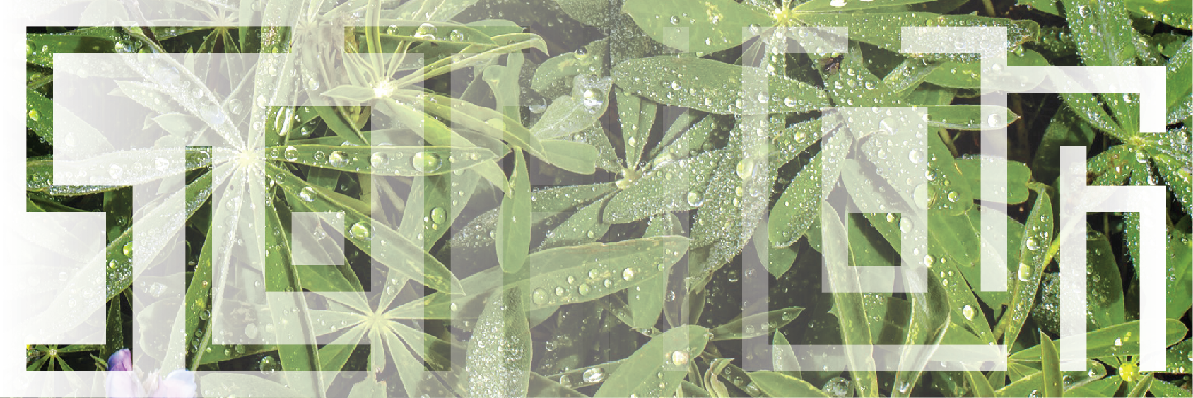
And here's summer, again courtesy of Wikimedia Commons.

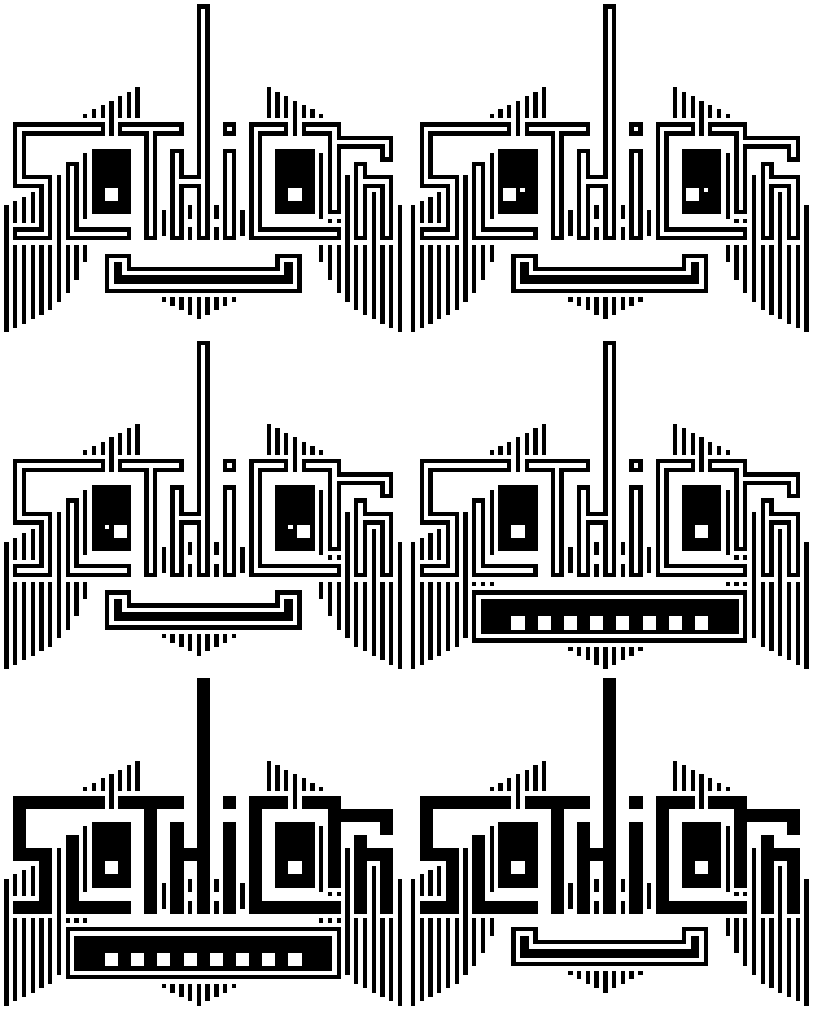

This is really amazing work! You've received an upvote from a @slothicorn! Click here to learn more! (@justatouchfey) ((.)ω(.))