Branding: Steem-Bounty (Steemit Reward System)
I'm stoked in a big way.
#1
@steem-bounty dubbed me winner of the logo design contest they recently hosted. Pretty sweet, right? What's better than doing something I love (design) on something I love (Steemit) to get something I love (Steem). Bam! It's a good day.
But here's the thing: it's not just about making pretty graphics. If you're an artist, it's about the journey. It's about expression and finding yourself within the process.
For designers, it's different. It's not necessarily about the "journey". It's all about the destination. Design is about purpose and strategic planning. There has to be a "point".
So when there's a "point" worth being passionate about, that's the stuff that fuels a designer's creative juices. That's what wakes us up in the morning. Which leads to the next point...
#2
Steemit is a platform that breeds loyalty. Why? Because it puts its money where its mouth is. It rewards content. It rewards engagement. It fosters teamwork and relationships. We lift each other up so that each day we're slightly better off than we were the day before. That's a cool concept.
Steem-Bounty is an automated application that highlights the same principles that make Steemit great. It provides Steemit users with the ability to integrate reward systems within their posts. Wait, what? Yeah, that's right. I'll say it again. It integrates reward systems within the posts.
What does that mean? It means that if you seek out or stumble upon a post that uses the Steem-Bounty tool, there's another layer of funds just sitting there, ripe for the taking. If that doesn't get your inner-viking excited, I dunno what will.
It makes life easier for the poster hosting the contest while also making the contest more enticing to the participants.
It's a win/win.
Bottom-line: I'm excited to play my part in what I'm sure will become a widely-used tool within the Steemit ecosystem.
That being said, I never officially created a post to properly display the Steem-Bounty branding in all it's glory. Chances are, the powers-that-be may want some tweaks, but that's okay. It just gives me a reason to make another post, haha.
So let's get this show on the road!
We'll start off with overall construction of the logo's icon. I utilized Golden Ratio mathematics to....what? You dunno what that means? Good. It gives me a reason to make another post.
Where was I? Oh yeah. So I basically used aesthetically pleasing math (yes, there's such a thing) to produce the lines, curves, and individual elements in a ratio that is proportional to...
...ah. You don't care, do you? Fine.
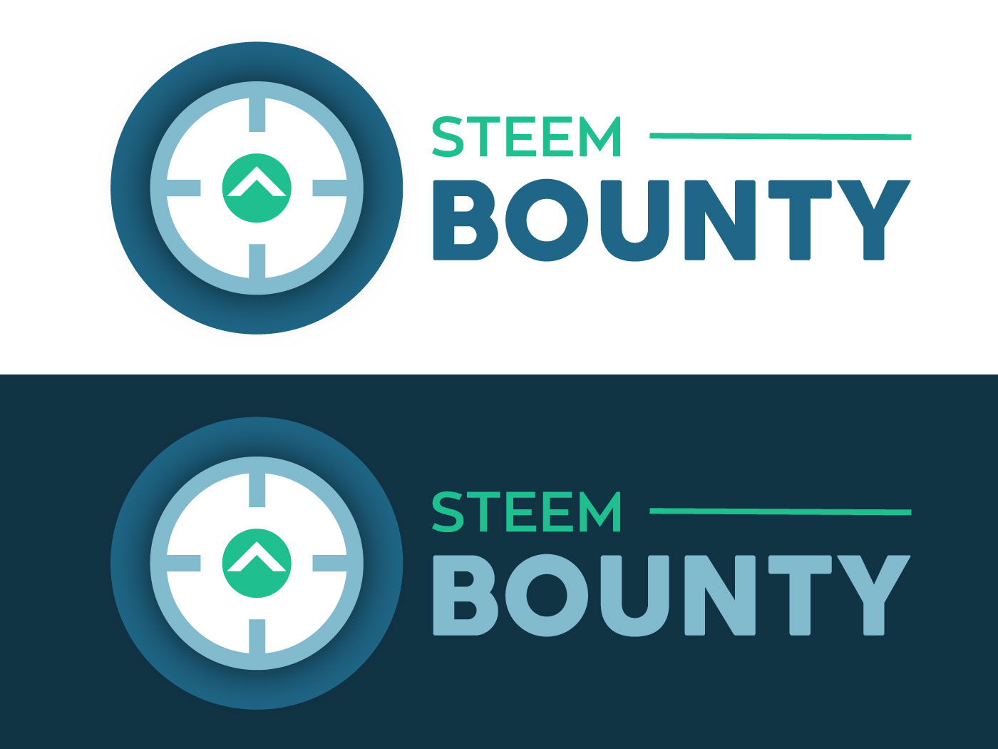
As you can see, the concept revolves around a rifle scope that emphasizes Steemit's upvote symbol. Users are encouraged to produce the highest quality content possible to be rewarded with the bounty that's sitting there in virtual space. The upvotes of the "owners" and the community are central to the system.
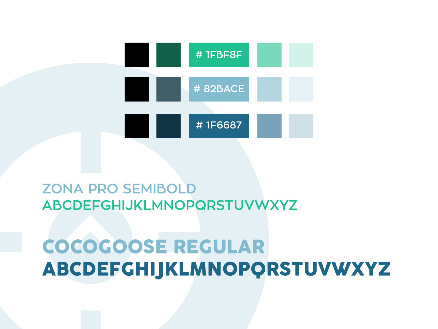
The Colors palette hints at the relationship with Steem/Steemit. The Typography choices are sans-serif typefaces that suggest a clean, modern style with a hint of character.
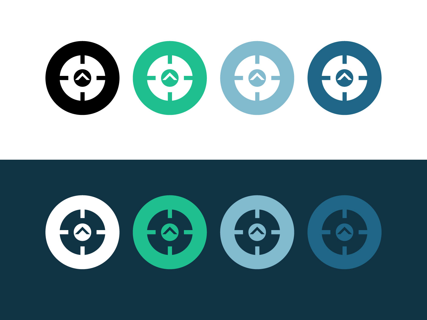
Creating a logo is one thing. Creating a BRAND is something else entirely. In my opinion, the better the logo can be interpreted with only ONE color, the more iconic it is. The more impactful. Think Apple. Think Nike. Often times, less really IS more.
To pull off one-color versions requires the use of negative space.
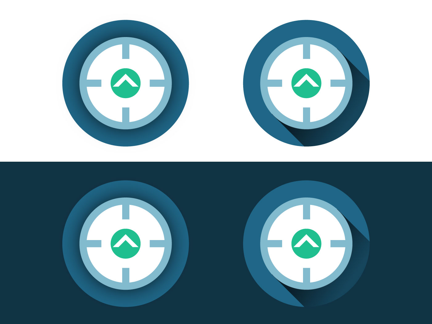
Now let's add some magic sauce. More color. Maybe a touch of gradient or opacity here and there.
Now we're cooking.
I know you've already seen the mobile phone mockup at the top of the post, but let's play with the branding a little more.
Here's a few concepts in how the branding might be utilized.
Well, thanks for making it this far.
In the future, I'll be sure to post some behind-the-scenes insights on my overall work flow, the software, and fundamental design principles that guide the entire process.
Now go do a search for any steem-bounty posts out there. Sound your barbaric yawp, and go WIN THOSE BOUNTIES!



bounty hunters!
That's one sleek business card. Patrick Bateman approves.
cool video
Great work! For any designers: We're running a month long contest for designing a logo for Steemgar service. It's a game that rewards winners with steem.
Rewards for contest winner include 50 SBD and a upvote from a whale. Read more here:
https://steemit.com/steemgar/@cryptoctopus/steemgar-logo-design-contest-win-50sbd-upvote
It would be nice to see something from you there as well! :)
Wow, that sounds cool! I’ll definitely check that out!
Congrats on the win, the logo and branding looks great.
Thanks!
You are such a professional. Congratulations on your well-deserved win. I participated in the contest with you. I earned my biggest upvote ever as a result of it.
Thank you for contributing and showing your process. Work like yours sets the standard and shows everyone that we have amazing talent on this platform. Everybody wins when we highlight quality.
Gosh @nikema ! I’m blushing. It’s great to meet another friendly designer! Thanks for the kind (and inspirational) words!
My kind words are all true. Congrats again :)
You have got some really simple and beautiful designs. And also, thank you for sharing ! We are also looking for such a designers here https://discord.gg/CN9Gb4m
Thank You
I’ll check it out!
wow! what a unique design, I am humbled by the uniqueness and simplicity of the design, everything is just balanced, the colour the shapes and the fonts.
looking forward to a generous rewarding system with steem bounty.
I like the concept of your logo that you have made great colors really Green for growth and blue for trust and loyality awesome man I'm also a graphics Designer and also start my blog on steemit good to see that people have a color scene
I look forward to seeing your stuff!
Now that was really interesting. And seriously; please post more about aesthetically pleasing math! Although I just do graphics to relax and really suck at it, it calms me down and makes me happy.
This post was actually educating and I'll take the liberty of trying some of it on the stuff on my hard drive.
Although having no idea what good or bad graphics are, your design strikes me as "right". I don't have to interpret it, because it just works.
So i hope to see more of your work and input around here :)
Have a lovely day (and congratulations by the way :))
I’ll write up some posts about why some designs feel “right” and others don’t. Yes, part of it does come down to “math”.
And I totally get what you mean by “relaxing”. Whenever I have an opportunity to slip on a headset, crank up the music, and go to town on the digital canvas...well, it’s awesome.
Great! I will be looking forward to your posts :)
lovely designs
Thanks!
Thanks!