STEEMGAR - Redesign website look - PART 1
STEEMGAR - Play game and earn tokens
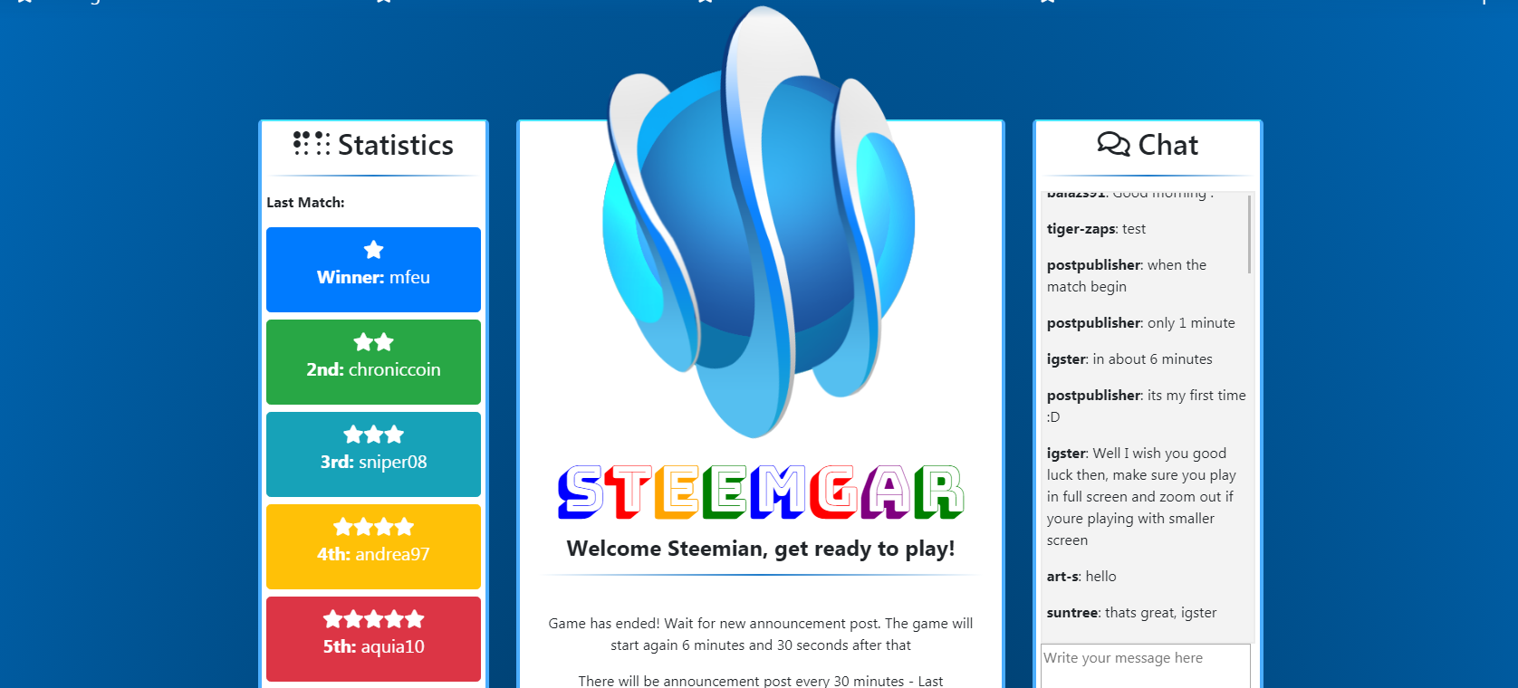
Many people playing this game on Steemit using this site https://steemgar.herokuapp.com/ so i played. In order to help community to grow and play this game i decided to redesign website look.
Original look was nice but when i looked under the hood i saw real mess in html and css code. So i downloaded html and css code to local server and start cleaning it and later changing it.
Look and performance
I noticed columns being almost the same width as those that supposed to be widget. That isnt so bad if you have same amount of content in all three but there was overcrowded middle column (with text) and clearly it should be wider.

My suggestion was using bootstrap framework and add to existing layout so we can use predefined elements and lower possibility of making coding mistakes. Some users was against using it but real advantage is:
When you have predefined element you dont need to write code from start - instead you can just add your style code on top of existing.
Bootstrap columns make website more friendly for smaller screen sizes (mobile,tablet,Ipod...) and bring more visitors (SEO) to website so i wrapped html code in bootstrap.
Performance issue for server isnt detected because i used CDN hosted files so any of that files wont be server from server. How that working? Its easy - When you host files on server, visitor send request to the website and website read file and then serve it to the visitor. Using CDN hosted files visitor downloading those files from other location so server doesnt need to read and serve those files from it, instead it was served from outer source so there is no impact to server performance. One more thing is that all files from CDN are minified.
Next thing i did not liked it was middle column distance from top. It should bring the focus on it by making it little closer to the top from other columns (widget). I decided to make new approach to this focus problem by putting something worthy of visitor focus on middle column and that was logo. Moving it little closer to top, logo became detail worth of making main focus when you visit first time this page and also making middle column little higher than others but in same line so there is no distorted look.
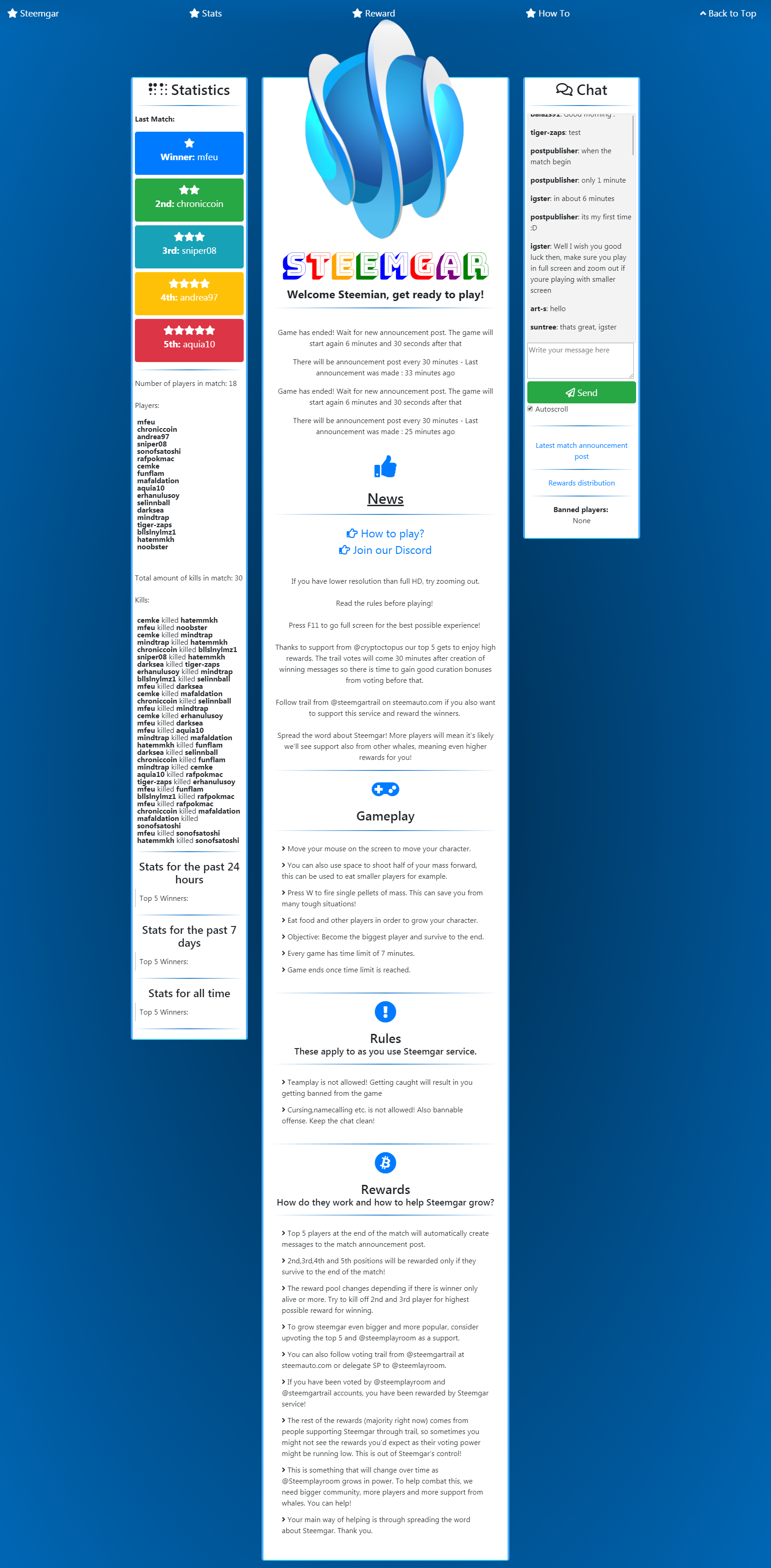
All widget titles was H1 tag and for styling in original template and it was used css font-size. That was bad because main SEO principles are that website need to have as few as possible H1 tags (one is perfect and two or more isnt). In order to fix that i used for widget title other Heading tags (H2,H3,H4,H5) and that will bring more SEO juice and increase visibility of website and game for many new players and promote game and STEEMIT thru it.
Winners and Stats
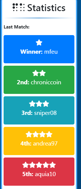
I noticed stats content being pulled from game or other website wrapped in too many "p" tags that ending with " br" = new line. Also "p" tags where doubled and added ID s which is useful for Javascript but they was doubled so i decided to clean it up and instead using same ID s make button with names and icons. Why i decided that? Maybe somewhere in near future we could implement button tooltip so user when click on some winner can see stats tooltip (baloon) for that user in last n time.
Widget stats with kills and number of players was same mess. It is ok to use it for example in middle main content but best practice for using it in widgets are being displayed as "li" tag without new line at end so i contacted @Igster for making it happens. That brings some order in code and look.
Widget was using borders for dividing visual parts but instead i use custom "hr" tag.
Centering heading and textual content was made also.

Main column
I mentioned above focusing on middle column with logo but what should i do with content. Splitting it with custom horizontal rule wasnt good enough because it exist some sections that need to be better visually separated (Gameplay, Rules, Rewards etc.) so i decided to add some fonts and icons using Font Awesome. That will distinct sections even better. Example of using Font Awesome for Winners:
<button class="btn btn-primary btn-lg btn-block"><i class="fas fa-star"></i><p id="winnerP"></p><p class="lastMatchWinnerP"><b></b></button>There is a problem with ID tags so i decided to wrap it in large button. I added next i tag before paragraph tag marked with ID=winner and i get icons before winner names. Same way can be used for any part of HTML document.
<i class="fas fa-star"></i>How did i know which "i" tag was right?
All available Font Awesome Icons and how to be used can be found Here.
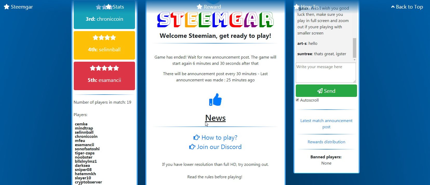
Now when i look i see there is almost all good. But, what will happens when middle content became too large? So i added sticky navigation and made it almost transparent so it doesnt have influence to content layout. Although, i had complaining that it doesnt need to have but i see possibility to break main homepage sections to separate pages somewhere in future and keep just excerpts on homepage so it will increase loading time. If any of those menu options considered as not needed we can always leave one link with Arrow icon on side for users who want to get back on top of the page just clicking it.

So final result for now is:

As a follower of @followforupvotes this post has been randomly selected and upvoted! Enjoy your upvote and have a great day!
Congratulations @aleksandar.vasic! You have completed some achievement on Steemit and have been rewarded with new badge(s) :
Click on any badge to view your own Board of Honor on SteemitBoard.
To support your work, I also upvoted your post!
For more information about SteemitBoard, click here
If you no longer want to receive notifications, reply to this comment with the word
STOP