Website Accessibility: WAVE Web Accessibility Evaluation Tool, Part 3
This is the third and final post exploring the WAVE Web Accessibility Evaluation Tool, this time we will look at all the remaining parts of the tool that we haven’t already discussed.
So to pick up where we left off lets move onto the reference tab and the reference system.
The Reference Tab
If we were to go to the reference tab as soon as we generate an evaluation report the page will show you the following.
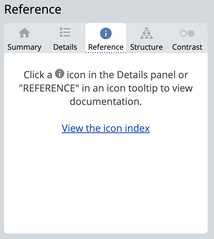
This is because the reference tab is a context sensitive tab and the content of which is dynamically populated by the method you arrive at this page. If you have nt used one of the two primary ways to get content appropriate references you can instead select the icon index and brwse the system manually
![]()
Whilst this facility is useful and illustrate just how many items this tool evaluates it is not the best way to use this tool. Instead we can access it via the preview plane modal tooltip as described in a previous post using the reference link:
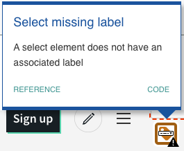
Or alterntively those who were pay particular attention or have tried to runthis tool thmeselves will have noticed on teh details page after each group of icons there was more information style icon which when clicked swaps you to the reference tab and populates it with the relevant information.
![]()
By clicking on this icon the tab is swapped over from the details tab to the refence tab and it will populated this section with a breakdown of the issue at hand.
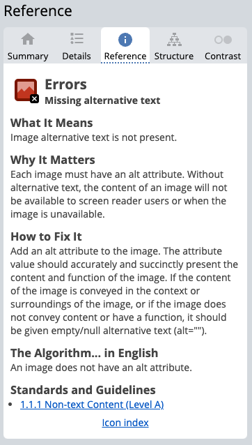
This usually will involve a textual description of the reference item, and why that is important from an accessibility perspective, the suggested solution and a link back to the specification documentation under which the item is being tested against.
The Structure Tab
On the details page covered in part 2, we were first introduced to the structural elements used on our page, whilst this can be useful in a very niche cases its not the best way to use this information, instead it's the structures tab which is where in my opinion the more useful breakdown is provided.
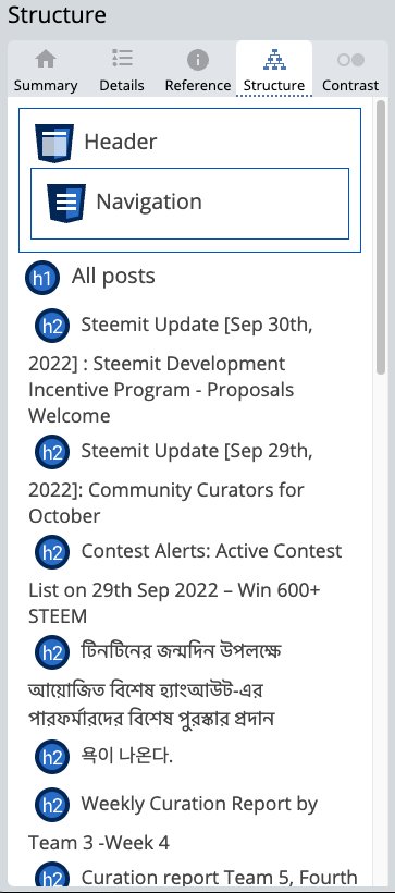
Part of accessibility is to ensure that the page makes sense when you remove the decoration and design. Grouping associated content together and using correct titles and markup will help make sense of larger pages, this feature here allows you to see the hierarchy of the page and how the parts of the page are grouped together, and very quickly see where structural based issues have been made.
The Contrast Tab
This tab is a complimaentry tab that builds off of the information provided in the details tab under the title of the same name. The advantage of this part is it also gives us access to some very powerful tools with which we can extrapolate the solution and allow us to correct the issues found.
Contrast is a particularly common issue for websites as it's often hard to imagine how someone else sees something if you yourself see it differently. Two colours that appear to the average user to be very clear could in fact be terrible if the user is colour blind or has a visual impairment.
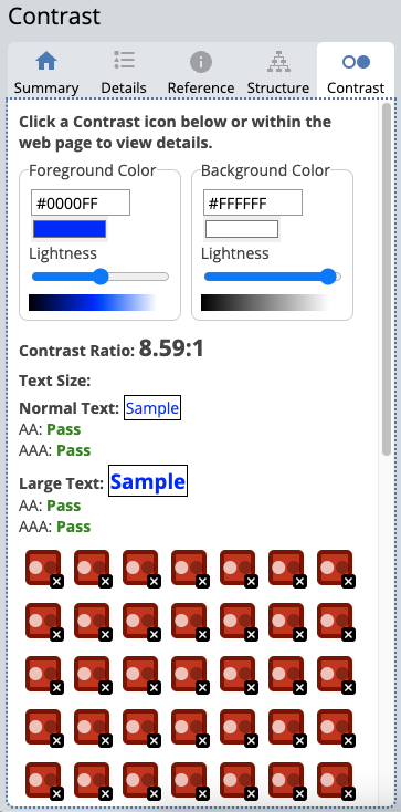
As mentioned before we need to achieve a contrast ratio of 4.5:1 but how do we know what equates to in our palette, your average designer will not be able to say with certainty in most cases so an average user has no chance. This tool available to us here addresses that and gives allows us to actually see and adjust our colours with dynamic feedback to see which of the two specification standards (AA & AAA) the colours pass or fail against.
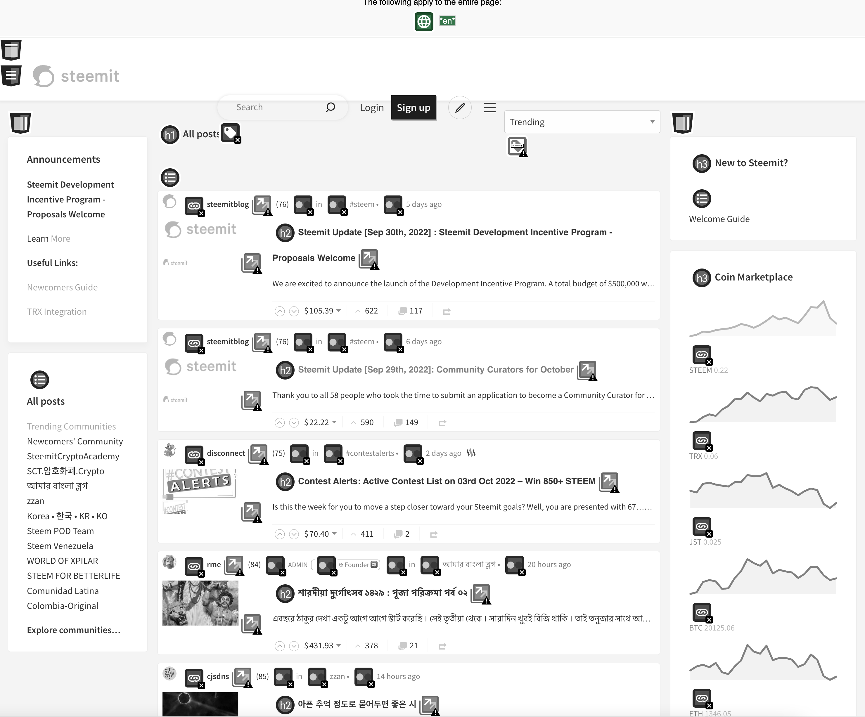
Finally, for this section it allows us to desaturate the page entirely this is very helpful for visually seeing identifying areas of poor contrast, whilst a bright red may seem noticeable and standout for a typical user once we desaturate the colours red actually a mid-range grey and mid-range colours are terrible for accessibility. What were looking for is either light text on a dark background or dark text on a light background, a mid-range colour doesn't work with either light or dark.
Toggle Styles
This is a very simple feature and does exactly what you would expect. It toggles the style sheet on and off.
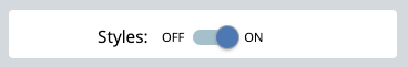
Whilst our structure tab will show and group the structure into a wireframe overview the toggle style sheet adjust the preview plane for us to see what that would look like with our actual content.
The reason we would want to do this is that many assistive technologies see the page in the same way an SEO crawler bot would look at the page, that is without visual representation. Through the use of javascript, css positioning, display attributes, flex box ordering to name but a few methods, it is possible for a developer to change the presentation of a page entirely from the way the underlying source code has laid it out for us.
Whilst this control may be beneficial to shape the way a person sees and interacts with a page we have to awknowledge that not all users do so in the same way. Therefore the source code or unstyle page is the foundation on which all accessibility is based off, and as such should make sense on its own, turning off the style sheets in this way allows us to see how the page falls apart, a good webpage still has everything a user needs without any decoration, after all, content is king and ultimately this is what the user is here for.
Conclusion
As you can see accessibility is a complex subject which has to cover a very wide array of issues, trying to build a product without a way to identify the issues would be near impossible. The specification documents are not always easy to read and it's very easy to miss or misinterpret its objective if you are not already in this space. Tools like the one I have presented here today go a long way to empowering developers to make a small change to make a very big difference.
It is said that almost 15% of website users have some form of disability. It is our duty as developers to make our products reach as many people as we can, and as I hope I have demonstrated with little knowledge and the right tool we can be inclusive by design.
Website Accessibility Series
- Website Accessibility: Series Introduction
- Website Accessibility: WAVE Web Accessibility Evaluation Tool, Part 1
- Website Accessibility: WAVE Web Accessibility Evaluation Tool, Part 2
- Website Accessibility: WAVE Web Accessibility Evaluation Tool, Part 3
SteemWOW
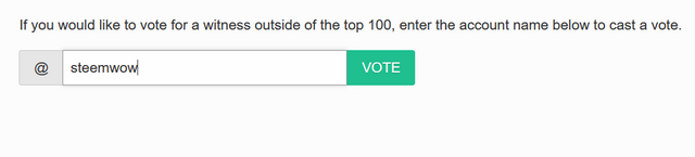
If you like the series so far and would like to show your appreciation please support the @steemwow team and vote for our steemwow witness, you can do this by heading over to the Steemit Wallet Witness list, and scroll to the form at the bottom of the page. Just type steemwow into the box and hit vote as illustrated below.
The most glaring contrast issue for me in Condenser is the Notifications screen when in Night Mode (which I usually am).
The more valuable notifications lose so much contrast I have to highlight the text to read them!
Edit: I'm sure we could come up with a different "highlight" algo to draw attention to the high-reward notifications without killing the contrast.
Absolutely, i too use night mode and it is the perfect example of a mid on mid-tone. Imagine if this was how you saw most colours because developers didn't give any thought to people who see sites differently from themselves.
Now regarding fixing it for Condenser you know me, I'm always up for a challenge, perhaps we can look at throwing our collective @steemwow hat into this developement incentive program?
Sounds like a plan, I'm in!