Math-Trail Logo Design Competition [50 SBD prize][Submit Your Entries Here]
Finally, here is the actual competition to design a new logo for Math-Trail. You can find previous discussions on this HERE and HERE.
Every topic-trail currently uses the same logo. As there are hundreds of such trails I sometimes have to hover over an icon to see if it was me who gave that vote or another! So, I think it time to have a distinctive new logo that can be used both as the profile image and within articles.
The Prize shall be 50 SBD for the winning logo.
There may be discretionary prizes of 20 SBD for any other exceptional designs that I feel we may use.
Two Phase Process
Phase One is to submit your design below in the comments.
Users please vote on your favourite design or designs.
However, this is not wholly fair as the first images will have more time to accumulate votes.
Phase Two will be a second post with the best designs.
This will be a fairer vote and the winner shall receive the Prize of 50 SBD.
The winning logo shall then be used in our profile and within posts.
Because of the different aspect ratios of a profile image and a post banner, the winner shall be asked to create a banner from the same design.
The Brief
The design shall be either square or circular and be effective as a profile image (38px and 46px) and up to a size of 600px.
The resolution shall be 300 dpi - it is acceptable if the resolution of the image posted in the comments is less than this.
The image shall include the legend "Math Trail" with any variation of lower or upper case letters.
This competition ends once the 7 days expire.
The final phase shall be posted very soon after this expiration.
Option A
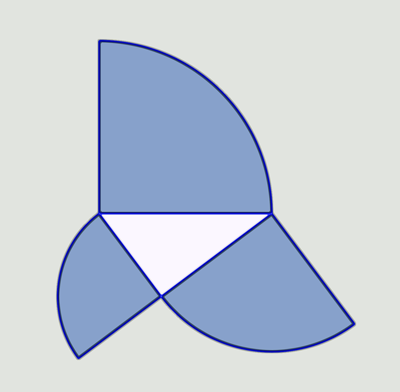
One thing that prompted me to have a new logo was the accidental creation of this image:

Yes, it somewhat resembles a whale and is also mathematical in that it illustrates the Pythagorean Theorem for quarter-circles constructed along the sides of a 3-4-5 triangle. Designers have commented that it is too flat and geometric to work as a logo as it stands, but could be used as a template.
So, if anybody wishes to improve on this design idea, here is the original line drawing:

Option B
Alternatively, you have complete freedom to come up with your own design, so long as it has some mathematical significance.
And Finally...
Mathematics and Art share a long history as iconic expressions of human culture. I'm really looking forward to seeing the creations that spring forth for this Math-Trail Logo Design Competition.
Designers, please post your images as a comment, probably best if they are all 300px square.
Readers, please vote on your favourite images - there will be a second round of voting to make it absolutely fair.
Comments are also appreciated as a good design might be tweaked to become great.
If I have forgotten anything, please leave a comment and I shall edit this article.
Please resteem to spread this to all corners of Steemit.
That logo looks cool, just apply 'material design' principle on it and we're good to go. Maybe I'll try that.
Edit: If this wins. You can get a clickable footer/banner!
Sorry, I am very limited with my resources. I only used pixlr.com/editor, 1001fonts.com and Paint.
https://steemit.com/steemgigs/@deveerei/math-trail-logo-contest-submission-by-deveerei
Do please try - a number of people have liked it but said it just looks too flat as it stands.
I'm also not sure about the bright white underpants!
I was wondering what the underpants was. Haha. It took time for me to figure that out.
That's my entry for the competition. I went with a different style =D
I am waiting for your feedback!
Hi.
My design is about a blackboard with words related to math and geometry around.
I have the editable files in case you want to make any changes to the design.
Greetings.
Mountain peaks always form a right triangle when the base of the mountain is the diameter of a circle that has the peak touching the circumference of the circle.
This is the 300 x 300 px version.
Colors and text are changeable
And with a Steemit Whale ...
The snow covered mountain peaks touching the circumference are all right angles.
at 38 px x 38 px:
at 46 x 46 px
With a steemit whale and Euler's Formula:
The snow covered mountain peaks touching the circumference of the circle are all right angles.
46px:
at 38 px
Excited to see some of the designs, time to get unique.
I sure hope so! I don't expect designs to appear within a day, but might be nice to post an expression of interest.
good one
Let's hope so! :-)
Say hi to the Abacus Whale (aka. my entry) !
Counting is one of the earliest applications of math. I thought combining the whale / aquatic theme with a counting tool seemed appropriate
How many designs can be submitted?
I will follow this up with a how-to article showing my process for making this draft.
If you want to see this with only blue beads, let me know.
Hadn't thought of that - logically, enter as many designs as you wish!
The abacus whale is cute! What I would do to give it that primary school feel is add MATH TRAIL in kids' fridge magnet letters and fit them on the base.
I like the idea, but - a bit like my pythagorean whale - it currently looks like diagram rather than a logo.
Anybody wish to improve on this? I'm happy to share the prize between two people (say 30 SBD) if a designer can improve on an idea.