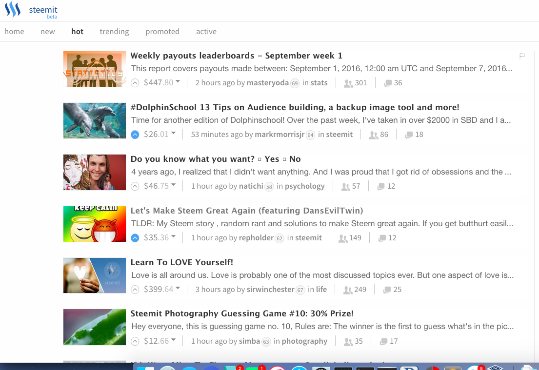
Why I'm becoming more and more convinced that UX/UI is a MAJOR bottleneck for author visibility (Plus a bounty!)
Everyday I wake up in the morning, one of the first things I do when I get to the computer is head to the Drudge Report. Say what you want about the political angle... that is not the purpose of this article.
What do you see when you jump onto the Drudge Report? A LOT. Quickly. Easily.
The eyes naturally flow over the simple to read words connected only by negative space and divided by a thin line to denote different stories. Some pictures are embedded near the news links. The important posts are bright red, and almost become a game to 'see whats red on Drudge today'.
There is a reason that Drudge is one of the top news sites in the world for many, many years. Drudge's first breaking news story was the Monica Lewinsky scandal back in '98, and its been climbing ever since.

His approach is simple: take the biggest news stories, condense the headlines into simple, easy to read blurbs of text that tell the reader the most important component of the story in just a few words, fill the page with those blurbs, move the stories that aren't performing down or off the page altogether, biggest stories go to the top in big red with pictures.
And it works... really well.

So what does this have to do with Steemit?
Not a day goes by where I don't stumble on some random users name, click to their blog posts, and scroll down a ways before I find a headline that stands out. I click to read a bit more and I'm amazed to have found a gem that I would have never seen were I not stumbling around in the alleys and darkened corridors of the Steemit infrastructure.

If you look at the main page right now (or any page on Steemit for that matter), AT MOST, you can see ~7 posts at one glance without scrolling down. Its far easier for the eyes to dance across the screen than it is to scroll down... and down... and down... past all the nonsense posts and garbage people throw at the wall in the hopes it will somehow stick. Eventually, I find a gem and get back to reading.
If there were more visible posts per screen view, there will be more impressions per post and more of a likelihood that your well-written post will get seen by more people and hopefully upvoted.
The Bounty
I'll stake a 50 SBD bounty for someone to develop a framework for getting more posts per page as a demonstration. The demonstration must pull in posts from the Steemit blockchain and format them to maximize post headline per page, while still maintaining functionality of upvotes. Bonus 25 SBD for added options to adjust (ie thumbnails, first sentence preview, number of columns/rows).
If you're interested, please comment below and estimate a time frame. If there are more than one interested parties, I'll make a follow-up post for Steemians to vote on the best designs to determine who will receive the reward.
maybe its because im a 2p2 4chan guy, but i've always felt that the reddit style interface was inorganic and clunky. Personally, i would much much rather see a phpbb type interface.
Im adding 100SBD to whoever wins the bounty, provided the new interface is fully functioning (voting and wallet enabled). Because i really think its needed. I also tossed in some monies for promotion
We may disagree strongly on some things and your style of debate may rub me the wrong way, but I certainly respect you @sigmajin. Thank you.
My hopes is that a suite of custom UX tools can be developed out so anyone can set up their 'Steemit' experience in whatever way suits them best.
Well, if you like donnie darko and the drudge report, you can't be all bad.
Thats a really good point. The ability to run real threads is not given. It looks fragmented and has no causal order.
Yes, the UI needs some work. I totally agree with your points and have a post regarding social buttons that should be added as well https://steemit.com/steemit/@contentjunkie/feature-request-add-social-sharing-widgets-to-encourage-organic-growth
At least for the new section it would make curation much more effectively if more headlines would be visible per page and therefore less scrolling needed. However, the main bottleneck for me is the opening and scrolling through the actual article after it´s headline caught my attention AND the clicking back to the feed to continue scanning. So what I would love to have is a tooltip that displays the entire body of text when hovering over the headline of an article. By this one could make a qualified judgement whether or not to upvote in a very fast but still conscious manner.
Hmm I like that..
The beauty is that ANYONE can create a UX on top of the blockchain and run with it. Just has to be developed.. Sort of what I was hoping to do with this article, but since I have no real name and no whale advocates, this will likely slip into the night unnoticed :P
I proposed a UI like this for exactly the reasons you have mentioned. Thoughts? I am a dev, so I could make it happen, I guess.
I agree with your assessment on the color palette. That looks pretty good though
I don't know code, or I'd take a crack at this. I like the idea, and I think the more options people have to customize their own view of Steemit, the better. I don't have a problem with the view now, but I'd enjoy trying out a view that is more like the Drudge report. I think it would be cool also to have different filters, such as certain tags, or even filter in favor of the least performing stories (that way hidden gems could be discovered). And while you're at it, how about permalinking the comments so you can click on the comment you want to read (like how the first line shows up in your "replies" page) and land on the actual comment instead of the original article.
Agree.
If I can find the time I'd like to take a shot at this. Time though... I think someone else will beat me to it.
Nice Idea!
We will see if this will be implemented.
Does the solution have to be a server/client web UI? Can we use say, piston's client/client web UI. In this UI the software is a server that runs on your local host. Then you interact with it via a browser.
That would work for me. Long term goal is that it would be a frictionless step for someone to get it up and running... grandma-proof I suppose. Obviously that would make the development far more costly, but I'd definitely be happy with something I could use on a local host and it would potentially prove out the concept.