RE: NEW STEEM T SHIRT DESIGN!!! I NEED FEEDBACK!
Sweet I've been waiting for this!
I want to know what you guys think of the logo. What color shirt should it be printed on? Would you want this logo on something besides a t-shirt? Stickers? What other garments you would like to see the artwork on Let me know!
I like the logo. The only thing I'd change is to make the "steAm" (the offset black background behind the three "steEm" lines) transparent or line graphics. To be able to change colors easily, and print easier (I think print easier).
- Hoodies for sure. those are versatile.
- Beanies. for the winter. (or is it beenie?)
- Velcro Patches
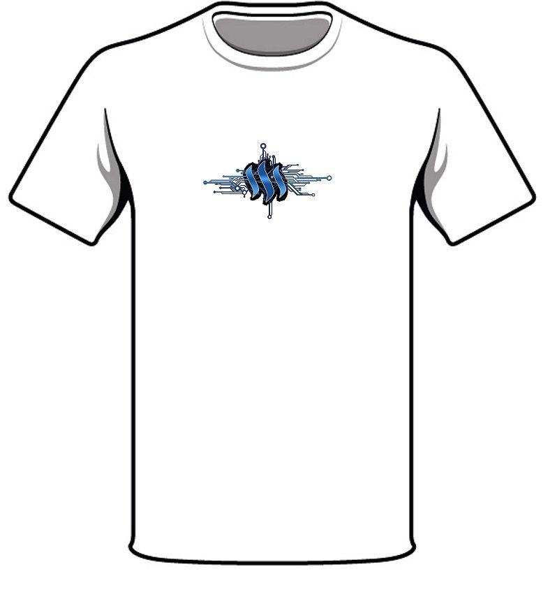
I think the current design would look good on a white background (see below). And as an alternative just black and white outline the logo on a white background (no example provided).

Whiteground with logo as is.
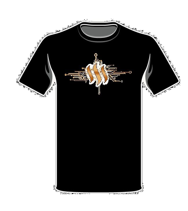
You could invert the color (see below) or just white it out (no example provided) and put it on a black background.

Blackground with inverted gold logo.
The last time I created a post about the T shirt idea, I didn't get as much feedback as I thought I would have.
I forgive you for not responding to my response...
SWEET! Thanks for the work getting it on a shirt dude!!! Super props for helping on this project! Upvoted!
I like the gold design, but the original colors for the www.steem.io logo i think are important. While the gold does look cool as hell! I was thinking about a larger flamboyant logo though. That one seems small and cool, but we need to get the brand out there to help promote steem. The gold size one is better i think!
You know, I was thinking, what about we put the words "www.steem.io" in small letters on the outside facing sleeve. Or maybe just steem
or maybe "CRYPTOCURRENCY STEEM"
My only thing with hoodies, do we go zip up hoody, or wear over?
Yeah the size was completely arbitrary, as I was using MS Paint (ahahha). So it was more about the concept.
Actually for arguments sake lets see the blue on black on black....
Super basic, crappy MS paint version of the regular logo on blackground. Ignore the quality (and size) of the logo. Just for conceptual color purposes.