Typography tweaks for a more beautiful & readable Steemit.com
After all of the writing I've done on Medium, I've been spoiled, typographically speaking. So, I had to make some tweaks to Steemit's typography. I'm applying these tweaks using the Chrome extension Stylish.
In case you're wondering why I'm so picky, I wrote a book, containing lots of geeky typography stuff, called Design for Hackers. I did an hour-long talk at SXSW, and I sell a course, all about…"white space" (which really is what typography is all about).
That said, I mostly defer to Robert Bringhurst's The Elements of Typographic Style when it comes to typography.
Here are the tweaks I made.
Shortening the line length
Assuming you don't have a custom style sheet, the line you're reading probably comes to about 15 words per line. That's not terrible. Not nearly as bad as Wikipedia, for example, but it makes reading stressful.
Bringhurst likes to go by the character, which I'm tempted to think is haughty, but it helps when typesetting languages that have long words, such as German.
"Anything from 45 to 75 characters is widely regarded as a satisfactory length of line for a single-column page…."
The current layout comes out to about 91 characters. I'm shortening it to about 73 characters with this CSS. I've styled this paragraph so you can see what that width looks like.
.PostFull {
    max-width: 40rem;
}
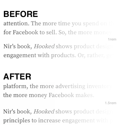
Adjusting paragraph margins
The spacing after a paragraph helps signal that a paragraph has ended, and a new paragraph is beginning.
I can't find at the moment where Bringhurst makes a recommendation on this. He's prefers indents, which is pretty old school for the web, considering the faster reading style. But the current style doesn't provide enough space-after-paragraph for me.
Currently, there's .5rem of margin on the top of a paragraph, and 1.0rem on the bottom. From what I can tell, the top margin isn't actually working. I can set it to 0 in Chrome's Inspector and I see no change.
I'm removing that .5rem from the top of the paragraph, and adding it onto the bottom, resulting in 1.5rem below the paragraph. Like this.
.Markdown p {
    margin: 0 0 1.5rem;
}
Remove hyphens
Hyphenating is primarily intended to avoid unsightly holes in justified text. The limitations of typography on the web are such that one should never justify text. Justified text is hard enough to pull off well in print.
Fortunately, Steemit doesn't justify text, but it uses hyphenation. Bringhurst explains that using hyphenation on ragged-right text (which Steemit uses, as should any other website) "combines the worst features of justification with the worst features of ragged setting, while eliminating the principle virtues of both."
In other words, justification (when done carefully on a print document) can look nice, but you unfortunately have to hyphenate to do it right. Meanwhile, ragged text is nice because the uneven line lengths help you keep track of where you are as you read. So, hyphenating on ragged text ruins that, while unnecessarily breaking up words.
Here's how I removed hyphenation.
.Markdown {
    hyphens: none;
}
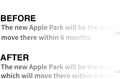
Reduce leading on headings
Steemit has a fair line-height of 1.5 (or 150%) on the paragraph text. It has a comfortable amount of "leading" (the name originates from strips of lead typesetters would put between lines).
But, Steemit's heading tags are all set to a line-height 1.4. Headings are rarely more than a couple of lines long, so such generous leading doesn't help. It just makes the headings look disjointed.
So, I changed the line-height to 1.2, like this.
h1, h2, h3, h4, h5, h6 {
    line-height: 1.2;
}
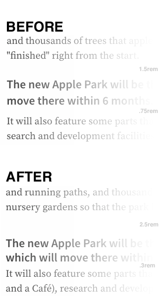
Tweaking margins on headings
The margins on headings help indicate that a new section is starting, and manage the spacing between the heading and that new section.
The headings are too far from the following paragraph for my taste, and not far enough from the previous paragraph. This is more a matter of personal taste. There are many ways to achieve the intended effect of making a heading stand out.
I added generous spacing on top of headings, and just enough below to keep it in "rhythm" (visually even spacing) with the paragraph below the heading.
.Markdown h1, .Markdown h2, .Markdown h3, .Markdown h4, .Markdown h5, .Markdown h6 {
    margin: 2.5rem 0 .3rem;
}
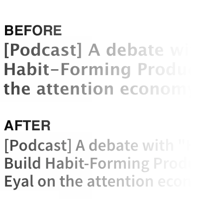
A better font for the post titles
Most of Steemit is set in Google Font's Source Sans Pro and Source Serif Pro. They are decent fonts that, as their names imply, go together.
But the titles of the posts are set in Lucida Grande. Lucida Grande is a great font for small sizes on screens with low resolution – which was the intention when it was released 17 years ago. A typeface should fit the display technology.
Titles are large, and screens are getting higher and higher in resolution. In this context, Lucida Grande is clunky. There isn't much subtlety to its contours – a side-effect of it being designed for low-resolution.
So, why not just use Source Sans Pro for the titles? While I'm at it, I'll adjust the line-height.
.PostFull__header>h1 {
    font-family: Source Sans Pro;
    line-height: 1.1;
}
Want to use these styles?
As I said, I'm using these styles in a Chrome extension called Stylish. You can copy and paste these styles if you'd like, but I believe if you install it, you'll see my styles available in the extension when you visit Steemit.com.
Thanks for the great tips. I am resteeming this to help spread it around a bit!
Thanks!
God yes. I don't know why the hell it was ever implemented on Steemit.com in the first place besides "hey look what we can do." Just the fact that it can't even be optionally disabled is annoying as hell.
I much prefer how it is, or even a bit wider. My computer screen isn't a vertical phone screen. If anything, I'd love to see a cookie-based setting to choose line width.
good stuff man! will try it on my posts
Thank you so much. I will test out the extension. I hope the Steemit team adopt some of these changes - particularly the titles just don't look right.
https://twitter.com/Soul_Eater_43/status/854438791490273283
Disclaimer: I am just a bot trying to be helpful.
Great suggestive tweaks, I have thought a bit about these issues too so its nice to see I'm not alone. Hope to try it out in my posts.
Excellent post! I like your work My friend
This is great - happy to see these changes being implemented on steemit.
I'll fiddle with the styles on #steemlink to match your suggestions :)